Wednesday, October 31, 2007

X-Men: Messiah Complex (One Shot)

As the launchpad for this season’s big “Messiah Complex” crossover, which covers every November X-Title, this one-shot has a single, specific purpose: to set the table and stand back. The issue accomplishes just that - when Charles Xavier senses a new power in Cerebra, the first manifestation of a new mutant since Wanda Maximoff went loony, he’s quick to act. Xavier dispenses a team of heavy hitters to the scene and hopes for the best, but the situation they find is anything but friendly.

Writer Ed Brubaker’s contribution to the issue is serviceable throughout, although nothing about it really struck me as being particularly outstanding, either. I’m not sure if I’d blame Brubaker for that or a first chapter’s natural tendency to hold the big events back for later, but the problem is noticeable. For all of its flair and promises, this really is a very slow-moving, do-nothing of a story. Sure, a few mild revelations are doled out between the covers, but the majority of the issue simply follows a high profile group of X-Men as they chase a dangling plotline with minimal results. It’s a chase scene without a conclusion, a lot of standing around, huffing, puffing and needlessly flaunting mutant abilities without a confrontation.

Within the scope of the Marvel universe, the potential of the tale is there. It’s been a long time since House of M nearly eliminated the mutant population, so it’s nice to see the potential of some progress on that front, but I just don’t see anything here that’s going to keep me interested for the duration of a multi-issue storyline. Where the events surrounding Wanda’s breakdown were presented as a landmark event that concerned the entire world, Messiah Complex feels like it’s just another run of the mill X-Men story. These books may change out the cast of characters from time to time, but they keep spinning the same kind of yarn.

I used to count Marc Silvestri among my favorite artists, even through his later works, but I just can’t get behind what he’s bringing to the table in this issue. This is a guy who used to illustrate Wolverine effortlessly, month after month, during his lengthy run on Logan’s monthly series. Today, I can’t even recognize Silvestri’s take on that cornerstone character. Logan doesn’t look war worn or hard-edged, like he used to under the artist’s watch - he seems downright cherubic. Emma Frost comes off as vacant, expressionless and overly sexed-up throughout the issue, which is a difficult feat considering the general acceptance of her usual wardrobe. Without the constant presence of his tail, I don’t think I’d have even identified Nightcrawler. These are characters I think I know very well, having followed the X-Men books fairly regularly in the past, but they all seem distant and foreign to me in the modern Silvestri’s hands. His style has largely abandoned the rough, sketched personality it once embraced, in favor of a stiffer, stereotypically over-muscled approach.

It’s like he’s gone from being a trendsetter to an imposter. Where before, there wasn’t another artist on the planet quite like him, today’s Marc Silvestri feels like a weak David Finch impression. While he can still impress when he really puts his mind to it, as evidenced by the scene-setting landscapes within the issue’s slower moving pages, a few stylized action panels or the infrequent silhouettes he seems to throw in on a whim, I found the majority of his work here fairly lacking. The man’s lost a step or two, I’m sorry to report. While in the past I’d have to say that his worst was better than most artists’ best, today Silvestri’s worst is much more decidedly average.

That seems to be a theme for this issue: great creative minds coming together to underachieve in unison. When he’s on, Brubaker can write a gorgeously compelling, intelligent drama in 22 short pages. He’s kept me on the edge of my seat for over a year in Daredevil, held me at attention in Criminal... but something isn’t working here. The characters don’t relate with each other as members of a tight-knit family, like they used to. They’re just teammates, objects ordering one another around the battlefield. Brubaker is great when he’s spinning ten plates at the same time, dedicating just enough attention to each storyline as necessary. When he’s tasked with a single, straight-laced narrative, as he is here, much of the magic turns up missing.

Don’t be fooled by the inflated price and deceptively padded page count in this issue: in the end it’s just another X-crossover. Worse than that, it’s just a lead-in to another X-crossover, not even the real meat and potatoes. If you’re a hardcore X-Men fan, I’d say you should borrow this from a friend, just to make sure you aren’t missing anything before the real show gets off the ground. If you’re a casual visitor to the mutant books, flip through it in the store instead. It’s a lot of fluff with a few minor talking points sprinkled throughout.

On a scale of 1 to 10, where 1 is poor and 10 is amazing...
Overall Score: 5.5

Tuesday, October 23, 2007

Thunderbolts #117

Under the watchful eye of Norman Osborn, formerly known to a select few as the Green Goblin, the Thunderbolts have found new life and new membership. As Tony Stark’s enforcers, the team has seen its ranks filled with an odd mix of forcibly reformed villains (Venom, Bullseye), original members (Moonstone) and unstable head cases (Penance). As the overly-violent crew responsible for restraining and capturing unregistered powers, the team has developed something of a notorious reputation after Penance went ballistic and Venom ripped off an unregistered hero’s arm during a recent mission.

I’ve had a love-hate relationship with Warren Ellis’s work over the years. When he’s on, writing science fiction adventures with his limitless imagination and incredible knack for believability, he’s among the industry’s finest. When he goes off on a tangent, gets stuck on a subject or gets overly political, I’ve got no time for him. In Thunderbolts, thankfully, his writing is much closer to the former than the latter. The bulk of this issue features Doc Samson, super-powered therapist to the stars, and his conversation with Robbie Baldwin, AKA Penance of the Thunderbolts.

Samson is the kind of character that, when treated properly, can single-handedly make a story. Peter David handled him beautifully in an issue of X-Factor years and years ago, and Ellis treats him likewise in this issue. Even though he’s not a regular member of the book, the writer covers him as one, granting him a great ability to read people and respond accordingly. He’s the voice of reason in this tale, a welcome breath of fresh air from the thick scent of darkness that’s invaded the rest of the team’s operations.

By giving that kind of respect to Samson, Ellis gives the character the kind of control he needs to transform Penance from a cheap joke of a concept into a genuinely interesting, conflicted personality. When Doc Samson is exploring his psyche, Baldwin is a tremendously developed individual– which came as a shock to me as a reader, after observing his (mis)treatment elsewhere. Penance and Samson are the centerpieces of this issue, and when they have a breakthrough during their brief therapy session, it’s exciting both visually and mentally. Penance’s outburst, coupled with Samson’s reaction, is a phenomenal moment that I won’t soon forget.

I mentally tripped over myself when I realized that the artwork in this issue belonged to Mike Deodato, Jr. This is some genuinely refined, mature work, completely in tune with the dialog-heavy story Ellis has provided. There’s very little giant, explosive action in this issue, just a lot of talking heads and some weighty talks. For many artists, that would be the kiss of death, but for Deodato, it’s an excuse to display the depth of his capabilities. Something as subtle as the slow clench of Robbie’s fist as Doc Samson unravels his personality… that would be lost on the reader under the watch of almost any other artist.

And the power of the artwork isn’t just limited to its basic execution. Deodato’s trying new things throughout this issue - with his paneling, his heavy use of shadows, the textures on his character’s clothing, the facial expressions – and without exception, they’re all hitting their mark. His artwork is a perfect fit for the tone and mood Warren Ellis is setting with the story, and gives the issue exactly the kind of honesty and realism it needed.

Every once in a while, you’ll stumble upon a single issue that works so well on its own that it immediately enhances the stock of the surrounding issues and the series as a whole. This is one of those comics. The storytelling is profound and intelligent without feeling stilted or overly wordy. The artwork does its job and then some, giving the tale a dose of style and a great personality. It’s firing on all cylinders, and truly a sight to behold. Buy this, even if it’s just for one issue. It’s a phenomenal read.

On a scale of 1 to 10, where 1 is poor and 10 is amazing...
Overall Score: 10

Marvel Adventures: Iron Man #6

Like its Marvel Adventures peers, MA: Iron Man provides an excuse for its creators to tell a straightforward story featuring one of the Marvel Universe’s heavy hitters, sans the decades of continuity and storyline ramifications that usually come along with the character. It’s a straightforward adventure book without any ties to the latest mega-crossover or epic multi-part storyline, which is a nice concept. If you’re sick of the whole “Tony Stark is the asshole leader of SHIELD who keeps trying to intimidate his peers” angle that’s been running in the other books, and just want to see a genius strap on a robotic suit of armor and fire a few laser beams, this is your book.

Unfortunately, this return to the simpler times of a self contained story and a lack of weighty continuity also drags along its own set of clichés and stereotypical plot devices. After blasting himself into orbit in a joint effort with NASA, Stark spends most of the opening pages dictating the story’s premise, via radio, to the technicians in Houston. Sure, that’s one way to quickly bring the readers up to speed, but wouldn’t the scientists on the ground already realize the point of their mission? Later, he casually explains the physics behind his decision to use booster rockets in zero gravity… while in a firefight with the Living Laser. While a lot of this book’s charm lies with its attempts to deliver a no-strings-attached retro storytelling experience, that’s also where I found many of its drawbacks. Comics may have taken a few steps backwards over the last few years in their repeated attempts to tell lengthier stories with more consequences, but they’ve also taken just as many steps forward with the quality of that storytelling.

Even overlooking these more traditional flaws, the story is pretty rough around the edges. The Living Laser succumbs to the most basic of super-villain shortcomings, explaining his master plan to Iron Man and then giving his enemy time to thwart it. Writer Fred Van Lente’s take on the Laser’s powers is tough to follow and largely without reason. While the story takes a few interesting twists and turns, it’s very B-Grade stuff. Even the surprise conclusion comes out of nowhere, spoiling what could have been a much more impactful moment by failing to give it the proper amount of build. In a way, the noble concept of a series built entirely on single-issue arcs is eventually its own downfall.

James Cordeiro’s artistic offerings fall in line with Van Lente’s lower-mid level storytelling. His work is there – it tells the story, puts the right characters in the right places as dictated by the plot, but never takes any risks or delivers anything unexpected. Iron Man seems quite pedestrian under Cordeiro’s supervision – not nearly the scientific marvel one would expect him to be. Shell head should be a constant visual delight, with the textures and paneling of his armor affording the artist dozens of opportunities to play with reflections, lighting and posturing. Here, he’s just a guy with a weird mask and a vaguely robotic appearance in outer space. This artwork is barely average, if it’s even that.

Rather than focusing on the things it can do, Marvel Adventures: Iron Man seems to highlight the things that it can’t. This book should not only be something that casual fans can pick up, but something they’ll want to. The kind of story Fred Van Lente wants to tell in this issue needed several issues to reach a proper conclusion, and crammed into such a tiny package it repeatedly stumbles. Where the major appeal of the series is its lack of deep continuity, the writer introduces new continuity to stand in its place. He fills the issue with needless explanation and a page-long introduction covering the Living Laser’s origin, when all he really needed was a setting, a villain and a firefight. Skip this.

On a scale of 1 to 10, where 1 is poor and 10 is amazing...
Overall Score: 2.5

Cable & Deadpool #46

With the recent events surrounding Cable, (he’s having one of those “almost dead” moments) this book has recently been much more Deadpool-dominated than usual. Fortunately, it’s avoided any status as a straight-up solo book, as ‘Pool has kidnapped “Bob,” a masked HYDRA Agent, and drug him into an adventure in Cable’s stead. Last issue the two were fired through time, emerging in the mid ‘40s and interacting with Captain America and Bucky before a series of strange after-effects jolted them forward on the timeline once again. Now the two are producing temporal shifts, with occasional flashes of light resulting in short-term memory loss to those directly surrounding them. Not a great time for the duo to spontaneously materialize on the Fantastic Four’s front doorstep somewhere in the late ‘80s, aboard Doctor Doom’s Time Platform.

Bob and Deadpool make for an entertaining pairing, with Bob wanting little more than some peace and quiet (he only joined HYDRA “for the dental plan”) and Deadpool providing nothing but firefights, frequent leaps through time and space, and quick puns. They share a similar outlook on life and stick together through some tough situations like a pair of old friends, and that makes them endearing as lead characters, if nothing else.

This book never takes itself too seriously, (it actually borders more than once on not taking things seriously enough) and the random memory losses the pair keeps uncontrollably handing out provide for some truly funny moments. I legitimately snorted aloud when Reed Richards suddenly transitioned from a calm scientific discussion with Bob to an action-ready state of shock, declaring “There is a HYDRA agent at our breakfast table!” within a single panel. It could’ve been overdone and too much, but Nicieza kept the device under control and the issue benefited for it. For all of the double-talk about time travel, untimely ramifications upon the future and twenty-dollar words this issue contains, the story provides a nice blend of drama, action and comedy, and its conclusion is fairly easy to understand and satisfying.

Reilly Brown’s artwork bounces around a lot in this issue. Within the opening pages, he’s just butchering the original Fantastic Four lineup, granting Sue an enormous pair of tits and a ditzy blonde expression. Midway through the issue, when the narrative momentarily returns to the present, he does an about-face and renders the Black Panther and Storm beautifully, accenting the feline aspects of the Panther’s costume and giving Storm a more natural, inquisitive appearance. He does great work with dramatic lighting when the situation calls for it, but he’s tasked with a few large-scale splash pages in this issue and his composition in those instances is less than stellar. He’s the kind of artist that takes one step forward, then immediately follows it with one step back.

This is everything you’d expect from a Deadpool book, which means it’s not for everyone. Actually, chances are good that if this is your style of comic, this series already resides in your pull file. It’s an offbeat, joke-heavy story set against the backdrop of a bigger picture and a more serious set of circumstances. If you’ve never given the series a try, you’ll want to flip through this and see what all the fuss is about. It’s a good enough issue, but certainly not a great one.

On a scale of 1 to 10, where 1 is poor and 10 is amazing...
Overall Score: 5.5

Black Panther #31

This is as much a Black Panther solo book as it is an extra Fantastic Four monthly. T’Challa and Storm, already regulars in the Panther’s regular ongoing, are once again joined this month by their F4 teammates, Johnny Storm and Ben Grimm. When the team was faced with a threat they didn’t understand and couldn’t overcome, team leader T’Challa unleashed an unfamiliar power in a desperate bid to contain the beast. Good news: it worked. The monster is no longer on Earth, and roams a variety of bizarre landscapes, alternate realities and parallel planes of existence. Bad news: the Fantastic Four are along for the ride, with no clue how to return to the Baxter Building.

After a dull fray alongside the cast and crew of Marvel Zombies for the last few months, author Reginald Hudlin has shifted the team into a different locale with this issue. The team has been traveling between realities via a super-powered, gold-skinned toad, and after abstaining from its use during their stay in the Zombies universe, their hand was finally forced at the end of issue #30. With their backs up against the wall, they chose to employ the frog’s powers once again and take their chances with another reality.

Aside from a few additional examples of the frog’s eccentric powers, this issue has no real purpose – it’s one needless twist after another, with the story failing to make any progress from first page to last, just a series of soft transitions from one oddball fantasy to the next. More than half the issue is thrown away on a crazed, page-turning imaginary sequence involving Storm and her teammates with the X-Men. The lead characters float mindlessly through the story, occasionally forced to remind one another of where they are and what they should be doing. When T’Challa and Ororo suddenly embrace in one panel, the Thing quickly reminds them that Johnny is unconscious, and the story casually shifts its focus to that plot development for a few minutes before something else steals its attention.

It’s like a creative writing assignment from a kid with ADD: imaginative, but so utterly random and lacking in circumstance that it downright refuses to connect with its readers. Where Grant Morrison took a similarly twisted concept in JLA: Earth 2 a few years back, he was successful in grounding it with a compelling story set in reality. Hudlin does nothing of the sort, and seems to be using this heretofore unheard-of superpowered frog to turn Black Panther into his own personal playbox within the Marvel Universe.

Artist Francis Portela produces a few bright moments, but is also largely unfocused and visually disinteresting. The Panther himself frequently appears to be staring vacantly off the corner of the panel under Portela’s watch, and the artist’s take on the Thing seems all wrong – like he’s merely wrapped a rocky texture around a vaguely humanoid blob. Storm never looks comfortable, always posing in an awkward position, but in the artist’s defense, she really is a difficult character to illustrate. Few have successfully captured the kind of grace and personality that’s been developed in her character without also giving her a glazed-over, snobby appearance. Within the few panels that he’s given a distinct backdrop to fill in, Portela does fine work, (I especially loved the cityscapes that filled the book’s final pages) but the majority of his contributions here are in the foreground… and universally sub-par.

This wasn’t a tough book to read, and it certainly wasn’t without creativity. Most of the dialog is kept noticeably brief, and the imaginary voyages these characters take in just 22 short pages cover a broad range of scenery. In the end, though, it was all flash with no substance. At the beginning of the issue, the cast was walking disoriented into a new reality with no clue how to return home. At the end of the issue, they’re in exactly the same situation. Nothing was accomplished, aside from a few crazy imaginary voyages and another fresh setting. I’m suggesting you skip this and look for something a bit more grounded in reality.

On a scale of 1 to 10, where 1 is poor and 10 is amazing...
Overall Score: 1.5

Monday, October 15, 2007

Penance: Relentless #2

Formerly known as Speedball in the New Warriors, Robbie Baldwin became Penance during the Civil War and basically flip-flopped his personality in the process. Stricken with guilt over the Stamford incident, Penance punishes himself by wearing wardrobe that’s spiked both on the exterior and the interior. Personally, I really didn’t care all that much for this character when he was the goofy guy with the power to create colored spheres – but from what I read of it during Civil War: Front Line, I’m not sold on his new personality, either.

This story has a few bright points – Paul Jenkins works beautifully with Norman Osborn, Baldwin’s supervisor with the Thunderbolts, and the former Goblin’s hesitant subservience to Tony Stark. It’s a constant battle of the wills between these two, as Norman struggles with his constant urge to tear into his superior at the first sign of a perceived disrespect. The nanites running through his bloodstream prevent him from acting on these impulses, and the effect it has on his personality makes for some interesting reading. Jenkins also treats Robbie’s “suiting up” rather well – the scene is short, only a single page long, but both uncomfortable and borderline painful to read.

Jenkins’s main ongoing plot just wasn’t all that interesting, though. Penance isn’t deep or interesting enough to carry a story by his lonesome, at least not yet. The writer compounds this problem by dropping Baldwin into a situation where he’s hunting and confronting a character who’s even less important than he is: The Robot Master. Tony Stark’s inclusion in this issue and his frequent confrontations with Norman Osborn are really the only threads of any interest here, and they’re treated almost as afterthoughts. I guess you can’t really call the book Stark and Osborn Illustrated, but if you remove them from the picture there’s literally nothing of value here.

Paul Gulacy’s artwork wasn’t really my cup of tea. His work is a bit too pedestrian and realistic for my taste, giving Iron Man a strange, out-of-place appearance with his bright red and yellow suit of armor (sans helmet) alongside a dozen businessmen in suits and ties. He treats Osborn beautifully, detailing every war-worn detail, blemish and wrinkle of the mastermind’s face, but that’s perhaps his only true success.

On the large, I found his style drab and dull, and that what praise he’s due for the personality he delivers to each character is quickly countered by his work during the issue’s action scenes. When Penance is facing off against a dozen robots midway through this issue, Gulacy’s contributions are downright awful. To his credit, though, the artist has a great understanding of the title character’s new wardrobe. He really makes it work for a few pages in the darkness near the end of the issue, allowing the brief spots of light to play with both the reflective surfaces of his armor and the warm, fleshy leather that surrounds it, but from my perspective that was a case of too little, too late.

I wasn’t expecting all that much from this title, and with a few fleeting exceptions it met those expectations. Paul Jenkins tries to make something of this despite a boring title character, but only serves to temporarily distract the reader from that fatal flaw. Couple this with a wholly mediocre artistic contribution, and I think you can safely skip this release.

On a scale of 1 to 10, where 1 is poor and 10 is amazing...
Overall Score: 3

Marvel Adventures: Fantastic Four #29

As the most accessible book in the Fantastic Four line, F4 Adventures focuses on out-of-continuity stories of the team, generally of a historical perspective. In this issue, for instance, Steve Niles tells us about an early confrontation between the team, the Hulk and General “Thunderbolt” Ross. There’s no need for an elaborate back-story, since the characters are already familiar to so many potential readers, so the writer can focus less on wordy explanations and more on delivering a simple, exciting tale.

Niles has a firm grasp of the lighter moments the four frequently share. Ben Grimm is distracted mid-sentence by a nearby dishful of candy. Sue warns the team to avert their eyes while Reed is “doing the eye thing,” presumably bugging his eyeballs out to inspect a bit of hardware in greater detail. It’s the little things that make his story such an entertaining throwback of a read, that give the reader a sense of familiarity and association with these heroes.

I’m not sure how long the Thing’s word balloons have been treated with jagged edges or if this is a recent development, but it’s really distracting and unnecessary here. I was constantly mistaking his lines for thought balloons throughout this issue, which in turn took me out of the story while I tried to figure out which dialogues were internal and which were Ben’s. The cardinal rule of a good letterer is to play their role nearly invisibly, so thumbs down to Nate Piekos for breaking that law here.

Fortunately, Leonard Kirk’s artwork generally atones for most of the letterer’s sins. His style is subdued and legible at some moments, dynamic and explosive at others, depending on the mood chosen by the storytelling. While he occasionally gets a bit too playful for his own good, (how much time can Reed possibly save by stretching his neck out forty feet in front of the Fantasti-car, greeting a guard at the gate before the team arrives?) these indulgences are par for the course as far as the Fantastic Four is concerned. I’m not crazy about his rendition of the Thing, who comes off a bit too gorilla-like for my taste, but he’s at least got the right texture and the rest of the team looks great.

Kirk is at his best during a fast-paced action segment, as evidenced by his illustrations of the team diffusing a skyscraper fire in this issue’s opening pages. As a reader, I can sense the urgency of the moment through his light, shadow-focused linework in these situations. He doesn’t weigh things down with a bevy of unnecessary details – he just delivers the pertinent information, fills the panel with motion (usually Johnny’s fire-tail while he’s in flight) and lets the characters do the rest of the talking. There’s a lot about his style that reminds me of Andy and Adam Kubert, particularly the simple, energetic way he’ll render characters at a distance. The brothers are masters at delivering a signature pose or tiny bit of body language in this kind of small, afterthought of a panel, and he follows their lead perfectly in that regard. I wouldn’t be surprised at all to discover he’s a graduate of their dad’s school.

There’s not a lot of weight to this issue, but that’s all right because they can’t all be multi-issue epics. There’s a time for giant events and it’s not every month – that’s something that a lot of books have lost sight of lately, and something that Marvel Adventures: F4 only shines a brighter light upon. Not all that long ago, this kind of a short, simple, entertaining read was the norm. Today it’s the exception, and I’m not sure if I’m all that happy about the situation. That’s not the fault of this book, though, as it achieves exactly what it sets out to do. It’s a no-strings-attached joyride through a simple chapter of the Marvel story. I was pleasantly surprised by Leonard Kirk’s artwork, found Steve Niles’s story entertaining, and closed the issue with a smile on my face. It gets a bit hokey at times and the tone of the tale won’t be for everyone, so I’m recommending you borrow this issue and see if it’s down your alley.

On a scale of 1 to 10, where 1 is poor and 10 is amazing...
Overall Score: 7.25

Captain America #31

Ed Brubaker and Steve Epting’s recent run on Captain America has been a roller coaster. Not only have they removed the title character from the proceedings, killing him off in issue 25, but they kept the book fresh and arguably improved it. With Marvel’s recent announcement that the star-spangled Avenger will be making a glorious return to his own title in three short issues, we can expect a few wheels to begin turning on that front starting this month.

One of my biggest gripes about the last issue of Captain America I reviewed was that too much was going on at one time. Ed Brubaker’s writing was great, but there was so much jumping around, so many different plotlines intertwining with one another in just twenty-two pages, that I found myself overwhelmed and lost. This issue confronts those flaws and erases them, focusing on one particular story (the Winter Soldier’s captivity and attempted brainwashing) with a few interspersed asides. The end result is a format that’s much friendlier to new eyes, a story that I could sit down and enjoy without struggling through a six paragraph “previously in…” blurb.

The slower pace allowed me to appreciate the strength of these characters more than I did when the story was more spread out. This issue is primarily a reactionary tale, with the Falcon and Tony Stark discussing Sharon Carter’s betrayal, the Red Skull introducing himself to a new army of followers and the Winter Soldier struggling with his past. With a thinner supporting cast, this issue may not have been possible, but this is when all of the work Ed Brubaker’s done in the build-up really starts to pay off. Although very little of consequence actually happens in this issue, especially compared to the last few months, it’s still an outstanding read. The characters have begun to fend for themselves, now all Brubaker needs to do is drop them into a situation and allow them to react.

Steve Epting’s artwork is something of a paradox: it’s exceptional in the all-too-brief warped flashbacks that frequent this issue, but a step or two below when the dialog returns to the present. The way he treats Cap and Bucky during World War II is downright gorgeous – the skies a dark grey haze of smoke and dirt, the fallen soldiers and shell-shocked vehicles he’s left abandoned on the cold city streets, the American icon’s silhouette in the background as Bucky leads the charge into a foxhole. His love of this era is blatantly obvious, so much that it detracts from the panels that follow, as they can’t hope to meet the lofty expectations he sets for himself from the outset.

Which is fine, because in its current format, this book doesn’t really need flash and flair. It needs substance, atmosphere and legibility, which Epting doesn’t hesitate to deliver. His work is technically sound, his characters identifiable, his storytelling classical. He’s a nice match for this book, and while I occasionally wished for a little more excitement to match the situation, what he delivered in its stead was perfectly acceptable.

This is a damn good book, and surprisingly one of the publisher’s most understated. With everything seemingly in place for the big event in just a couple short months, the next few issues could prove to be can’t-miss. I’d recommend you buy this one – it’s addressed the problems I previously had with it as a reader and seems to be on the verge of greatness.

On a scale of 1 to 10, where 1 is poor and 10 is amazing...
Overall Score: 8

Friday, October 12, 2007

Warhammer 40,000: Damnation Crusade (Trade Paperback)

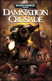
Warhammer 40,000: Damnation Crusade, on shelves this week from BOOM! Studios, provides an interesting look at the consistencies and differences between modern warfare, historical battles and a fictional, futuristic battlefield. It pits the forces of the Imperium of Man, clad in gigantic suits of robotic armor, against both an army of inhuman creatures and their own inherently human limitations. “Pain is an illusion of the senses – despair an illusion of the mind,” one superior barks at his subordinate, at once delivering something familiar and something foreign. It’s a great line, which wouldn’t be out of place at all in a war zone or a locker room today, but it takes a different meaning in the future, when physical pain receptors are intentionally burnt out of new warriors. Evidently, by the 41st century, the military has taken an age-old concept (pain is only temporary) and perverted it into something completely different (pain is irrelevant). As the story unfolds, this becomes something of a theme – the rules of combat are familiar, but skewed just enough to let you know that something’s strangely different.

Writers Dan Abnett and Ian Edginton display a good feel for the scale of this story, ending the first chapter with the awe-inspiring visual of an airship hovering above an ancient, crumbling castle. It’s something they never lose sight of, whether they’re showing their readers a firefight between fleets of enormous, city-sized spacecraft or a pile of bodies twenty feet deep, with fresh blood doing battle directly above. This feels like a tale with a large impact, shaking planets with its importance and shaping the universe with its consequences, which is just as it should be.

A lot of the interspersed dialog is tough to follow, especially when the generals get to flapping their gums. Their conversations are part medieval, part tactical and all bland. While they’re discussing events and strategies that are vital to the progression of the storyline, their speeches are so ridiculously lengthy, picked from such a strange vocabulary, that they largely go unrecognized. Ever tried reading the dialog in a Shakespearean play? It’s the same deal – the words are there and they’re technically correct, but they’re so far from the current dialect that it’s hard to find any purpose to them. When was the last time you and your buddies got together and somebody spit out something like “What passes for blood would run chill in their heretic veins! Such victory is a sweet benediction. To sip at the cup of glory is a moment to be cherished…”? If you were curious, that’s a line from Warhammer, not Titus Andronicus.

As I touched on in the introduction, there’s one theme that’s constantly reinforced throughout this book, and that’s the importance of the unit over the individual. And, while that’s a motif that you’ve probably seen in countless war movies over the years, it’s handled a little differently here. Where heroism and praise seem to go hand in hand in our current culture, the war machine of the 41st century follows a much stricter code. If even the slightest hint of ego or self-adulation is detected in a warrior, he’s ostracized from the group and cast aside. Even in the heat of battle, the commanders are reinforcing the idea that the most glorious way to die is in the line of fire for the empire – something of a fanatical twist on an age-old concept.

It seems like an opportunity is lost when every single face on the battlefield is in complete and utter agreement with this practice, to the point that one soldier even worries to his master that he may be taking too much pride in his accomplishments during war. On one hand, it establishes just how revered this theory is in the current situation, how strong a grip this mentality has on its followers. On the other, it paints both sides of the battle in a similar hue: righteous in their own minds, but not necessarily in the reader’s. I had a hard time choosing which army I wanted to see win this war – the “heretics” who fought tooth and nail against this kind of singular mentality, or the disciplined, armored masses who are the subject of the series itself.

Tankred, an enormous monstrosity of steel body and human psyche, is a perfect example of the ideal imperial soldier. While the rest of the cast throws around bad dialog before, during and after their battles, the enormous Tankred sleeps, rising only long enough to fight another battle, decimate his opponents, and then return to slumber. Only awakened when the circumstances are dire enough to require his presence, he often dozes through entire centuries, waking shocked to find that an old friend has died, that entire planets have shifted. Disoriented, he sorts out the fragments of his existence for mere seconds, before dismissing the past and moving forward with his next violent objective. He’s easily the most tragic figure of the story, and probably the only individual with which I could sympathize as a reader. It’s a wonderful side story, not something I’d want to see featured in its own series, but it’s also perhaps the only universally successful plot thread of the paperback.

On the artistic side, JM Ringuet’s colors really steal the show, enhancing the illustrations beyond their original strength and granting the book a solid, unified look and feel despite the presence of multiple artists. He frequently decorates the page with thick, painterly strokes but never seems to skip out on the fine details when they’re needed. While the majority of the book is cast in shadow, he manages to introduce a wide range of accents to the mix, whether he’s drawing your attention to the fresh blood on the edge of a soldier’s sword or driving forward the features of a warrior’s face. This book wouldn’t be halfway as visually intriguing without his efforts – he takes artwork that’s average at best and transforms it into a near-masterpiece.

The colorist also does some great work on backgrounds, whether the illustrator chooses to detail them or not. If there’s a rigid backdrop to bring to life, such as the giant, billowing clouds that frequently rise from the field, Ringuet does so in style. If he’s granted nothing but blank space and dead air, he sees it as an open invitation to play with abstract textures and splashes of color. And, while he does occasionally take that creative liberty a bit too far, distracting the reader from what’s going on in the foreground, for the most part his contributions are breathtaking. His work is the first thing you’ll notice about this book, and he’s responsible for almost all of its spirit.

Lui Antonio handles the illustration chores for the first, fourth and fifth chapters, and while he could use a little seasoning, he clearly has a thorough understanding of the subject matter. For a book that’s based off of a popular series of sculpted miniatures, (themselves a vehicle for a table-top fantasy game) the importance of that can’t be overstressed. He renders these enormous suits of mechanical warfare with care and respect, never missing an opportunity to reinforce just how imposing and gargantuan they really are.

He’s fortunate to be working on a story so largely focused on robotics and giant suits made of reinforced sheet metal, too, because he really struggles when asked to illustrate a swordfight or dialog without the armor. His characters feel rigid and uncomfortable, with muscles just a bit too over-detailed and facial expressions a little too grotesque for their own good. He’d have been a great fit at Chaos! Comics in the mid ‘90s, and I don’t mean that in a good way. So long as he’s handling bizarre, hideous creatures or lumbering, smoke-blackened war machines, he’s in his element – and that’s the case more often than not.

Chapters two, three and six feature the artistic talents of Greg Boychuk, who works a less excitable style than Antonio’s, but also doesn’t feel out of place when dealing with a simple conversation. While his work is a bit more fleshed out, quite a bit easier to follow than Antonio’s, he doesn’t bring the same impact or emotion to the page. His conversational scenes may flow across the page more effortlessly, but they aren’t nearly as interesting. Where Lui brought life to the cold, heartless machines that dominate Warhammer’s battles, Boychuk gives them a plain, everyday, overly technical look that pales in comparison. They feel like toys, not gargantuan bringers of death and destruction, and that works against the tone that the story is trying to set.

When the metallic hordes are set loose upon an army of bloodthirsty Viridians (ogres) at the beginning of the third issue, (and again at the onset of the fourth) the quality of Boychuk’s artwork picks up noticeably. He tells a great story during the chaos of an all-out battle, which is reinforced by JM Ringuet’s decision to bathe the first fight’s opening moments exclusively in black, white and selective reds. It’s a sharp contrast to the deep, rich colors that had preceded it, and forces the reader to pay closer attention and a bit more respect to the illustrator’s original contribution before snapping them back to reality.

But while Boychuk proves his worth throughout the story’s lengthy fight scenes, he then settles back down into complacency as soon as the battle is over. It’s frustrating to read, actually, because he’s very good while the action lasts, but equally lazy during the discourse away from the battlefield. This is particularly evident as the story wanes near the middle of the sixth and final chapter. Boychuk’s work here is sloppy and undisciplined, which stands at odds with the strength he exhibits in his earlier contributions.

As far as translations of existing properties go, Warhammer is a fairly good one. Its roots are set firmly in territory that should be familiar to followers of the table-top game, but the events and surroundings are interesting and developed enough to catch the eye of certain readers unaware of the source material. Basically, if you’re a fan of gunfire, swords, blood, guts and action, this is right up your alley. It’s about three quarters action, one quarter elaboration – and you’re never more than five pages from the next bloody massacre. If you consider yourself more of an all-around reader, you’d better flip through this in the store before making up your mind. Phenomenal colors and a galactic scale in the storytelling make this book worthy of a second glance, but convoluted dialog, underdeveloped characters and a slow pace keep it from being a must-buy.

On a scale of 1 to 10, where 1 is poor and 10 is amazing...
Overall Score: 7.25

Monday, October 1, 2007

Fantastic Four and Power Pack #4

The Power Pack is a team with a deep history in the Marvel universe, one that has been largely overlooked and treated with disdain since the cancellation of their self-titled series in the early ‘90s. They’ve enjoyed something of a revival lately, as Marvel brought them back into continuity with a self-titled mini series in 2005. Since then, they’ve appeared in a variety of crossovers with Marvel’s heavy hitters, meeting up with the X-Men, the Avengers, Spider-Man, the Hulk and now the Fantastic Four (with an Iron Man mini already in production).

In last month’s issue, Dr. Doom discreetly swapped bodies with Franklin Richards, which isn’t necessarily his most diabolical plan for world domination, but one which still fits the expectations of a lighter book like this one. Fred Van Lente treats Doom beautifully in this issue, retaining every bit of his plotting, maniacal personality despite all outward appearances, which makes for a few great moments. His interactions with Franklin’s elementary school teacher and a pair of bullies are just great, as he’s stripped himself of his physical powers but refuses to back down nevertheless. The Power Pack, Franklin’s classmates, notice Richards acting strangely and choose to intervene. In retrospect, this is a real cream puff of a story, but it’s handled so effectively that I barely noticed. It’s very by-the-rules, but it acknowledges that fact and never takes itself too seriously.

Gurihiru, a Japanese duo with an extremely clean, expressive style, has been handling the artistic chores for the bulk of Power Pack’s comeback. Their uncomplicated, animation-influenced work is a great fit for the childlike, innocent flavor that their stories provide. They bring an interesting blend of Manga and Disney to the table, borrowing the best of both worlds while selectively editing out each style’s more overused indulgences. Their stuff is surprisingly simple, considering the amount of action that’s crammed into this short issue, but constantly effective. There aren’t a lot of lines on any given page, but that never limits the visuals, and the characters never lose sight of their personalities along the way.

The team’s interpretation of the Thing is unspectacular, borrowing more from the character’s lumpy, clay-like first few appearances than his more modern, rocky representation, but their work with the rest of the characters is great. They nail the motherly / scientific personality of the Invisible Woman and pull no punches when Reed or the Torch are using their powers. When the focus shifts to the Power Pack, the artists quickly display their familiarity with the characters, (they’ve illustrated the majority of the group’s recent appearances) showcasing their youthful energy through body language, restrained use of speed lines and a few dynamic poses at the right moments. This is some nice work.

Fantastic Four and Power Pack is a fun read, regardless of age. While more hardcore Marvel enthusiasts may need to curtail their expectations a bit going in, the nature of this story fits snugly alongside the history of the imprint’s first family, and even the hard-edged Doctor Doom doesn’t feel out of place alongside four kids with super powers. This is good fun, with a lighter tone and younger cast making it friendly to a younger audience but a solid plot and quality artwork appealing to more serious readers such as myself. I’d recommend you borrow this and give it a read without any preconceived notions. It’s great reading for a lazy Saturday afternoon on the couch.

On a scale of 1 to 10, where 1 is poor and 10 is amazing...
Overall Score: 7

Exiles #99

The current team of Exiles is a ragtag group of loose ends and characters who fell through the cracks at one point or another. Truly, the only common element is that they each emanate from a continuity outside of the main Marvel U, and that their monthly books have been discontinued or concluded. Blink, Sabretooth and a modified version of Morph from the Age of Apocalypse, Spider-Man 2099, alternate versions of Kitty Pryde, Psylocke and Thunderbird… there wasn’t much left for these characters besides a small cult following and a shortage of monthly publications, so Marvel seems to be keeping them on retainer by lumping them all together here and hoping something clicks.

Well, to an extent, something does. Their status outside the current continuity, separated forever from everything they’ve ever held dear, gives these characters a common sadness that binds them together like strong glue. Chris Claremont’s story is surprisingly light on dialogue and full of interest and potential. When the team loses contact with one another after a mission, they’re scattered across time and space with no immediate means of reaching one another. Claremont gives each character’s new locale a look and feel all its own, complete with an immediately interesting supporting cast. It feels like the beginning of an epic story, covering several issues before even coming close to a conclusion. But then, around the halfway mark of its very first issue, the epic suddenly concludes.

It’s like a light switch is flipped. Suddenly, Claremont’s tendency to overcomplicate a solid foundation is evident, as he abandons what looked to be an intriguing direction in favor of another far-reaching, long-winded, high-concept mess. Reading the first half of this book, immediately followed by its conclusion is a horribly disjointed experience. It’s like he finished the first nineteen pages of script, realized that he wasn’t going to have time to reach a conclusion before the end of the upcoming 100th issue, and hurried to reach a point that he would.

Artist Clayton Henry is asked to straddle a lot of different styles in this book, and he manages to do a decent enough job. While he’s given carte blanc with some of the lesser known characters, the Age of Apocalypse characters and Spider-Man 2099 are naturally associated with some very distinct visual styles. Fortunately, not only do none feel out of place or uncomfortable in Henry’s hands, but they also fit in decently enough with their peers – which is very much easier said than done.

That’s not to say it’s all wine and roses. Henry does a decent enough job at capturing the styles and personalities of these characters, but none feel as dynamic or exciting as they did in their original interpretations. His style is fundamentally strong, but with a nasty tendency to turn the amazing into the humdrum. When one new character surprisingly bursts into flames, it’s treated so casually that the effect is lost on the reader. If the characters aren’t surprised by these developments, why should the readers be?

This book has a lot of potential, and it had nearly pulled me in when Claremont tore his initial concept away from us. I like these characters, and I like the way they interact with each other. They have some chemistry together, and while he’s not knocking my socks off on every page, Clayton Henry at least knows how their worlds should visually intertwine. It’s a shame that the initial plot wasn’t given enough time to simmer before reaching a boil, because I think it could’ve really been something special, something that’s right down Claremont’s alley. I’m going to suggest you flip through this, which is a shame because it was right on the verge of being something more.

On a scale of 1 to 10, where 1 is poor and 10 is amazing...
Overall Score: 6