Monday, February 18, 2008

Jenna Jameson’s Shadow Hunter #1

I know what you’re thinking. “Oh Christ, that’s just what the world needs. An ongoing comic book focused on the globe-trotting adventures of Jenna freaking Jameson.” I thought it too, but my job here is to be impartial and to ignore those preconceived notions, so here we go.

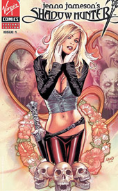
Right from the opening page, Mukesh Singh’s artwork steals the show. It’s gorgeous, both in composition and in execution, and that’s doubly impressive considering he evidently handled all facets of the book’s visuals – pencils, inks and colors. His layouts are strikingly beautiful, a great blend of darks and lights, and he clearly knows how to maximize the impact of that kind of a style. It’s become too much of a gimmick for an artist to randomly slap a panel up against a plain white background, but Singh shows that when it’s properly amplified, that treatment can still make an impact. He loses himself in the details of his backdrops, but allows the characters to stand their ground with a minimal amount of detail. And, when he’s really allowed to cut loose with some darker, more disturbing imagery, he leaves nothing to the imagination. He’s at his best when he’s working with a vivid splash page or a sudden, jarring action scene, and this first issue gives him plenty of opportunities to flex both of those muscles.

Singh occasionally runs into some problems with the facial expressions of the central character, who’s named Jezzerie Jaden, but is very obviously modeled after Jameson herself. I think she’s meant to carry a sort of dreamy, introspective appearance, but she generally just seems confused and ditzy. That’s not a good match for the wordy internal dialogs that accompany these sketches, but I guess you can only apply so much artistic license to a real-world subject that leaves something to be desired.

The storyline, concocted by Christina Z and Jameson herself, is a bit self-obsessed. It’s all about a buxom blonde heroine (the aforementioned Jenna look-alike) who’s dealt her entire life with ethereal visions of an invisible battle between good and evil. When she finally seeks professional help in adulthood, the experience only serves to make the visions even more vivid and dark-hinted. Jaden is a shallow character, one who I’m not really all that interested in learning much more about, but she’s the only face who’s given more than a page or two to define herself in this first issue, so I guess I don’t really have a choice.

So much of the story occurs through internal monologues and hallucinations that it becomes more of an abstract exercise in metaphor than a real sequence of events. Jezzerie’s thoughts are so disorganized that it’s like taking a long walk in the shoes of somebody with a bad case of ADD. One minute, she’s thinking about the dark, stringy, shadowy cratures who just attacked her in broad daylight, the next she’s talking to herself about how she still doesn’t know if she prefers men or women. That’s… not really appropriate here, but… OK, thanks for sharing, I guess.

At the end of the day, this is a meddling storyline set against an absolutely breathtaking backdrop. The writing seems to be so focused on guaranteeing the reader as to its authenticity that it doesn’t make a lot of forward progress, and I really didn’t give a crap about any of the characters, least of all the protagonist. The only redeeming factor of this book is Mukesh Singh’s artwork, and that alone makes it worth flipping through. It really is fantastic, and if he could do this much to make a bad story sing, I can’t wait to see how he reacts to something that’s genuinely worthwhile.

On a scale of 1 to 10, where 1 is poor and 10 is amazing...
Overall Score: 3.5

Incredible Hercules #114

With the Hulk busied in his new monthly title and the stories of Incredible Hulk more closely focused on the actions of Hercules and Amadeus Cho than the green goliath, last month the book was appropriately re-christened Incredible Hercules. It’s still a kind of companion piece to the Hulk’s daily adventures, as the pair had worked feverishly to help Banner out during the events of World War Hulk, but it’s not really the green spotlight that it used to be. This month, after an infusion of hydra blood drove him into a mindless fury, Hercules has become little more than a weapon in Cho’s plan to completely and utterly eliminate SHIELD. With the Mighty Avengers hot on their trail, the duo finally seems ready to show their hand.

As has typically been the case with Hercules, the greatest challenge is with his dialog, since he always speaks in this stilted, outdated verbiage. For the most part, that’s handled nicely here, as he’s kept out of his mind on a rampage for much of the issue, but he still gets a few chances to shout some nonsense about Greek Gods and ancient times. Personally, I can’t stand the way Herc, Ares and Thor speak, but the style has its fans and I can handle it in small doses like we’re given here. So long as the “verily” count is kept low, I think I can deal.

Most of the issue involves a series of muddied flashbacks, as Hercules’ mind bounces from one chapter of his history to another. It’s actually a fun ride, especially once the Mighty Avengers pick up on that and start to use his delusions against him. The Black Widow looks like a genius with her effortless containment of the impervious Greek, and her subsequent rapport with her old teammate is a nice bit of characterization on both parts. This may not be Brian Michael Bendis writing the Mighty Avengers, but the team doesn’t miss a step under Greg Pak and Fred Van Lente.

Khoi Pham’s artwork was a nice surprise. A mixture of the Kuberts’ outstanding compositions and Leinil Francis Yu’s intense attention to detail, Pham still leaves room to make his own mark. Whether he’s working in the past (the issue opens with a violent flashback to Homeric Troy) or the present, the artist briskly sets the locale with a series of backdrops that are detailed enough to tell the story, but not so overly rendered as to distract from the central characters. When he handles a moment of pure action, such as Herc’s on-a-whim dismissal of a pair of charging chariots, it’s both beautiful and exciting. At times, he closely toes the line between simplicity and recklessness, and I don’t think he put everything he had into a few of these pages, but for the most part I was happy with Pham’s contributions.

Hercules and Amadeus Cho have come a long way since I was first introduced to them during World War Hulk, as they’ve turned into a legitimately interesting tandem. Cho in particular is cast in just enough shadow to keep readers guessing about his true intentions, while Hercules provides him with the unquestioning muscle to achieve nearly anything. Pak and Van Lente have never been better, and Khoi Pham’s artwork is largely very good, despite a few rough patches. If they can keep up this pace and iron out a few wrinkles, this could be a serious contender. Borrow it from a friend and release your expectations.

On a scale of 1 to 10, where 1 is poor and 10 is amazing...
Overall Score: 6.5

Tuesday, February 12, 2008

Nova Annual #1

Richard Rider, current dome bearer of the golden-helmed Nova Corps, has been working long and hard to aid the Kree in their resistance against the Phalanx. He’s been infected with the consciousness-manipulating Transmode Virus, and thus far has been successful in overcoming its commending influence. Ultimately, though, it’s going to be a losing battle and the intergalactic warrior is eager to find a cure as soon as he can. Now, with the aid of Knowhere, a scientific research facility located at the edge of time and space, he’s searching the past and the future for that cure, along with the present.

The writing tandem of Dan Abnett and Andy Lanning has pleasantly surprised me through both issues of Nova that I’ve reviewed so far, Although this annual is really just a fleshing out, both of the hero’s past and of his destiny, it’s still an entertaining, approachable read. Richard Rider never loses sight of his humanity, even when he’s sixty years old aboard an intergalactic cruise ship, and he’s easy to identify with. While Rider often toes the line between a genuine guy and somebody who’s just a little too wholesome, enough of that is kept in check to keep the reader rooting for him from cover to cover. In Nova’s battle against the Phalanx in a dark, distant future, Abnett and Landing provide an ongoing motivation to see this issue through to the end. It fits nicely alongside the continually entertaining narrative in the ongoing series.

The artwork is handed by a mixed bag of fill-in artists... five pages by one name, three by another, a two-page spread by a third contributor, then back to the first illustrator again. The majority of the heavy-lifting is done by Mahmud Asrar, whose work shows a lot of promise. His characters can occasionally feel stiff and needlessly over-muscled, but he gives them each a unique face and he’s got a nice handle on how good body language can help to tell the story. His backdrops are almost always nicely detailed and populated, too, which is becoming a rarity, and he always manages to leverage that to expand the depth of the tale with a little extracurricular background activity.

The rest of the visuals are handled by Wellinton Alves, the regular series artist, and newcomer Klebs Demoura. Alves is an artist whose work apparently suffers during the transition from pencils to inks, because I’ve seen some of his raw artwork and it’s stunning. In print, though, it loses a lot of its luster and feels a bit too realistic for its own good. In contrast with Asrar’s work, Wellinton’s contributions feel empty – a bit too straightforward and literal for their own good. He’s got his moments, like when he’s briefly sketching the golden-bodied future Quasar, but they aren’t frequent. Demoura’s work, which only appears on a handful of pages, is the worst of the trio. It isn’t awful, but it doesn’t add anything to the story like its peers do. His work is so detail-heavy that it gets tough to follow and doesn’t have much personality.

Really, a carousel of styles and treatments like this can be more than a little distracting, and is a major reason why I rarely bother with annuals unless the regular creative team is left fully intact. In this instance, it’s less an issue than normal, since the artistic changes are almost always accompanied by a change of tense – past, present or future. Some shakeups can be expected, and if the art chores simply have to change hands, it’s as good a situation for it as you’re going to get. Still, the difference in direction from page to page in this issue can be jarring, especially when making the leap from Asrar’s tight, under-detailed Phil Hester-style approach to Alves’s more lifelike, if wooden renderings.

Even in this annual, which isn’t close to an integral part of the story, Nova continues to overachieve. Aside from the occasional jolt of a jump between artists, this is a good read. Strong characterization, brief, informative dialog, a compelling plot that moves forward at a decent pace... as long as you’ve got these, it doesn’t really matter how important the book’s characters have been in the past. The artistic choices hold it back from being everything it could be, but this is still worth borrowing. I’m slowly becoming a Nova fan.

On a scale of 1 to 10, where 1 is poor and 10 is amazing...
Overall Score: 7.5

Dead of Night Featuring Man-Thing #1

Dead of Night Featuring Man-Thing is the latest attempted relaunch of the bayou-dwelling, fear-tasting Marvel answer to the Swamp Thing. This time around, the beast has been given a horror digest flavor, in the same vein as the pulp books published during EC’s heyday. Dead of Night borrows heavily from the themes and devices introduced in The Vault of Horror and Tales From the Crypt, in more than just the style and design of the cover artwork, and there isn’t a genre more deserving of a revisitation. As a MAX title, the Man-Thing can finally break free of the stereotypical treatment he’s been given in the past and emerge as a seriously chilling creation... even if his origins are very, very similar to his DC counterpart.

Writer Roberto Aguirre-Sacasa has a fairly strong grasp of the horror genre: he knows how to quickly define a cast and sway his readers’ feelings about it on a whim, and he delivers on the few instances where he’s looking for a shock. Although he occasionally goes overboard in his quest to use big words and long conversations, even those potential pitfalls are kept fairly tolerable. I didn’t like the way he tied the book into the Marvel Universe, (how many times can somebody’s origin involve an attempt to replicate the super soldier serum, anyway?) but it was at least done in an inventive way that I’d never seen before.

Kano, who provides the artwork for the majority of this first issue, offers solid, stylish visuals that focus on storytelling first. Flashy art would be counterproductive in a setting like this one, where the real emphasis should be on the characters and their odd tale, and Kano seems to understand that. His work is a mixture of Tim Sale and Goran Parlov – very clean and simplistic, but also never shirking on detail. Like Parlov, he can display a gory payoff realistically, further driving home the impact of an important moment, (as he does near the end of this issue) and like Sale his characters all have a unique face, their own obvious personality. While he occasionally shows signs of being rushed, (his backdrops could use a bit more refinement, and the later pages of this issue show a sudden drop in overall quality) for the most part I enjoyed his contributions.

Dead of Night is bookended by a pair of painted pages featuring “the digger,” whose introduction and conclusion to the story is in the same vein as the Cryptkeeper in Tales From the Crypt. Nick Percival is the painter of choice for these brief asides, and provides a markedly different flavor than Kano’s work in the rest of the issue. Percival’s work is grotesque, which I mean as a compliment. The Digger’s decayed skin falls from his bones, his tattered clothes look like they were last washed some time in the eighteenth century, and his entire world is cloaked in a dense fog. It’s a little cheesy, but that’s understandable in a book like this, and provides a nice respite for readers at each end of the issue.

This is a real mixed bag: when it’s working, it’s top-notch, but it’s only really working for about half of the issue. The rest of this debut is somewhat sloppy: the story seems to have climaxed too early, (this is just part one of a four-issue arc) the artwork has some serious ups and downs, and I’m not particularly compelled to see where this all leads in the second chapter. Still, it’s a much better treatment than I’d expected for a character who’s been little more than a doormat in the past, and like I said... on the occasions that everything comes together, it’s great. Borrow this from a friend if you get the opportunity. It could’ve been a masterpiece, but instead it’s merely “pretty good.”

On a scale of 1 to 10, where 1 is poor and 10 is amazing...
Overall Score: 7

Thursday, February 7, 2008

Ms. Marvel #24

I’m having a hard time understanding the recent extraterrestrial events in Ms. Marvel. Evidently, she’s battled the invading forces of the Brood alongside a shape-shifter named Cru, who somehow handed over a few shards of her own genetic material to the titular superhero. Since then, Carol’s been surviving wounds she shouldn’t, inexplicably losing faith in her own body and hearing voices. Now Cru wants her genetics back, there’s a new Brood Queen in town and Carol’s powers are continuing to expand.

Sounds like an awful lot, right? Fortunately, in action it’s not so bad. Brian Reed has a talent for compressing such complicated events into a clean, reader-friendly format. He occasionally overdoes it with the internal monologues, (especially considering each box of introspection is accompanied by a gaudy lightning bolt icon… it’s cute once in a while, but five of them within two panels?) but even those are thankfully kept brief and straight to the point. Although the majority of this issue is slobberknocking action, it maintains an intelligent dialog and never seems to regress into mindless fistfights and power blasts for their own sake. There’s some weighty stuff going on with serious consequences, and Reed is able to surprise readers on several instances in this issue.

With that said, I’ve never been much of a Brood fan. There’s something about an inconquerable mass of gigantic, sharp-toothed sentient insects that removes me from that suspension of disbelief and takes me out of the story. They’re treated semi-seriously here, as a real threat, but one that says things like “I’ll snap you in half and eat your innards!” randomly and repeatedly from cover to cover. Still, it’s a solid enough conclusion to the arc, which leaves just enough threads dangling to keep the fanboys coming back for another month.

Aaron Lopresti’s artwork is a great match for the tone of Brian Reed’s tale – it’s just simple enough to keep the page’s focus on the storytelling and not his linework, but detailed enough to enliven the page with an extra touch of depth. He’s got a nice firm understanding of the primary cast: Carol, Wonder Man, Sleepwalker, Agent Sum… and gives each of them a unique face. His fundamentals are spot-on, but he could do with a little work on his splash pages. As an all-out action issue, he’s asked to provide several of them (the first six pages are nothing but full-page spreads) and they generally underwhelm. They’re missing the rich creativity and ease of motion evidenced in his interiors, like he’s overreaching in search of some unseen perfection. When he’s constrained within a solid set of panels, he’s great, but he has trouble translating his style into a larger format without that rigid frame.

If you’ve been reading Ms. Marvel for a while, you should know what to expect here. It’s solid storytelling, albeit with a moderately low-level cast, accompanied by fine artwork that’s good enough to slip by unnoticed but not great enough to demand your attention. There are a couple of big shocks contained within this issue, and they both deliver. Normally, this would be something I’d recommend you merely flip through unless you have a special interest in the cast, but this month’s is a minor step above that. Borrow it from a friend, it’s worth a second look.

On a scale of 1 to 10, where 1 is poor and 10 is amazing...
Overall Score: 7

Moon Knight #15

Times have been rough in Moon Knight lately... (I think I could sum up just about every modern hero in that very same way) after a brutal battle in an alley with the Bushman two years ago, the Knight crossed the most sacred of lines. At the conclusion of the fight, the Moon Knight was victorious, but his opponent lay dead. In the two years since that fateful evening, Marc Spector has been haunted by visions of a dark-minded spirit, hounding his every step and shouting instructions along the way. It’s made his daily routine into a chore, and kept his guilt over the death of Bushman at the front of his mind.

I made no secret about my disdain for this book last month, when I wished the series an early death, but gave it the benefit of a clean slate this time around. And, to be fair, the story’s marginally better than it was last time around. It’s still nothing I’m going to go out of my way to follow, and it often floats directionlessly for page after agonizing page, but there’s at the very least a touch of forward motion present this time around.

Mike Benson and Charlie Huston are finally going forward a bit with the registration storyline they’ve been teasing for the last few months, although it doesn’t seem to be a very pressing matter. In his brief appearance, Tony Stark is handled decently enough, and the reasons he’s taking an interest in a C-Level hero like the Moon Knight are laid out pretty well. It’s not like this is a completely worthless story, but the wooden characterization, slow pace, and lengthy, rotten dialog drain it of any and all momentum that the plot happens to build.

The opening pages seem to show an improvement in Mark Texeira’s artwork, as the Moon Knight nearly beats a bare-chested bad guy to death with clenched fists, but that quickly spirals downward. Colorist Dan Brown tries his best to add some life to the page, giving Tex’s illustrations a soft, painterly touch in a few isolated instances, but it’s not enough. These layouts are so dull and boring, lacking in life and personality, I don’t know that there’s anything here worth saving. Nobody looks comfortable (or even familiar) in their own body throughout the issue, everyone (even the supporting cast) is built like Brock Lesnar, and there’s nothing drawing me into these compositions. Tex, man… what happened to you?

While this month’s issue is an improvement over the last, I’m still not enjoying what I’m seeing. The storylines in the forefront are excruciatingly boring, none of the characters have an identity, and nothing that happens carries any weight. Mark Texeira’s artwork is about as bad as I’ve ever seen it, too, which doesn’t help matters. It’s not at the bottom of the barrel, but it’s scraping pretty close. Skip it if you aren’t a masochist… it’s still light years away from being something I’d willingly buy on a regular basis.

On a scale of 1 to 10, where 1 is poor and 10 is amazing...
Overall Score: 2