Monday, April 28, 2008

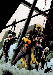
Ultimate X-Men #93

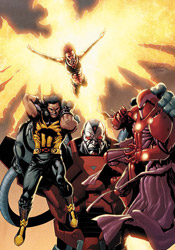
It's the coming of Apocalypse. While the X-Men were convinced that school founder Charles Xavier had been killed, the truth of the matter was that he'd been merely displaced, both in space and in time. Cable had taken the Professor to the future, training him as mutant-kind's last hope against the almighty power of Apocalypse. Now that Xavier has met the monster in battle and fallen, the only thing standing between the X-Men and utter annihilation is the unstable, galaxy-shattering power of Jean Grey's Phoenix force. Not exactly the Cavalry.

Writer Robert Kirkman has certainly strayed from the beaten path with his depiction of Ultimate Apocalypse, and I can't fault him for that. The Ultimate line was founded on the promise of old stories retold against an all-new backdrop, and he's taken that to heart here. His Apocalypse is truly fearsome and intimidating in a way that's completely different from his cousin in the 616 universe. He's also written the character, for whom I've long held disdain, into a corner with another of my least favorites (the Phoenix) and come out of it smelling like roses. I don't have a lot of time for all-powerful monsters in comics, especially when they've been overused like these two, but their conflict here leaves the X-Men in an unusual “damned if I do, damned if I don't” situation.

So the plot is good by me, although the actual storytelling falls a bit short. The battle between Phoenix and Apocalypse plays out like a turn-based RPG, each character shouting something impressive and then cutting loose with an assault while the other just stands there and takes it. Kirkman's dialog is quite stilted, even for the characters who aren't universe-devouring entities, and seems much more concerned with looking cool than with progressing the story. It's give and take throughout the issue, really – every good counter-balanced by a bad and vice versa... and the story's ending is the cop out of all cop outs.

Harvey Tolibao's artwork is so focused on detail that I had trouble following the narrative from cover to cover. His panels are so meticulous, so overfilled with teeny tiny little lines, that they often overflow into one another. This work is busy to a fault, detailed above and beyond the point of reason, and while it can occasionally work to his benefit, the sacrifices he makes in the issue's legibility aren't worth the trade-off.

If that weren't enough, Tolibao's odd take on anatomy and his characters' musculature makes his artwork even more off-putting. While his characters are very clearly three-dimensional, impressively weighty and sufficiently dramatic, they're just far enough off the beaten path to be unsettling. Never is this more evident than in his depictions of the Phoenix, whose appearance is basically a buck-ass naked orange Jean Grey sans her naughty bits. Here's a character whose design is body and nothing more, and her form is so far from that of an actual person that it's hard to imagine she's even human. His characters' muscles are oddly shaped, their bodies curved in places where they shouldn't be... it's borderline grotesque. And, if his rendition of Phoenix is bad, his take on the men is flat-out rotten. Every possible inch of flesh is coated with a spider's web of veins, accentuated by an amount of muscle that's so gratuitous, even a longtime pro wrestling / mixed martial arts / comic book geek such as myself has to look at it and shake his head. Steroids must run rampant in Xavier's mansion.

This issue has a lot of promise, but it fails to live up to that. The storytelling is largely good, but the limitations it displays are enough to keep it from reaching its potential. The artwork is gorgeous in a few specific moments (explosions and backdrops, largely) but is generally well below my expectations for one of Marvel's premiere titles. Come the perfect storm of a great artist and a plot that finally manages to execute, Ultimate X-Men could finally return to greatness. Right now, though, that moment seems like it's still quite a ways off. Skip this - the bad far outweighs the good at the moment, and it's not something new readers are going to want to dive into.

On a scale of 1 to 10, where 1 is poor and 10 is amazing...
Overall Score: 3

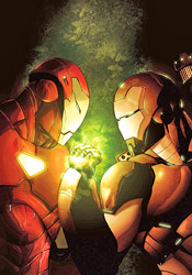
The Order #10

It was naturally only a matter of time before one of Tony Stark's bitter enemies (of which there are many) used his passion for the Initiative and his special connection to the Order against him. And that's exactly Zeke Stane, the son of Iron Man's arch-nemesis / corporate rival, the late Obediah Stane, has done over the last few issues. He's worked out a formula that strips the team's members of their powers, and used it to overload the mind of Mulholland, the crew's resident psychic. The powerful mental outburst led the entire population of Los Angeles to riot, and without their powers the Order is in no position to help. In short, it's one big public relations nightmare for the crimson-clad director of SHIELD.

Matt Fraction's story may be complex, but the basic plot points are easy enough to understand. Zeke Stane, his criminal mastermind, makes for great entertainment. He's manic and blood-hungry, reveling in the moment of his greatest victory. His plans are clever in their simplicity, make for an intriguing conflict, and tie neatly into the real uncertainty of modern America. In the same vein as some of Alan Moore's finest creations, he's not laying out his plans to the heroes, leaving them for dead somewhere and hoping they don't miraculously escape to thwart him… he's already executed his plot, and now merely basks in the afterglow.

Zeke's personality stands in such sharp contrast to that of the Order's members that I actually found myself pulling for the bad guy. This team is so wooden and stereotypical that I can't really understand how anyone couldn't. Where Stane is asking questions and making changes, the Order is merely trying to restore the status quo and failing to ask whether it's something that's even worth reviving. Whether or not Fraction's goal was to lead his readers to make that revelation themselves is debatable, but considering the book isn't dubbed Zeke Stane and Friends, I'd be willing to bet that it wasn't really in the plans. This is an intriguing read, but not for the reasons I think Fraction intended.

The book's artwork struggles to find an identity, and never really seems to settle on one. That can probably be attributed to the dozen different artists with their hands in the mix this month, (OK, half a dozen) but an understanding of the causes behind this problem won't do much to alleviate it. The issue's visuals feel both dated and rushed, like many of the comics published by Valiant in the early '90s. They're heavy-handed and uncertain, hard to follow and short on personality. On a few flickering instances, a fine illustration will pop its head through the garbage and surprise you, but for the most part this is bonafide crap. It's detailed when it needs simplicity to direct the reader's attention, and overly simplistic when the story asks it to help drive the narrative with specific details. There's no flow to this artwork, no identity granted to the characters, and no excitement to inspire the reader to continue reading onward.

This was a series with an identity crisis, and that's never been more evident than it was here in its final issue. Though Matt Fraction's concepts remain fresh, original and wholly entertaining, his execution here is murky. I wasn't given a reason to pull for the team, or even to identify with them and as a result the big conclusion felt unrewarding and hollow. Mediocre storytelling and awful artwork means The Order #10 lands somewhere near the bottom of my list of recommendations. Although Zeke Stane is a great character that I want to see more of, I'm going to suggest you skip this.

On a scale of 1 to 10, where 1 is poor and 10 is amazing...
Overall Score: 2

Avengers: The Initiative #12

Tony Stark's band of government-sponsored superheroes has been taking heavy fire lately, and it's come from an unexpected source. When MVP passed through the training program, he was every bit the ideal candidate to join the Initiative. But when he was suddenly killed in action during an early mission, the brass didn't want to lose an opportunity to spotlight this perfect example of the kind of good their program can produce. They cloned him, multiple times, with much of the team kept out of the loop, and now one of those clones has gone mental. With a dangerous new weapon strapped under his arm, the duplicate (now known as KIA) has cut a bloody path through the Initiative's ranks, slaughtering trainees and full-fledged members alike.

With the fight against KIA now in their past, this month the supervisors of the Initiative are dealing with, perhaps, a more unsettling foe: their explanation-hungry superiors. After the wealth of raw action that preceded it, this month's issue may seem to be a drastic change of pace. The Initiative #12 spends most of its time focused on the personalities and relations of the team's members – how they respond to authority, how they interact with one another, their public strengths and private weaknesses... it's a good chance for new readers to get to know the squad, but it's not particularly exciting. The issue's tone is very strange for a mainstream superhero book, although I can't quite decide whether that's a good thing or a bad thing. On one hand, it's sculpting characters who were once little more than C-List into well-rounded, deep, original individuals. On the other, it's a far cry from the bravado, super-powered firefights and would-be world rulers that many might expect from a series bearing the Avengers namesake. It's the mainstream superhero series that looks and reads more like an indie comic.

In the same vein as Power Pack's Gurihiru Studios, Steve Uy provides every aspect of the artwork for this month's Initiative himself – everything from pencils to inks to colors goes through his hands, and that makes for a tight, cohesive visual identity. It's important that Uy handle the colors himself, because his style is so reliant on the palette to provide shading that it could prove to be a real headache in someone else's hands.

His actual artwork is cut down to the very basics, with a heavy emphasis on composition and posturing, and actual linework used only as a last resort. While this serves to keep the page airy and appealing, that benefit doesn't come at the cost of his characters' individuality. If anything, it gives the artist a greater opportunity to focus on the shape and size of his cast – no two look even remotely alike, neither in facial expression nor in build. If you're familiar with the work of the Luna Brothers on Ultra or Girls, this is a very similar bag of tricks, but I think Uy is doing a better job of it. It's a nice approach that doesn't fall into any of the traps that one might expect, and the book benefits from its presence.

This month's Avengers: The Initiative is the black sheep of the Avengers family. It seems more concerned with what happens after the disaster than how it was averted in the first place, which is certainly a unique perspective for a mainstream superhero book. While co-writers Dan Slott and Christos N. Gage display a tendency to overload a page with dialog, it's at least compelling reading with the noble goal of expanding and enhancing the team's members. Matched with Steve Uy's distinct artwork, the duo delivers a book that's unlike any of the other post-Civil War books Marvel's delivered thus far. Borrow it from a friend and see if it's your cup of tea... The Initiative is worthy of a long look.

On a scale of 1 to 10, where 1 is poor and 10 is amazing...
Overall Score: 7.5

Wednesday, April 23, 2008

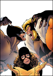
Wolverine: First Class #2

The latest series in a long line to focus on telling the forgotten stories of years gone by, Wolverine: First Class returns readers to the Xavier Mansion of the mid 1980's. Although the marquee on the cover reads Wolverine, the focus of this story is young Kitty Pryde, with guest shots from a number of other team members from that era thrown in sporadically.

I'm getting a little tired of the trend that's been developing around this style of "forgotten adventure" storytelling, but First Class is a bit different in that it's not trying to reinvent the wheel, nor is it concerning itself with a very weighty subject. Naturally, it's not all fun and games, but the majority of the issue is a rare glimpse at happier moments behind the scenes, which is a welcome change from the doom and gloom that typically follows the team. On a few occasions the tone of the book seems inappropriate for its characters (I can't imagine anyone throwing a surprise birthday party for Logan) but writer Fred Van Lente makes up for it by adding a little depth to these familiar faces. I'd never really thought about it, but it makes sense that Storm wouldn't have a need for a driver's license… if you can propel yourself through the air with just a thought, the wait at the DMV starts to seem a bit unnecessary.

Occasionally, the writer takes these gimmicks a bit too far, especially with the ridiculously themed restaurant that Logan visits in the second half of the story, but these excesses are kept in short doses so they never become more than a momentary interruption. And every so often, the writer surprises you when one of those gimmicks really pays off. When Sabretooth shoved a fistful of wasabi up Logan's nose, I thought he was just being an asshole… until he snickered and hid, reveling in the knowledge that he'd stolen his enemy's powerful sense of smell.

I'm happy to note that the writer takes great care to maintain the setting of the story in the '80s, too. While I've seen a flashback sequence that features modern technology more times than I'd like to admit, Van Lente takes every opportunity to remind us that this story took place over twenty years ago. Kitty's computer is a clunky old tower with a fat CRT monitor. Logan's wardrobe is yellow and brown-dominated. Mariko's cel phone looks like a brick. Everything fits, and that does a lot to immerse readers into the storytelling.

Andrea Di Vito's artwork is a good pairing for the lighter tone of Van Lente's story. It's smooth and stylistic, with a minimal amount of linework but a big emphasis on personality. Di Vito gives each character a unique identity through body language and clothing alone, and works through some borderline cheesy material in a way that keeps the read upbeat and enticing. His work benefits tremendously from Laura Cillari's beautiful colors and textures, which enhance his minimal backdrops just enough to give them depth without losing the minimal approach of the surrounding artwork. While Di Vito falls back on a solid black page border that doesn't feel appropriate considering the tone of the book, that's really his only mistake… and it's a minor one at that.

I was pleasantly surprised by First Class. What looked at first glance to be a frilly, needlessly upbeat look at an over-documented era in the X-Men's past is actually an entertaining ride down memory lane. It's not going to blow your socks off, but it's at least a pleasant diversion. Borrow it if you've got the chance, or at least give it a long look on the shelves.

On a scale of 1 to 10, where 1 is poor and 10 is amazing...
Overall Score: 7

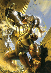
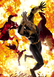
Ultimate Fantastic Four #53

A lot of what I loved about the first few arcs of Ultimate Fantastic Four was the fresh, youthful take those stories offered on these old characters. In the 616 Universe, Reed, Ben, Johnny and Sue have been hashed and rehashed so many times over the years that they've become stagnant. Their personalities have been written into a corner, every last inch of their psyche explored twice over. Their Ultimate counterparts, on the other hand, had loads of potential. They were inexperienced and unfamiliar, young but brainy. They retained elements of what I'd loved about their predecessors, but left enough undocumented to ensure plenty of material for hundreds of issues' worth of storytelling.

Somewhere along the line, all that changed. It's been a year or two since I regularly read this series, but I can't even imagine these are the same characters that were there at the outset. They've fallen into the same ruts as their older counterparts, taken the status quo of the main universe as far too rigorous a guideline. Reed isn't the starry-eyed kid that awkwardly entered the Baxter Building in UFF #1, he's the disconnected uber-brainy old spirit that occupies the main universe. His teammates have grown accustomed to their travels quickly, and in so doing they've become that which they were created to counterbalance. Even their adventures follow the same old path as the original series. Whether you demanded it or not, Thanos has arrived in the Ultimate Universe... and although this interpretation has a few subtle differences, (hey, he's got a new outfit! And... it kind of sucks...) he's largely the same guy that's existed in the main Marvel U since the '70s.

Mike Carey has been at the helm for the majority of this book's slide from grace. Taking over from Mark Millar following the series co-creator's second run with the team, Carey has taken the Four further and further away from what made them stand out with each new issue. His writing here just stinks, filled to the brim with clichés (two characters died last month, only to be revived a few pages into this issue) and endless pseudo-scientific explanations, often bordering on the illegible. I'm trying to understand how Reed survived a filthy death at Thanos's hands, but I don't quite have my doctorate in astrophysics yet. The plot is hard to follow, the characters are too caught up in their scientific babble to move things along, and I have no reason to care if a single one of them lives or dies. It's an ugly, convoluted mess.

Tyler Kirkham's accompanying artwork is detailed to a fault, and is only worsened by an over-the-top coloring job. While his imaginative scenery is far and away the best part of the issue, towering over the horizon in a haunting silhouette, most readers will be too distracted by his weak character models to notice. Kirkham goes way, way overboard with his use of crosshatch, spends far too much time obsessing over the little details in his work, and can't tell a story without the aid of a word balloon. Not to mention his Ben Grimm is among the worst I've ever seen. This really isn't good.

Ultimate Fantastic Four has fallen a long way since its inception, and issue 53 only further emphasizes that fact. Both the storytelling and the artwork are lost somewhere in the mid '90s, filling the page with directionless battles, weak dialog and a heavy excess of linework. The characters try nothing new, and a guest shot from the Ultimates only serves to sully that team's reputation. This sucks. Skip it.

On a scale of 1 to 10, where 1 is poor and 10 is amazing...
Overall Score: 1.5

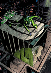
She-Hulk #28

Never one to let the grass grow beneath her feet, the She-Hulk has remained quite active of late. Shifting away from her career as an attorney, Jen has embraced her adventurous side, launching a new life as a bounty hunter and taking on a partner in Jazinda, a Skrull with an overactive healing factor. On the trail of a mad bomber, the pair has been sidetracked more than once, and now finally appear ready to cut to the chase.

While I've never been much of a fan of either She-Hulk or the Skrulls in general, Peter David has granted them both enough personality to pique my curiosity. While the bulk if the issue is spent pursuing Bran, the bounty they're after, it's the pages in between the action that are the book's most successful. Jazinda constantly reminds the reader of her alien origins, but not in a way that comes across as forced. While Jennifer is constantly trying to form a bond with her, whether that's due to compassion or just the sheer boredom of being out on the road, Jaz seems oblivious. They make a great odd couple, with Jen offering an olive branch and the Skrull responding with an unintentionally conversation-halting comment.

I didn't care so much about their search for the big bounty, but I found Jen and Jaz's off-the-cuff conversations to be very easy reading. David's writing on the whole has been better, though, and there were a few little details that really pulled me out of the story (the Browns weren't 4-12 last year, but something tells me this issue was plotted long before the 2007 NFL season). Still, for an inconsequential middle-of-the-pack superhero book, it's not a bad read whatsoever.

Artist Val Semeiks has been around a while, but his work is still inconsistent. When he's working with backgrounds or incidental characters, he's at his best... minimal, but detailed. When Jennifer enters a prison at the issue's outset, he perfectly captures the dilapidation and desperation of a small, isolated cell. His rendition of the She-Hulk herself, though, is not good. It's worse than not good... I'd almost call it unsettling. It's like he wants to simultaneously accentuate her build, her sex appeal and her physical size, but when it all comes together it's a terrible mess. She barely looks human, let alone female... the only things that give it away are her lipstick and her enormous tits, which sit on her chest like a pair of speed bags. Jen is a character that requires a lot of care to treat properly, and Semeiks doesn't even get close. His work with Jazinda, Shulkie's Skrull running buddy, isn't much better. Semeiks shines in the backdrops, but shrivels in the foreground.

She-Hulk isn't a bad book, but it has too many problems to call it a good book. Its successes are nice, but they're often immediately canceled out by its failures. The storytelling lacks consequence, but the characterization of the two lead characters is tremendous. What do you get when you pair inconsistent writing with inconsistent artwork? Surprise! An inconsistent read. It's got its moments, but they're few and far enough between to keep this issue from being worth your while. It gets a recommendation to flip through.

On a scale of 1 to 10, where 1 is poor and 10 is amazing...
Overall Score: 4

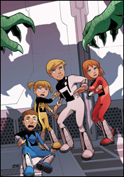
Power Pack: Day One #2

The eighth Power Pack mini-series since the team's return from hiatus (and the sixth featuring the artwork of Gurihiru), Day One looks back on the squad's origins, and their first adventure. When the Power family unwittingly wandered into the path of a serpentine alien force, they were quickly scattered and disoriented. While Mom and Dad were taken captive aboard the alien mothership, the four kids ran into a noble sorcerer, who granted them each incredible abilities with his dying breath.

Fred Van Lente is the second writer to handle the Pack since their rebirth in 2005, but his familiarity with their personalities is evident right from the start. It's easy to lose sight of a young character's age when (s)he starts dealing with globe-threatening intergalactic warfare, but Van Lente never allows the plot to progress too far without reminding us that these are just kids. They're constantly throwing jabs at each other, bickering like a real family, and never really speak beyond their age. While Alex, the eldest of the troupe and de facto leader, always seems to be putting on an unusually brave face for a twelve year old, his body language often betrays his uncertainty. These may be very bold, mature kids, but at the end of the day they are still children.

Van Lente does get a little carried away in a few spots, which gives the issue a borderline Saturday morning cartoon vibe, and will probably turn away much of the older audience as a result. The younger audience this line is targeted towards should love it, though. It's cheery and exciting without talking down to them, maintaining its dignity despite the presence of a walking, talking stallion with a magic wand. I've read a few stories where this writer has mailed it in, but I can't say that about his work on Power Pack: Day One. He's given us a tight cast, a firm plot and some interesting food for thought. While the issue certainly has its excesses and shortcomings, overall it's a solid package.

The artistic duo at Gurihiru Studios, in charge of pencils, inks and colors, has given the Power Pack a distinct visual punch for most of their comeback, treating the squad to a smooth, cartoony appearance. Gurihiru's efforts are simple and colorful enough to keep the attention of the youth, but stylized and handsome enough to catch the eye of more serious readers. The artistic team has become closely tied to the Pack's identity, and I don't know if I'd enjoy their adventures under anyone else's watch. Having said that, this isn't the studio's best offering. I was much more impressed with their contributions to the preceding Power Pack and Fantastic Four series. Their work feels less refined than before, a bit more hurried and humdrum. Their take on the kids themselves is still very good, a credit to their close association with the majority of the team's recent books, but their surroundings and the aliens they're interacting with aren't really all that imaginative.

This wasn't my cup of tea, but to be fair it was never intended to be. Unlike the preceding Power Pack minis, I felt kind of silly reading much of this issue... in the past, it was childish but still entertaining to adults. Day One is almost exclusively for kids, overflowing with rainbows, talking, smiling, walking animals and glitzy superpowers. Fred Van Lente's writing is technically quite good, but his imagination has taken the Power Pack to a place that I'd rather leave unexplored, and Gurihiru's contributions aren't up to their usual standards. Just flip through this if you aren't seven years old or really, really want to know what's going on with a discarded old team from the '80s.

On a scale of 1 to 10, where 1 is poor and 10 is amazing...
Overall Score: 5

Tuesday, April 15, 2008

Powers Annual 2008

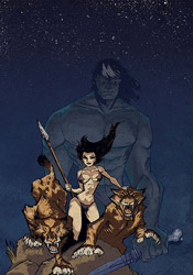
If you were one of the multitude of Powers fans thrown off by the now-infamous (or famous, depending on who you ask) "monkey love" storyline a few years ago, I'll get this out of the way right now: you're going to want to skip this one. In Michael Avon Oeming's first outing as co-writer alongside Brian Michael Bendis, Detective Walker reminisces once again about his long, twisted past in the earliest days of human history, and the results are very similar to that polarizing original storyline.

Although this Powers Annual contains thirty-five pages of story, it's actually a much faster read than most of its regular-sized contemporaries. There's very little dialog, and when there is a speaking part, it's quick and monosyllabic. Although Oeming is credited as the co-writer, the bulk of the issue's storytelling falls upon his shoulders as an artist. The story's pacing, its details and its explanations are almost universally unveiled by the artistic direction, and narration is sparse at best.

This is basically a playground for Oeming. He tries all sorts of things to help establish that visual narrative and tell the story in a way that it's never been told before. When it works, it can be tremendously powerful... the tense, thrilling moments that follow a collision between two gigantic apes at the outset of the story is some of his best work as a storyteller. But such experimentation comes at a high cost – specifically, the exposure of his faults alongside his strengths.

His paneling work, in particular, wilts under the spotlight. When accompanied by Bendis's frequent word balloons and incidental dialog, the flaws in his work's legibility could largely slip by unnoticed. Now, left to tell the tale on their own, they're frequently confusing and tough to follow. Oeming refuses to obey a strict gridwork for his paneling, and although that gives his work a unique flair, it hampers the story's flow and creates a legibility nightmare. I've had problems following Oeming's panels in previous issues of Powers, but always had the roadmap of a sequential dialog to fall back on. When that lifeline is reduced to a series of Cro-Magnon grunts and moans, the façade collapses and everything seems to lump together into a big, confusing mess.

Oeming's artwork has seen better days. His work has lost the sharp cleanliness that set it apart during the book's prime, and now often seems extremely hurried and underthought. When it clicks, as it does during the few important moments staggered throughout this issue, his work can still be very effective at delivering a tremendous visual impact, really pulling the reader right into the heart of the moment. When it's off, it drags the quality of the issue down the tubes with it. On a few occasions throughout this issue, I had to wonder if Oeming had actually done his illustration work while asleep. When he's good, he's great but when he's bad, he's terrible... and we get a little of both in this issue.

Looking back over what I've just written, I may have been overly harsh on this issue. I didn't dislike the experience so much as I was puzzled by it... a similar reaction to the one I had the last time Powers ventured into this era. Oeming's contributions to this issue's writing have given the book a different flavor than I'm used to, especially in the few pages set in the present, and I'm not sure the change is welcome. The creative team was trying something different with this issue, and I can't fault them for that, but not every experiment can be a success. This Powers Annual was as confusing to read as it was to try and fit into the big picture. If you're a longtime fan, you'll want to give it a shot, but for more casual readers I'd recommend a flip through first.

On a scale of 1 to 10, where 1 is poor and 10 is amazing...
Overall Score: 6.5

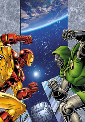
Iron Man: Legacy of Doom #1

Even the planet's brightest scientific minds aren't immune to a bout of forgetfulness from time to time. That's the premise behind Legacy of Doom – while disintegrating an old suit of Iron Man armor for recycling, Tony Stark finds an adventure he'd completely forgotten stored on one of the unit's memory chips. While an unexpected meeting with Doctor Doom may not seem like the easiest thing to disregard to you and I, in his defense, Stark is a billionaire, a CEO, an engineer, an adventurer, a scientist and an action figure all balled up into one. He's likely overlooked dozens of situations that most folks would remember to their dying day.

Still, this is Doom... in outer space. I'm sure at some point the act of fighting crime becomes mundane when you're successful enough to be named leader of the Avengers, but it's not every day you're floating in orbit with a booster rocket strapped to your ass, yukking it up with Doctor freaking Doom. Co-writers David Michelinie and Bob Layton seem to be following the same path as David Lapham's Spider-Man: With Great Power... here, in more ways than one. While the books share a historical look back on the undocumented adventures of a pair of Marvel's flagship characters, their greatest similarity lies with their uncharacteristic portrayal of those heroes' personalities. Lapham's Spider-Man was brazen, selfish and unlikable, and Michelinie & Layton's portrayal of Tony Stark is out of touch, predictable and dull. His dialog in particular is flat-out awful, seemingly pulled directly from the '60s, and left me to wish he'd been rendered silent throughout the issue. The duo unquestionably nails Doom's self-important, demeaning presence, but by comparison, Stark is always short on words.

While I'm sure the point can be made that because Legacy of Doom is set in a much earlier chapter in these characters' lives, their words and actions should match the setting. And, to a degree, I'd agree with that sentiment. But when that device stops being a curiosity and crosses over into annoyance, it loses my support. That's exactly what happens here... it's an enjoyable throwback for a few pages, but when it dawns on you that the entire series is going to be like this, your patience starts to wear thin.

Ron Lim's artistic contributions are a mixed bag, great on a few occasions and meager on several others. His work is at the very least solid and easy to read, if not always exciting. Maybe I'm allowing myself to be led astray by the dated suit of armor Tony Stark is wearing, but Lim's work comes off as a bit too retro – it's often under-detailed and sometimes borders on unfinished. His take on Doom is extremely drab, certainly not intimidating, and while his Iron Man is a fair sight better than that, shell-head isn't especially great here, either. Lim tells the story effectively, but he never really enhances the experience.

What starts as an interesting idea, a forgotten incidental adventure of Tony Stark during the glory days, quickly spirals into something that's so large in scale that ol' Ironsides would have to be suffering from a severe bout of Alzheimer's to have overlooked it. That, or his memory of the events would have to be erased, which seems to be the more logical solution of the two. But that, naturally, begs the question – if I've already deduced the story's end after a single chapter, and that end involves erasing every moment of the mini-series from the character's memory, what's the point of reading? I certainly wasn't captivated by the awful take on the lead character, the randomness of the plot or the inconsistent quality of the artwork. This is the very definition of a throwaway story. Skip it, unless you're an Iron Man lunatic who's been hungering for a taste of the old days. Even then, you may want to substantially temper your expectations.

On a scale of 1 to 10, where 1 is poor and 10 is amazing...
Overall Score: 2

Thursday, April 10, 2008

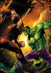
Marvel Adventures Hulk #10

This month's Marvel Adventures Hulk doesn't beat around the bush – on the first page, the Hulk is facing off with Juggernaut at the edge of a cliff. By the middle of this issue, you'll find yourself wishing the mutant menace had just gone ahead and hurled Hulky over the edge, because the story goes into a straight free-fall almost immediately.

Paul Benjamin's writing is blunt and often dull. I didn't care for him the last time I reviewed an issue of MA: Hulk, and although this one is a good deal better than the last, it's still a far cry from anything I'd recommend to my friends. Benjamin sets the story in an interesting locale - the dank, unexplored jungles of Korea – but his writing is still full of holes. He frequently feels the need to remind the reader that Banner = Hulk and Hulk = Banner, most notably through the repeated use of a Hulk-themed narration that runs throughout Bruce's scenes. Maybe once or twice it would've been cute, (probably not, but hey, maybe) but the gimmick runs throughout the issue. It doesn't add anything to the story beyond the constant reminder that this is a Hulk book, and it's flat-out annoying. If it were a dialog box on my laptop, I'd click "don't show me this again."

His characterizations are almost universally weak and obnoxious, too. I realize that Benjamin is trying to get me to identify with the "everyman" Rick Jones character when he bemoans the lack of American Idol in an underdeveloped village or celebrates "pwning" the Juggernaut, but that only makes me want to see the Hulk step on his throat. His take on Caine Marko is one-dimensional and overplayed, slapping around villagers and monkeys alike in a vain attempt to look like a badass. Even his Bruce Banner is uninspiring, constantly worrying that the slightest jolt will turn him green and never really doing anything all that brainy. I know Banner is meant to be kind of a pussy, a direct contrast to the mindless physicality of the Hulk, but the guy has to have more on his mind than "OMG – Hulk time?!?" all day long.

Steve Scott's artwork is serviceable, although I have to wonder about his assignment on the Marvel Adventures line. His work is frequently moody, dark and mature, while the entire premise of this line is to provide a lighter, more welcoming atmosphere geared toward younger audiences. Normally, I'd be all about mixing and matching styles, trying new things in different places, but this is a poor pairing. His work is technically good, often reminiscent of Leinil Francis Yu, although not nearly as loose and sketchy. He makes the most of his opportunities to spotlight Caine Marko's intimidating physical presence when he's not wearing his Juggernaut armor, and his scene-setting backdrops are often downright gorgeous.

One thing that Scott's artwork doesn't do justice, surprisingly, is the Hulk himself. His Juggernaut is fairly pitiful too, while we're on the subject. When he's depicting Marko in his civvies, Banner with his glasses and a variety of Korean villagers, his work is fine. But once Caine dons that orange suit of armor and the Hulk is unleashed, the quality of his artwork goes right down the drain. How can you assign a guy to a Hulk story if his rendition of the green goliath is this bad?

This is rotten. Paul Benjamin may be revealing himself as one of my least favorite current writers, and this issue is all the evidence I need to justify that claim. Steve Scott's artwork can't save this story... skip it at all costs. This is the kind of story that could drive you to swear off of comics altogether.

On a scale of 1 to 10, where 1 is poor and 10 is amazing...
Overall Score: 1

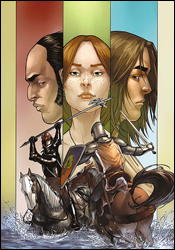
The Hedge Knight II – Sworn Sword #6

Some books enrage me by including no back story-explaining recap page, while others... well, they carry the concept a bit too far. Hedge Knight II is a good example of the latter, devoting two lengthy paragraphs to a detailed history of the series and the family tree of most of its cast. Fair enough, I guess. Given the choice, I'd rather be in the know than in the dark.

The book's lead character, Dunk, is a knight-for-hire, roaming the countryside with his squire, Egg. After the death of his master, Dunk took up the old man's sword and shield, dubbed himself Ser Duncan the Tall, and set about making a name. It wasn't long before he'd enraged the land's prince, gone to trial and fled the land. Now residing in the countryside, in the service of the retired Ser Eustace, Duncan and Egg find themselves once again at a point of conflict.

Despite the verbose introduction, George R. Martin's storytelling is a very easy read, nicely paced without getting too caught up in the Olde English dialect. With a few exceptions near the end of the issue, no word balloons drag on for longer than they should, and everyone gets a chance to deliver a big line or two. Martin creates strong characters with obvious pride and distinct motivations, and while you won't be pulling for all of them, you'll at least understand where they're coming from. His cast is deep and well developed, but not overly complicated or full of hot air. It's a nice, quick read but that doesn't mean it's without substance.

Martin takes great care in explaining the particulars of a medieval battlefield, enlightening the reader while keeping up a brisk pace. When Duncan duels with another knight early in this issue, both men's strategies are concisely laid out before the first strike is thrown. If that sounds like an unnecessary level of detail, it isn't. The writer manages to explain everything an unfamiliar reader would ever need to know about the fight quickly and concisely. It deepens your understanding and appreciation for these aged arts, and without their presence, the battles would quickly regress into stereotypical melees.

Ben Avery's artwork is a decent counterpart for that meticulous, yet simple attention to detail. His pages are largely kept simple and stylized, but clearly a lot of effort was made to retain the authenticity of each knight's unique suit of armor and the civilians' manner of dress and posturing. His linework is generally very good, detailed when it needs to be and clean when it doesn't, but he doesn't bring a lot of excitement to the table. Even during the issue's more explosive scenes, I didn't find myself overly enthused... it's more of a document of events than an exaggeration of an action scene. He has a gift for denoting each character's personality in their faces, which is a bit of a rarity among modern artists, and helps further highlight the depth George Martin has poured into each of them. Avery has problems with his storytelling, though, particularly during battle. There were several instances where, despite the writer's descriptions, I wasn't quite sure what had happened, and I have to blame the artwork for that.

Hedge Knight II is worth a good look. I'm not typically one for stories set in the middle ages, but I'd be willing to make an exception here. The book isn't without its flaws, particularly on the artistic side, but it's worlds better than I expected when I first laid eyes on it. Borrow this from a friend if any of your friends have actually bought it. It's solid enough.

On a scale of 1 to 10, where 1 is poor and 10 is amazing...
Overall Score: 6

Tuesday, April 1, 2008

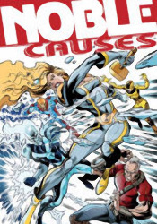
Noble Causes #34

Image's Noble Causes, a self-professed "super-hero soap opera," is the ongoing saga of the Noble family, a wealthy tribe of super powered kin. Where its peers seem to focus more on the dynamic of good vs. evil and the physical battles that ensue, Causes takes a more active interest in the clan's personal lives. Recently, the book has thrown the status quo to the wind and leapt five years into its own future... mixing up the cast and changing the landscape considerably.

Writer Jay Faerber has been with the series since its inception, and his familiarity with its characters is clear. Although this issue features a lot of different faces, they're all treated to their own unique identity and as a new reader I never felt lost or overwhelmed. There's a lot of internal conflict amongst this team, and some heavy accusations are tossed around within the first few pages, but Faerber does a fine job of keeping everyone up to speed, regardless of their familiarity with the story so far. That's a lot easier said than done without the benefit of an introductory "previously in..." blurb.

The concept of a dysfunctional superhero family isn't entirely unique, although the writer does enough to distance Noble Causes' approach from the competition. Occasionally, he allows the soap opera aspects of the series to get the better of him, (there's more than one overdramatic attention whore-style outburst in this issue) but he generally balances that out with honest conversation and a touch of action.

My biggest gripe is that although the Nobles deal with plenty of adversity in this issue, it's all sorted out so quickly and easily that nothing seems to be of any real circumstance. The heroes bicker fiercely amongst themselves, but ultimately take the moral high road and talk through their differences, diffusing the situation while also draining it of its drama. Their battles with villains are so humdrum and easy that I wonder why the bad guys even bother putting up a fight. How long would the dynamic between Spider-Man and J. Jonah Jameson have lasted if they'd casually shook hands and agreed to disagree after the Daily Bugle's first negative story about the web slinger went to press? There's a lot of potential to tell some really emotional stories here, but because the conflicts are solved so cleanly, they never get the chance to develop into something of substance. When Faerber finally drops a pair of bombshells at the end of the issue, I'm already resigned to the fact that they'll be wrapped up before issue 35 is laid to rest.

Turkish-based artist Yildiray Çinar gives the series a very clean, open visual identity. While his artwork is extremely simple and underdetailed, that doesn't mean his characters are unrealistic or exaggerated. Where Bruce Timm and Michael Avon Oeming use a similarly light-handed approach with their linework, Çinar's characters have little else in common with theirs. They retain a very lifelike, realistic shape and size, without complicating the page with excessive detail. While he takes that concept to an extreme by routinely leaving out the accompanying background artwork, his grasp of fluid motion and ability to lead the reader's eye from panel to panel make up for it. While the book takes pride in its focus on character interactions over explosive fight scenes, this issue was peppered with enough action to keep Çinar busy throughout.

I had a hard time making heads or tails of this book. I liked the atypical direction it takes with a very common subject, humanizing its superheroes by spotlighting their rocky relationship as a family, but never felt a sense of urgency or importance to any of their actions. I loved the brunt of Yildiray Çinar's artistic contributions, but found his lack of backgrounds and occasional losses of focus to be distracting blemishes on his style. It's got its ups and its downs, I suppose. Flip through it... it's not quite good enough to go out of your way for, but not nearly bad enough to discredit.

On a scale of 1 to 10, where 1 is poor and 10 is amazing...
Overall Score: 6

New Exiles #4

A ragtag cluster of discarded and forgotten characters from around the Marvel Universe, the New Exiles shoulder the task of protecting each planet, reality and possibility in the Omniverse from outside threats. Currently stationed on Earth-6706, (do we really need almost seven thousand replicas of our own reality?) the team has been separated from one another and forced to make sense of this disastrous alternate reality on their own. Before the good-intentioned Exiles have had a chance to gather their bearings, however, the planet's resident Black Panther, an evil woman with an entire army at her disposal, strikes from the shadows.

If that opening paragraph wasn't hint enough, this book is terribly complicated. As if the proposition of interacting with one parallel reality wasn't enough, writer Chris Claremont has taken on the task of managing a whole grab bag full of them. And, given his tendency toward convoluted storytelling, he really isn't the ideal writer for this kind of situation. I had to read the first page alone three times over before I had even a vague understanding of what was going on. It doesn't help that he massacres these panels with unnecessary dialog in both thought balloons and lengthy spoken monologues. What are the rest of the heroes doing while the Black Panther stands and speaks, Sue Storm's life in her hands? Are they just listening? Why aren't they trying to save her?

While the idea of working with characters so far outside the mainstream continuity should open up nearly infinite possibilities, Claremont instead chooses to use it as an excuse to dispense dozens of mildly different takes on existing characters. Without sixteen ongoing books to tie into, the sky should be the limit for his riff on the Fantastic Four and Namor here, but he still treats them gingerly, like he's afraid he might break them. It's all well and good that Sue and Namor are lovebirds in this reality, but I'm afraid that kind of premise isn't strong enough to carry an entire story arc on its own. Without the benefit of a long history, these characters come of as pale impersonations of their more familiar brothers and sisters, and Claremont does nothing to help them stand out.

Tom Grummett's artwork has a few very specific moments of clarity, usually featuring Psylocke, but for the most part comes across as very run of the mill and blasé. Part of that can be attributed to his unenviable task of composing a very specific, detailed battle scene without getting in the way of the endless word balloons, but that doesn't excuse the cast's stiff, boring posturing or his poor consistency. Namor's appearance changes from panel to panel, and Sabretooth looks more like a haggard old reject from the grunge scene than a ferocious warrior. His work with backgrounds and machinery is fairly good, and clearly much more of an emphasis than his character renderings, but that's really a case of too little, too late. This writing stinks, and outside of a few noteworthy exceptions, the artwork follows suit.

New Exiles is almost all wrong. Instead of trying new things with familiar faces, Chris Claremont is debating the subtle differences in Atlantean politics between our reality and that of Earth-6706. He's wasting his opportunities to unleash something totally new on the scene by going back to his same tired bag of tricks – pointless battles, unnecessary dialog and dull, repetitive characterization. Tom Grummett, sadly, is just more of the same. His work is uninspiring and drab, without a visual punch or flair for the dramatic. This series isn't worth the paper it's printed on. Skip it.

On a scale of 1 to 10, where 1 is poor and 10 is amazing...
Overall Score: 1

Logan #2

Superstar creative teams seem to be the trend at Marvel recently. Whether it's Joe Madureira and Jeph Loeb, Mark Millar and Bryan Hitch, David Lapham and Tony Harris or Brian K. Vaughan and Eduardo Risso, the name of the game seems to be mixing and matching big names on some of the publisher's top characters. For Risso and Vaughan's Logan, the focus is more specifically on a long-forgotten chapter in Wolverine's history. We're suddenly remembering details about Logan's past right alongside the adamantium-clawed Avenger himself, and not all of the memories are good ones.

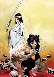
Brian K. Vaughan, fresh off the conclusion of Y: The Last Man, is just the latest to explore the Canucklehead's undocumented history, and while his take on the character isn't the best, it's also not the worst. He tells this story with a strikingly small cast, but grants each character enough quirks and touches of individuality to fill in the gaps. Vaughan's storytelling is decent at best though, not his best work, and never really seems to hit its stride. The story's setting in WW2-era Japan is intriguing, although the big surprise near the end of the issue is a bit over the top, and leads me to wonder if there were ever a major historical event that occurred without Logan's immediate presence. Marvel needs to show a little more restraint, or else we'll be seeing a panel where Logan scratches a hole in the side of the Chernobyl cooling tower sooner than you think.

During his run on 100 Bullets, Eduardo Risso has become one of the industry's best-kept secrets. His work with the seedy businessmen and stone-cold killers of the Vertigo series has been consistently atmospheric, gritty and inventive. His linework is thick but controlled, his characters undeniably human and justifiably flawed. Perhaps his greatest strength lies in telling stories with lighting alone – he can soak an environment in atmosphere through little more than the placement of its illumination. His characters wade effortlessly through the shadows as though they were a warm bath.

In Logan, he successfully carries over each of his remarkable abilities, but something's still a little off. I think it's his take on Wolverine himself. The most visible member of the X-Men, Logan never truly looks like himself in this book. Risso seems to struggle with spandex, which is understandable since it's not something he's been asked to handle at all during his tenure on 100 Bullets. He's typically great at developing and depicting a real badass, (hell, Lono is basically an evil Wolverine in a Hawaiian shirt) but this rendition of Logan stinks. His work throughout this book, particularly in its backgrounds, is great… but his take on Logan is almost bad enough to spoil it all.

Logan is a tricky book to critique. On one hand, its successes are tremendous – Risso's backgrounds are universally fantastic, and the new characters that Vaughan has introduced play off each other very well. On the other, its failures are equally spectacular – the artist's take on Logan himself, the brevity of the story and its ridiculous conclusion. I'm going to be gentle with this one and say it's worth borrowing. I was hoping for a little more than I got, but wasn't entirely disappointed, either.

On a scale of 1 to 10, where 1 is poor and 10 is amazing...
Overall Score: 6.5

Kick-Ass #2

Last month, Mark Millar and John Romita, Jr. introduced us to Kick-Ass, the saga of a teenaged boy who's taken the initiative in applying the fantastic adventures of his favorite comic book superheroes to the real world. Sadly, he may have been misled as to the practicality of that pursuit… in his first patrol he was stabbed and beaten, then bowled over by a Mercedes that fled the scene before he'd even hit the ground. Now he's clinging to life in a hospital bed, miles from his goals, with his chances of even walking again looking more and more grim as the hours of unconsciousness slip into days.

I was overjoyed to see this book in my review pile this week. I'd picked up the first issue on a whim and found it a quick, exciting read that left me hungry for more. While the tempo slows in this follow-up, the tone remains the same. The protagonist, Dave Lizewski, is a smart, imaginative young kid who's relatable and inspiring. He's learned some tough lessons about the world in these first issues, and it's already becoming evident that his growth as an individual is one of the story's central themes. Although he's still an adolescent, he isn't treated with kid gloves. Millar lets him shine through as a mature, intellectual mind with broad views and wisdom beyond his years.

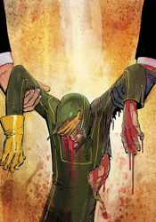
Although the first half of the issue's dialog is almost entirely internal, it doesn't feel redundant and overplayed. Dave is well spoken, but doesn't seem haughty or inapproachable, and some of his lines are downright brilliant. “And so, after four operations, two months of counseling, three metal plates fitted inside my head and endless weeks of physical rehabilitation, I finally realized why there's no such thing as superheroes in the real world.” That's gorgeous. That's a mission statement for this entire series, conducted over the course of four panels. This is a title that can cover brutal violence and quiet introspection within just a few pages of each other, yet it's never disjointed or awkward. It's just right.

His partner in crime, John Romita Jr., needs little introduction. Although he's been in the business for over twenty years, his art remains fresh and unique. He's one of those rare artists whose work is instantly identifiable, whether he's dealing with superpowers and firefights or wheelchairs and hospital rooms. Although he's had better contributions, (a lot of this issue looks like it was rushed out the door, especially early in the book) his work remains in the industry's upper echelon and his layouts alone justify his ongoing presence. When Dave is briefly hallucinating about reincarnation early in the issue, Romita treats both imagination and reality as one, telling both stories without missing a beat. I don't think I'd have trusted such a complicated moment to anyone else.

Mark Millar has fast become one of my favorite modern writers, and John Romita, Jr. has long been among my favorite artists. Although Millar isn't above making a few mistakes, he almost never fails to surprise, to push the envelope. Every one of his books has its own identity, and Kick-Ass is just the latest and greatest. He's giving us phenomenal action, sharp characters and tough questions, and Romita is bringing them all to life as only he can. I can't say enough good things about these guys, and their work together is a rare example of top-level talent living up to steep expectations. Buy it if you see it, this is great.

On a scale of 1 to 10, where 1 is poor and 10 is amazing...
Overall Score: 9