Monday, December 21, 2009

Gen13 #33

There’s a natural rivalry brewing between the members of Gen13 and their apparent successors, Gen14. Only natural that the younger squad would be in a hurry to take over, while their predecessors would take offense to being replaced before they’re ready. After coming to an uneasy understanding, uniting to confront their would-be masters in the US Military and making a long journey to the city of Tranquility in the hopes of finding kindred spirits, the teams were met by an unsightly surprise. Tranquility, thought to be home to dozens of retired or inactive super-heroes, is no more. In its place is a large, smoldering crater and no signs of a culprit. Subsequently the unlikely allies have agreed to continue their trek across the country, but with no particular destination in mind.

In their first issue under temporary writer Adam Beechen, it doesn’t take long for the tribe to run into some unexpected fireworks. Just one page, in fact, but the ensuing battle doesn’t last long. But much as I’m no fan of brainless action sequences just to kill time, in retrospect I think I’d have preferred it to stretch the length of the entire issue. It certainly would’ve been preferable to the weak attempts at a backstory and limp-wristed character development segments that followed. Beechen does little to differentiate each member of the team besides a brief showcase of his or her powers. He doesn’t reveal anything new about the cast, lend them any depth or give his readers a reason to get interested in learning more about them. They stroll through the issue like husks on a clothesline, floating blandly from one dull, over-explained predicament to the next without so much as a yawn’s worth of personality.

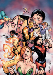
Beechen’s partner in crime, Cruddie Toran, offers his finest J. Scott Campbell impression. At first glance, it’s a decent enough approximation – abundant curvy women with long, thin fingers, unusual paneling and abundant blast lines – but upon closer inspection his shortcomings grow obvious. Not that Campbell’s take on the characters was without its own flaws, but at least at the time it was something original.

Toran’s illustrations take an already-excessive style and amp it up even further, casting aside any concerns for storytelling or organization along the way. They’re a collection of pin-ups that just so happen to contain similar characters in an analogous environment. His work is the embodiment of style over substance, and it’s not even particularly good-looking at that. Think what you will about his work in the mid ‘90s, but at least Campbell could draw two different kinds of characters: long-legged, gangly supermodels and thick, chunky, over-muscled bodybuilders. Toran struggles with the latter, often sketching them in laughably effeminate poses with the same tiny, dainty little legs as their counterparts. And of course, everyone’s muscles remain rigid and fully clenched at all times.

This is the very definition of a throwaway issue. The team bumps into a few Wildstorm regulars, fills the audience in on their whereabouts, diffuses a bomb or two and moves along. There’s nothing memorable about it, nothing inside to change or even define the characters it supposedly embraces. The story does little to excite and the artwork doesn’t help its case. Skip it.

On a scale of 1 to 10, where 1 is poor and 10 is amazing...
Overall Score: 2

X-Men Noir: Mark of Cain #1

Perhaps the most critically admired of Marvel’s first set of Noir titles, the X-Men of the 1930s concluded their first adventure with something of a cliffhanger. In X-Men Noir: Mark of Cain #1, the story resumes shortly thereafter. Presumably powerless (the final verdict on that one is left to us), Xavier’s class in this series consists of a band of sociopaths and delinquents, youths with a black mark on their past who have resorted to outrageous stories of inhuman abilities to attract attention to themselves. It’s an interesting way to turn the mutant mythos on its head, a storytelling twist that surprisingly enough doesn’t result in a change in the themes of the traditional X-Men dialog so much as it merely shifts the reader’s perspective on them

Fred Van Lente, who masterfully penned the first series, resumes his duties in this second chapter, which transplants the team from the detective-flooded streets of New York City to the deepest jungles of Madripoor. But that’s not before he takes the opportunity to initiate new readers with a quick, newsreel-styled recap of the first series. It’s a perfect way to cover the complicated material of that first tale, while also setting the mood and tone of the era he’s emulating. Where that historically-appropriate footage leaves off, Van Lente picks up with the issue’s dialog, which seems to leap right off of those ancient movie screens and onto the page. It’s a cool enough trip down the path of nostalgia that I could almost lose myself in the atmosphere alone.

Eventually Van Lente does trip over a few hurdles, however. Despite the double-sized recap section, much of this story is dependent upon a close understanding of elements from the first series that are left undisclosed to new readers. While his cast’s dialect is responsible for much of the issue’s flavor, he also refuses to shake it up between characters. Some of the effect is bound to get lost if everybody speaks like a hard boiled detective, and that’s precisely the case here. Many times, amid the shadows and identical speaking patterns, it’s tough to isolate who’s doing the talking and who’s merely listening. In the end, are these minor gripes? Sure, but they’re valid ones nonetheless.

Dennis Calero’s artwork, like those of each of his Noir counterparts, is crucial to the success of this series. So much of what makes such a story work depends on the deep shadows, careful compositions and sharp mood set by its visuals that it’s tough to imagine any revival finding much success in the hands of a middle-of-the-road talent. Calero manages the job effectively, employing a style that’s oft reminiscent of Jae Lee in its use of selective lighting and densely layered surroundings. The style is particularly effective in the title’s first fight scene, when Logan and Angel are caught off-guard by an onslaught of shadowy natives. The action is quick and chaotic, bewildering but deliberately and successfully so. My sole qualm with the artwork lies with the decision to offer it in full color. Especially contrasted by the black and white tones of the newsreel footage that opens the issue, the lush palette and full tones seem at odds with its inspirations. The array of color gives this story a more modern flavor that seems counterproductive to the thick atmosphere and weighty mood the line is chasing.

Mark of Cain may not be as captivating as the original series, but it still holds its own as a handsome addition to the Marvel Noir line. It’s effectively written, gorgeously illustrated, and despite a few slips and flaws worthy of a closer look from fans of the first mini-series. New readers may find that their mileage varies. Borrow it.

On a scale of 1 to 10, where 1 is poor and 10 is amazing...
Overall Score: 8

Tuesday, December 15, 2009

Thor #604

It's really nothing new, but life's been kind of shit for the Norse God of Thunder over the last few months. After returning from hibernation, reviving the lost city of Asgard and its population and helping to defeat the Skrull invasion, Thor was exhausted and ripe for an attack. That's all the invitation his half-brother needed. Acting swiftly, Loki wrested the control and loyalties of Asgard to a more controllable figurehead, transplanted the city limits to Latveria and forged an uneasy alliance with, who else, Doctor Victor Von Doom.

It really wasn't that long ago that this series had built a respectable head of steam. J. Michael Straczynski and Olivier Coipel had managed the relaunch in style, giving Thor a new mortal link, Asgard a new locale and the Gods themselves a fresh direction. I still wasn't especially taken with the cast, which is why I merely flirted with the title around its launch and then left it behind, but things seemed to be headed in the right direction. Imagine my surprise, then, when I opened up this issue to find that things had all but returned to the stale status quo that had all but doomed the series years ago.

In his first month at the helm, new writer Keiron Gillen has inherited something of a disaster in Thor. Gone are the new directions that had effectively granted the series a face-lift. Thor still employs Donald Blake as his link to the mortal realm, but he's becoming more of a bit player and less original with every passing moment. Asgard loses a bit more of its luster in each panel, becoming less the unique floating city that left Oklahomans in awe two years ago and more the crusty, ancient tomb it had been for decades before. The gods have returned to their distant, haughty old ways. Add to all that another cryptic scheme from Dr. Doom that doesn't really make any sense, and you've got a book that's running - no, sprinting - in the wrong direction.

Like the gassy topping of a turd sundae, the artist of choice for this leg of the series is none other than Billy Tan. To say I have a mild distaste for Tan's artwork would rank among the understatements of the century. He's not single-handedly responsible for my dropping New Avengers from the pull list several months back, but his lumpy musculatures and nasty layouts were among my chief reasons. Since moving to Thor, his rendering has improved moderately, but his compositions remain clunky and messy, infuriating to navigate and terribly confusing at even their finest moments. Tan routinely rides on the coattails of his writers, summoning whatever cheap gimmicks he can muster on the pages that offer built-in visual excitement and adding nothing to those that don't. I don't understand what Marvel sees in this guy: he constantly turns in disappointing work and they keep rewarding him with regular, high profile gigs. I guess, as an evaluator of talent, sometimes when you swing for the fences you wind up striking nothing but air.

Simply put, this issue is a waste. A waste of time, of paper, of momentum, of character... take your choice. It's all of the above and then some. It's exactly what the first issue of the relaunch seemed to go out of its way to step away from, and it's sad to see it's returned there so swiftly. Skip it.

On a scale of 1 to 10, where 1 is poor and 10 is amazing...
Overall Score: 1

Blackest Night: The Flash #1

If you haven't been keeping track, the dead are coming back to life across DC's landscape. That means if you're a hero and you've ever met someone who's since departed this mortal coil, chances are they'll be knocking on your door within the next few days, a brand new ring on their finger and maybe a few basic grooming issues to think over. Although the primary story has finally reached the second act in the primary Blackest Night series, where the heroes have taken the fight to the reanimated mob, this issue takes place before any of that. After all, why move the story forward when you're doing just fine with a lengthy and repetitive introduction?

Of course, longtime Flash readers will be less interested in that than they are the return of scribe Geoff Johns to the land of the scarlet speedster. Johns's return, however brief it may turn out to be, helps this installation of the crossover to stand out more than the majority of its competition. For a character such as the Flash, possessor of a large, colorful gallery of rogues both living and dead, this level of intimate knowledge is crucial. A less experienced writer would have spent the entirety of this issue just getting to know the bit players, while Johns can swoop right in and concentrate on getting their stories straight.

Rather than following the reactive storytelling embraced by the other authors in the Blackest Night tie-ins, this installment takes a more proactive look at the dark events transpiring around the glove. Barry Allen isn't content to sit back and wait for his fallen enemies to seek him out, and Geoff Johns isn't happy to fill the story with random fists punching their way out of the grave every couple pages. Instead, he tells us a bit more about the dead themselves, be it through Barry's memories of his last encounter with the fiend, the gut reactions of the rogues still among the living (who aren't always especially happy to see their former rivals returning from the grave), or the lost memories tied to the corpses themselves. This isn't always a flash-bang action flick, and that alone is enough to make it special.

Himself no stranger to the Flash, pencil-man Scott Kolins brings a style to the issue's artwork that's often eerily similar to that of Andy and Adam Kubert. The reunion with his former collaborator is a good fit for Kolins, who also lends a sense of familiarity and comfort to the proceedings, slipping back into the scene in the same way he would an old pair of gloves. It's a good thing, too, because he reunites with every last of those acquaintances in this issue. Covering almost every corner of the Flash's cast - living, dead, friend, enemy - this tale frequently and rigorously puts Kolins's memory to the test, and he nearly always manages to use it as motivation to produce something excellent.

With so many characters vying for our attention, the issue certainly runs the risk of running short on elbow room. And, on a few occasions, that's the case - but for the large majority of it, Johns and Kolins manage the numbers better than I could've imagined. More importantly, they do so without handicapping the main narration along the way. While it's awfully crowded, this is a solid first issue that unleashes several intriguing new plot lines and offers new peeks behind the mask of several important characters. It's not just for Flash die-hards, casual fans will find plenty to enjoy here, too. It's one of the few tie-ins to really explore the full potential of this crossover. Borrow it.

On a scale of 1 to 10, where 1 is poor and 10 is amazing...
Overall Score: 7.5

Superman: Secret Origin #3

The origin of Superman is one of comics' most well-known, timeless classics. It's universally appreciated by men, women and children of all ages and nationalities, a true legend of pop culture past, present and future. So it should only seem natural that more than one creative team would want to take a crack at it over the years, right? Perhaps, and on several occasions that return to familiar territory has been backed by a valid reason. John Byrne's The Man of Steel, for instance, cast aside the silliness of the Silver Age and paved the way for a revitalized continuity and a more streamlined universe. It was a case of the right place, the right time and the right man for the job. So where's the pressing need for a similar retelling today?

Geoff Johns makes the case that, while we've seen these events before, we've never seen them from this perspective. Through the innocent, inexperienced eyes of Clark Kent himself, we're promised a rare glimpse at the instincts and motivations that made the big blue boy scout what he is today, blemishes and all. It's a fair point, one that had the potential to really open a few locked doors behind the veneer of DC's most iconic character, but with a few exceptions Johns shies away the kind of introspection I was hoping for. Instead of sharing Kent's thoughts as he sees the skyscrapers of downtown for the first time or the hustle, bustle and selfishness of the pedestrians on its streets, we're merely along for the ride, and that's nothing new.

We're also literally drowning in word balloons. Johns fills several pages with so much dialog, the artwork has to fight just to occupy some cramped gutter space. I can understand the need to introduce and define familiar characters such as Perry White and Lois Lane, to keep them familiar but also add a new layer so the retelling is justified. It's an ambitious goal, and often the only way to reach it is through bold dialog. That's not a problem for this author – his writing is clever and effective, and he especially nails the no-nonsense, "get the story at any cost" attitude that defines Lois. There's just so damn much of it, the plot's never given the chance to gather a head of steam. I admire the quality of his work, but I wish it were more concise.

His artist, Gary Frank, captures the wide-eyed wonder of Clark's arrival in Metropolis with flair. I wasn't always a fan of Frank's work, but over the years he's made a believer out of me. It seems that with each appearance he adds a new layer of detail, discipline and polish to his work, and his take on Superman and company is no exception. Sometimes he does get carried away – as he does with Jimmy Olsen's buck toothed, freckle faced nerdy visage – but given the choice I'd rather see a page with too much character than too little. His more realistic, lifelike tendencies may have been out of place at Marvel, but he's a perfect fit for the DC style.

Secret Origin is a valiant effort, but I didn't find the slight tweaks and irregular glimpses into Clark's psyche urgent enough to necessitate yet another stroll through such familiar terrain. It's only been five years since the last time we dredged up the Super-Origin (in Mark Waid's Superman: Birthright) and that's not enough time to move on. This is strong work, but that's hard to appreciate because its every move is so thoroughly telegraphed. Flip through it, but don't expect much. This Secret Origin runs surprisingly short on secrets.

On a scale of 1 to 10, where 1 is poor and 10 is amazing...
Overall Score: 4

Die Hard: Year One #3

Hey, you remember Die Hard, right? The original, that is. Barefoot on broken glass, bad guys crashing through a cop car with several hundred feet of momentum, yippee kiyay motherfucker, badass Die Hard? Before John McClane was reduced to escorting the "I'm a Mac" guy through computer generated fireballs, ducking under sailing cabs and censoring his own catchphrase to fit within the confines of a PG-13 release. Yeah, that was a pretty good movie. Not sure if it really needed a comic book prequel, exploring the experiences and events that shaped the action hero's life as we saw it in his cinematic exploits, but that's where the overzealous actions of the merchandising department have taken us. Let's try to enjoy the ride.

Howard Chaykin is the man of the hour, writing this special peek back at a time when McClane was still a beat cop; pounding the pavement, trusting in his superiors' orders and looking at the world through much a more naïve pair of eyes. As fate would have it, though, the subtraction of several decades' worth of experience has also robbed our lead of most of his charm and charisma. Or maybe Chaykin's just written him into a terrifically boring role. Either way, the guy we're following throughout this issue has little more than a name and a badge in common with the man at the center of the big screen quadrilogy. He doesn't even look like Bruce Willis.

One thing the movies are particularly good at is getting the setup out of the way quickly and diving straight into the action. Once they've fired off a few rounds, the films loosen up and make with some surprisingly solid moments of character development amidst shattering windows and bursting C-4 packets. In that respect, Year One is once again an estranged member of the family. As the middle act of a five-issue mini series, one might expect something to be happening by this point, but Chaykin seems to have left the gearshift in neutral. When the bad guys finally show their hand in this chapter's closing pages, I was left wondering why it took two and a half issues to get there when the first film worked a very similar plot ten times more efficiently.

Mercifully, Chaykin does not lend his hand to the visuals. I can only imagine the kind of pouty lips and assless chaps that would have adorned McClane's wife-to-be in this issue. As it is, he's written her into wearing one of the more ridiculous outfits in recent memory. Dressed in a head-to-toe spandex outfit patterned after a star in the US flag, complete with knee-high white leather boots, she dons a pea green mumu and is suddenly rendered incognito to the pedestrians surrounding her. Stephen Thompson's renditions of mid-70s New York are serviceable, if not era-appropriate. I particularly liked his effective use of halftone shading, and his style is reminiscent of Frank Cho or Adam Hughes although he's clearly not at their level. There's just nothing here to convince me that this story is set in 1976, rather than the present day, and the cast's lackadaisical body language and facial expressions seem to imply they're just as disinterested in this plot as I am.

This comes across as a completely unrelated story that was merely repurposed and repackaged to take advantage of the Die Hard property, and not a very good one at that. Chaykin's cast moves and acts like a flock of robots, the villains' master plan doesn't make any sense, McClane doesn't have a reason to be there, and I don't have a lot of sympathy for the victims at the heart of the matter. Fans and critics alike will have no reason to rejoice this one. Skip it.

On a scale of 1 to 10, where 1 is poor and 10 is amazing...
Overall Score: 1.5