Monday, November 29, 2010

Osborn #1

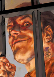
Norman Osborn has stagnated fairly significantly over the past year. Not that one could blame him, being confined to just ten square feet of cell space in one of the back corners of the Raft, floating home to Marvel’s criminally insane and maniacally dangerous. The ex-Green Goblin hasn’t been without his share of visitors since the Avengers forcibly removed him from power in Siege, but for the most part he’s been left to spend some time with his own thoughts. As it turns out, that might be all the company he needs, what with the pair of strong-willed personalities crammed in there, each vying for control of his mind and body.

I can get that considering his static locale and lack of company, Norman himself isn’t the most likely candidate for a starring role in his own limited series right now. No matter how fascinating his psyche may be, readers aren’t going to stream through the doors to follow the adventures of the firmly incarcerated man and his active imagination. As a means to keep this series from becoming a single-perspective series of internal monologues, writer Kelly Sue Deconnick has sent us off to a small handful of locations around the globe with at least one thing in common: a subject of conversation. If you imagined that topic as Norman himself, I’ll be around to deliver a cookie shortly. Although his finger is no longer on the button, it seems the Goblin is still a popular subject of debate in various military, press and religious circles, and for at least one day we get to play flies on the wall.

Bearing that in mind, it still feels quite odd to read a book titled Osborn in which Norman himself has only a few very brief appearances. Understandably, it’s the first issue of the series and Deconnick spends most of her time setting up the pins so forthcoming issues have something to bowl over, but at the end of the day it’s still the villain who has the most intriguing persona of the lot and his regular presence is sorely missed.

Deconnick’s temporary partner, artist Emma Rios, left me something more to be desired. Her work dances a fine line between frantic and over-composed, neglecting detail in certain circumstances and pouring it on in others. Her take on the story’s few recognizable characters (namely Peter Parker, Ben Urich and Norman himself) are foreign and unfamiliar, a trend that continues when she moves to take on the issue’s new faces. There’s no sense of adventure or excitement in her work, not that the word-heavy situations she’s illustrating have much call for that, but that gives her art a bland, drawn-out personality. Rios seems like a fill-in artist who’s missing her opportunity to turn a few heads as a regular. Her page layouts are easy to follow and clean enough, but the artwork itself is stale, faceless and dry.

I once thought that Osborn himself was the key to any issue’s success. With such a deep, rich, charismatic character already defined beforehand, I was certain that any story could find new life by merely including him. And for some time, that little theory of mine held up. Different writers and different titles all tried Norman on for size, and with very little exception, each came out smelling like roses. Odd, then, that it’s the Goblin’s own self-titled mini-series that kills it for me. Despite its promise and the character’s long string of success stories, this story just isn’t a winner. It’s slow moving, witless and predictable, three traits I never thought I’d assign to anything involving the former head of the New Avengers. Skip it.

On a scale of 1 to 10, where 1 is poor and 10 is amazing...
Overall Score: 2

Spider-Girl #1

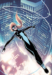
Spider-Girl may look like a familiar marquee to Marvel regulars, but I think I can safely assure you that the new series is anything but. Casting aside the costume, numbering, identity and timeline of the under-loved previous series that had so frequently flirted with cancellation, this new number one seems to share only a masthead and a willingness to fight crime with its long-lived predecessor. Set in the present day, Spider-Girl #1 features the debut of former Young Ally Araña in her new getup, swinging through the city on artificial webs during the intermission between classes at Milton Summers High School.

Clayton Henry’s artwork is a good way to get a new series off on the right foot. His style is sleeker, smoother and more vividly realistic than the exaggerated, overly stylized work of both Ron Frenz (on Mayday, the previous Spider-Girl) and Mark Brooks (earlier iterations of this character). The shift in artistic discipline is a nice touch, one that reinforces the differences between the new focal point and those two preceding faces. Araña has grown up a bit since the first time we met her, evidenced by her recent appearances in Amazing Spider-Man’s “Grim Hunt” and the short-lived Young Allies series. Henry does a fine job of reflecting that in the character’s physique, demeanor and body language, resulting in a lead that almost feels too mature to still be in high school.

Writer Paul Tobin makes an effort to counterbalance that, interspersing a running set of internal monologues throughout the issue in the form of tweets and IMs. That’s not exactly a new trick, but despite a few snags (as in, how is she carrying on a chat at the same time she’s putting the boots to a generic villain in the issue’s opening pages?) and a dangerous proximity to the realm of full-on gimmicks, it does serve a purpose. These little pseudo-interactive thought bubbles are a quick, informal way to introduce new readers to who this new lead character is, what she’s concerned about, and where she’s coming from. Presumably so the story can waste little time in diving right into the thick of its first juicy story arc.

Only the drama doesn’t start up immediately, or even imminently. Having efficiently established most of the cast within the first six pages, Anya then spends the next dozen on a carefree stroll through the city, shooting the breeze with Susan Richards. When an unspecified threat to the city forces Sue to cut their lunch date a bit short, our lead does finally dive into the action, although it’s of the generic variety. Stopping purse snatchers, halting a carjacking, that sort of thing, with hints and dashes of tweets and IMs still dropped in at appropriate intervals. It’s a casually paced introduction to the character that slowly builds to ensure something bigger next month.

The new Spider-Girl has lots of promise, although it’s still playing with its ultimate intentions held close to the vest. This opening volley is unusually carefree in tone, moving through the story with the same sense of urgency most folks show window-shopping at the mall on a Sunday afternoon. The artwork is gorgeous, thanks in no small part to Chris Sotomayor’s brilliant colors, and the story has spent enough time laying the groundwork for a major shake-up to really have a profound effect. The big question is, will next month’s story stand up and take advantage? As it stands, this debut is decidedly middle-of-the-road. Borrow it.

On a scale of 1 to 10, where 1 is poor and 10 is amazing...
Overall Score: 6

Monday, November 22, 2010

Batgirl #15

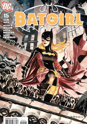
With Bruce Wayne back at the head of the table in Batman, it looks like it’s finally time for the whole slew of related titles to move on with their lives and get back to business as usual. Of course, that’s not entirely a new course for Batgirl, which has already been dancing to its own tune for a few months. While Dick, Tim, Alfred and company were off searching for Bruce and trying their damnedest to fill his shoes, Stephanie has been gaining experience, both in her pointy-eared nightware and her civvies. Now that the extended family around her is finally nearing some form of solidarity, she’s in a great position to really reap the benefits of that relationship. Of course, she’s something of a work in progress.

Bryan Q. Miller is still setting up shop on Batgirl, establishing characters, settings and dilemmas with every new issue, but the groundwork he’s laid thus far has the book set on a firm, whimsical course with a solid, well-rounded lead at the center of it all. As a protagonist, Stephanie is far from the typical caped crusader. Where the rest of her comrades are products of the cookie-cutter school of the slick, the quick and the grim, Steph is more vocal and aloof. The grit teeth, clenched fists and spooky shadows that have become the trademarks of the Wayne family are never far from sight, but they’re often balanced with a low-key character moment over the dinner table or an off-the-cuff remark that reminds us of that missing mental toughness. Where Bruce and company are all-business, all the time, Stephanie’s still an occasionally flaky, almost-average girl feeling her way through one extraordinary situation after another.

Issue fifteen marks the debut of new ongoing artist Dustin Nguyen, a name which should carry some weight among dedicated Dark Knight fanatics. In between twin stints on The Authority, Nguyen has spent time on Batman, Detective Comics and Streets of Gotham, with each run remembered fondly by the die-hards. His work here is a direct continuation of those preceding stops, slightly skewed to match the more upbeat, playful tone of this series. Though this is his first visit with Stephanie’s crew, his work with the lot is so solid and consistent it’s already like he’s known them for years. Nguyen’s artwork is nicely framed and impressively complete; he never skimps on a background or trivial detail, and the simple, crisp style he employs focuses on efficiently moving the story along to its next stop. He’s a fine addition to the series, with the kind of name recognition to attract new readers and the quality of work to keep them around for a while.

If you’re looking for a good time to jump on-board with your first Bat-title, Batgirl #15 is an excellent opportunity. Not only are the first three pages dedicated to a quick, easy-to-skim summary of the entirety of Batman’s history, but the lack of deep continuity and more open, approachable nature of the primary character makes this issue excessively easy to slide right into and start enjoying right away. It’s not quite as deep as its stable-mates, but that’s responsible for a lot of its charm. Borrow it.

On a scale of 1 to 10, where 1 is poor and 10 is amazing...
Overall Score: 7

Batman: The Return of Bruce Wayne #6

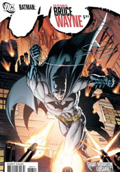
As it turns out, Bruce Wayne was never really dead. Though his body appeared limp, drained and devoid of life after taking a point-blank blast from Darkseid’s Omega Beams in Final Crisis, in actuality Bruce’s spirit had been blasted out of more than just his skin. Awakening at the dawn of humanity with no memory of the battle, Wayne had also been blown through time and space in some sort of ridiculously convoluted master plan to gather cosmic energy and destroy every modicum of life as we know it.

I’m sure Darkseid imagined it as a sort of insult-to-injury kind of situation: the JLA rescues one of their founding members who had been lost in various states of prehistory, they all enjoy a good laugh and a series of pats on the back, and then Wayne goes kablooey at the after-party and destroys all consciousness on the planet. At any rate, Bruce (being the galactic-level detective that he is) figured out the big plan and this issue represents his final efforts to thwart it and make the bad guy feel all pouty and defeated off in the corner somewhere.

It’s been my experience that Grant Morrison is an exceptionally hit-and-miss writer. When he’s in “hit” mode, he not only knocks the ball out of the park, he sends the sucker off into another arena altogether. We3, New X-Men and All-Star Superman are all fine examples of the very best the medium can deliver, all-world material through and through. When he steers his train of thought off the path of the conventional, though, it can be a bona fide disaster. The man has a knack for getting caught up in high concepts, jagged dialog and lengthy, elaborate explanations that only serve to confuse. Some consider this style of work to be among his very best, ripe with hidden meanings, thoughtful undercurrents and weighty theories. Personally, I see them as an infuriatingly inefficient means to conveying his ideas. Either way, The Return of Bruce Wayne #6 has dashes of both. The primary narrative of the Justice League, arriving at the restaurant at the end of the universe to rescue their lost comrade, is married at the hip to a series of wacky, verbose statements and observations about the whole of recorded history, the role of a set of simple minded robotic record-keepers and the futility of changing one’s fate from the precipice of time itself. In short, it’s both literally and figuratively all over the place.

That means the issue’s artists, Lee Garbett and Pere Perez, had their work cut out for them. Dodging word balloons at every corner, working with increasingly abstract concepts and visual demands as the issue wears on, the duo still manages a mostly competent contribution. Their take on a cold-faced hybrid Wayne-cyborg at the story’s peak is appropriately chilling and disturbing, and the two deal with an obscenely large cast of characters without losing sight of who each and every one of them are. Illustrating this issue could not have been an easy task, and while their artwork isn’t on the same level as, say, Frank Quitely, they manage to tell Morrison’s story admirably without sacrificing their own identities to the sea of ideas.

While The Return of Bruce Wayne won’t be going down on my list of favorites, I have to admit I appreciate Morrison’s effort and ingenuity. Tackling the root of what makes Batman who he is, then emerging from the other side with not just a clear-cut ending in sight but a genuine revelation, well, that’s one hell of a tall order. My complaint lies more with the author’s means of arriving at that natural, appropriate finale than the conclusion itself. Working through this issue was like walking through a thick patch of swampland weeds: difficult, maddening and painfully slow-moving. It’s a relief to come out the other side, but I’m still not really sure it needed to be such a struggle to get there. It's worthy of a flip through, at any rate.

On a scale of 1 to 10, where 1 is poor and 10 is amazing...
Overall Score: 4.5

Kick-Ass 2 #1

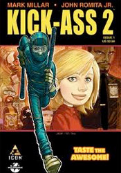
What could there possibly be to dislike about a series that invites us to passionately "taste the awesome" right there on the front cover? Yes, Mark Millar and John Romita Jr. are back in the saddle, resuming the saga of the miniscule home grown superhero wannabe, Kick-Ass, in their own inimitable way.

This new series picks up an indiscriminately short time after the conclusion of the first. The basic premise is still the same: nerdy kid wants to become a superhero, buys a jumpsuit and nunchucks online, rushes out to the streets and quickly discovers that he’s in over his head. Minus the few casualties of the first series, the cast is also virtually unchanged. Dave, the title character, is still a comic-obsessed geek-by-day and a punishment-absorbing random crime fighter in the evenings. Mindy (aka Hit-Girl), the potty-mouthed scene-stealer from the second act of the original series, has become a part of police detective Marcus Williams’s family and secretly begun training Kick-Ass as her sidekick. The rest of the supporting cast is still along for the ride, too: Dave’s arch-nemesis the Red Mist, his geeky high school running buddies, the longtime object of his lust, Katie… it’s as close to a return to normalcy as the series could ever really achieve.

In practice, that quest for a reassuring starting point actually works against the book’s identity. A lot of the charm of that first run was in the unusually quick pace it managed to keep up from the very first issue. There was a constant flavor of wonder mixed with adrenaline, a real sense that the cast was walking along a tightrope on every page. That’s missing from this issue, where the theme of the day seems to be illustrating just how commonplace a back-alley brawl has already become for these guys. Millar grants us a few genuinely amusing moments in the dialog, generally any time Dave’s fanboy civilian pals are on the page, but on the large this issue is strictly business – cleaning up the lingering mess, setting the pins back up and giving us a peek at what’s barreling down the alley to knock them all down again.

Moving forward with this series minus co-creator John Romita Jr. would have been a mistake. His distinctive artwork had just as much to do with establishing these characters and their world as the way they were written, so it’s great to see him back at the reigns for the follow-up. Bearing that in mind, Romita’s customary attention to detail and sharp, polished compositions aren’t up to his usual level in this issue. JRJr’s still got a firm grasp on Kick-Ass himself, a rail-thin kid stuffed into a jumpsuit that’s still somehow too small for him, but there’s something off about the rest of the issue’s occupants. Many of them seem over-simplified and unusually proportioned, a flaw that’s particularly noticeable when Mindy appears to sprout a giant Barbie doll head late in the issue. It’s unquestionably Romita, so take that for what it’s worth, but it’s also not the most complete effort I’ve ever seen him deliver.

The first issue of Dave Lizewski’s second adventure is a relatively passive one. It’s nice to check in with so many of the characters that provided gasoline for the fire of the first series, but it feels odd to see so many of them relegated to mere business as usual. Every great adventure begins with a single step, as they say, but let’s hope the next chapter speeds us up to a healthy jog. Borrow it.

On a scale of 1 to 10, where 1 is poor and 10 is amazing...
Overall Score: 7

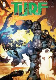
Turf #3

As far as the basic premise goes, you’ll have to look far and wide to find another series even remotely like Turf. Mixing equal dashes of period piece, crime lifestyle, horror, monster movie cliches, aliens and science fiction, the series bridges several genres for the very first time, perhaps, anywhere. That it can maintain each and every one of them while still managing to deliver a somewhat decipherable narration is nothing short of miraculous.

Writer Jonathan Ross seems to know exactly what he’s after, though, and that certainty and determined conviction allows the series itself to become something entirely distinct, even forgetting the broad range of influences and directions it embodies. It is, unapologetically, its own beast, and for that reason alone it’ll turn off some readers. Even followers with a more open-minded perspective of multi-genre concepts may have some difficulty dealing with Ross’s frequent leaps from one scenario to the next. We’re introduced to new characters with every turn of the page, with changes of scenery occurring every bit as regularly. It’s a tale that might just be too large for its own good, but with such a vast collection of characters, situations and conflicts also comes considerable depth and the promise that, no matter their preference, there’s a story for everyone here.

With a strict, realistic style in the same vein as Alex Maleev and Sean Phillips, Tommy Lee Edwards works the majority of his magic in the incredibly detailed backgrounds and deep black swaths of shadow that envelope most of the book’s panels. He’s a perfect fit when the storyline leans in a more horrific direction, slightly less so when the subject veers towards science fiction. Victorian candles, cultists wearing dark gowns, filthy gumshoes and mysterious well-dressed men are right at home in his artwork – bright exoskeletons and laser blasts, not quite so much. Fortunately enough, the vast majority of this issue takes place in prohibition-era New York, with only fleeting glances beyond the stratosphere. In that dated domestic setting, Edwards’s artwork absolutely sings.

On the surface, this just seems like an anthology of unrelated side-stories set in the same bizarre world, but dig deep enough and you’ll find a sense of connection that holds the entire issue together. It’s not a particularly energetic read, nor is it something that comes quickly into focus, but once it clicks, you’ll realize just how complex and sharp Turf’s story really is. That breadth of scale is both a blessing and a curse, though, for as much as it adds in the long run, it takes away on the short term. The multitude of layers, themes, new faces and conflicting directions make the task of deciphering and enjoying this issue a daunting one, but also incredibly rewarding given a dedicated investment on the reader’s part. Gorgeous artwork, challenging writing and an ambitious subject make this one worth buying.

On a scale of 1 to 10, where 1 is poor and 10 is amazing...
Overall Score: 9