Monday, August 29, 2011

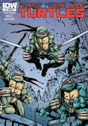
Teenage Mutant Ninja Turtles (2011) #1

With no less than eight different titles in its past, each bearing their own unique set of continuity implications, one might think the ship has sailed on ever truly rebooting the famed TMNT license. And, considering the somewhat speckled public reaction to the turtles' animated relaunch efforts, the timing of another fresh take might be considered suspect as well. However, considering the tidal wave of responsibilities associated with the franchise which forced co-creators Kevin Eastman and Peter Laird to abandon their initial run very early in its publication lifespan, perhaps those recent bumps in the road are a blessing in disguise. After all, without a hundred different licensing opportunities clouding its vision, the timing could finally be right for the book’s original promise to shine brightly once again.

All of that sounds reasonable enough, anyway.

In practice, it’s a total flop. Eastman’s return to the property that made him famous is a lifeless reinvention, a gruelingly dated “new” direction with a strange set of priorities. In rushing to poke fun at the exaggerations of the original series, particularly those that were most played up in the classic Saturday morning cartoon, the writing comes off as jaded and bitter, a classic knee-jerk overreaction. Where Eastman is looking for a sharp, biting edge, it feels instead like he’s taking target practice at point-blank distances, at times even disrespecting the very core of the characters themselves.

The issue’s plot structure is a total mess, too. After dedicating its entire front end to a brainless, baseless fight scene, the narration leaps to an equally futile new point of genesis for the fearsome foursome. Without giving anything away, I’ll note that the axis of their origin has shifted from the classic “discarded toxic waste in the sewers” to something much more generic and overplayed. And, considering the amount of characters that owe their livelihoods to the presence of radioactive materials, that’s really saying something. Surrounding the four infant turtles is a cast of familiar names in reinterpreted roles. April, Splinter, Baxter Stockman, Krang, Casey Jones – they’re all here, but they’ve each been fundamentally altered for no discernible purpose beyond the capacity to say it’s fresh material.

With Peter Laird declining to participate in the new series and Eastman content with co-writing and layout credits, the chore of actually illustrating this issue falls to up-and-comer Dan Duncan, fresh off a run on Image’s creator-owned The Butler. Duncan’s loose, frenetic work shows a ton of potential elsewhere, particularly on his personal blog and DeviantArt page, but within the confines of TMNT it’s disorganized, constantly muddied and completely forgettable. I’m not sure if the blame can be placed on the pressures of such a high profile gig, the presence of Eastman’s guiding layouts or a tight deadline, but it’s a total miss in every aspect from a guy who seemed to be a surefire prospect.

In no uncertain terms, this isn’t an issue to even entertain opening. If the plot alone wasn’t enough to leave me squinting my eyes and slowly shaking my head, the artwork would’ve straight-up chased me out of town. A desperate cash-in on a dead property, it captures neither the spirit nor the adventurous nature of the original. Some franchises are best left to the crows. Skip it.

On a scale of 1 to 10, where 1 is poor and 10 is amazing...
Overall Score: 1

Monday, August 15, 2011

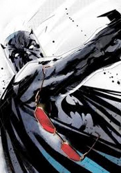
Detective Comics #881

An interesting thing about children – sometimes they don't fall far from the tree, as the old adage says, but sometimes that fruit lands on a slope and rolls into dark, unfamiliar territory. Such is the case with Commissioner James Gordon, whose biological son and adopted daughter are the figureheads of this month's drama. While Barbara has always embraced the path of the righteous, fighting crime as both Batgirl and Oracle, James Junior has traveled an entirely different route that's culminated in stays with Arkham Asylum and fraternizations with many of Gotham's most colorful enemies.

Gordon's son is different from the rogues Batman has traditionally stared down without a flinch. He doesn't believe in cronies, mindless brawls or elaborate costumes – truly his father's offspring, he relies on cool logic and calculated moves to solve the problems he perceives before him. That makes him a nice change of pace from the usual business, with a few inherent personal feelings of abandonment and jealousy as they relate to his father and sister only adding fuel to the fire. The man is crazy, criminally so, but he's not stupid and that's the kind of enemy that's often the most dangerous.

It's that same careful balance that writer Scott Snyder hopes to capitalize on, but I found the accompanying plot to be a bit too heavy on the build-up and shockingly light on the climax. More than half the issue is dedicated to James Junior's overly verbose explanation of his master plans, a character flaw that even poor captive Barbara can't help but point out, and his lack of an effective follow-through left me wondering how brilliant he actually was. Snyder's heart is in the right place, and on a few occasions he provides a rare, empathic peek into the mind of a psychotically disturbed individual, but the issue's dialog repeats itself fairly regularly and the story's hurried conclusion does nothing to address the deeper issues he hints at. In the end it's just another day at the office masquerading as something more substantial.

The artwork, provided by the team of Jock and Francesco Francavilla, varies from moody and unsettling to chaotic and twisted. Each artist works with a light touch; showing restraint and a solid eye for composition, they both manage to do more with less. There's a pretty clear moment about two-thirds of the way through the issue where the style shifts and it's obvious that we've changed artists, but the styles compliment one another decently enough that such a shakeup isn't unsettling. There's really nothing wrong with the way this issue looks, but it doesn't exactly leap up and take control of the reader's imagination, either - it's suitable but not spectacular.

It's clear from the way he writes the character that Scott Snyder understands the need for a difference between Bruce Wayne's Batman and Dick Grayson's. It's important enough that he even grants the issue's villain a few panels on the subject. There's a rare opportunity to redefine this character at hand, but it's going to take something with a bit more daring than this month's issue to get us there. In a few select panels, Snyder scratches the surface of something with potential, but by the time he's reached the back cover, those glimpses remain just that - peeks of promise that are left unparsed. It's a perfectly decent issue, one that inches the greater plot forward a tiny bit, but not exactly required reading. Borrow it to stay current, just don't expect to come back to it any time soon.

On a scale of 1 to 10, where 1 is poor and 10 is amazing...
Overall Score: 7

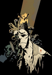
Hellboy: The Fury #3

With nearly twenty years of stories behind him, Mike Mignola's Hellboy is still moving forward with a voracious appetite, investigating the supernatural issues no one else dares to touch. On this adventure, though, he very well may have bitten off more than he can chew. That's no hyperbole either, as the scale and stakes have never been higher, both for Hellboy and the planet itself. Staring down the Queen of Witches, Hellboy's aim is nothing short of circumventing the end of civilization as we know it. An extinction event on par with the fall of the dinosaurs is nearly upon us, and the only thing standing between it and us is the little red demon with a giant, gloved right hand.

This penultimate chapter for both mini-series and character is heavy on the atmosphere but still exceptionally easy to read. Mike Mignola's writing has come a long way since he teamed with John Byrne back in Hellboy's very first adventure, and the way he calmly lets major events play out without an excess of narration or explanation is just further proof of his graduation from writer-artist to genuine storyteller. It's an extremely well-crafted issue that efficiently covers the full gamut of emotions, then leaves its audience wide-eyed and uncertain about where things can possibly go next. While he may not be providing the artwork any longer, Mignola's writing is still masterfully streamlined and simple, and he trusts his companion implicitly enough to leave the majority of the storytelling to the visuals.

Of course, the real question for any artist who dares to take up the mantle on Hellboy is how their work compares to Mignola's original run with the character. And while no less than a dozen different artists have offered their take on his signature creation, none have stuck around nearly as long as Duncan Fegredo. Since his first run with the series in 2007's Darkness Calls, Fegredo has carved a spot for himself in the Hellboy mythos, and with good reason - his style is an extremely close approximation of Mignola's. Truth be told, aside from their differing takes on common human characters, it's difficult to distinguish the two at all, particularly when it comes to the titular character. Fegredo's work gets lots of room to stretch its legs this month, with a gigantic fight scene spanning most of the issue and macabre gothic accents enlivening the backgrounds, and he responds in fantastic form. It's a genuinely gorgeous issue that takes on a wide variety of emotions, implications and premonitions, while still maintaining that eerie sense of haunted reality that Mignola has always brought to the table. The big man himself couldn't have done it any better.

It's a rarity in the comics world, or truly in any form of entertainment, for promises of "this changes everything" to truly deliver. Either editorial interference, reluctance on the part of the creators or desperate, poorly concocted new directions hamper such examples with very few exceptions. Not so with Hellboy: The Fury. It's a concluding chapter worth remembering, a storytelling decision born not of any perceived need to shake things up. It's the natural progression of a yarn that's been spinning for some time, and an especially effective one at that. Buy it.

On a scale of 1 to 10, where 1 is poor and 10 is amazing...
Overall Score: 9.5

Monday, August 8, 2011

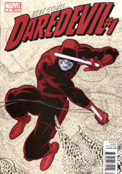
Daredevil #1

It was bound to happen sooner or later: when the primary facet of a character's personality is the way he handles a series of increasingly gloomy situations, eventually there's going to come a time when the storm has to break. A hero can either resign himself to his fate and curl up in the gutter or seek to reverse his fortunes with a new outlook on life – and I'll give you one guess which direction Matt Murdock has chosen.

In the wake of Shadowland, where Matt truly dove off the deep end and embraced his dark side, this sudden about-face is like watching a different man beneath familiar skin. Mark Waid, no stranger to the happy-go-lucky hero, handles the change of pace more than adequately, but it's going to be difficult for long-term fans of the series to accept a shift in tone so drastic. Fortunately for the new book's sake, Waid's take is brimming with fresh ideas relating to the hero's powers and his place in the new Marvel Universe – seeing them in action for the first time is a crisp, refreshing sensation that's tough to turn away from. I'm just not sure if there's a reasonable way to explain away Matt's transition from the demon-possessed master of a murderous ninja sect to a kiss-stealing, tune-whistling, head-in-the-clouds optimist.

Fortunately, Waid hasn't completely abandoned the wealth of storytelling that preceded him. The majority of New York still believes Murdock is Daredevil, an accusation Matt jokingly deflects more than once this month, and the law practice isn't exactly running smoothly following his lengthy sabbatical. There's still plenty of thunder on the horizon, but for the time being it's grinnin' 1970s Murdock at the wheel and not the self-absorbed, violently angry newer model.

Paolo Rivera's artwork serves as an appropriate compliment to the shift in tone and texture. Following a long line of gritty, darkly realistic pencil pushers, his lighter touch and bright, airy rendition of the city is a breath of fresh air. With the reality-altering villain Spot to play around with and an original perspective on Matt's oft-documented “radar vision” in his arsenal, Rivera makes his first showing a strong one. His work may not be as moody nor as flashy as his predecessors', but it's no less fitting to the style of storytelling it accompanies and on the two or three occasions his gets to stretch his legs with a splash page, it really hits the mark.

Coming straight from the mouth of a longtime reader, the new Daredevil can be considered a success, but not an unbridled one. The bits of promise that Mark Waid shows in his writing are the first hints of a proposed “new direction” that really feels new, despite the similar promises made by each new writer to take the reigns since Frank Miller himself. It's an enterprising new angle that's sure to alienate some readers, but should ultimately be for the best as far as the character is concerned. Nobody should lose all the time. Not even Matt Murdock. Borrow it.

On a scale of 1 to 10, where 1 is poor and 10 is amazing...
Overall Score: 7.5

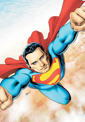
Superman #714

With their days numbered thanks to the publisher-wide relaunch that arrives later this summer, one could easily come to the conclusion that the air's been let out of many of DC's upper-tier books. And I'd love to tell you differently, that the creative teams in question are using the impending shake-up as motivation to tell the stories they've always wanted to tell, not a death sentence looming directly overhead, but this month's issue of Superman serves as no such proof.

J. Michael Straczynski's storyline this month feels like a limp-wristed placeholder without any purpose beyond keeping the racks supplied with a fresh cover. It's as run of the mill as they come, almost insulting in its reluctance to move forward with any sense of purpose or revelation. Worse, it retrofits recent storylines to fit a cheap, cop-out of a payoff with neither rhyme nor reason.

This month's issue has Superman at his preachy worst, bleeding heart in one hand and random Kryptonian plot device in the other. It's one retreaded flashback after another, serving no significant purpose beyond reminding the readers once again of where the character has been and giving Supes a reason to don a goofy, ill-timed grin in the middle of a brawl. It's a series of narrative thought bubbles spoken aloud to no one in particular. It's every bad stereotype I've come to associate with the character, but always hoped could be disproven. It's a rotten waste of time issue, and I can't just relegate that criticism to the storytelling.

Jamal Igle makes for a spectacular background artist, but his foreground work could do with a major overhaul. Under Igle's watch, Superman himself moves clumsily, wears a series of odd, over-rendered facial expressions, and looks like a genuinely dated character out-of-place with modern society. Accompanied by Marcelo Maiolo's harsh, drastic color choices, though, his efforts seem even worse. Amidst an excess of contrast and a reckless amount of detail, this month's visuals are difficult to decipher at best and downright ugly at worst. It's the tag team from hell, and they're double-teaming your eyeballs behind the referee's back.

Naturally, a bad plot, terrible script, overwrought pencils and overbearing colors don't often come together to produce a worthwhile finished product, and in that regard Superman #714 performs no miracles. It's a burden of an issue, traumatic to the bitter end, and something I wouldn't loan to my worst enemies for fear of how far they'd have to reach to seek true retribution. An abysmal failure of a comic book, it proves that in some instances the great DC renumbering is something of a mercy kill. Skip it.

On a scale of 1 to 10, where 1 is poor and 10 is amazing...
Overall Score: 1