Monday, October 31, 2011

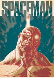
Spaceman #1

With a ten-year collaboration on the critically acclaimed 100 Bullets already under their belts, along with the preceding Jonny Double and a brief flirtation with mainstream waters in Batman, it's becoming pretty clear that Brian Azzarello and Eduardo Risso have a good thing going. Their latest effort, the nine-issue limited series Spaceman, signifies a triumphant return to the seedier type of creator-owned property that put the duo on the map. It's not 100 Bullets all over again - the two have little in common beyond dark overtones and each creator's unmistakable panache - but it's every bit as effective in its own way.

Azzarello's writing in this premiere already has a lot of meat. His vision of a pollution-smeared, technologically advanced future is as much a viable prediction as it is a fully functional backdrop for the tale he's got in store. While the poverty-ridden lower class (in which our protagonist counts himself a member) may enjoy the kind of astonishing personal technology that would make Apple blush, they do so in squalor and despair, beneath a muted gray skyline. While the local drug dealers now accept wireless debit cards, the dollar in the accounts they're pilfering effectively halves in value several times a week. Like many timeless sci-fi classics, Azzarello's climate marries modern concerns with a distant future that's just different enough from our own to remain a fantasy.

The primary storyline is just getting rolling by the time the back cover rolls into sight - par for the course where half-sized, budget-priced premiere issues are concerned - but already it's clear that there's plenty going on. There's something not quite human about the spaceman himself, who's never given a proper name, although he shows all the signs of just such a condition. He routinely gives in to vice, scarcely making enough time to earn the bucks for tomorrow's fix, and often fades off into memories (or are they daydreams) of an outer space lifestyle left far behind. This puzzle's pieces are twisting and turning with no obvious rhyme or reason at the moment, but if I look closely enough I can tell there's a gorgeous tapestry waiting to come together.

As usual, Eduardo Risso's artwork proves the perfect compliment to his partner's visions, no matter how elaborate. His clever use of perspective and carefully limited linework gives the landscape every bit of justice it deserves, while keeping the page cleanly navigable. His character designs, boiled down to the essence of each individual, are only further steps in that same direction. Our cast is easily identifiable by just the second page, and it's astonishing how much character Risso can imbue with only a few sharp strokes. His gritty, unwashed style makes no effort to conceal the world's warts, blemishes and shortcomings, which makes it a terrific match for the tone and nature of this kind of story.

Eventually these two may overstep their bounds, perhaps when they tire of dark skies, angry grimaces and gun barrels, but that's neither here nor now. Spaceman is another smash hit for the duo, brilliantly fleshed out but still quick, easy and entertaining to read. It's got instant, pulpy substance, what looks to be a twisting, turning central mystery and a dark, cloudy distant past that's screaming for further investigation. At full price this would've been worth a strong recommendation, but for a dollar it's criminal to leave it on the shelves. Buy it without a second thought - what have you got to lose?

On a scale of 1 to 10, where 1 is poor and 10 is amazing...
Overall Score: 9.5

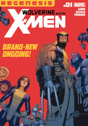
Wolverine and the X-Men #1

It's opening day for the rejuvenated Xavier school for mutants, and this time it's not just the underclassmen that are adjusting to a new environment. Following the events of Schism, Wolverine's found himself headmaster of the east coast squad, and he's appointed a faculty full of familiar faces. In further evidence of the cyclical nature of all things human, (or homo superior, as it were) many of your favorite X-Men alumni have returned to their old stomping grounds in an effort to help train and teach the next generation of mutant wonders.

Jason Aaron's plot is like a glimpse back to the heyday of the X-Men family, when life as a mutant wasn't all pomp and circumstance and the crew was certainly not above leaning back on a day off and having themselves a little fun. The character-driven central storyline hinges on a crucial visit from the Department of Education, who seem to have made up their minds about the facility before they've even stepped through the front door, and their decision to give the school a green or red light with the state commission. With the readers riding shotgun, Logan and Kitty - clearly uncomfortable in their new roles as grinnin' mouthpieces - do everything in their power to make the best of an inherently difficult situation and fail repeatedly in increasingly spectacular fashion.

It's a new trial for Logan, who's long been a lightning rod of controversy among hardcore fans for being so oversaturated and resistant to change. We've seen Wolverine as the warrior, the rebel, the bleeding heart and the father figure, but never as the calm, collected institutional leader. It's a role that's going to take a lot of getting used to, both for him and for us, but one Aaron seems to have a clear, intelligent plan for. With Shadowcat at his side for counsel and a staff of close friends providing further guidance, Logan will have every opportunity to make this work, but something tells me some old habits die too hard for everything to go too smoothly. In fact, those inevitable blow-ups are what I'm looking forward to the most. When was the last time Professor X threatened to disembowel a misbehaving student?

Returning to the Xavier landscape yet again, respected journeyman Chris Bachalo delivers a special blend of character, informality and familiarity to the both student and teacher. Bachalo's had his ups and downs over the years, with tight deadlines occasionally leading to some sloppy efforts, but when he's motivated his work is among the industry's very best. Concerned readers can quit worrying, because he's brought his A-Game this month and the subject matter lends itself perfectly to his strengths. Featuring a wild variety of body types to play with, a few staggering two-page spreads and an excess of playful, body language-infused dialog, Bachalo's personality fits this setting like a glove.

It's been quite a while since I've been so impressed with a debut issue featuring a prominent X on its cover. Amidst so many years of crossover events, landscape-changing mega revelations, in-fighting and relationship drama, it's a real breath of fresh air to see these characters finally letting their guards down a bit and just being themselves. Jason Aaron's storyline is simple, deliberate and enjoyable, a basic premise that succeeds wholly because the cast is so diverse and colorful. Pair that with a lively, enthusiastic tone and a solid, appropriate turn from Chris Bachalo and you've got my attention. Where we go from here is anyone's guess. Buy it.

On a scale of 1 to 10, where 1 is poor and 10 is amazing...
Overall Score: 9

Monday, September 26, 2011

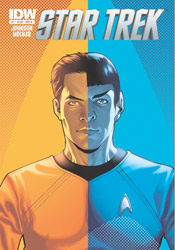
Star Trek (2011) #1

Confidence is a trait James Kirk never seemed to lack in Star Trek's recent film reboot, but for that quality to truly manifest itself into something meaningful, it requires the respect and loyalty of one's peers. That's something we never had a chance to see in play during the squad's first adventure, as Kirk spent the entire tale proving his worth and, ultimately, staking a claim to the captain's chair. When we rejoin the cast in this month's Star Trek #1, and presumably in the forthcoming sequel, Kirk has already completed his transition from ragged potential leader to proven, venerable commander.

In some respects that's a good thing; leaving the origin chapter behind can only open new doors to adventure. Eventually the core group members have to embrace their responsibilities and push forward as a bright, versatile young unit. However, it also runs plenty of risks, some of which aren't so deftly avoided in this very issue. When Kirk, Spock and Bones step away from the bridge to discuss a sudden threat to the Enterprise, for example, the conversation could just as easily have come from the mouths of Shatner, Nimoy and Kelley as their fresh-faced counterparts. They've already slid too easily into the static, classical roles associated with each character, and the last thing the fledgling crew should be doing at this point is getting too comfortable on the bridge. After all, what's the point of taking a new direction if it's just going to wind up in exactly the same place as before?

I suppose it's inevitable that some amount of revisitation is in order for such a long running, well-regarded series. The plot of this month's issue, notably, is lifted almost directly from an episode of The Next Generation. What's to stop the movie franchise from going a similar route and resurrecting Khan in the near future? And who's to say they'd be wrong to do so? My concern is that too much reverence is paid to the original tales at the cost of ingenuity and fresh thinking. It's a very thin line between the two, but I left this issue with the impression that it wound up standing on the wrong side. Excessive familiarity does breed contempt, after all.

Fortunately, the artwork doesn't subscribe to quite the same mantra as the storytelling. Stephen Molnar's linework is loose and playful, more concerned with gesture and character than rigid technical proficiency. Though he does occasionally tread a bit too near the uncanny valley in some of his interpretations of the actors behind each role, those transgressions are usually tempered by a crisp, clean environment and a quick return to form in the next panel. Molnar doesn't get much liberty to light up the page in this bookful of board rooms and staff meetings, but he does manage to keep things fresh and interesting all the same.

Sadly, as slightly more than a passing fan of the Trek mythos myself, I found the new troupe's debut issue redundant and actionless, a safe reinterpretation of a classic story that never manages to shift out of first gear. Though forthcoming issues may promise more in the way of exploration and extraterrestrial encounters, the tone that's been set in this initial adventure is a long ways from reaching the potential set by its celluloid predecessor. Die-hard Trekkies might enjoy it as an appetizer for things yet to come, but even they will find plenty of minor ticks and glitches to pick away at. Flip through it.

On a scale of 1 to 10, where 1 is poor and 10 is amazing...
Overall Score: 4

Monday, September 5, 2011

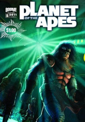
Planet of the Apes #5

When this issue rolled into my review box, I momentarily paused to consider how such a lucrative franchise had managed to avoid this medium for so long. After all, the intelligent blend of sci-fi and fantasy seen in the Apes seres has typically fared very well in comic books, and without any concern for prosthetics and special effects to get in the way, the concepts and ideas behind the story itself could be reasonably expected to succeed. Well, a quick Wikipedia search later and the facts stand revealed: the 2011 edition is far from the first adaptation attempted with this license. Since the original film landed in theaters, no less than a dozen different publishers have tried their hand at the simian landscape, including several mangas, a three-year run at Marvel and a Dark Horse tie-in to the 2001 Tim Burton-helmed failed relaunch. Learn something new every day.

Despite that long tradition of ill repute, however, Daryl Gregory's new interpretation might just wind up being the one that finally sticks. Like this year's big screen relaunch, it seems like Gregory can see beyond the masks, make-up and long-lasting catchphrases of the first film to the enduring message buried beneath. On the surface it's a sci-fi adventure with apemen riding saddled horses and humans thrashing wildly in their cages, but beneath that lies a complex, relevant message about segregation, society and racism of all shapes and sizes. Not only does the new series meet these issues head-on, but it does so with a hefty, diverse cast, a large-scale primary storyline and dozens of intelligent minor plot threads. And though this issue can at times be intimidating for new readers, its pace is deliberate enough for fresh faces to catch up quickly without feeling completely overwhelmed.

Gregory's found himself a great match in Carlos Magno, too, whose sharp, vivid artwork is all the proof at-a-glance viewers need to tell Boom! Studios is serious about this series. Like former Wildstorm golden boy Travis Charest, Magno's work is richly meticulous, but sparingly so. Both artists speak volumes in the details of each panel, balancing the heavier portions of a layout with effective, strategic use of negative space. Naturally, Magno's contribution doesn't entirely benefit from such comparisons, as Charest's work is more evenly stylized and poetic, but the potential for similar growth is there. With a bit more finesse and a few more years at the table, Carlos could easily grow into a formidable talent. As it is, his artwork is a bargain for the $1 asking price.

That last statement holds true for the full issue, as well. At a standard price, this effort would have received a firm "borrow"”" recommendation and a few words about its potential to move into my pull list somewhere down the line. At less than a third the price of most mainstream comics, though, it easily makes the leap up a level, making it a solid buy. The moody, cinema-influenced artwork might get the first hooks in, but it's the smart, multifaceted storytelling that'll bring readers back for more.

On a scale of 1 to 10, where 1 is poor and 10 is amazing...
Overall Score: 8

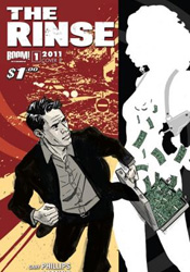
The Rinse #1

With no shortage of crime drama on the shelves today, it can be difficult for new books in the genre to make their mark, particularly ones without the benefit of a big-name creative team. In the case of The Rinse, new from Boom! Studios, the goal is to overcome both issues by shedding light on a heretofore under-explored aspect of the shady man's business: the laundering, or "rinsing," of dirty money into nice clean, suspicion-free taxable income. This issue's man of the hour, one Jeff Sinclair, became the best there is at what he does through careful dealings, a razor-sharp mind for the business and more than a few well-placed punches and kicks. He's the under the table high roller's best friend, with a playboy's gift of gab and an attitude like a pulp private eye.

Although we're joining Sinclair at the top of his game, with a wealth of experience and a bed of hundred dollar bills beneath him, that doesn't mean the first issue doesn't deliver its share of elaboration. In fact, the book's half over by the time Jeff removes the training wheels, leaves the paint-by-the-numbers explanations behind and gets on with the story developments. Thing is, for all the effort author Gary Phillips dedicates to explaining the various hoops Jeff jumps through on any given day, I didn't completely buy into the validity of his work. It all seems too straightforward, too effortless and too transparent to escape the eye of his enemies. It's a trend that carries over into the forward-gazing plot threads that stretch their legs in the latter half of this issue, where again our rinser's interactions seem far too on-the-surface to be credible. While the charm of a good noir tale is often in the hints and clues that are left unspoken, The Rinse may as well have spelled everything out on a series of flash cards.

Marc Laming's artwork is a curious choice for such a book. His bright, bubbly style and grinning, happy-go-lucky characterizations seem at odds with the street smart tone of the narrator and the seedy underworld he occupies, like a hot dog stand set up inside the front door of a ritzy club. Laming's best work is in establishing shots, where he showcases a slick, minimal knack for rendering vivid landscapes and bustling city street corners - throw an important character or some action into the mix and he gets tripped up. The mismatch of styles isn't helped by Darrin Moore's shiny, polished color efforts. With a subtle, sleazy palette at play, much of the artwork's shortcomings could have been neutralized. Moore's overuse of warm, friendly shades just drives it further in the wrong direction.

For all the small things this issue gets right - a calm, cool lead, an original take on a crowded genre - there are another dozen larger issues it gets helplessly wrong. Hammy, vanilla dialog is a cardinal sin in a book like this one, but under the right circumstances that can be forgiven. A blunt, predictable plot would take a bit more work to compensate for. Roll all of that up with a badly paired artist, though, and you've got a full platter of problems. Not even a discounted cover price can get this one where it needs to be. Skip it.

On a scale of 1 to 10, where 1 is poor and 10 is amazing...
Overall Score: 3

Monday, August 29, 2011

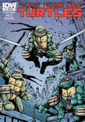
Teenage Mutant Ninja Turtles (2011) #1

With no less than eight different titles in its past, each bearing their own unique set of continuity implications, one might think the ship has sailed on ever truly rebooting the famed TMNT license. And, considering the somewhat speckled public reaction to the turtles' animated relaunch efforts, the timing of another fresh take might be considered suspect as well. However, considering the tidal wave of responsibilities associated with the franchise which forced co-creators Kevin Eastman and Peter Laird to abandon their initial run very early in its publication lifespan, perhaps those recent bumps in the road are a blessing in disguise. After all, without a hundred different licensing opportunities clouding its vision, the timing could finally be right for the book’s original promise to shine brightly once again.

All of that sounds reasonable enough, anyway.

In practice, it’s a total flop. Eastman’s return to the property that made him famous is a lifeless reinvention, a gruelingly dated “new” direction with a strange set of priorities. In rushing to poke fun at the exaggerations of the original series, particularly those that were most played up in the classic Saturday morning cartoon, the writing comes off as jaded and bitter, a classic knee-jerk overreaction. Where Eastman is looking for a sharp, biting edge, it feels instead like he’s taking target practice at point-blank distances, at times even disrespecting the very core of the characters themselves.

The issue’s plot structure is a total mess, too. After dedicating its entire front end to a brainless, baseless fight scene, the narration leaps to an equally futile new point of genesis for the fearsome foursome. Without giving anything away, I’ll note that the axis of their origin has shifted from the classic “discarded toxic waste in the sewers” to something much more generic and overplayed. And, considering the amount of characters that owe their livelihoods to the presence of radioactive materials, that’s really saying something. Surrounding the four infant turtles is a cast of familiar names in reinterpreted roles. April, Splinter, Baxter Stockman, Krang, Casey Jones – they’re all here, but they’ve each been fundamentally altered for no discernible purpose beyond the capacity to say it’s fresh material.

With Peter Laird declining to participate in the new series and Eastman content with co-writing and layout credits, the chore of actually illustrating this issue falls to up-and-comer Dan Duncan, fresh off a run on Image’s creator-owned The Butler. Duncan’s loose, frenetic work shows a ton of potential elsewhere, particularly on his personal blog and DeviantArt page, but within the confines of TMNT it’s disorganized, constantly muddied and completely forgettable. I’m not sure if the blame can be placed on the pressures of such a high profile gig, the presence of Eastman’s guiding layouts or a tight deadline, but it’s a total miss in every aspect from a guy who seemed to be a surefire prospect.

In no uncertain terms, this isn’t an issue to even entertain opening. If the plot alone wasn’t enough to leave me squinting my eyes and slowly shaking my head, the artwork would’ve straight-up chased me out of town. A desperate cash-in on a dead property, it captures neither the spirit nor the adventurous nature of the original. Some franchises are best left to the crows. Skip it.

On a scale of 1 to 10, where 1 is poor and 10 is amazing...
Overall Score: 1

Monday, August 15, 2011

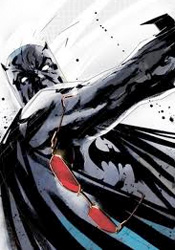
Detective Comics #881

An interesting thing about children – sometimes they don't fall far from the tree, as the old adage says, but sometimes that fruit lands on a slope and rolls into dark, unfamiliar territory. Such is the case with Commissioner James Gordon, whose biological son and adopted daughter are the figureheads of this month's drama. While Barbara has always embraced the path of the righteous, fighting crime as both Batgirl and Oracle, James Junior has traveled an entirely different route that's culminated in stays with Arkham Asylum and fraternizations with many of Gotham's most colorful enemies.

Gordon's son is different from the rogues Batman has traditionally stared down without a flinch. He doesn't believe in cronies, mindless brawls or elaborate costumes – truly his father's offspring, he relies on cool logic and calculated moves to solve the problems he perceives before him. That makes him a nice change of pace from the usual business, with a few inherent personal feelings of abandonment and jealousy as they relate to his father and sister only adding fuel to the fire. The man is crazy, criminally so, but he's not stupid and that's the kind of enemy that's often the most dangerous.

It's that same careful balance that writer Scott Snyder hopes to capitalize on, but I found the accompanying plot to be a bit too heavy on the build-up and shockingly light on the climax. More than half the issue is dedicated to James Junior's overly verbose explanation of his master plans, a character flaw that even poor captive Barbara can't help but point out, and his lack of an effective follow-through left me wondering how brilliant he actually was. Snyder's heart is in the right place, and on a few occasions he provides a rare, empathic peek into the mind of a psychotically disturbed individual, but the issue's dialog repeats itself fairly regularly and the story's hurried conclusion does nothing to address the deeper issues he hints at. In the end it's just another day at the office masquerading as something more substantial.

The artwork, provided by the team of Jock and Francesco Francavilla, varies from moody and unsettling to chaotic and twisted. Each artist works with a light touch; showing restraint and a solid eye for composition, they both manage to do more with less. There's a pretty clear moment about two-thirds of the way through the issue where the style shifts and it's obvious that we've changed artists, but the styles compliment one another decently enough that such a shakeup isn't unsettling. There's really nothing wrong with the way this issue looks, but it doesn't exactly leap up and take control of the reader's imagination, either - it's suitable but not spectacular.

It's clear from the way he writes the character that Scott Snyder understands the need for a difference between Bruce Wayne's Batman and Dick Grayson's. It's important enough that he even grants the issue's villain a few panels on the subject. There's a rare opportunity to redefine this character at hand, but it's going to take something with a bit more daring than this month's issue to get us there. In a few select panels, Snyder scratches the surface of something with potential, but by the time he's reached the back cover, those glimpses remain just that - peeks of promise that are left unparsed. It's a perfectly decent issue, one that inches the greater plot forward a tiny bit, but not exactly required reading. Borrow it to stay current, just don't expect to come back to it any time soon.

On a scale of 1 to 10, where 1 is poor and 10 is amazing...
Overall Score: 7