Monday, February 23, 2009

The Darkness #75

Nearly every artist and colorist still on-staff (and one or two outsiders) join regular writer Phil Hester this month for the anniversary-sized Darkness #75. If something smells fishy and you seem to remember issue #10 shipping just last month, don't worry– you haven't missed sixty-plus issues, Top Cow has merely renumbered the current series to match the combined issue count of the three volumes published since 1996.

In this stand-alone tale set in the distant future, there isn't much hope for the future of mankind. Pollution has grown so widespread, boundless clouds of smog have long since snuffed out any glimpse of sunlight, and for Jackie Estacado that makes for one hell of an advantage. When you're pulling strength from the shadows, a world wrapped in a persistent black shawl is your oyster.

Phil Hester's writing this month is impressive, both in concept and in execution. His musings on the climax of modern civilization and the end of the world are chilling, and the prose with which he delivers his narration is imaginative and vivid. We don't need to see the yellow foam that floats along the surface of this world's oceans, Hester has painted that picture for us himself, liberating the artwork to tell a separate, secondary story. Hester's vision of a world governed by Estacado is cold and unrelenting, just like his portrait of Jackie himself, so many years removed from his humanity. It's a grim, bleak future to match the title character's personality and the origin of his powers.

Despite the quality of Hester's writing, I found that some of the issue's magic is lost on the glut of different artists that were forced upon it. While the reckless jump from one extreme style to another makes sense in the brief flashback that takes place around the middle of this issue, the same can't be said for the awkward leaps from artist to artist in the midst of a single scene. This is especially problematic when Jackie himself makes his first appearance early in the issue, as his adversaries completely change wardrobe during the pause between pages. It's random and confusing; especially when the two sides begin warring and a nameless third party randomly jumps into the fray. Maybe regular readers will have a better idea of what's going on, but I'd have to imagine that the herky-jerky feeling of changing artists every three pages would put them off, too. There's some genuinely beautiful work here, but it always manages to get lost in the hustle to give way to the next creative team.

In marking an anniversary that's shaky at best and downright imaginary at worst, I think The Darkness wanted too badly to make an event of something that didn't really merit it. Phil Hester did his part, concocting a story deserving of such attention, but a cavalcade of artists and a dozen superfluous pages turn the whole thing sour. As a regular-sized issue with a steady artistic showing, this could've been a genuinely memorable one-off, but it's not an event unto itself. Borrow it – its shortcomings are distracting, but it's nevertheless a solid bit of story.

On a scale of 1 to 10, where 1 is poor and 10 is amazing...
Overall Score: 7

R.E.B.E.L.S. #1

While it's given the moniker of a team book, REBELS is really just a one-man show for Vril Doz, the arrogant jerk son of Brainiac. Although he's a terrific douchebag, the character has a certain charisma and charm about him that makes it tough to look away when he's on the page. Doz is never without a purpose and rarely lacking an accompanying verbal barb, which makes him constantly entertaining and effortlessly colorful. His back-and-forth with Supergirl this month is great, reminiscent of those rare occasions when Superman and Lex Luthor would unite to confront a common foe. Supergirl is so stiflingly naïve in contrast to Doz's intellect that his curt responses to her questions and comments provide some of the issue's best moments. You know he's just being a dick, but you'll still hold your breath waiting for the punchline every time she opens her mouth.

Although his cast is primarily rooted in the distant 31st century, writer Tony Bedard has plenty of fresh ideas that apply to the present-day DC universe, too. Using Supergirl's heat vision to burn data to a blank DVD, for example, might not be especially practical but it's an imaginative way to update an old character's power set without disturbing anything. Bedard is overflowing with such ideas, which makes the issue a real fresh read. Although he deals with some very intellectual ideas and characters, his writing is accessible, not daunting like you might expect.

Detective Comics and 2000AD veteran Andy Clarke is on board to provide artwork for the new series. Though I've found his previous showings to be rigid and postured, reminiscent of Greg Land, in REBELS it looks like he's trying something different. His efforts here are very fluid and natural, but still especially detailed – a mix of Travis Charest and Leinil Francis Yu. He tells a great story, with jaw-dropping freeze frames highlighting moments of action and subtle nuances thrown in to help keep the pace up during the moments in between. He's also responsible for furthering a lot of the characterization that's so crucial in a premiere issue, particularly that of Doz, the focal point of the book. His snide facial expressions, a constant mix of apathy and disdain, are a constant match for the tone of his dialog. Although Clarke doesn't exactly nail every character, (his Supergirl in particular leaves something to be desired) he does have a strong grip on the primary cast and his compositions as a whole are wonderful.

This issue keeps a brisk pace from cover to cover, throwing readers right into the action from the word go and never relenting until the last panel promises even bigger things on the horizon. It's a fine adventure, entertaining whether you're intimately familiar with the cast or the only thing you recognize is the shield on Supergirl's chest, and a fine initial outing from both writer and artist. Buy it and keep your eyes peeled for the next issue.

On a scale of 1 to 10, where 1 is poor and 10 is amazing...
Overall Score: 8.5

Monday, February 16, 2009

The Mighty #1

In this retrospective look at a more innocent era, we're introduced to Alpha One – the world's first and, so far, only super hero. Embraced by both the public and the law, Alpha One enjoys the support and backup of Section Omega, his own dedicated police force, fronted by an old friend by the name of Gabriel Cole. But when a high-profile murder shakes the organization to its core, things start to unravel. Maybe these simpler times aren't quite as ingenuous as they'd seemed at first...

Co-writers Peter J. Tomasi and Keith Champagne have teamed to script an accurate look back at several notable eras of the superhero genre. When the book opens, we're whisked back to the 1950s, when the nation was both and respectful and apprehensive of the combined blessing and threat of nuclear energy. Moments later, we leap forward thirty-odd years to a modernized vision of the early '90s without batting an eyelash. Tomasi and Champagne make us feel at home in both instances, adding little details and eccentricities that both validate the timeframe and set their readers at ease. The backstories of Alpha One and his support squad are introduced via the unique media outlets of each era, and are accomplished so casually they almost catch their audience by surprise. I was completely up to speed after eight pages, but it didn't feel like I'd gone through boot camp to get there.

The Mighty goes to great lengths to achieve that level of comfort, and it in the end it pays off in spades. Naturally, you know what they say about the best-laid plans… just as soon as you've come to grips with the utopian status quo of this land, the plot takes a violent turn for the worst. I can't argue with the timing, the setup nor the delivery. The sharp curve this issue takes just beyond the midway point hits like a body blow – it's the ground rushing towards your face that wakes you from a peaceful dream.

The issue's artwork, provided by Peter Snejbjerg, is uncomplicated but strong. While he does churn out a handful of nice compositions, this is primarily a character-driven story and Snejbjerg has no problem moving out of the way while the dialog takes center stage. His artwork feels authentic when the narration is set in the distant past, but still relevant and applicable when the perspective shifts towards the more modern era. Perhaps most impressive is Snejbjerg's ability to subtly shift the tone of a panel through careful tinkering with camera angles and lighting. When Alpha One stands guard over the city at the issue's conclusion, the panel could have easily been seen as a noble portrait of the resident hero. But in his hands it takes a very mildly sinister turn – one that I'm convinced is a sign of things to come. I'm not sure how many other artists could have conveyed that slight a turn of emotion.

This issue was as good an introduction as I've seen in the last few years. Although it's a very easy read, the plot is tremendously multi-layered and the cast is compelling. If subsequent issues can manage to follow up on many of the promises delivered by this introduction, we're in for a real treat. Buy it up, this one deserves all the attention it can get.

On a scale of 1 to 10, where 1 is poor and 10 is amazing...
Overall Score: 9.5

Eureka #1

I've always taken it for granted that a great majority of the nation's most brilliant minds are under the employ of the US Government. Between its connections, its resources and the ability to literally print their own money, the feds enjoy a large number of benefits that private corporations simply can't match. So, barring any moral dilemmas, if you're a brilliant mind in the United States, chances are good you're working for the man. But where does that put you, physically? Where do you park your seat from nine to five on a typical working day? Where do you call home? In Eureka, an adaptation of the popular Sci-Fi channel TV series, the answer to both questions is a small town in the Pacific Northwest with an average IQ of somewhere around 180.

Andrew Cosby and Brendan Hay pair up on the book's writing duties; Cosby, co-creator of the original series (and one of the founders of publisher Boom! Studios) handles the issue's plot while Hay pens its script. Cosby is wise to recognize that, while the concept of a town full of brainiacs may seem interesting on paper, in execution it's probably going to be tough to establish a connection with a less-intellectual audience. His solution is Sheriff Carter, an everyman lead character who provides a sense of perspective and stability amongst a culture of mad scientists. The eccentric geniuses of the city keep their quirks, the story keeps its unique angle and the readers aren't hung out to dry without an emotional anchor. Problem solved.

Newcomer Diego Barreto provides Eureka's artwork, which is kept clean, basic and organized in the same vein as Stray Bullets veteran David Lapham. Barreto may not have the discipline, seediness and maturity evident in Lapham's work, but the two share a knack for visual characterization and the ability to keep the page clean amidst a wealth of activity. His storytelling is sometimes tough to follow, however, which can be very disorienting at times. Early in this issue, for example, Sheriff Carter appears to sprint away from a hostage situation, only to be seen chatting face-to-face with the bad guy on the next page. I'd thought a few panels had gone missing, but it turns out cloudy artwork was to blame, and it wasn't the only time I had to step back to figure out what had just happened.

Fans of the TV series will find plenty to enjoy here, as the comic book expands on the backgrounds and personalities of characters that were left unexplored in the primary series. Readers unfamiliar with the material needn't fret either, as this is fairly accessible material after a brief feeling-out process. It's good fun, although it came off a bit more generic than I'd expected – Eureka enjoys a deep cast almost unanimously populated by geniuses, but this month we're rolling along with the sheriff to crack a hostage situation? Seems like a waste of a perfectly good premise. Borrow this from a friend: it's solid on most fronts but I can't imagine I'll want to read it over and over again.

On a scale of 1 to 10, where 1 is poor and 10 is amazing...
Overall Score: 7

Wednesday, February 11, 2009

Hero Squared: Love and Death #1

Six months ago, the world was a very different place for twenty-something loser Milo and his friends. When Captain Valor, the star of one of Milo's favorite comic books, actually showed up, in the flesh, in the middle of his living room, that was one thing. When the hero confessed that the two were actually interdimensional clones, that was another. But when he revealed that his arch-enemy Caliginous shared a similar connection to Stephie, his loving girlfriend, well, that threw the weirdness scale completely off the charts. It also sent our lead character's imagination in a new and not entirely noble direction. All of which begs the natural question: is it really cheating if the girl you're banging on the side is just an alternate reality's version of the one you're already dating?

Well known for their collaboration on Justice League of America and later Justice League International throughout the 1980s, Keith Giffen and J.M. Dematteis have reunited on this series. And, like their work on those superheroic adventures twenty-odd years back, the tone of Hero Squared is thoroughly tongue-in-cheek. This is humor in the same vein as The Hitchhiker's Guide to the Galaxy. You won't get any winks or nods from the cast along the way, but you likewise won't find them immune to the temptation to completely halt the plot and step back a few steps for some off-the-cuff observations about their situation. The humor is hit and miss – it's either charmingly cheeseball and genuinely funny or six feet beyond the limits of good reason. I'll take what I can get.

Free from the reigns of a rigid mainstream publisher, Giffen and Dematteis are able to really cut loose and explore subjects that would have been taboo with more established characters, for better and for worse. At times their remarks are welcome and unusual, such as their musings on the soap opera that is the love life of a super hero. In other moments, there's little argument the pair could have benefited from the contributions of a stern editor. I guess the best friend of a creative genius is someone who can say when they're off on a tangent and need to reel it in a bit.

Nathan Watson's artwork may not be the most striking I've ever seen, but it fits the bill for the tone of Hero Squared. His loose, hurried strokes make for a good continuation of the haphazard style of the storytelling, as if neither really takes themselves too seriously. Watson has his moments of weakness, where his cast looks like it's been momentarily lobotomized and I wonder why they aren't drooling on themselves already. But in general he keeps it together and tells a coherent, if not entirely exciting, ongoing visual narrative. Watson seems to be doing his best to mimic and update the style of Giffen's earlier work, but he doesn't quite have the chops to pull it off. It's a close enough approximation, but there's just something missing.

On all fronts, Hero Squared has its ups and downs. The story is original and interesting, and when it's firing on all cylinders it's tough to tell where it's going next. Giffen and Dematteis bring a good mix of serious moments and off-the-wall comedy, although their passion is clearly in writing the latter and the plot drags when they focus on the former. Paired with artwork that's at least serviceable, this is worthy a quick flip through.

On a scale of 1 to 10, where 1 is poor and 10 is amazing...
Overall Score: 3.5

Buckaroo Banzai: Big Size #1

Twenty-five years after he first arrived as the star of an eponymous feature-length film, The Adventures of Buckaroo Banzai Across the 8th Dimension, our hero is back in the saddle again. Under the guiding influence of Mac Rauch and W.D. Richter, the same writers responsible for the aforementioned celluloid exploits, Banzai's adventures have picked up precisely where the film world left them without skipping a beat. A born renaissance man, he's a surgeon, a rock star, a noted physicist and a famed racecar driver all rolled into one. He's the counterpoint to James Bond, the intellectual equal of Albert Einstein and more than a physical match for both Lebron and Kobe.

Although Richter and Rauch's new tales may be set in another galaxy, ages from now, they're more Tombstone than Blade Runner. The majority of the plot centers on a wild pack of desert dwellers and Banzai's objections to their mule-poaching ways, and the title character doesn't even appear until the last pages of the issue. Though I think the point was to shock and surprise readers by building up his mystique a bit before his unexpected arrival, it really only serves to drag things out. Instead of racing straight into the action, most of this issue is spent setting up the players, listening to their idle chit-chat and waiting for the shit to hit the fan. On one hand, that gives us a chance to get to know the cast before they're thrown into the fire. On the other, I didn't find any of them interesting enough to share that much time with in the first place.

Paul Hanley isn't much of an artist. His work is dull and unfocused and his paneling is hard to follow. Although the issue's cold open offers him several opportunities to spread his wings and show us what he's got, Hanley completely misses the boat. When Banzai's sidekick, Perfect Tommy, throws a punch with "the wallop of a country mule," it looks more like a love tap. When the same character makes his escape from two-dozen armed gunmen moments later, it takes so much time that I wondered if maybe he managed to put them to sleep beforehand. God knows they wouldn't have been the only ones. Hanley has a major problem with pacing; actions that needn't fill more than one or two panels eat up six or seven. He illustrates every minute action, no matter how redundant and unnecessary, and that further slows down an already-crawling narrative. This isn't easy to read as it is, and the artwork only manages to make it worse.

While this book's premise likes to give the impression that it's a nonstop ride through a landscape of excess, the truth is it's more of a long, dreary, insignificant stroll. If you haven't already developed a relationship with this cast, it provides no inspiration to delve any deeper. This is an adventure that would've been best left untold. Skip it.

On a scale of 1 to 10, where 1 is poor and 10 is amazing...
Overall Score: 1.5

Sunday, February 1, 2009

In Brief - January 2009

A quick glimpse at what else I've been reading this month...

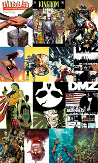
Invisibles Volume 1: Say You Want a Revolution - I love Grant Morrison when he's on, and the first story arc here is some solid stuff, even if it's begun to show its age. I went in without any idea what to expect or what to think, and enjoyed where it took me. The adventures of a juvenile delinquent with a mad homeless guy on drugs in another reality is something you'll only find published by Vertigo. The second arc lost me a bit, mostly because I'm not all that crazy about comics that involve real historical figures and spend too much time wallowing in prose, both of which were featured in a major way. While I'd thought I was close to understanding the big picture after the first arc, the second threw me for a loop and left me questioning whether I'm really interested in continuing the series. I felt that Jill Thompson's artwork was a horrible mismatch. She was terrific on Sandman and has gone on to a fine career, but the light nature of her work didn't provide a good partner for Morrison's dark-hinted, deviant-themed storytelling.
6/10


Kingdom Come: Book One - I was inspired to go back and reread this entire series after reviewing an episode of The Kingdom in December. Still a very good read, although not quite as good as I'd remembered it being. Alex Ross's artwork benefits from a foggy memory and doesn't stand up as well as I'd thought, although it's unquestionably some of the finest work of his career. Still, the issue delivers when it wants to with huge reveals and emotional turns. Superman's big moment at the end of the issue is a fine cliffhanger, and the incident in Kansas was treated extraordinarily well. Better still, I know the best moments are yet to come. I received a whole armload of TPBs for Christmas, though, so I'll have to leave issues 2, 3 and 4 on the backburner for now.
8/10


New Avengers #48 - Kind of a nothing issue for me, picking up the pieces of Secret Invasion (because really, 30 dedicated issues of New Avengers wasn't enough of a focus on the Skrulls) and following the abduction of Cage and Jessica's baby, which is a plot thread I really don't give two craps about. Billy Tan's artwork was genuinely terrible from cover to cover, stealing the flexibility and personality from Spider-Man, turning Wolverine into a 500-pounder, making the new Cap look even stiffer than usual and putting Osborn's head on the body of an American Gladiator. Bendis gave Logan a great line though, offering a drink to Iron Fist. "My body is a temple." "Then put beer in your temple." Sadly, that line alone wasn't worth $2.99.
3/10


Ultimate Spider-Man #129 - I guess if they're discontinuing Ultimate Fantastic Four, Bendis plans to keep Johnny Storm active in this series? A few interesting turns that should be fun to see play out, like Johnny's crush on Parker's female clone... can't wait to see how that one goes. Mostly a character issue, with about three frames of Peter in his Spidey threads and four pages of action, but that's par for the course as far as USM goes. Immonen's work has begun to slide of late, and he looks strangely Bagley-esque here. I like the cliffhanger the issue ended with, but I have a feeling Ultimatum's tidal wave is going to hit NYC in time to ruin that storyline before it gets moving. Not the best issue, but worthwhile anyway.
6/10


New Punisher #1 - I actually loved this, despite getting all kinds of bad vibes from the cheesy cover and the hilariously bad premise of sniping someone with a six-foot long rifle from four miles away. Rick Remender just took Frank and the Sentry, gave them a reason to be angry with each other and let the characters dictate the rest of the action. Basically just a popcorn-chomping action story that explores what would happen if the Punisher and Superman ever faced off, with the end result something of a draw. Dozens of awesome moments, the best of which would have to be Castle opening fire six inches away from the Sentry's face while being carried through the open sky. Jerome Opena's artwork is great, too, a tight mix of Sam Kieth and Leinil Francis Yu.
8/10


Daredevil #114 - When it's on track, this is my favorite book on the market. Every time I think Matt's reached rock bottom, something new happens to remind me I don't even know what the term means. Sharp, smart dialog, a lights-out supporting cast, fresh new faces every month that fit perfectly into the tapestry and risks aplenty. I don't really care for Lady Bullseye, but that's OK because she didn't even show up this month. Hooray! This is fantastic writing, and the artwork is a perfect match. Lovin' it.
10/10


DMZ Volume 1: On the Ground - I'd never had an opportunity to check this series out until I was assigned an issue earlier in 2008 and am now making up for lost time. An imaginative, well-planned premise, a glimpse into civilization that's sometimes a little too honest, and an explosion around every corner. It's very smart at its core but still manages a thrill a minute, mixing bits and pieces of cinema's best apocalyptic visions of the near-future and military action, like I am Legend meets Black Hawk Down. Although the book's political motivations are clear, Brian Wood does give the impression that he's trying to split the narrative evenly between both perspectives, and does at least fleetingly acknowledge that nobody ever believes they're on the "evil" side in this kind of a situation. Paired with Riccardo Burchielli, a high quality artist who only seems to get better as the series continues, this is great reading. As introductions go, I call it top notch. Three fantastic voyages in just five issues, damn.
10/10


DMZ Volume 2: Body of a Journalist - The first really involved story arc of the series, I loved it to pieces. By the end of the trade, Matty has been in NYC for over a year and he's grown tremendously as a character. Things never went in a direction I could've predicted, but in retrospect everything made perfect sense. My only qualms were with Zee's origin issue and the handbook that closed the issue, neither had the appeal or matched the intensity of the primary story... they just felt kind of tacked on.
9/10


Punisher: Frank Castle #66 - I thought the last storyline / writer started off hot and quickly cooled as things played out, but this new team hasn't caught my interest at all. Well, scratch that - I have some mild curiosity about the cliffhanger at the end of the issue, but it's so hard to convince readers that the lead character of three separate ongoing titles is in real trouble, a lot of the edge is lost before the arc even gets off the ground. Also, why does every single story involving Frank have to start with the same setup? We get that he kills a lot of mobsters. It's kind of redundant by this point. I'm thinking about removing this from my pull folder.
3/10


100 Bullets #99 - Can't believe this series is almost over. I'm still hopelessly lost as to where the story's going, but the artwork is as strong as ever and people are dying left and right so I can't want for consequence. I really need to go back and re-read the entire series so I'm somewhat aware of what's going on in time for the finale.
7/10


New Avengers #49 - Well, at least that storyline didn't linger. This read like a quick blowoff that trivialized the only interesting development from last month's issue (Luke switching sides) and reset the status quo on a whim. But whatever, at least now we don't have to deal with a sixteen-issue arc about chasing an alien-abducted baby. Feels like it's been five years since the Civil War, but we're only just now getting the promise of a real face-off between the dueling Avenger squads (naturally, the very second one roster completely changes), but I don't know if I buy Hawkeye's reasoning as much as his teammates did. A very mediocre showing from Bendis meets artwork of a similar level from the blase Billy Tan.
5/10


Daredevil #115 - I love the Izo character, and can't wait to see his relationship with both Murdock and Iron Fist evolve over the next few months before he's unceremoniously slaughtered before their very eyes by the next big threat. Still don't see a lot of promise in Lady Bullseye, but it's becoming clear that she's little more than a pawn in the grand scheme anyway. I was ready to cheer aloud when Matt pulled down his mask to REALLY join the battle in the middle of this issue, but then all the fighting stopped and it was time to talk for a while. Laughed my ass off at the message of that talk, too ("The Hand doesn't take no for an answer!" "I understand, but my answer is still no." "Oh... well, no big deal. See you later then!") , but I don't think that's what Brubaker was going for. A bit of a slowdown following the chaos of last month's issue, but still a fine read. I didn't think much of the Hand's "Plan B" comment until I turned the page and saw the cover for next month. If that means what I think it means, shit...
8/10


Ultimate Spider-Man #130 - After a few months of subpar contributions, the real Stuart Immonen is back! His work on the countless splash pages that coated this issue was phenomenal, particularly the shots of the grounded ship in the middle of NYC and the Hulk confronting Spidey at the end of the issue. Simply gorgeous. It's a shame this was slammed right into the middle of Ultimatum, because it made actually reading it a bit disorienting. When we left them last month, Pete and friends were headed downtown to party with Johnny Storm. From the outset this month, his buddies are busy rescuing civilians from a communter train and Parker's in full wardrobe swinging through the city without so much as an editor's note. Surely that could've been done a bit more smoothly...?
7/10


Wolverine #69: Old Man Logan - The gimmick is starting to wear a little thin at this point, and I don't know if I can live with a book that ships twice a year. Naturally, this issue came out in November so I'm a little behind, but it's taken that long for a copy to remain on the shelves long enough for me to actually buy it. McNiven's artwork varies from breathtaking to sloppy, and Millar's story follows suit. The cool stuff is really cool (Loki's enormous skeleton crushed beneath the Baxter Building) but the boring stuff balances things out by being really boring. I loved this series after the first two issues, but my patience is wearing thin.
5/10

Mighty Avengers #21

Huzzah, the Secret Invasion is finally at an end! But alas, the giant crossover left both rosters of Avengers shaken and dissipated, particularly Tony Stark’s band of merry men, the Mighty Avengers. In the aftermath of Stark’s removal from power by no less than the President of the USA himself, the team has been virtually left for dead. But when natural disasters suddenly strike dozens of cities around the globe, a new group of heroes find themselves working together to defeat the common enemy. Any bets on who’s the first to shout “assemble”?

New writer Dan Slott has the unenviable task of following Brian Michael Bendis on this series, and though I can’t fault him for trying to set a different tone I’m really not a fan of the new direction. Under Bendis’s watch, this was inarguably a superhero title first and foremost, but that was tempered with an unrelenting serving of action and a boundless mind for adventure. I may not have liked everything he did, in particular those early experiments with bringing thought bubbles back into the picture, but I could at least count on him to deliver a worthwhile story that made sense in the grand scheme of things. At its best, Mighty Avengers was both a love letter to the glory days of Marvel storytelling in the ‘60s and ‘70s and an homage to the heyday of the smart action flick.

Slott’s interpretation is similarly injected with an inspiration from the past, albeit a much less positive one. Between the unnecessary new threads flashed by familiar characters, the revisionist flashbacks that don’t really make any sense and the mindless plans flaunted by its villains, reading Mighty Avengers #21 is akin to flipping through a mainstream back issue from the mid ‘90s, the dark ages of good storytelling. It’s filled with changes nobody asked for, a mismatched roster that I can’t imagine functioning as a single unit and an evil mastermind so dull I was ready for a nap after his first appearance. For all its huff and puff, this storyline spent the better part of the issue going nowhere, and when it finally got up and did something, the results were so spectacularly bad that I wished it would go back to doing nothing.

I’ve enjoyed Khoi Pham’s artwork elsewhere, but found nothing to get excited about this month. Pham has always shown a tendency to lose focus and rush his work from time to time, but that’s never been as obvious as it is here. Though he’s given dozens of characters to try his luck with this month, some of which he’s worked with in the past (Hercules and Amadeus Cho in particular) he fails to connect with any of them. His contributions are universally tame, underdetailed and disproportionate. Having seen and appreciated his artwork in the past, seeing Khoi’s work fall so flat on a stage of this size is disappointing.

I’ve been a Mighty Avengers subscriber since the word go, and though the series has survived some lean times in the past, this issue has left me seriously considering dropping it altogether. I’m always willing to give a new creative team the chance to prove themselves, and for the most part Marvel has been very good with such changes over the last few years (see The Punisher or Daredevil) but this is just plain bad. Skip it whether you’re a longtime follower or an unfamiliar reader looking for a new fix. Something stinks.

On a scale of 1 to 10, where 1 is poor and 10 is amazing...
Overall Score: 1

Fathom #5

As someone unfamiliar with the Fathom mythos, I felt like a fish out of water before I’d finished the first sentence of this issue’s recap page, and not just because it was written in a font the size of a single atom. If you’re unfamiliar with the character and her mythos, if you don’t understand the difference between the Blue, the Black and the Humans, best to step away right now because this is some complicated business and it hasn’t the time nor the inclination to slow down for you.

Although this issue’s lore comes in about twenty paces ahead of its more casual readers, J.T. Krul keeps his writing concise and approachable. He doesn’t overload the page with monologues and diatribes, although I’m sure the temptation was great since the bulk of its cast consists of a network of military leaders with complicated master plans. As a result of the light narration, this issue’s plot moves along at a brisk pace, sometimes too much so. When we left Fathom last month, one of her arms had been turned into a giant, bulky mass of stone – presumably a major setback. At the outset of this issue the arm is still a problem, but when she casually repairs it without a hint of panic or even a fleeting touch of concern, it left me wondering if it was even worth mentioning in the first place. Was that last month’s cliffhanger, remedied without a second thought after just a page and a half? If so, what does that say about the “all new precedent” this issue promises to deliver in its dramatic conclusion?

The book’s penciler, Ale Garza, works a clean, exaggerated style that’s reminiscent of Joe Madureira, just without as much discipline. On some panels he manages a perfect balance of line weight, mixing thick blobs of shadow with sharp, jagged edges. In others, his focus wanes and the page deteriorates into a shoddy, overly stylized mess. At his best, he’s able to transform a relatively mundane scenario (a run-of-the-mill government suit distributing orders) into an elaborate visual experience, adding atmosphere, personality and suspense that probably wasn’t there in the script. At his worst he achieves the polar opposite, draining every bit of energy from a particularly startling situation and punching out supporting characters so faceless and boring they wouldn’t pass as extras in another book. Garza is a far cry from the tight, detailed technique employed by late series creator Michael Turner, and while the stylistic change alone is no cause for concern, I really expected this to look much better than it actually does.

Despite its big talk, complicated plot threads and moving pieces, the story at the core of Fathom #5 isn’t all that monumental. The title character herself only appears in a small handful of uninspired panels, and while there’s no shortage of action in the issue’s closing moments, it’s so quick and matter-of-fact that it doesn’t have a whole lot of impact. This is a story that’s heavy on backdrop and light on elaboration, matched by artwork that’s only noteworthy a small percentage of the time. It isn’t an outright failure, but I’d still recommend you skip it.

On a scale of 1 to 10, where 1 is poor and 10 is amazing...
Overall Score: 2.5