Monday, December 22, 2008

Marvels: Eye of the Camera #1

With DC revisiting Alex Ross's seminal Kingdom Come mini-series in recent months, the boys across the street at Marvel have taken a long, hard look at their own publishing history and discovered that yes, they too have a classic Ross tale to exhume and reexamine. In Marvels: Eye of the Camera, we catch up with Phil Sheldon, the unassuming leading man of 1994's Marvels. A photojournalist in every sense of the word, Sheldon is always on the job and the action always seems to gravitate toward him. He's always in the right place at the right time with a camera on his hip and an itchy trigger finger.

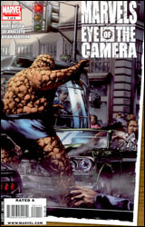
Although Ross is occupied elsewhere, original writer Kurt Busiek has returned to the property he co-created a decade and a half back. His familiarity with both the characters and, perhaps more importantly, the tone and subject matter, cannot be overstated. I can't imagine this series working nearly as well under another writer's watch, and although the original Marvels covered a wide array of crucial moments in the publisher's timeline, there's no shortage of good material to burn in the follow-up. This month, for example, we're looking at the moment the floodgates opened, when the Fantastic Four held their first press conference and the flow of new heroes burst forth like a blast of water from the fire hose. Where before, the nation was certain that every new face who opposed the Axis Powers was friendly, in the years after the war that distinction has become much less clear-cut. It's a natural follow-up, one that will be welcomed by fans of the original, but it's missing the fire that made its first run so compelling.

Artist Jay Anacleto wisely doesn't try to match the efforts of his famed predecessor. Even after all this time, there isn't anyone quite like Alex Ross, and though Anacleto does adopt a style that vaguely mimics the painter, he injects enough originality to avoid a direct comparison. Problem is, the new artist's work isn't strong enough to make readers forget about what had come before.

A big part of what made the original Marvels work was its tremendous visuals, which jumped right off the page and into our world. They were sharp, colorful, but most of all relatable. The very concept of a pedestrian perspective into a superhuman world banks entirely on the power of the book's illustrations, and despite his best efforts that's just something Jay Anacleto isn't able to deliver here. His characters don't feel natural; the world they occupy is washed out and short on contrast. Everything is painted over with the same shade of soft, muting gray, like the entire country is dozing off. His compositions retain that same sense of the mundane; the everyday sense that made the spectacular seem like a part of our own world, but his execution is off. Rather than enhancing the ordinary, he's muted the incredible.

As a direct continuation of the original Marvels, Eye of the Camera is suitable. It touches the same bases, asks similar questions and retains the sense of wonder, though this time it's laced with a growing sense of mistrust. It's every bit the spiritual successor I have to think it was intended to be, but it's almost too much of the same thing. When the original series landed, it was like nothing we'd ever seen before, a human perspective into a traditionally superhuman world. Now, years later, it's not quite so original nor so endearing. As a follow-up, this is par for the course. No better, no worse. Borrow it.

On a scale of 1 to 10, where 1 is poor and 10 is amazing...
Overall Score: 7

Haunted Tank #1

Outside of Sgt. Rock, DC has never had a longer running combat series than the original Haunted Tank. Usually found within the pages of the old G.I. Combat series, the ghostly panzer was seemingly abandoned with that series' cancellation in the late '80s. But alas! So long as there exist creators with sharp memories and editors with space to fill, no character shall remain unpublished for long.

In this fresh interpretation, the Haunted Tank has abandoned its old digs in WW2-era North Africa in favor of a new station inside present-day Iraq. It's familiar scenery, warfare against the backdrop of blackened sand, only modernized in both setting and opposition. Of course, the soldiers on the other side of the conflict are about as clichéd as they come; a ragtag cluster of underdressed, over-armed militants who descend onto the scene shouting about infidels and imperialists… but they aren't the focus of the story, and the speed of their arrival is matched only by the haste of their departure. Author Frank Marraffino spends more time this month introducing us to the good guys than he does sending them into action, and it's just as well. While the speedy, intense battle scenes may be more visually impressive and exciting, the real hook of the story is with the ghost of a Confederate General, the boys he rescued from certain death in the middle of an oasis and their offbeat, uneasy relationship. Besides, there'll be plenty of time for bullets and ‘splosions later in this five issue mini-series, and from the small taste we get this month, I know it'll be worth the wait.

Henry Flint's artwork is the real superstar of this issue. He must have been the kind of kid whose trapper keeper was filled with sketch after sketch of machinery, because he treats this job like a labor of love. His renditions of a desert-bound tank and the mechanical competition it encounters are strikingly accurate, but not stifling or lacking in individuality. His machinery wears its scratches and grime like a medal of honor, reminders of battles once fought and terrain left far behind. It carries its personality on its thick metal hide, and is identifiable as a character unto itself from the word go. Perhaps most importantly, Flint never misses an opportunity to remind his readers just how gigantic a tank really is, spotlighting its size in comparison to the men behind the controls and allowing it to tower menacingly over a full-sized pickup truck.

Flint has a mastery of impressive, cinematic storytelling, too. This issue reads more like a thoroughly fleshed-out storyboard than a traditional comic, with the artist's impressive attention to detail working with his adventurous camera angles to deliver a fantastic final product. When this tank gets moving, the sense of motion is so vivid that you'll swear the panels have started shaking.

Haunted Tank is loads of fun. Its cast of characters is identifiable, admirable and genuinely funny, and their relationship with the ghost that drives their adventures is a bit more complicated than it would seem on the surface. Who could've thought it would take a comic book about a possessed war machine to bridge the enormous generation gap between the Civil War and today? This is dynamite stuff: it's light and goofy when it needs to be, deep and dirty when it doesn't. I'm buying it, give it a shot yourself.

On a scale of 1 to 10, where 1 is poor and 10 is amazing...
Overall Score: 9

Batman #682

In the aftermath of "Batman: RIP," Gotham faces the uncomfortable prospect of life without its guardian angel. No, despite the preceding crossover's dubious title and the dark knight's absence from his city's streets, Bruce Wayne hasn't bit the big one. But maybe a few important portions of his personality have, and the prospect of a Wayne without the heart to continue may be twice as unsettling as the death of a caped crusader.

Grant Morrison doesn't provide a distinct narration this month so much as he does a series of random snapshots. Flashes and frames of Bruce Wayne's life and times under a cape and cowl, relationships curtailed by his activities after dark, missed opportunities to step away from his responsibilities as the Batman… as an abstract spattering of personality, it's spot-on, but as a straightforward narrative, it leaves something to be desired. I can get into the occasional trip down memory lane, which is how this was intended, but in such a curt, random form, I found it more like watching a DVD at 24x speed. You'll get a basic understanding of what's going on, but it's all kind of crammed together and disconnected.

Morrison has an unquestionable gift for drawing his readers into the situation, emotionally involving them with a startlingly short supply of vocabulary. That fact is reinforced over and over again in the pages of Batman #682, but just as quickly as the writer delivers these sharp, compelling scenes into our lives, he cruelly takes them away. He's started in enough interesting directions this month to have sufficient material for hundreds of issues' worth of storytelling, even if most of those avenues have already been explored. The writing is great, but its focus is so scatter-brained that the actual experience of ingesting it is often frustrating.

With "RIP" artist Tony Daniels taking a breather before "Battle for the Cowl" later this month, fill-in artist Lee Garbett doesn't take too many chances. In fact, his style is so similar to that of Daniels that I'd have to wonder if he's working as some sort of an understudy. Garbett's smooth, cartoony artwork is strong enough, particularly in dealing with Batman himself, and though his renditions of Robin don't fare as well, for the most part he does enough to get by. With the nature of this month's story, I noticed a few missed opportunities for creative license, particularly when the focus is on Bruce's early crime fighting career, but by avoiding such risks, Garbett ensures his work is inoffensive. He's strong as filler talent goes, but not entirely ready to move up in the pecking order.

As a standalone issue, this month's Batman is a swift disappointment. I'm sure the issue's constantly-shifting focus will look much rosier when collected in a trade paperback, but that's neither her nor there. Grant Morrison's writing is terrific, but it because it comes in such short doses, I had to really reach to appreciate it. Flip through it and give it a closer look in a few months when the full story is revealed.

On a scale of 1 to 10, where 1 is poor and 10 is amazing...
Overall Score: 4

Wednesday, December 10, 2008

Transformers: All Hail Megatron #5

If you haven't been keeping track, there's been a lot going on with the Transformers recently, and none of it looks all that good for the Autobots. Under Megatron's leadership, the Decepticons have conquered Earth, chasing the remnants of their opposition to a secluded corner on Cybertron. With Optimus Prime at death's door, the duties of leadership have fallen to Jazz, and his work is cut out for him. While his first order of business is procuring a steady source of energy, of which little remains on their hollow, exhausted home planet, uncovering the traitor in his group's midst remains a close second priority.

Series artist Guido Guidi was born for this kind of work. When it comes to the Transformers, there have historically been two kinds of artists: those who get it and those who don't – and sadly, the latter have far outnumbered the former. Granted, the task of illustrating an entire race of boxy, metal-skinned, living, breathing robots (no two of which look even remotely alike) is not an easy one… especially when so many different interpretations have come and gone over the years. But I've found that the very best renditions have been able to convey the unique qualities of the Cybertronians' physical features while also delivering a strong sense of identity and humanity to the mix.

Guidi is able to bring all of that to the table, while also adding a detail-rich series of backdrops to the list. His work is painstakingly detailed, but not exceptionally busy. Its look and feel is clearly manga-influenced, a carryover from the visual style of 1986's animated Transformers: The Movie, and bursting at the seams with liveliness. Each page of this issue leaps right off the page, which makes actually reading it a delight. This is what I've been looking for out of this property since it was officially relaunched: it's clearly crafted by a longtime fan, and he's poured his heart and soul into his work.

Shane McCarthy's writing isn't quite that good, but it's strong enough to draw similar comparisons to The Movie, which I consider to be the quintessential Transformers story. All Hail Megatron caries a similar sense of dread and frustration, with the good guys outnumbered and on the lam while their enemies run unchecked. His story is epic in concept, and while it's sometimes clunky in execution (the pacing in particular is a little strange) at the end of the day it left me anxious to see where it's all going. The best moments in Transformers lore always seem to come after the day has grown its darkest, and the revelations at the end of this issue have sent the storyline into uncharted territory as far as that's concerned.

While this property was having its issues a few years ago, floating around with little direction at Dreamwave, its shift to IDW has been rejuvenating. The storytelling has taken a step up, returning the franchise to familiar, celebrated themes, and if this issue is any indication, the artwork has never been better. All Hail Megatron was created by the fans, for the fans, and that's a welcome change. Buy it for the artwork alone: the story's just gravy.

On a scale of 1 to 10, where 1 is poor and 10 is amazing...
Overall Score: 8

DMZ #36

Set on the island of Manhattan in the very near future, DMZ examines how the lives of New Yorkers have changed since the town was designated a demilitarized zone. When a freethinking revolution passes through the hearts and minds of Middle America, the concept takes hold stronger than even the most optimistic rebel could have dreamed possible. As that idea manifests itself in the form of a full-scale revolt, the majority of the country's national guard is stationed overseas, which enables the Free State movement to overtake the vast majority of the US landmass. The battle stalls in NYC, however, and with neither army able to maintain control, it's labeled a no man's land and summarily evacuated.

Series creator and ongoing writer Brian Wood paints an unsettlingly relatable picture of a United States so divided it's settled on civil war as its only option. He raises some pertinent issues, escalates the conflict of ideas that's already present into a physical struggle, and adds just enough dashes of the modern rhetoric to make it all feel natural. Is it idealistic? Well, yes and no… on one hand, I don't think anyone wants this to end in bloodshed, but on the other, the two sides of this country are already so sharply divided that eventually something's going to have to give. I don't know how we go from criticizing the President on a daily basis to taking up arms and rising against his government, but should that come to pass I wouldn't be surprised if it wound up looking an awful lot like this.

That's where Wood is at his best. He's able to make things seem so familiar that his readers let their guard down and accept this as a continuation of their current reality. America's two sides may not have reached this level of extremism yet, but because the soldiers on the ground in DMZ are spitting the same kind of rhetoric we're hearing in the aisles at Wal-Mart today, it doesn't seem like that much of a stretch.

Kristian Donaldson has joined the party as a special temporary artist for this story arc, delivering work that's as simple as the issue's subject matter is heavy. Fans of Brian Wood's work will recognize Donaldson from their previous collaboration on IDW's Supermarket. His uber-minimal approach is reminiscent of Phil Hester, though the DMZ artist isn't quite as animated and his characters don't feel as natural. Tasked this month with representing a US Army captain at the end of his rope, Donaldson is able to capture enough facial expression to tell that story without the aid of narration. The captain has crazy eyes, his body language betrays his mental state, and the tendency of his underlings to keep their distance tells us they don't entirely trust their fearless leader. Though his characters occasionally feel stiff and uncomfortable, Donaldson is otherwise a solid contributor.

DMZ is a rarity in that it can tell a deeply political story without feeling heavy-handed or preachy. Brian Wood's continuous use of recognizable talking points and familiar imagery lends familiarity, and that in turn helps the story to connect with its audience. It's pertinent, timely and elaborate, something worthy of a chance, regardless of your political affiliation. Buy it.

On a scale of 1 to 10, where 1 is poor and 10 is amazing...
Overall Score: 8.5

Buffy The Vampire Slayer: Season Eight #19

Remakes and adaptations are the modern-day law of the land. Whether it's yet another big bucks Hollywood picture based on a 1970s TV series, a comic book replication of a new film or a video game based on an aging theatric property, the idea of originality seems to be antiquated. And to a certain degree, that's true of Buffy: Season Eight. Yes, we're returning to familiar territory, resuscitating a television show that's been dead and buried for years and cashing in on the title's cult following. But Buffy has a few things that set it apart: for one, this isn't a retelling of the same old stories, it's a direct continuation of the saga that picks up right where our TVs left off back in 2003.

It's also nice to see the same creative minds involved. Sure, those Star Wars novels that were blessed by LucasArts may have been fascinating, but because King George himself wasn't a hands-on collaborator, they never seemed authentic. That's no problem for Buffy: Joss Whedon, the brains behind the entirety of the show's lifespan, is getting his hands dirty as writer of this Dark Horse Comics follow-up. It's both a spiritual and a literal sequel to the renowned series, and one that I'm sure most fans will greet with open arms.

As long as the action keeps moving, Whedon's writing makes for easy, entertaining material. Though he does irregularly indulge himself with a few pages of long, breathy conversation, Whedon seems to acknowledge that this series is at its strongest when it's throwing haymakers and impaling evildoers. And while he's dealing with a huge cast of beloved characters, the writer doesn't pull any punches, either. That makes those fight scenes just a bit more interesting, every near miss a tad more suspenseful.

Karl Moline is the artist of choice this month, benefiting from a deep pre-existing cast and an elaborate, rich atmosphere. With so many character designs already laid out in detail, Moline's only task is to accurately reproduce them and throw in an infrequent twist in wardrobe here or there. The familiar faces wear their scars like a badge of honor, with each distinguishing mark tied to a specific moment earlier in the series. The wear and tear shown by his characters and their surroundings manages to be light on linework but surprisingly descriptive, akin to Chris Bachalo's later efforts, while Moline's thick but graceful linework sometimes reminds me of Frank Cho. The denizens of Buffy's world can often be at once beautiful and haunting, a balance that's much easier said than done, but the artist is able to pull it off. With the exception of one or two uncharacteristic slip-ups, this is a very good-looking issue.

Although I came into this series with little more than a passing knowledge of Buffy and was eighteen issues behind the curve, I never felt left out or confused. Sure, some of the names and faces didn't mean as much to me as I'm sure they would for one of the TV show's dedicated viewers, but I still found something to enjoy within this story. It's well written, nicely illustrated, and manages to stand on its own two feet, with or without the gigantic reputation that precedes it. Big fans will want to buy this up immediately, while more casual observers like myself will still want to borrow it. It's good stuff, and a good example of what can go right with a popular cast of licensed characters. Treated with dignity and respect, they can still bring out strong emotions in their audience.

On a scale of 1 to 10, where 1 is poor and 10 is amazing...
Overall Score: 7.5

Monday, December 1, 2008

The Helm #4

Ever find something at a garage sale that's so completely, ridiculously obscure, you absolutely have to have it? Matt Blurdy had one of those moments just recently, with the object in question being an aged Norse helmet that just so happened to start talking once he'd got it home. And the things this magical piece of head gear has been telling him… that he's the next big hero, that the forces of evil are closing in, that his old boss at the video store is an evil necromancer… they're enough to send any self-respecting nerd out on the warpath.

In Matt, The Helm's protagonist, writer Jim Hardison has pieced together a good approximation of the innocent gullibility and self-conscious apprehension that most AD&D-playing dweebs share. Is that helmet really talking to me? Am I really the chosen one of my generation, or am I lost so far in my own imagination that it's high time for a trip to the psychiatric ward? The age of wonder is well behind us, and nowadays if a golden helmet with voice and locomotion were to surface in someone's living room, I have to imagine its reception would be a bit different from the one it received back in the middle ages.

I remember adoring Bart Sears's work on the early issues of Wizard Magazine, and later with Alan Moore on the underappreciated Violator mini-series before I lost track of his career. Or maybe I just lost track of his style, because outside of the cover his work is borderline unrecognizable. Sears has reinvented himself since I saw him last, cutting a great deal of the elaborate detail that had become his calling card and transforming himself into a smoother, cleaner, more animation-inspired artist. I can still see a lot of the old Bart Sears in there, particularly in his love for deep, fluid shadows and the gentle curves of his linework, but what he's become on the surface is something entirely different. In the past he had the nasty tendency to get hopelessly lost in the specifics of his work, producing heroes who were muscular beyond the limits of good reason and postured so awkwardly, I think they may have been punishing themselves. Now he may have overcompensated, simplifying his efforts so much that his artwork no longer seems like the labor of love that it once was.

For the most part, this story is light fare with little real surprises. It's an imaginative concept, fleshed out by an average supporting cast and an identifiable lead character, but it never takes any risks and as a result isn't terribly exciting. It's worth flopping through if you're about to go on a long road trip or need some last-minute reading material at the DMV, but there isn't enough substance here to make me a repeat customer.

On a scale of 1 to 10, where 1 is poor and 10 is amazing...
Overall Score: 3.5

The Brave and the Bold #19

A long-lasting staple of the DC line, The Brave and the Bold told the stories of DC’s mightiest team-ups for nearly thirty years before its cancellation in the early 1980s. Now more than a year into its second run, the series has once again turned its attention to team-ups, featuring a good blend of established characters and lesser-known faces. This month, for example, features an intergalactic SOS that’s answered by both Hal Jordan and The Phantom Stranger. Sounds like business as usual, right? Well, here’s the catch: that cry for help from a far-away galaxy was conveyed a brain-dead child in a West Virginia hospital.

Cast in the unenviable role of a placeholder, biding time with the series until J. Michael Straczynski takes over in 2009, writer David Hine is nonetheless making the best of his limited window of opportunity. This issue’s story, an unexpected blend of horror, sci-fi and medical drama, is both smart and interesting. While Hine has a tendency to lose himself in scientific detail, especially during the set-up of the issue’s first few pages, such moments lend the story authenticity and immediately deliver the sharp, distinctive tone that flows from cover to cover. This writer displays the ability to deliver tremendous detail and sobering circumstance with only a few panels of explanation and a minimum of dialog. He’s done a lot of research, added a few original twists of his own and compressed it all into a format that’s brief but powerful.

When the narration leaves the Earth, Hine’s imagination really shines. While the story itself has a very specific underlying purpose, the author still takes the opportunity to stop and smell the roses so to speak, enveloping his readers in the culture and personality of a heretofore-undocumented alien world and noting its similarities to our own. If the spectacular adventure of the primary story weren’t so good, I could get lost in the minutiae of this alien culture without qualm. Such attention to detail and care is unusual, especially from temporary talent, and I’ll be keeping an eye out for more of Hine’s work in the future.

Artist Doug Braithwaite is an equally imaginative, if somewhat less consistent, talent. Braithwaite’s strict, lifelike style is a good partner for the story’s stoic flavor, and delivers the straight, intellectual appearance that his writer was seemingly after. The artist’s renditions of the vast alien wilderness are fantastic, and his dramatic timing is top notch. My only misgiving lies with the drastic, and often distracting, level of detail that he brings to the page, which often hampers the book’s legibility. It’s a minor issue and one of personal preference, but an issue all the same.

I was tremendously surprised and impressed by this issue. Oftentimes, the arrival of a star-studded creative team is immediately preceded by a series’ worst moments, filler work by creators with little time or investment in the book and its characters. That couldn’t be further from the truth in the case of David Hine and Doug Braithwaite. In the interim before the more widely anticipated arrival of JMS and company, this pair has delivered something to be heralded. It’s smart, compelling and well written, with a cliffhanger that has me anxious to see the resolution. Buy it and see for yourself.

On a scale of 1 to 10, where 1 is poor and 10 is amazing...
Overall Score: 8.5

Star Trek: The Next Generation: The Last Generation #1

How passionate are you about the Star Trek universe? Fervent enough to follow an alternate-reality take on the Next Generation timeline? If so, you've hit the jackpot with The Last Generation. Staged in a parallel galaxy in which the Klingons have conquered Earth and ruled for seventy years, the series follows an outlaw resistance group led by Jean-Luc Picard as they struggle to free their species from extraterrestrial oppression.

While the story's basic premise relies on some very specific details from the Star Trek mythos, (did you remember an assassination attempt at the end of Star Trek VI? I didn't, but I'm not even sure I saw that one...) there's something here for both passive fans and hardcores alike. Even non-fanatical followers of the franchise will know the difference between the Worf of the standard TNG and his counterpart in The Last Generation, and the story's author, Andrew Steven Harris, stuffs this first issue full of easter eggs and subtle winks at his more astute readers while still keeping the narrative moving.

But where his love for Trek trivia is obvious from the very get-go, Harris's passion for writing doesn't follow suit. Although the story's concept may be rich and original, in execution it's full of plot holes, tasteless dialog, redundant battle scenes and fabricated drama. Every single fight scene ends in precisely the same way, (unexpected cavalry, hoorayyy) the issue's cast has zero chemistry and the narrative jumps around like a manic six year old on Jolt Cola and Fruity Pebbles.

The writer's collaborator, Gordon Purcell, doesn't even fare that well. His artwork is downright terrible, a bad parody of fan work that may be the worst I've seen in print since the industry-wide glut of the early ‘90s. I'm used to seeing big-name licensed books shoveled out with little regard paid to quality, but this is ridiculous. Purcell's work is busy, two-dimensional, faceless and amateur at its finest moments and downright illegible at its worst. To his credit, he manages a close enough likeness to the major characters' big screen counterparts that the story remains understandable, but honest to god, this stuff is so bad I'm surprised I didn't see the edges of a spiral-bound notebook on a few pages. It's hideous, and deals a significant blow to the story's legitimacy before it can even get off the ground.

I wouldn't recommend this to even the most devoted Trekkie. While the foundation may hold some interest, an all-conquering race of Klingons who finally live up to their potential as the baddest of all bad guys, that basic concept is the only thing here that's actually working. Insufferable storytelling combined with terrifically rotten artwork makes The Last Generation an undeniable failure. Set your phasers to skip.

On a scale of 1 to 10, where 1 is poor and 10 is amazing...
Overall Score: 1