Thursday, April 21, 2011

Malignant Man #1

When your day-to-day involves a hospital gown, waiting room music, clusters of whirring medical equipment and a series of stern, sympathetic looks from the doctor, it can be tough to find something worth living for. Such is the case for Alan Gates, a cancer patient who’s just been told he has less than a month to live. So it shouldn’t come as a total shock that, when confronted with an armed robbery in progress, Alan takes it upon himself to intervene, carelessly throwing his life to the wind in exchange for the chance to feel something… anything… again. What Alan (and, by proxy, the reader) couldn’t have predicted is the chain reaction instigated by that one selfless, split-second decision.

Weighing in at just twenty-two pages, this introductory chapter successfully manages to cover a lot of ground at a breakneck pace without sacrificing clarity along the way. A simple enough concept is partly to thank for that. James Wan’s plot, adapted for the page by Michael Alan Nelson, wastes little time on characterization. Instead, it chooses to spend its time asking a series of increasingly brow-furrowing questions, then jerking the wheel in sudden, surprising new directions. It thrives on that lengthy string of unexpected leaps of faith, asking more questions than it has pages to answer them in similar fashion to the opening act of The Matrix, albeit much less eloquently.

Despite its aura of mystery, though, Wan and Nelson’s storyline can be quite blunt and generic at times. Its excessive use of slang during a tense scene in the operating room seems forced and unrealistic, not to mention unnecessary. Later scenes involving a gun-slinging escape from the hospital feel too calm and casual, robbing the moment of its inherent drama. In fact, nearly all of the issue’s dialog comes off as clunky and awkward, difficult to read and even tougher to visualize in a conversational setting. The nameless, faceless enemy that stands revealed at the issue’s climax appears to have arrived directly from the book of late ‘90s action clichés. It’s a story that’s furiously treading in foamy water, taking two steps forward with its gumption and adventurous timing, then two backward with stilted dialog and empty characterization.

Piotr Kowalski’s visuals keep up fairly well with the aggressive pace, but fail to deliver a true signature style at any point. His layouts perform very well, slickly moving the action from one panel to the next and pausing at all the right moments. He works a clean action scene, sculpts a few well-designed original characters and maintains a steady beat throughout the issue. Kowalski is just lacking that certain touch of panache which simply can’t be taught. His pages don’t feel entirely alive, nor are they something I could pick out of a sketchbook lineup. They’re fundamentally strong, but ultimately bland and soulless. With a bit more polish and character, his work could easily turn that corner and become something to behold.

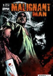
Malignant Man has promise, but seems to be missing a real hook in both its artwork and its storytelling. Alan is a painfully dull lead character thus far, really just groggily reacting to the series of crazed events around him, and while that’s a flaw that could be rectified in future issues, it’s also something that could keep readers from bothering to tune in for them. Flip through it; the first issue certainly isn’t a bad one, it’s just quite vanilla.

On a scale of 1 to 10, where 1 is poor and 10 is amazing...
Overall Score: 4

Monday, April 11, 2011

Fear Itself #1

Let's just take it for granted that things are a bit rocky in the Marvel Universe. Though the classic Avengers have finally reassembled, Norman Osborn has been removed from power and the sun seems to be rising over the horizon, things are far from perfect both within Avengers mansion and outside its golden gates. And as the unrelenting dust storm begins to start up yet again, the publisher's most visible heroes have a bevy of new foes to confront as well as several fresh, prickly situations to diffuse.

Matt Fraction's tale in Fear Itself is a natural progression of the “superheroes as social commentary” vein most recently tapped in Brian Michael Bendis's big crossover arcs, in which the biggest names of the Marvel U find themselves entangled not in the robotic arms of Doctor Octopus or another evil mastermind, but rather in the hot button political issues of the day. Where Bendis and the dozens of preceding authors would skirt a direct confrontation by way of allegory and metaphor, though, (take Civil War as a dissertation on the sharp divide between America's political factions, for example) Fraction has thus far been much more up front. He's not using mutants as a stand-in for the civil rights movement, he's actually dropping Steve Rogers in the middle of the ground zero mosque demonstrations. Tony Stark is using his new popular resurgence and the desperate need to rebuild Oklahoma after the events of Siege as a vehicle to create American jobs in the midst of a recession. We're not exactly dancing around the issues any more, and whether you see that as a positive turn or a negative one will depend entirely on the level of maturity and / or escapism you expect from your mainstream comic events.

Of course, it should go without saying that such weighty issues are also counterbalanced by a healthy dose of good old-fashioned superhero mystique. With forty pages of content, this issue has plenty of room for both, and Fraction pulls off his act with impressive poise. The topical matters thus far haven't felt shoehorned in, heavy handed or one-sided, and the more fantastic scenarios around every other page don't seem completely ridiculous or out of place alongside them. This doesn't feel like an opportunity to spray an unsolicited political agenda so much as it does an instinctive next step forward for the publisher's heroes. It's the battlefield on which popular opinion and ancient mythology come to blows.

Aiding Fraction with his work is the uber-talented Stuart Immonen, one of Marvel's most recognizable top-notch superstar artists. Immonen has that magic touch, a knack for conveying whatever mood the writer is looking for via subtle shifts in his artwork. When Fraction is trying to invoke fear, Immonen uses a darker tone and more daunting, worm's eye camera angles. If he's after humor, the panels grow lighter and you'll notice more little throwaway jokes going on behind the action. Even in the more stern, straightforward conversation-based scenes, of which there are plenty, the artwork keeps the pace moving with passion and vigor. It seems like I never have a bad thing to say about Stuart Immonen, and with good reason. The guy never takes a panel off. He's constantly one-upping himself, improving his game and impressing under the glare of a hot spotlight. This issue is no exception.

I'll admit to being a bit burnt out by crossover events of late. Just between the two big publishers alone, it seems like nary a month has passed without some manner of major, series-spanning super story over the last five-plus years. The gimmick is tired, but that doesn't mean it's without the capacity to bring the goods from time to time. Whether or not this storyline delivers on its promise remains to be seen – Marvel's track record on that one isn't exactly spotless – but as setups go, I found this to be thoroughly intriguing. Fraction is asking a bookful of questions without a simple answer to be found. How he chooses to answer them (or if he does at all) will determine how the series is ultimately remembered. Buy it.

On a scale of 1 to 10, where 1 is poor and 10 is amazing...
Overall Score: 9

Green Wake #1

Image's latest foray into the surreal, Green Wake, provides yet another chance for the versatile publisher to showcase its flexibility. The mini-series, a murder mystery set in a Silent Hill-styled purgatory for hopeless spirits, is horror in a more subdued manner than, say, The Walking Dead or Hellblazer. Its lofty aspirations seem to be of a cloudy, atmosphere-dominated tangle in the same vein as David Lynch's Twin Peaks, but its methods of execution leave a lot to be desired.

Our writer, Kurtis Wiebe, for example, seems to delight in being vague. He'll open a doorway wide, then smugly refuse to step through. In carefully limited doses, this technique can be a powerful method to personally involving readers in the storytelling. After all, which is scarier: the monster you see in living, breathing color or the one you'll catch a glimpse of with peripheral vision, a peek so fleeting your imagination is left to fill in the gaps? Overuse of this method, however, is a quick and dirty recipe for frustration and abandonment. If you refuse to reveal a thing, eventually the audience is just going to lose interest in what's behind the curtain altogether. Wiebe's concept, of a world where lost souls go to slog for eternity, is fertile soil, but he's so reluctant to tell us anything at all that it leaves the impression that he hasn't quite figured it out himself. That lack of elaboration also robs the cast of any dash of personality and, consequently, approachability. We're along for a ride through the gray void with a small cluster of cold, expressionless specters.

Riley Rossmo's artwork is a different beast altogether. Rossmo, who's quickly becoming one of Image's hottest talents following prolonged runs on the kooky Proof and Cowboy Ninja Viking, works a captivating style that's equal parts old school, new school and boarding school. His chaotic, loose linework is unbalanced and sharp-edged, like a series of quick gesture drawings freed from the confines of a favored sketchbook. An exuberant, overwhelming dose of benday dots adds depth and structure in unexpected spaces, creatively applied in a similar fashion to James O'Barr's work with The Crow decades back. For the final touch, he sprays the page with a blotchy, often bleakly monochromatic, dash of rough painted color a'la Ben Templesmith. It's at once stripped down, complicated, impersonal and intensely intimate; utterly unmistakable. Like many of the best unconventional artists, his work is curious enough to inspire a much closer look regardless of the accompanying material, which is certainly the case with Green Wake.

Rossmo's work carries the book. While Wiebe is doing his best to add pseudo-suspense via a series of open-ended questions and a distinct lack of elaboration, Riley is off on his own, populating the world with shady characters, haunting landscapes, coal-spoiled skies and leaky pipes. It even appears that, at times, the writer actually realizes the inessential nature of his presence, as he drops completely out of the picture and lets the artwork stroll around on its own for several pages. It's as close as Green Wake ever gets to any degree of enlightenment.

Wiebe and Rossmo's alcohol-soaked venture into the crusty fringes of consciousness is, ultimately, little more than a depressing picture book. It's not quite as complicated, nor as engaging, as it seems to think it is, with a distinct lack of a strong hook leaving the whole experience quite shallow. An adventurous premise and strong establishing shot may deliver readers an early taste of promise, but for the rest of the issue we're sleepwalking through the story just like the city of Green Wake's entire population. Flip through it for the artwork.

On a scale of 1 to 10, where 1 is poor and 10 is amazing...
Overall Score: 3