Monday, July 27, 2009

Action Comics #879

Superman has stepped away from the action, both on the planet Earth and in his headline billing within DC's second longest-running publication. Yep, ol' Supes has left our soil to take up residency on New Krypton, leaving the future of both the planet and this series up in the air. But the uneasy focal points of Action Comics during Kal's exodus, armor-clad fellow Kryptonians assuming the roles of Nightwing and Flamebird, haven't had to look far for a sense of purpose in his absence. With a renewed, camouflaged onslaught from General Zod in play, the planet's newest defenders have set out to eliminate every last one of the villain's sleeper agents, scattered across the globe.

Of course, with all that backstory a requirement to understand just what the heck's actually going on in this issue, the continued lack of a recap page in DC's ongoing catalog has never been more painful. If you've been keeping close track of the proceedings, Greg Rucka has organized a deep, relevant storyline here. In the missteps and miscommunications of Thara Ak-Var and Chris Kent, the two new heroes in question, there are a lot of obvious similarities to the days of Superman's own heroic coming of age. The two new faces are making a lot of mistakes that I have to imagine Clark made at some point, too. They're stepping into traps, being forced into tough decisions despite their good intentions, proving that especially at the start of their careers, nobody's perfect. Yet, without doing the appropriate online research, I'd have been left scratching my head and wondering why Dick Grayson was flying through the sky aboard a pair of built-in rocket boots. Shouldn't he be holding down the fort in Gotham City?

In his pair of new leads, Rucka has given us a pair of genuinely likable faces. Are they a bit too shiny, genuine and naïve? Maybe. But much of that can be written off as simple inexperience with this world, having been raised in a much more utopian society. Clark Kent is routinely seen as the world's biggest boy scout, and he was reared on Earth from his infancy. These two are experiencing the darker hints of our planet for the first time much later in life, and it's only natural that they'd be more out of touch than Superman was.

The latest in a series of fill-in artists, Diego Olmos performs decently enough. His layouts and storyboarding in particular are very strong, but lose some of their charm when brought into closer detail. As a result, his best work comes on pages with a broader scope, where the characters require less detail and the strength of his compositions can be better appreciated. In his finest moments, Olmos displays nice restraint and an excellent sense of movement, but his work often feels generic and agonizingly bland. As a whole, he's fundamentally sound if not especially exciting or original. At this point in his career, he seems content to merely fade into the background, filling a role but not taking it over. He needs something to set himself apart from his peers and I don't see it here.

I have to admire this issue's dedication to doing things a little bit differently, even though it doesn't always work. The constant Kryptonian dialect and accompanying subtitles throughout the issue are perfect examples. In theory it's a unique way to remind the readers of how detached the protagonists (and their targets) are from the world, but in execution it's clunky, providing more of a hurdle in the way of smooth reading than an aid to help us better understand the cast. The creators' hearts are in the right places, but the end product is always a few steps short of being a resounding success. Flip through it, see if you can keep up with it, and only then give it a closer look.

On a scale of 1 to 10, where 1 is poor and 10 is amazing...
Overall Score: 5

Deadpool #12

One of the many moving pieces behind the scenes of the recent Secret Invasion was the conversation between former SHIELD taskmaster Nick Fury and Deadpool, his chosen independent mercenary. Tasked with thieving information on the identity of the Skrull Queen, Deadpool accomplished his mission, but Norman Osborn intercepted the ensuing transmission. Normy then used that intel to take down the queen himself in a bold (and successful) reach for power. Now Deadpool wants his money, Fury ain't paying up, and Osborn is ready to move on. In an effort to rid himself of the hassle in one fell swoop, he's sent one of his most skilled Dark Avengers, Bullseye (in the guise of Hawkeye) to personally take care of our little red merc once and for all.

At least, that was the plan before he caught a meathook to the belly and woke up in the ICU with a little love note from Wade Wilson in his "get well soon" flowers. Now feelings are hurt, prides are wounded and jobs are dangling in the balance. Daniel Way's writing in the buildup to this final, ostensibly climactic fight between the two has been terrific. It's given us a closer look at the competing motivations behind the twisted psyche of the Kingpin's former assassin, delivered an average of three near-death situations per issue, and never let up on the gas pedal the entire time. When the two finally meet to finally settle this thing around the halfway point of this issue, it's like a powder keg chilling out in the middle of an unsupervised boiler room.

While that big confrontation is over and done with faster than you'd think, the few iconic freeze frames it delivers in just a handful of pages are good enough to make the whole thing worthwhile. The big payoff may seem cheap at first, but starts to make sense as it settles in. And just as you're beginning to come to terms with that situation, the issue's jarring cliffhanger blindsides you. Nothing is out of bounds in Deadpool. That idea is reinforced time and time again, but every single time I think I understand, I'm left with the realization that I haven't a clue. My only concern is, after this one, I don't know how much further it can really go.

Despite a few obscure hiccups (why did Norman Osborn's arms shrink by about two feet in-between panels?) Paco Medina's artwork makes a great compliment to Way's storytelling. Every bit as frenetic and eccentric as the title character himself, Medina's work rarely stops to take a breath. It's filled with ongoing visual puns, touches of personality and all-around enthusiasm. The influences of J. Scott Campbell in his prime are hard to ignore, but Medina has taken that inspiration and improved upon it, perhaps solidified it. Campbell's work always had an excess of energy and action, which Medina clearly retains, but it often felt unfinished and unrefined. The Deadpool mainstay's work seems more secure and intentional in action. He can be loose and goofy when it's needed, (and it's needed a lot) but also balance it out with an air of composure when the time is right. He brings both to his interpretation of Hawkeye, and that really helps transform him from just another foil into a legitimate counterpart for the rambunctious title character.

Just about every time I've sat down for a visit with Marvel's merc with a mouth, I've closed the last page with the sense that I'd just endured the final dip of a madly enjoyable roller coaster. That doesn't change here. Deadpool and Bullseye make for some wild action scenes, some intense situations and one hell of a crazy brawl, and at the end of the day there's no questioning who came out on top. Medina brings good artwork, Way keeps pushing the limits of good taste, and Deadpool keeps reaping the benefits. Loads and loads of fun. Buy it if you like watching the crazies bounce around inside their padded room.

On a scale of 1 to 10, where 1 is poor and 10 is amazing...
Overall Score: 8

Monday, July 13, 2009

Amazing Spider-Man Annual #36

Peter Parker's dear old Aunt May has gone and got herself engaged. That's right, the old maid is ready to take on a new suitor, and despite her previous missteps in the ways of love, (remember, this is the lass who once dated Doctor Octopus) in this instance she seems to have chosen wisely. The only snag? Her bubbling hubby-to-be just so happens to be the single father of a certain cigar-chomping, short-tempered, flat-topped newspaper editor by the name of J Jonah Jameson. If you can't see how that might throw Peter for a loop, well, perhaps it's time to catch up on the back-story a little bit.

Marc Guggenheim's story offers a split focus – half on the engagement party and half on the ensuing super powered rumble that never seems to be more than three steps behind Parker at any point in his life. Watching Peter and Jonah snipe at each other from across a dinner table makes for a few amusing moments, but doesn't really add any insights into their relationship that weren't already common knowledge. If anything, Peter comes off every bit as petty and irritating as his longtime nemesis during that long, drab meal, which makes the whole ordeal even less appealing. If they're both being smarmy dickwads, whose side am I supposed to be on?

It only gets worse when the action spills onto the streets and Guggenheim takes every possible opportunity to remind us that this story is taking place in Boston. Between the constant flaunting of the city's notorious accent, the excess of commentary from the peanut gallery and the random dude decked out from head to toe in Red Sox gear, I was ready for Spidey to start throwing punches at the crowd after three panels. Never has the word "wicked" been uttered so many times in a two-page span.

While Pat Olliffe's accompanying artwork doesn't exactly benefit from the comparison to Olivier Coipel's gorgeous cover, it still manages to get the job done. If you're looking for anything more, though, you're out of luck because Olliffe doesn't bring much else to the table. His work is serviceable; it's easy to follow and fundamentally sound, but often overly safe and unspectacular. He paints the page with the same lack of excitement during Spidey's sudden brawl with a new masked opponent as he does Aunt May's hugs n' kisses with the future in-laws. It's a one-note approach, and while I can't really fault his technique, I'm not all that excited by it either. Match that with the grossly generic costume design he establishes for that new villain, dubbed Velociraptor, and you've got enough stale bread to feed a flock of seagulls.

With artwork that could often be mistaken for fill-in work from the early 1990s and an excess of jokes that widely miss the mark, this would've been bad enough without the eyeball-rolling revelation near its conclusion. Even with the teaser that's dropped during those final pages, the lack of consequence present in this issue is staggering. The storytelling plays it so safe that I felt like I'd been running in place for thirty pages, and Guggenheim never makes amends. This issue deserves a special term all to itself, because somehow the word "filler" doesn't really do it justice. Even if you're a serious Spidey fanboy, skip it.

On a scale of 1 to 10, where 1 is poor and 10 is amazing...
Overall Score: 1.5

Captain America Reborn #1

There's been a lot left undetermined regarding the life, death and ultimate fate of Steve Rogers, the first man to don the chain mail and wing-tipped mask of Captain America. What's clear is that he was gunned down in cold blood on the steps of a DC courthouse, mourned by an entire nation and quietly sent to his final resting place below the arctic ocean by a small group of friends. But even today, two years since his assassination, many of Cap's closest friends smell a cover-up. And when Sharon Carter suddenly starts to recall the details of her brainwashed fatal strike on that rainy autumn day, the floodgates burst wide open. Is Rogers truly dead? More peculiar, could he truly be alive? The answer to both questions might just be no.

Naturally, the only man most fans would trust with attempting to revive such a revered icon would be Ed Brubaker, the very same writer who penned Steve's final moments twenty-five months ago. Under Bru's watch, Captain America has become a commercial and critical success, reinventing the character (not to mention the men who play him) and his closest companions while slowly altering the book's personality. His complex, interwoven plots, slow pace and frequently political overtones have given the series a mature slant that seems much more at home with America's present identity both at home and abroad.

Make no mistake, much of that carries over to what Brubaker has produced in this first episode of Reborn. We're dealing with the same cast, naturally expanded to include many of the big players elsewhere in the Marvel Universe, they're working within the same dark, seedy world, and much of the plot is dependent upon a lot of quiet, effective espionage work. Familiarity isn't the problem, it's the dramatic turn into the realm of bad science fiction the issue takes around the halfway point that's stuck in my craw. The hinging point of Steve's death and ultimate resurrection, the device at its core, comes so completely out of left field that it requires more of a suspension of disbelief than I'm willing to provide. There was a certain degree of sad irony to the way Steve died, amidst the panic of a sniper's bullet on those cold courthouse steps. Here was a man that had personally stared down the onslaught of a Nazi war machine and emerged unscathed, but he still wasn't safe on the front lawn of his home country's justice system. Can the big payoff to that stirring scene really be something so far-fetched?

Taking time away from his run with Fantastic Four, resident Marvel superstar Bryan Hitch provides Cap Reborn with its artwork. Sadly, even his efforts are disappointing, especially when compared to the recent success he's had alongside Mark Millar with F4 and the seminal first two installments of The Ultimates. Hitch still delivers a small spattering of unmistakable panels and spreads this month, but spends the rest of the volume seemingly obsessed with matching the tone and style of Alex Maleev, Sean Phillips and, more likely, Cap mainstay Steve Epting. The attempt is admirable, but only seems to weigh down Hitch's normally striking attention to detail and dazzling compositions. With the exception of a few occasional splashes of color, the thick strokes and drab, murky atmosphere that coat this issue's visuals are hard to get through, often rendering the work of one of my favorite artists nearly unrecognizable. I can't help but wonder if the typically slow-but-reliable Hitch has bitten off more than he can chew by taking on this project.

Look, at the end of the day this is a comic book. Strange things happen routinely and are accepted as fact. I get that. It's just a tremendous disappointment to see something so smart, so different, distilled into yet another empty, confusing, cheesy major event, almost at the drop of a hat. If you've been enjoying Brubaker's run with Captain America so far, you'll find plenty to enjoy but will more than likely be just as sourly disappointed in the way they explain away Steve's triumphant return as I was. Flip through it and see for yourself.

On a scale of 1 to 10, where 1 is poor and 10 is amazing...
Overall Score: 3.5

Monday, July 6, 2009

Greek Street #1

In his new series, Greek Street, writer Peter Milligan sets his sights on modernizing and, perhaps, romanticizing a vaguely familiar set of myths and parables. In this instance, those influences are noticeably (and, given the title, predictably) Greek. Although the timeframe is decidedly modern and the location undeniably British, (The real life Greek Street is situated in London) there's no mistaking the origin of many of the stories within this issue. Eddie, the first chapter's fleeting focal point, wastes no time in revealing himself as a modern-day Oedipus. The mafiosos that control much of the city call themselves the Fureys. It's not exactly rocket science if you're aware of the subject material, but Milligan does a decent enough job of casting these ancient myths in a modern light and freshening things up.

Which isn't to say this is a particularly easy read… actually, quite to the contrary. We're introduced to so many new faces, expected to remember so much, that many of the finer points of each personality undoubtedly slip by the wayside. Some characters speak in riddles, others try to make sense of it, and in the end the readers are left feeling like they've just tangled up a big mess of cords behind the entertainment center. The more we try to settle down and understand where these people are coming from, the more tightly that little ball of confusion squeezes together.

David Gianfelice brings a visual sense to the title that's right at home in a Vertigo series. His stylized, restrained efforts show the influences of a broad variety of artists, Chris Bachalo and Mike Mignola in particular, while adding a graceful, European sensibility to the mix. Although his methods are minimalist at heart, Gianfelice doesn't shy away from details, neither in the foreground nor the scenery that fills his backdrops. In fact, the world represented within the pages of Greek Street is surprisingly vibrant and lush, detailed with the utmost care but also not obsessed over.

This issue moves along fairly quickly, but Gianfelice maintains a firm hold on the reigns and never lets the pace get out of control. His storytelling abilities are admirable, able to do their job and step out of the way without drawing too much attention. And although his illustrations are generally very simple, the grace and elegance of his linework is unusual in a good way. At a glance, his work doesn't seem particularly involved or even all that special, but upon closer inspection it really begins to shine. Keep an eye on him.

It's tough to climb in on the ground floor of a series like this one and offer a definite verdict, because there's still so much that's yet to be revealed. Certainly, all the pieces seem to be in place for Greek Street to deliver something significant, but that's neither here nor now. As regular-sized debuts go, this piqued my curiosity, if nothing else. Like many of his Vertigo predecessors (and contemporaries) Milligan's writing leaves a lot up in the air, with even more open to interpretation. His teammate, artist David Gianfelice, is more immediately appreciable. If you're a fan of the imprint, first issues like this one should come as no surprise – you'll know that the eventual payoff is usually worth the initial tease. It's worth a longer look than usual, but isn't something that's going to grab your imagination with both hands and start twisting. Not right away, at least. Borrow it.

On a scale of 1 to 10, where 1 is poor and 10 is amazing...
Overall Score: 7

Justice League: Cry for Justice #1

After all this time, why haven't the mainstream heroes taken a more proactive stance against their enemies? That's the question posed, more or less, at precisely the same time around the planet by the Green Lantern, Green Arrow, Supergirl, the Atom, Shazam, Congorilla and Starman. United by a terrible sense of personal loss and motivated by a shared yearning for justice, this unlikely group of heroes seems destined to meet up sooner than later. The real question isn't how far they're willing to go, but rather how their actions will be perceived by their more straight-laced former teammates.

James Robinson's take on Hal Jordan is about as solid as they come. When the Green Lantern stands before DC's big guns and asks what the “Justice” in Justice League stands for, it's more than just a rhetorical question. As he observes the changes their enemies have made over the years, notes the terrible losses they've suffered and bemoans the super group's stagnation, it becomes clear that none of the other leaguers have an answer for him. Robinson delivers a Green Lantern that's stern, but not without reason. He nails the close friendship shared by Hal and the Green Arrow, although the two only share a few brief pages together. Just about any time there's an emerald-themed hero on the page, in fact, you're in for a treat.

That statement doesn't always hold true when the book turns its focus to the other protagonists. While the writer's rendition of the past and present Atoms (Ryan Choi and Ray Palmer) is equally effortless, I can't say the same for Starman or Congorilla. The same level of care and personal investment that Robinson delivers to the better-known heroes isn't afforded to their associates, which is odd because the writer actually cut his teeth on Starman years ago. Either way, this results in a plot that starts out exceptionally well and slowly fizzles away over the course of its final pages.

Mauro Cascioli's blend of traditional pen and ink with vivid, picturesque painted colors is also initially impressive, but eventually overstays its welcome. When Cascioli gets a powerful scene to really dig his teeth into, as he does more than once in this issue, his work is dazzling. The shot of Ollie and Hal levitating away from a tongue-tied Justice League is some fantastic work. It's the moments in between – the meat of Hal's speech to his teammates, the unsettling quiet in the Congo after a massacre – that don't seem suitable to such precise detail, such intense visual scrutiny. That makes for an issue full of tense, postured, constantly flexing characters, even when the situation is wholly inappropriate for that kind of pose.

Does it look good? Frequently, yes. I'm a big fan of painted sequential artwork when it's done well, and on a few occasions I'd absolutely use that phrase to describe Cascioli's work in Cry for Justice #1. But I also believe that painted visuals can be just as much a detriment to the story if handled irresponsibly. And, more often than not, that's the case here. Is Superman always clenching his stomach to show off his perfect abs? Even when one of his oldest, dearest friends is threatening to walk away? This issue's artwork largely plays out like a series of sparsely related pin-ups, rather than a single cohesive piece. The continuous word balloons may be enough to tie it all together, but that shouldn't be their concern.

While I get that the one thing unifying these heroes is their shared, renewed sense of purpose, by the end of the issue things begin to seem a bit redundant. Yes, they've each suffered a loss, understood. They each seek justice, okay, also understood. Did they all really need to take the time to shout the word at the top of their lungs, even if it made no sense in the context of their conversation? JUSTICE! Yes, that's fine, I see it's the title of the mini-series… but damn, could it have been any cornier?

Ultimately, my opinion of this issue is split. When it's focused and relevant, it's genuinely moving. Hal's scolding of his JLA teammates makes for some fantastic reading, and then ends with a conundrum with no easy solution. Pity it isn't always that driven, and when the writing begins to slump, the artwork follows suit. Flip through it and pay close attention to the first half-dozen pages. It's downhill from there.

On a scale of 1 to 10, where 1 is poor and 10 is amazing...
Overall Score: 5

Saturday, July 4, 2009

In Brief - June 2009

A quick glimpse at what else I've been reading this month...

The Ultimates: Book 2 - This was Secret Invasion, done properly, five years before Elektra was revealed to be a Skrull. Quite a bit more action-oriented than the first story arc, and as a result not quite as smart, I'd still call it a top-notch experience. Millar takes a few more chances with the cast and their abilities in this arc, which distances their world a bit from the vivid reality represented in the first storyline. He also adds a few pieces to the supporting cast in Hawkeye, the Black Widow, Quicksilver and the Scarlet Witch. Fortunately, the new faces only serve to compliment what was already a fantastic group of distinct personalities, filling roles that were left vacant during the earlier adventure. I didn't remember there being quite so many punchlines in this collection, which took a bit away from the mystique that had been previously established, but at least it's actually funny when it tries to be. Good stuff, good stuff.
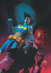
9/10


Batman and Robin #1 - A bit of a slow start for the new series, which isn't necessarily a bad thing. Not every story needs to be an unstoppable destruction derby from start to finish. I did find it a bit strange that either the entire issue took place during an overcast afternoon or Frank Quitely doesn't have a thing for long shadows and dark backgrounds. Batman and Robin are so consistently associated with the night that it seems off to catch them going about their business against a well-lit skyline. I liked the rapport between Dick and Damian, with neither side of the new partnership fully trusting the other, and the give and take certainly put a new spin on an old, traditional relationship. I'm not at all sold on the villains yet - they seem skewed and twisted just for the fun of it - but again I suppose that's intended to put a fresh stamp on this classic pair of characters. Did Wayne Tower always have pointy Batman ears on the roof? Isn't that a bit obvious? I found this to be acceptable, not blow-me-away good like the pair's run on All-Star Superman but also not a complete let-down. I'll give it time to fully develop before I dive into any harsher criticisms.
6/10


The Walking Dead #62 - After what happened to the group last month, it's understandable to burn an issue on reactions and recoveries, both emotional and physical. Of course, it wouldn't be Walking Dead without a random appearance by a stumbling, mumbling gang of zombies, but that's over and done with in a few pages and then it's back to the mourning. Not sure where Kirkman is going with the upcoming "Trackers" storyline, but he's certainly foreshadowed the hell out of it so clearly there's something important about to go down. I keep wishing he'd just get on with it, reaching the end of the issue and deciding that surely next month is the moment the cat gets out of the bag. But then it doesn't, and the process just repeats itself. At least this month the shadowy men lurking in the background have taken some sort of action, so it seems that they're finally ready to make their move. That is, until next issue rolls around and it's more of the same. Still, these are minor complaints and even during a slow month this remains a tip-top series.
8/10


Last of the Independents - I'd bought this when it was first released, having been a somewhat regular reader of Matt Fraction's blog at the time, and haven't picked it up again since. I can remember finishing it the first time through in a single sitting, and fortunately enough it's handled the years very nicely. The story is simple enough - an aging low-level mastermind and two buddies aim to hit it big by clearing out a small-town bank, only to find the unexpected: three enormous bags of mafia property sitting in the vault when they arrive. The rest of the developments spiral outward from there. It's a simple heist tale with a trio of complex, well-rounded personalities and no shortage of imaginative explosions or sudden gunfights. Fraction's writing is astonishingly concise and terrifically effective, but the show's really stolen by his artist, Kieron Dwyer. Dwyer brings a fresh face to every character in the drama, whether it's a lead or one of the nameless suits unfortunate enough to step on a land mine after a single panel. The entire issue is presented in a wanted poster-style duotone: brown, white and khaki on a newsprint stock that gives things an extra layer of western authenticity. I felt like I needed to wash my hands after sitting down to read this, and could've sworn I tasted some of the dust that was kicked up during one of its crazier action scenes. Loads of fun, easy to pick up but painfully difficult to set back down again.
9/10


Ex Machina #43 - I can't shake the feeling that I'm missing something here, because from all indications each of the major characters are focused on one specific direction and I haven't the foggiest what on Earth it is. Reading this issue was like watching the trials at the end of Indiana Jones and the Last Crusade without realizing they were after the Holy Grail. Why are they going through all this trouble? What do they expect to find? What could possibly be worth this kind of a risk? Eh... we'll just tell you when they get there, mmmkay? That nothing much of consequence really went down this month only makes things worse. It was just thirty-odd pages of characters gearing up, saying their farewells and getting ready to face, literally, the great unknown. Except they know what it is. Maybe I'll appreciate it more once the series has concluded with issue #50.
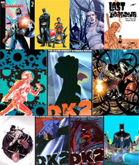
6/10


The Dark Knight Strikes Again #1 - After a few years on the shelf, I wanted to see if this was still as bad as I remembered it being. Well, as far as the first installment goes... it is. If I dig deep enough, there's plenty of great conceptual work here to get excited about - the Atom's entrapment inside a petri dish, the idea of an artificial President of the United States, the extremes the media has gone to in order to gain an upper hand in the ratings - but it's all tangled up in such a forced, convoluted plot that it's tough to pay attention to the good stuff. Miller's writing is infuriating, he spends half the issue testing to see how much slack the DC editorial staff is willing to give him and to call the other half sloppy does a disservice to the word itself. The plot is all over the place, introducing unnecessary changes on a whim while never really explaining the motivation, and the artwork... fuck, the artwork. It's HORRIBLE. I've admired the risks Miller has taken with his style for literally his entire career. He never stands still, always trying something new. Take a look at his Daredevil, his Ronin, his Sin City; when he's motivated Miller is a genuine renaissance man. He can try anything, take any inspiration to the page, and still come out smelling like roses. The Dark Knight Returns is his masterwork, a gorgeous blend of frantic linework, meticulous details and careful omissions. Professors could spend entire semesters on the lessons he taught in that mini-series, but in TDKSB he's utterly lost his mind. With the exception of the aforementioned petri dish scene, in which Miller reverts back to the style he employed on Ronin, this is inexcusable work. If I were the editor upon whose desk these pages had arrived, I'd have been strongly motivated to reject them, for all the brass balls that kind of move would have required. I know that as a culture, we afford legends a certain degree of lenience out of respect for what's come before, but there's a limit to what I'm willing to accept and this is well, well beyond that. It's just awful, and I fear my memories are correct: the worst is yet to come.
2/10


Dark Avengers #6 - I might be able to write the same review for just about every issue of this series. For the moment, at least, more Osborn means more entertainment and this issue provides yet another playground for his personality to fool around with. Of course, the green-shaded voices that keep filling his head are cause for concern, but for now I'll give Bendis the benefit of the doubt. He hasn't gone completely over the top with Norman yet, and the scene he delivers with the fearless leader and Namor this month is good enough to momentarily erase any worries about the future. Deodato could stand to make Norman a bit less of a Tommy Lee Jones clone, but otherwise his artwork is showing continued signs of improvement. He's a bit different than what I'm used to in a high-profile Marvel book, but this is anything but your typical team of superheroes.
8/10


Daredevil #119 - Feels like the calm before the storm - there's a lot of talk, double-crossing and maneuvering this month, without a lot of action. Every issue of Brubaker's run has seemed like it's moving to a completely different tempo, which may make for good reading in the trades but it's a bit disorienting when you're following month-to-month. If anything, he knows how to keep me guessing - I haven't known where this arc has been going from word one, and I'm pleased to report that hasn't changed this month. Bru keeps surprising me with the duality of his characters, which means there are very few truly good or evil men and women in this series. Matt's made some serious mistakes recently, and rather than confront them he's chosen to sink back into his work as Daredevil and neglect his personal life. The Kingpin has been through the wringer since his disappearance, and while he's clearly not the same man who took charge of the city years ago, that isn't stopping him from giving the old business another serious shot. Eventually something's got to give, but we've all spent so much time getting to know these individuals that it's going to make quite a thud when one of them falls. It gets pretty dry in parts, but otherwise this is some really complex, fascinating work.
7/10


The Dark Knight Strikes Again #2 - Even worse than the first issue. How long did Miller spend on this? One long weekend sounds about right... there's so little effort involved with these illustrations that they almost transcend their own genre and become great comedy. Maybe more disappointing than Frank Miller's own failures in this series are those of his wife and collaborator, Lynn Varley. Throughout the first Dark Knight, she was an easily-overlooked but essential part of the team. Her colors brought just as much to the scene as Miller's pencils, inks and storytelling, and in an era before computerized colors, she really helped the series to stand out. None of its competitors looked anything like it. Now, a decade and a half later, she's trying her hand at the magic computer box with embarrassing results. Easily fascinated by gradients, Varley pays more attention to blur filters and awkward, pixelated special effects than she does to coloring inside the lines or adding anything to the visuals. Her failures just throw one more shovelful of dirt on the unmarked grave of this awful mini-series. No matter where I look, there's something to furrow my brow and frown about.
1/10


The Dark Knight Strikes Again #3 - I'm a little confused about why this is even classified as a Batman book, since the caped crusader quite clearly plays second fiddle to Superman in ever single issue. Even the lead villains, Luthor and Brainiac, are shamelessly pillaged from Clark's Rogues Gallery. Despite being little more than an afterthought in issues 1 and 2, the imposter Joker finally shows his hand with about ten pages left in the third chapter, climaxing in Bruce's one true moment to himself and a surprise revelation that should probably carry more weight than it does. Miller's artwork remains crazily inconsistent in this issue, with some pages showing actual promise and others displaying the same callous lack of interest that damned his first two showings. His writing does show a slight improvement, but Lynn Varley's colors don't enjoy the same fate. This sequel is a disappointment from start to finish, uncomfortable at its best and insulting at its worst. Did I really drop close to thirty bucks on this when it first came out? What a shame...
2/10


Batman and Robin #2 - I wasn't so sure about the direction proposed by the first issue, but should've known better. Morrison and Quitely hit the ground running this month and never look over their shoulders. This issue moves quickly, asks more questions than it answers and shows off the inherent difficulties in Dick and Damian's relationship. It's an uncertain time in both characters' lives, and they each seem to feel that the other is holding them back from realizing their own true potential. I didn't really care for the freakshow villainy squad last month, but they're beginning to grow on me, particularly as more of their odd eccentricities are revealed. I love the tiny, campy little nods to the old TV series that Quitely has been working into his artwork so far. The string of S's left behind in the smokey trail of that departing rocket, the "smash" spelt out by the cracks in the wall after a scuffle, they're subtle enough to blend in, but not so much that they go unnoticed. This is starting to be just as much fun as All-Star Superman.
9/10