Monday, July 30, 2007

Shanna the She-Devil #1

Justin Gray, Jimmy Palmiotti and Khari Evans have come together this week to give us Shanna the She-Devil #1: “Pirates, Gangsters and Sea Monsters.” Originally brought to the Marvel collective as the wife of Ka-Zar, Shanna was reimagined and relaunched by Frank Cho just a few years ago, losing her association with the Lord of the Jungle and many of her inhibitions along the way.

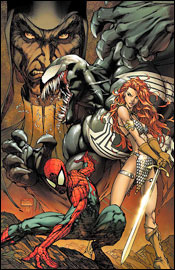
This book looks, acts and reads like the kind of softcore porn that fills Cinemax’s airwaves after 10:00 on any given weeknight. Some rudimentary thought is given to developing a very basic story, introducing a cluster of paper-thin characters and bringing them all together into a common locale, but that’s not really the main order of business here. Shanna is designed to deliver two things: action and pin-ups, and it balks at neither mission.

The story wastes little time on introductions, throwing most of the lead characters into the fire on page two, which makes for some difficult initial reading. One second you’re following a squad of nameless goons, the next an entirely different squad of nameless goons is being mowed down in a hail of gunfire. It took me a few minutes to realize that the entire cast hadn’t been obliterated before the series had finished taking its baby steps. You’d think that some time would be devoted to further developing this team as the issue carries on, but no such insight is forthcoming. Since the entire story focuses on three main characters, it doesn’t really mean anything when some of the aforementioned goons meet a grisly demise about twenty pages later.

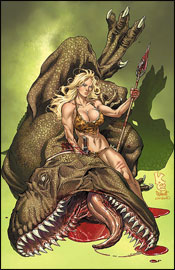
Khari Evans’s artwork is often interesting, and his paneling style gives the issue a unique, lighthearted flavor that sets a tone, presumably, for the entire series. It doesn’t take itself too seriously, so the reader doesn’t need to either. Evans shows flashes of brilliance here, especially when he’s tasked with illustrating a crazy action scene, an extinct species of wildlife or a scantily clad lady, but he has some problems with consistency. His interest is obviously in the above subjects and little else, as the quality of his work suffers when there’s nothing exploding, stripping or attacking on-panel. He seems to grow bored with the subject matter, and as I quickly found out, a bored Khari Evans makes for a dull visual.

In those instances, though, the work of colorists Paul Mounts and Christina Strain make up for the artist’s shortcomings. They really do provide an excellent splash of life to the issue, and their work on the frequent splash pages is downright stunning.

So long as you know what you’re getting into with this, it won’t disappoint. Men fire guns. Women strike awkward poses that serve no purpose but to highlight certain aspects of their anatomy. Dinosaurs attack and blood flows freely. You’re not going to get any philosophical insights into the human condition, but if you were really expecting that after a peek at the cover, maybe that reveals a little something about your own internal wiring. This would make for a great bachelor pad bathroom book, but if you anticipate company at any point in the next two years, you might want to settle for a flip through in the store. After twenty seconds with the issue, you’ll have absorbed just about all it has to offer.

On a scale of 1 to 10, where 1 is poor and 10 is amazing...
Overall Score: 5

Spider-Man / Red Sonja #1

Spider-Man participates in his latest crossover book this week, randomly crossing paths with the chain mail-adorned, sword-wielding lady warrior Red Sonja. The two have actually met once before, way back in Marvel Team-Up #79, a notorious 1979 tale by Chris Claremont and John Byrne. Now, nearly thirty years later, Michael Avon Oeming and Mel Rubi do their best to honor the work of that highly regarded duo in a five-issue mini-series featuring the same characters.

Michael Avon Oeming’s story takes many of its cues from that Team-Up original – the villain, the diabolical means of his arrival, the uneasy air between the title characters – and the basic plot holds up surprisingly well. Oeming’s little twists on that existing story, however, leave me wanting a bit more. For the first in a five-issue series, there doesn’t seem to be a lot of substance here, and I’m not sure how he’ll stretch the concept through the entire run. None of the major threads introduced here are substantial enough to require another four issues to wrap up, which makes me think that the following issues will be overflowing with filler – just like a lot of this one was.

I’ve read some of his writing before and enjoyed it, but Oeming seems to be out of his element here. He never adequately addresses the vast cultural differences between the middle ages and the modern age, so there’s a major hiccup when the two begin to intertwine. He shrinks the size of the city enormously: how were all of these major faces in the same block of Manhattan at the same time on the same night? He struggles with the identities of some of Spider-Man’s most well defined characters, instead reducing them to a minor supporting cast and eliminating their most interesting quirks and flaws. Somehow, I can’t imagine J. Jonah Jameson saying something like “Your sorcery is indeed strong.”

Hiding behind a beautiful Michael Turner cover, you might be surprised to discover that Mel Rubi’s interior artwork is fairly mundane. His style fits into the Marvel archetype but is inoffensive to a fault, lacking in personality and rarely taking any risks. It’s also unflattering to the subject – there’s a panel early in the book of Spidey standing upright in an alleyway that’s just begging for a touch of creative liberty, but is instead rudimentary, painfully dull and surprisingly squat and pudgy. As the issue progresses, he loosens up a bit in this regard, but never seems entirely comfortable with the characters.

Rubi rarely takes an opportunity to allow the shadows to play a part in his rendering, and it really serves to flatten his style and erase a lot of the life from these panels. On the rare occasion that he’s all but forced to stray from his habit of straightforward line work and introduce some dark blocks of shadow, he struggles. The last page is an especially bizarre example, as the two heroes meet on a rooftop and stand mere inches from one another. Spidey is utterly awash in strangely placed shadows while Sonja stands completely lit, not a dark spot on her body. It almost looks like the illustration is only partially finished.

He also opts to sketch Spider-Man with a variety of different expressions on the eyes of his mask from panel to panel, which is a major pet peeve of mine. The mask doesn’t work that way. If you can’t think of a way to establish that Peter is confused or angry through body language, maybe you should stay clear of masked characters in general.

This is a crossover for crossover’s sake, really. There wasn’t any need to bring these two characters together again, save to reignite interest in their original one-shot, and it doesn’t look like they have any plans to reprint that issue in the near future. If you’ve read the Claremont / Byrne take on this clash, you can skip this without missing a thing, as it’s basically a modernized version of the same story. If you’re new to the experience… eh, skip it anyway and try to get your hands on the original. It’s selling for three bucks on eBay at the moment, and you won’t have to wade through four additional issues to get a resolution.

On a scale of 1 to 10, where 1 is poor and 10 is amazing...
Overall Score: 2

Tuesday, July 24, 2007

X-Men: First Class #2

Jeff Parker, Roger Cruz and Marvel Comics present X-Men: First Class #2 this week, in a story dubbed Island X. Telling the forgotten stories of Charles Xavier’s first cluster of mutant pupils, First Class serves as a sort of Year One for the X-Continuity. Before the Beast was blue, before Warren Worthington had gone to the dark side (and back again), there were these tales.

Cruz is no stranger to the X-Men, as he’s jumped around the various books beneath that umbrella for several years, and shows a lot of promise as a regular artist here. His style is an interesting mesh of detail and simplicity, never overcomplicating his characters’ bodies, but also never pulling any punches on their surroundings. Truthfully, his greatest strength is his work on backdrops and environments. I was twice as taken by the ocean liner surrounded by cloudy skies that carried the team early in this issue than I was by the mutants themselves, and a jungle setting provides him plenty of space to play throughout the story.

When he does get a chance to go detail-heavy in the foreground, as is the case with a few of the monsters in this issue, Cruz really hits the ball out of the park. I’m a big admirer of the work of Geof Darrow, and Roger channels his work nicely in that respect. His understanding of the peaks and valleys of action storytelling is dead on, too. When the fur starts to fly, your eyes rush frantically to the next panel, but when the drama hits a lull he doesn’t lose your attention.

Jeff Parker’s story is kind of bargain-basement, unfortunately, and reminded me more of the freebies Marvel gives away on certain occasions than a real meat-and-potatoes book featuring some of their most marketable characters. The narrative is stilted and often unnecessary, and the story has some serious issues with pacing. He brings plenty of fresh ideas to the table, but the conflicts are presented and resolved so quickly, it hardly feels like there was much of a threat to begin with.

I had a hard time specifying a timeframe for this story. As a flashback title in premise, I found a lot of the dialog to be way too modernized for its own good. Iceman and Angel play the more freewheeling members of the team, and throw around words that I can’t imagine anyone using conversationally in the ‘60s or ‘70s, which is when one would presume this is meant to be set. Then again, I guess that would mean these original teamers are pushing fifty / sixty years old in today’s books, and we all know that’s not the case. Such is an inherent problem when dealing with a “lost stories” title – it forces readers to confront the inaccuracies in the main cast’s aging processes.

All things considered, it’s not an awful tale - it’s just very light reading. Jeff Parker has an excellent grasp of the team’s interactions with one another, and delivers good comedy in the story’s frequent lighthearted moments. Just don’t go in expecting God Loves, Man Kills. Roger Cruz still has a few wrinkles with his style, and may be best suited as a dedicated background artist, but he’s got a great grasp of the fundamentals, which is refreshing. This isn’t something I’d jump to add to my pull file, but it’s worthy of a flip through.

On a scale of 1 to 10, where 1 is poor and 10 is amazing...
Overall Score: 5

X-Men #201

Mike Carey and Humberto Ramos bring you X-Men #201, Blinded by the Light (part 2 of 4), available this week from Marvel Comics. Last issue, Mystique blindsided Rogue’s squad, reformed the Marauders and nearly decimated the heroes in one fell swoop. This month? Fightin’. Lots and lots of fightin’.

Humberto Ramos is an artist that I’ve always meant to get really into, but never really got around to investigating more closely. It’s been years since I’ve seen his work, and while there were always similarities between his art and that of Chris Bachalo, over the years he’s accrued a nice variety of styles. I’m seeing shades of Joe Quesada here, bits and pieces of Joe Madureira there, and enough fresh work to know that he isn’t ripping any of them off.

Ramos really excels in these battle scenes, where the dialog is kept to a minimum and he can focus on the story of a large-scale brawl on his own. He maintains Wolverine’s squat proportions, while keeping his appearance ferocious and dangerous – which is nowhere near as easy as it seems. His take on Cannonball is explosive and intriguing. Seeing both in the heat of the battle only serves to further highlight his talent. It takes a good writer to trust his collaborator with this kind of a scene, and an even better artist to make it work out for the both of them.

While I’m slowly becoming an even bigger fan of his work, Humberto does have his little quirks and seams. Almost everybody has their mouth hanging wide open throughout the issue, which initially makes for an outstanding visual. After a few panels, however, one starts to wonder how they’re keeping the bugs out of their throats and whether there’s a big problem with lockjaw among the superhuman community. He also tends to overemphasize the size of his characters unnecessarily, and occasionally struggles with facial expression. There’s a panel midway through this issue where Kitty Pryde looks like she has some sort of a mental disorder. An overwhelming, enveloping visual style can be both a good thing and a bad thing, and Ramos doesn’t quite know how or when to show restraint. It’s all-dynamic, all the time.

Mike Carey does a fairly good job of balancing the high-intensity fight scenes that dominate this issue with a few scattered change of pace segments. While he’s dedicated to advancing the main plot through explosions, mutant powers and knock-down drag-outs, his best writing in the issue is with a conversation between Kitty and Peter back at the mansion. He explains more about these characters through a short chat about scary movies than he could with any amount of fireworks or fistfights. As a matter of fact, there’s a fair amount of dialog throughout the issue for an action book, but it’s never too verbose and it remains realistic and subdued throughout.

My main complaint about the issue is that it reads too quickly. Since it’s primarily an action issue with a few brief asides, that’s to be expected, but it remains a problem. Unless you’re familiar with a lot of these characters, you’re likely to be overwhelmed, too. There are a lot of faces scattered around these pages - more than four teams’ worth of heroes, villains, tweeners and outsiders - and there isn’t the room nor the inclination to introduce them all for first-timers.

The artwork is outstanding, the writing has moments of brilliance, and neither creator is hesitant to take serious risks with these big-name characters, which makes for a fun read. If you’re any kind of an X-Men enthusiast, this book will already be on your radar, regardless of my opinion, and with good reason. If you’re like I’ve been, casually browsing the titles for some time but never seriously following them, give this book a borrow. You might see a few things that you’ll like.

On a scale of 1 to 10, where 1 is poor and 10 is amazing...
Overall Score: 7

Onslaught Reborn #4

Jeph Loeb and Rob Liefeld have teamed up to deliver Onslaught Reborn #4, shipping this week from Marvel Comics. Amazingly, it’s been ten years since Liefeld and then-partner Jim Lee teamed up to refresh some of Marvel’s most noteworthy properties, and the publisher is celebrating that anniversary with this five-issue limited series. I’ve missed the first three chapters, so we’ll dive right in here with issue number four.

In traditional Liefeld fashion, most of this book’s panels aren’t afforded the luxury of a background, and those that are given this special treatment overflow with needless winks and nods at the reader, distracting from the story and interrupting the action. A wrecked car sits at the edge of one panel, with a license plate that reads “LIEFELD.” It’s then shamelessly repeated further down the page, before the backdrops are once again left to the imagination of the colorist.

Constant inconsistencies with Iron Man’s appearance, along with Liefeld’s... special... grasp on human anatomy don’t help matters. I don’t know how the Scarlet Witch gets a breath of air into that outfit. She’s so top-heavy that if she tried to stand completely upright, her spine would buckle under the pressure... but that’s the case with all of his female characters. Every moment of every panel is filled with tight-fitting wardrobe, grit teeth, painfully-overflexed musculature and squinting eyes. It’s all the worst bits of the Image Comics style without any of the personality or flair.

It’s like the guy hasn’t learned anything from his rise to and fall from stardom in the mid ‘90s. His work hasn’t evolved, he hasn’t addressed the holes in his game, and without their outfits I couldn’t distinguish one character from another. I feel like I’ve been reading an old issue of Youngblood with a new writer and a different cast of characters.

I’ve long been a proud Jeph Loeb supporter, but I can’t honestly defend his work here. Some of the dialog he delivers between Iron Man and Captain America in this issue is so hokey, I have a hard time imagining that he’s actually responsible. I don’t think Ant Man has an original phrase in the book – they’re all borrowed from one source of pop culture or another. Onslaught’s lines are straight out of the “stereotypical, megalomaniacal evil villain playbook,” and the good guys’ comebacks are such hackneyed, machismo-soaked garbage that I’d rolled my eyes a half dozen times before even reaching the halfway point.

Even as a standalone issue, the story is filled with inexplicable holes and coincidental pauses in the action. Battles screech to a halt so characters can deliver their monologues on cue. Villains reuse the time-honored tradition of assuming their plans will succeed before they’ve actually begun to execute them. I don’t even know what happened at the end of the battle between Onslaught and Captain America. It’s the sort of story that punishes its readers for trying to think for themselves.

Everybody probably has a book like this one in their collection somewhere, even if they’re too embarrassed to admit it. It’s an issue produced with little attention to detail, minor personal investment and every intention to look hip, smart and cool on the big stage. Loeb left just enough room for Liefeld to slide in three or four two-page spreads, which have long been his specialty, but beyond that there’s really nothing worthy of your attention here. If you're looking for something with even a shred of substance, steer clear and raise your head up high. Onslaught Reborn is exactly what you'd think it would be. Skip it.

On a scale of 1 to 10, where 1 is poor and 10 is amazing...
Overall Score: 1