Monday, October 31, 2011

Spaceman #1

With a ten-year collaboration on the critically acclaimed 100 Bullets already under their belts, along with the preceding Jonny Double and a brief flirtation with mainstream waters in Batman, it's becoming pretty clear that Brian Azzarello and Eduardo Risso have a good thing going. Their latest effort, the nine-issue limited series Spaceman, signifies a triumphant return to the seedier type of creator-owned property that put the duo on the map. It's not 100 Bullets all over again - the two have little in common beyond dark overtones and each creator's unmistakable panache - but it's every bit as effective in its own way.

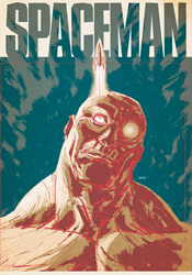
Azzarello's writing in this premiere already has a lot of meat. His vision of a pollution-smeared, technologically advanced future is as much a viable prediction as it is a fully functional backdrop for the tale he's got in store. While the poverty-ridden lower class (in which our protagonist counts himself a member) may enjoy the kind of astonishing personal technology that would make Apple blush, they do so in squalor and despair, beneath a muted gray skyline. While the local drug dealers now accept wireless debit cards, the dollar in the accounts they're pilfering effectively halves in value several times a week. Like many timeless sci-fi classics, Azzarello's climate marries modern concerns with a distant future that's just different enough from our own to remain a fantasy.

The primary storyline is just getting rolling by the time the back cover rolls into sight - par for the course where half-sized, budget-priced premiere issues are concerned - but already it's clear that there's plenty going on. There's something not quite human about the spaceman himself, who's never given a proper name, although he shows all the signs of just such a condition. He routinely gives in to vice, scarcely making enough time to earn the bucks for tomorrow's fix, and often fades off into memories (or are they daydreams) of an outer space lifestyle left far behind. This puzzle's pieces are twisting and turning with no obvious rhyme or reason at the moment, but if I look closely enough I can tell there's a gorgeous tapestry waiting to come together.

As usual, Eduardo Risso's artwork proves the perfect compliment to his partner's visions, no matter how elaborate. His clever use of perspective and carefully limited linework gives the landscape every bit of justice it deserves, while keeping the page cleanly navigable. His character designs, boiled down to the essence of each individual, are only further steps in that same direction. Our cast is easily identifiable by just the second page, and it's astonishing how much character Risso can imbue with only a few sharp strokes. His gritty, unwashed style makes no effort to conceal the world's warts, blemishes and shortcomings, which makes it a terrific match for the tone and nature of this kind of story.

Eventually these two may overstep their bounds, perhaps when they tire of dark skies, angry grimaces and gun barrels, but that's neither here nor now. Spaceman is another smash hit for the duo, brilliantly fleshed out but still quick, easy and entertaining to read. It's got instant, pulpy substance, what looks to be a twisting, turning central mystery and a dark, cloudy distant past that's screaming for further investigation. At full price this would've been worth a strong recommendation, but for a dollar it's criminal to leave it on the shelves. Buy it without a second thought - what have you got to lose?

On a scale of 1 to 10, where 1 is poor and 10 is amazing...
Overall Score: 9.5

Wolverine and the X-Men #1

It's opening day for the rejuvenated Xavier school for mutants, and this time it's not just the underclassmen that are adjusting to a new environment. Following the events of Schism, Wolverine's found himself headmaster of the east coast squad, and he's appointed a faculty full of familiar faces. In further evidence of the cyclical nature of all things human, (or homo superior, as it were) many of your favorite X-Men alumni have returned to their old stomping grounds in an effort to help train and teach the next generation of mutant wonders.

Jason Aaron's plot is like a glimpse back to the heyday of the X-Men family, when life as a mutant wasn't all pomp and circumstance and the crew was certainly not above leaning back on a day off and having themselves a little fun. The character-driven central storyline hinges on a crucial visit from the Department of Education, who seem to have made up their minds about the facility before they've even stepped through the front door, and their decision to give the school a green or red light with the state commission. With the readers riding shotgun, Logan and Kitty - clearly uncomfortable in their new roles as grinnin' mouthpieces - do everything in their power to make the best of an inherently difficult situation and fail repeatedly in increasingly spectacular fashion.

It's a new trial for Logan, who's long been a lightning rod of controversy among hardcore fans for being so oversaturated and resistant to change. We've seen Wolverine as the warrior, the rebel, the bleeding heart and the father figure, but never as the calm, collected institutional leader. It's a role that's going to take a lot of getting used to, both for him and for us, but one Aaron seems to have a clear, intelligent plan for. With Shadowcat at his side for counsel and a staff of close friends providing further guidance, Logan will have every opportunity to make this work, but something tells me some old habits die too hard for everything to go too smoothly. In fact, those inevitable blow-ups are what I'm looking forward to the most. When was the last time Professor X threatened to disembowel a misbehaving student?

Returning to the Xavier landscape yet again, respected journeyman Chris Bachalo delivers a special blend of character, informality and familiarity to the both student and teacher. Bachalo's had his ups and downs over the years, with tight deadlines occasionally leading to some sloppy efforts, but when he's motivated his work is among the industry's very best. Concerned readers can quit worrying, because he's brought his A-Game this month and the subject matter lends itself perfectly to his strengths. Featuring a wild variety of body types to play with, a few staggering two-page spreads and an excess of playful, body language-infused dialog, Bachalo's personality fits this setting like a glove.

It's been quite a while since I've been so impressed with a debut issue featuring a prominent X on its cover. Amidst so many years of crossover events, landscape-changing mega revelations, in-fighting and relationship drama, it's a real breath of fresh air to see these characters finally letting their guards down a bit and just being themselves. Jason Aaron's storyline is simple, deliberate and enjoyable, a basic premise that succeeds wholly because the cast is so diverse and colorful. Pair that with a lively, enthusiastic tone and a solid, appropriate turn from Chris Bachalo and you've got my attention. Where we go from here is anyone's guess. Buy it.

On a scale of 1 to 10, where 1 is poor and 10 is amazing...
Overall Score: 9

Monday, September 26, 2011

Star Trek (2011) #1

Confidence is a trait James Kirk never seemed to lack in Star Trek's recent film reboot, but for that quality to truly manifest itself into something meaningful, it requires the respect and loyalty of one's peers. That's something we never had a chance to see in play during the squad's first adventure, as Kirk spent the entire tale proving his worth and, ultimately, staking a claim to the captain's chair. When we rejoin the cast in this month's Star Trek #1, and presumably in the forthcoming sequel, Kirk has already completed his transition from ragged potential leader to proven, venerable commander.

In some respects that's a good thing; leaving the origin chapter behind can only open new doors to adventure. Eventually the core group members have to embrace their responsibilities and push forward as a bright, versatile young unit. However, it also runs plenty of risks, some of which aren't so deftly avoided in this very issue. When Kirk, Spock and Bones step away from the bridge to discuss a sudden threat to the Enterprise, for example, the conversation could just as easily have come from the mouths of Shatner, Nimoy and Kelley as their fresh-faced counterparts. They've already slid too easily into the static, classical roles associated with each character, and the last thing the fledgling crew should be doing at this point is getting too comfortable on the bridge. After all, what's the point of taking a new direction if it's just going to wind up in exactly the same place as before?

I suppose it's inevitable that some amount of revisitation is in order for such a long running, well-regarded series. The plot of this month's issue, notably, is lifted almost directly from an episode of The Next Generation. What's to stop the movie franchise from going a similar route and resurrecting Khan in the near future? And who's to say they'd be wrong to do so? My concern is that too much reverence is paid to the original tales at the cost of ingenuity and fresh thinking. It's a very thin line between the two, but I left this issue with the impression that it wound up standing on the wrong side. Excessive familiarity does breed contempt, after all.

Fortunately, the artwork doesn't subscribe to quite the same mantra as the storytelling. Stephen Molnar's linework is loose and playful, more concerned with gesture and character than rigid technical proficiency. Though he does occasionally tread a bit too near the uncanny valley in some of his interpretations of the actors behind each role, those transgressions are usually tempered by a crisp, clean environment and a quick return to form in the next panel. Molnar doesn't get much liberty to light up the page in this bookful of board rooms and staff meetings, but he does manage to keep things fresh and interesting all the same.

Sadly, as slightly more than a passing fan of the Trek mythos myself, I found the new troupe's debut issue redundant and actionless, a safe reinterpretation of a classic story that never manages to shift out of first gear. Though forthcoming issues may promise more in the way of exploration and extraterrestrial encounters, the tone that's been set in this initial adventure is a long ways from reaching the potential set by its celluloid predecessor. Die-hard Trekkies might enjoy it as an appetizer for things yet to come, but even they will find plenty of minor ticks and glitches to pick away at. Flip through it.

On a scale of 1 to 10, where 1 is poor and 10 is amazing...
Overall Score: 4

Monday, September 5, 2011

Planet of the Apes #5

When this issue rolled into my review box, I momentarily paused to consider how such a lucrative franchise had managed to avoid this medium for so long. After all, the intelligent blend of sci-fi and fantasy seen in the Apes seres has typically fared very well in comic books, and without any concern for prosthetics and special effects to get in the way, the concepts and ideas behind the story itself could be reasonably expected to succeed. Well, a quick Wikipedia search later and the facts stand revealed: the 2011 edition is far from the first adaptation attempted with this license. Since the original film landed in theaters, no less than a dozen different publishers have tried their hand at the simian landscape, including several mangas, a three-year run at Marvel and a Dark Horse tie-in to the 2001 Tim Burton-helmed failed relaunch. Learn something new every day.

Despite that long tradition of ill repute, however, Daryl Gregory's new interpretation might just wind up being the one that finally sticks. Like this year's big screen relaunch, it seems like Gregory can see beyond the masks, make-up and long-lasting catchphrases of the first film to the enduring message buried beneath. On the surface it's a sci-fi adventure with apemen riding saddled horses and humans thrashing wildly in their cages, but beneath that lies a complex, relevant message about segregation, society and racism of all shapes and sizes. Not only does the new series meet these issues head-on, but it does so with a hefty, diverse cast, a large-scale primary storyline and dozens of intelligent minor plot threads. And though this issue can at times be intimidating for new readers, its pace is deliberate enough for fresh faces to catch up quickly without feeling completely overwhelmed.

Gregory's found himself a great match in Carlos Magno, too, whose sharp, vivid artwork is all the proof at-a-glance viewers need to tell Boom! Studios is serious about this series. Like former Wildstorm golden boy Travis Charest, Magno's work is richly meticulous, but sparingly so. Both artists speak volumes in the details of each panel, balancing the heavier portions of a layout with effective, strategic use of negative space. Naturally, Magno's contribution doesn't entirely benefit from such comparisons, as Charest's work is more evenly stylized and poetic, but the potential for similar growth is there. With a bit more finesse and a few more years at the table, Carlos could easily grow into a formidable talent. As it is, his artwork is a bargain for the $1 asking price.

That last statement holds true for the full issue, as well. At a standard price, this effort would have received a firm "borrow"”" recommendation and a few words about its potential to move into my pull list somewhere down the line. At less than a third the price of most mainstream comics, though, it easily makes the leap up a level, making it a solid buy. The moody, cinema-influenced artwork might get the first hooks in, but it's the smart, multifaceted storytelling that'll bring readers back for more.

On a scale of 1 to 10, where 1 is poor and 10 is amazing...
Overall Score: 8

The Rinse #1

With no shortage of crime drama on the shelves today, it can be difficult for new books in the genre to make their mark, particularly ones without the benefit of a big-name creative team. In the case of The Rinse, new from Boom! Studios, the goal is to overcome both issues by shedding light on a heretofore under-explored aspect of the shady man's business: the laundering, or "rinsing," of dirty money into nice clean, suspicion-free taxable income. This issue's man of the hour, one Jeff Sinclair, became the best there is at what he does through careful dealings, a razor-sharp mind for the business and more than a few well-placed punches and kicks. He's the under the table high roller's best friend, with a playboy's gift of gab and an attitude like a pulp private eye.

Although we're joining Sinclair at the top of his game, with a wealth of experience and a bed of hundred dollar bills beneath him, that doesn't mean the first issue doesn't deliver its share of elaboration. In fact, the book's half over by the time Jeff removes the training wheels, leaves the paint-by-the-numbers explanations behind and gets on with the story developments. Thing is, for all the effort author Gary Phillips dedicates to explaining the various hoops Jeff jumps through on any given day, I didn't completely buy into the validity of his work. It all seems too straightforward, too effortless and too transparent to escape the eye of his enemies. It's a trend that carries over into the forward-gazing plot threads that stretch their legs in the latter half of this issue, where again our rinser's interactions seem far too on-the-surface to be credible. While the charm of a good noir tale is often in the hints and clues that are left unspoken, The Rinse may as well have spelled everything out on a series of flash cards.

Marc Laming's artwork is a curious choice for such a book. His bright, bubbly style and grinning, happy-go-lucky characterizations seem at odds with the street smart tone of the narrator and the seedy underworld he occupies, like a hot dog stand set up inside the front door of a ritzy club. Laming's best work is in establishing shots, where he showcases a slick, minimal knack for rendering vivid landscapes and bustling city street corners - throw an important character or some action into the mix and he gets tripped up. The mismatch of styles isn't helped by Darrin Moore's shiny, polished color efforts. With a subtle, sleazy palette at play, much of the artwork's shortcomings could have been neutralized. Moore's overuse of warm, friendly shades just drives it further in the wrong direction.

For all the small things this issue gets right - a calm, cool lead, an original take on a crowded genre - there are another dozen larger issues it gets helplessly wrong. Hammy, vanilla dialog is a cardinal sin in a book like this one, but under the right circumstances that can be forgiven. A blunt, predictable plot would take a bit more work to compensate for. Roll all of that up with a badly paired artist, though, and you've got a full platter of problems. Not even a discounted cover price can get this one where it needs to be. Skip it.

On a scale of 1 to 10, where 1 is poor and 10 is amazing...
Overall Score: 3

Monday, August 29, 2011

Teenage Mutant Ninja Turtles (2011) #1

With no less than eight different titles in its past, each bearing their own unique set of continuity implications, one might think the ship has sailed on ever truly rebooting the famed TMNT license. And, considering the somewhat speckled public reaction to the turtles' animated relaunch efforts, the timing of another fresh take might be considered suspect as well. However, considering the tidal wave of responsibilities associated with the franchise which forced co-creators Kevin Eastman and Peter Laird to abandon their initial run very early in its publication lifespan, perhaps those recent bumps in the road are a blessing in disguise. After all, without a hundred different licensing opportunities clouding its vision, the timing could finally be right for the book’s original promise to shine brightly once again.

All of that sounds reasonable enough, anyway.

In practice, it’s a total flop. Eastman’s return to the property that made him famous is a lifeless reinvention, a gruelingly dated “new” direction with a strange set of priorities. In rushing to poke fun at the exaggerations of the original series, particularly those that were most played up in the classic Saturday morning cartoon, the writing comes off as jaded and bitter, a classic knee-jerk overreaction. Where Eastman is looking for a sharp, biting edge, it feels instead like he’s taking target practice at point-blank distances, at times even disrespecting the very core of the characters themselves.

The issue’s plot structure is a total mess, too. After dedicating its entire front end to a brainless, baseless fight scene, the narration leaps to an equally futile new point of genesis for the fearsome foursome. Without giving anything away, I’ll note that the axis of their origin has shifted from the classic “discarded toxic waste in the sewers” to something much more generic and overplayed. And, considering the amount of characters that owe their livelihoods to the presence of radioactive materials, that’s really saying something. Surrounding the four infant turtles is a cast of familiar names in reinterpreted roles. April, Splinter, Baxter Stockman, Krang, Casey Jones – they’re all here, but they’ve each been fundamentally altered for no discernible purpose beyond the capacity to say it’s fresh material.

With Peter Laird declining to participate in the new series and Eastman content with co-writing and layout credits, the chore of actually illustrating this issue falls to up-and-comer Dan Duncan, fresh off a run on Image’s creator-owned The Butler. Duncan’s loose, frenetic work shows a ton of potential elsewhere, particularly on his personal blog and DeviantArt page, but within the confines of TMNT it’s disorganized, constantly muddied and completely forgettable. I’m not sure if the blame can be placed on the pressures of such a high profile gig, the presence of Eastman’s guiding layouts or a tight deadline, but it’s a total miss in every aspect from a guy who seemed to be a surefire prospect.

In no uncertain terms, this isn’t an issue to even entertain opening. If the plot alone wasn’t enough to leave me squinting my eyes and slowly shaking my head, the artwork would’ve straight-up chased me out of town. A desperate cash-in on a dead property, it captures neither the spirit nor the adventurous nature of the original. Some franchises are best left to the crows. Skip it.

On a scale of 1 to 10, where 1 is poor and 10 is amazing...
Overall Score: 1

Monday, August 15, 2011

Detective Comics #881

An interesting thing about children – sometimes they don't fall far from the tree, as the old adage says, but sometimes that fruit lands on a slope and rolls into dark, unfamiliar territory. Such is the case with Commissioner James Gordon, whose biological son and adopted daughter are the figureheads of this month's drama. While Barbara has always embraced the path of the righteous, fighting crime as both Batgirl and Oracle, James Junior has traveled an entirely different route that's culminated in stays with Arkham Asylum and fraternizations with many of Gotham's most colorful enemies.

Gordon's son is different from the rogues Batman has traditionally stared down without a flinch. He doesn't believe in cronies, mindless brawls or elaborate costumes – truly his father's offspring, he relies on cool logic and calculated moves to solve the problems he perceives before him. That makes him a nice change of pace from the usual business, with a few inherent personal feelings of abandonment and jealousy as they relate to his father and sister only adding fuel to the fire. The man is crazy, criminally so, but he's not stupid and that's the kind of enemy that's often the most dangerous.

It's that same careful balance that writer Scott Snyder hopes to capitalize on, but I found the accompanying plot to be a bit too heavy on the build-up and shockingly light on the climax. More than half the issue is dedicated to James Junior's overly verbose explanation of his master plans, a character flaw that even poor captive Barbara can't help but point out, and his lack of an effective follow-through left me wondering how brilliant he actually was. Snyder's heart is in the right place, and on a few occasions he provides a rare, empathic peek into the mind of a psychotically disturbed individual, but the issue's dialog repeats itself fairly regularly and the story's hurried conclusion does nothing to address the deeper issues he hints at. In the end it's just another day at the office masquerading as something more substantial.

The artwork, provided by the team of Jock and Francesco Francavilla, varies from moody and unsettling to chaotic and twisted. Each artist works with a light touch; showing restraint and a solid eye for composition, they both manage to do more with less. There's a pretty clear moment about two-thirds of the way through the issue where the style shifts and it's obvious that we've changed artists, but the styles compliment one another decently enough that such a shakeup isn't unsettling. There's really nothing wrong with the way this issue looks, but it doesn't exactly leap up and take control of the reader's imagination, either - it's suitable but not spectacular.

It's clear from the way he writes the character that Scott Snyder understands the need for a difference between Bruce Wayne's Batman and Dick Grayson's. It's important enough that he even grants the issue's villain a few panels on the subject. There's a rare opportunity to redefine this character at hand, but it's going to take something with a bit more daring than this month's issue to get us there. In a few select panels, Snyder scratches the surface of something with potential, but by the time he's reached the back cover, those glimpses remain just that - peeks of promise that are left unparsed. It's a perfectly decent issue, one that inches the greater plot forward a tiny bit, but not exactly required reading. Borrow it to stay current, just don't expect to come back to it any time soon.

On a scale of 1 to 10, where 1 is poor and 10 is amazing...
Overall Score: 7

Hellboy: The Fury #3

With nearly twenty years of stories behind him, Mike Mignola's Hellboy is still moving forward with a voracious appetite, investigating the supernatural issues no one else dares to touch. On this adventure, though, he very well may have bitten off more than he can chew. That's no hyperbole either, as the scale and stakes have never been higher, both for Hellboy and the planet itself. Staring down the Queen of Witches, Hellboy's aim is nothing short of circumventing the end of civilization as we know it. An extinction event on par with the fall of the dinosaurs is nearly upon us, and the only thing standing between it and us is the little red demon with a giant, gloved right hand.

This penultimate chapter for both mini-series and character is heavy on the atmosphere but still exceptionally easy to read. Mike Mignola's writing has come a long way since he teamed with John Byrne back in Hellboy's very first adventure, and the way he calmly lets major events play out without an excess of narration or explanation is just further proof of his graduation from writer-artist to genuine storyteller. It's an extremely well-crafted issue that efficiently covers the full gamut of emotions, then leaves its audience wide-eyed and uncertain about where things can possibly go next. While he may not be providing the artwork any longer, Mignola's writing is still masterfully streamlined and simple, and he trusts his companion implicitly enough to leave the majority of the storytelling to the visuals.

Of course, the real question for any artist who dares to take up the mantle on Hellboy is how their work compares to Mignola's original run with the character. And while no less than a dozen different artists have offered their take on his signature creation, none have stuck around nearly as long as Duncan Fegredo. Since his first run with the series in 2007's Darkness Calls, Fegredo has carved a spot for himself in the Hellboy mythos, and with good reason - his style is an extremely close approximation of Mignola's. Truth be told, aside from their differing takes on common human characters, it's difficult to distinguish the two at all, particularly when it comes to the titular character. Fegredo's work gets lots of room to stretch its legs this month, with a gigantic fight scene spanning most of the issue and macabre gothic accents enlivening the backgrounds, and he responds in fantastic form. It's a genuinely gorgeous issue that takes on a wide variety of emotions, implications and premonitions, while still maintaining that eerie sense of haunted reality that Mignola has always brought to the table. The big man himself couldn't have done it any better.

It's a rarity in the comics world, or truly in any form of entertainment, for promises of "this changes everything" to truly deliver. Either editorial interference, reluctance on the part of the creators or desperate, poorly concocted new directions hamper such examples with very few exceptions. Not so with Hellboy: The Fury. It's a concluding chapter worth remembering, a storytelling decision born not of any perceived need to shake things up. It's the natural progression of a yarn that's been spinning for some time, and an especially effective one at that. Buy it.

On a scale of 1 to 10, where 1 is poor and 10 is amazing...
Overall Score: 9.5

Monday, August 8, 2011

Daredevil #1

It was bound to happen sooner or later: when the primary facet of a character's personality is the way he handles a series of increasingly gloomy situations, eventually there's going to come a time when the storm has to break. A hero can either resign himself to his fate and curl up in the gutter or seek to reverse his fortunes with a new outlook on life – and I'll give you one guess which direction Matt Murdock has chosen.

In the wake of Shadowland, where Matt truly dove off the deep end and embraced his dark side, this sudden about-face is like watching a different man beneath familiar skin. Mark Waid, no stranger to the happy-go-lucky hero, handles the change of pace more than adequately, but it's going to be difficult for long-term fans of the series to accept a shift in tone so drastic. Fortunately for the new book's sake, Waid's take is brimming with fresh ideas relating to the hero's powers and his place in the new Marvel Universe – seeing them in action for the first time is a crisp, refreshing sensation that's tough to turn away from. I'm just not sure if there's a reasonable way to explain away Matt's transition from the demon-possessed master of a murderous ninja sect to a kiss-stealing, tune-whistling, head-in-the-clouds optimist.

Fortunately, Waid hasn't completely abandoned the wealth of storytelling that preceded him. The majority of New York still believes Murdock is Daredevil, an accusation Matt jokingly deflects more than once this month, and the law practice isn't exactly running smoothly following his lengthy sabbatical. There's still plenty of thunder on the horizon, but for the time being it's grinnin' 1970s Murdock at the wheel and not the self-absorbed, violently angry newer model.

Paolo Rivera's artwork serves as an appropriate compliment to the shift in tone and texture. Following a long line of gritty, darkly realistic pencil pushers, his lighter touch and bright, airy rendition of the city is a breath of fresh air. With the reality-altering villain Spot to play around with and an original perspective on Matt's oft-documented “radar vision” in his arsenal, Rivera makes his first showing a strong one. His work may not be as moody nor as flashy as his predecessors', but it's no less fitting to the style of storytelling it accompanies and on the two or three occasions his gets to stretch his legs with a splash page, it really hits the mark.

Coming straight from the mouth of a longtime reader, the new Daredevil can be considered a success, but not an unbridled one. The bits of promise that Mark Waid shows in his writing are the first hints of a proposed “new direction” that really feels new, despite the similar promises made by each new writer to take the reigns since Frank Miller himself. It's an enterprising new angle that's sure to alienate some readers, but should ultimately be for the best as far as the character is concerned. Nobody should lose all the time. Not even Matt Murdock. Borrow it.

On a scale of 1 to 10, where 1 is poor and 10 is amazing...
Overall Score: 7.5

Superman #714

With their days numbered thanks to the publisher-wide relaunch that arrives later this summer, one could easily come to the conclusion that the air's been let out of many of DC's upper-tier books. And I'd love to tell you differently, that the creative teams in question are using the impending shake-up as motivation to tell the stories they've always wanted to tell, not a death sentence looming directly overhead, but this month's issue of Superman serves as no such proof.

J. Michael Straczynski's storyline this month feels like a limp-wristed placeholder without any purpose beyond keeping the racks supplied with a fresh cover. It's as run of the mill as they come, almost insulting in its reluctance to move forward with any sense of purpose or revelation. Worse, it retrofits recent storylines to fit a cheap, cop-out of a payoff with neither rhyme nor reason.

This month's issue has Superman at his preachy worst, bleeding heart in one hand and random Kryptonian plot device in the other. It's one retreaded flashback after another, serving no significant purpose beyond reminding the readers once again of where the character has been and giving Supes a reason to don a goofy, ill-timed grin in the middle of a brawl. It's a series of narrative thought bubbles spoken aloud to no one in particular. It's every bad stereotype I've come to associate with the character, but always hoped could be disproven. It's a rotten waste of time issue, and I can't just relegate that criticism to the storytelling.

Jamal Igle makes for a spectacular background artist, but his foreground work could do with a major overhaul. Under Igle's watch, Superman himself moves clumsily, wears a series of odd, over-rendered facial expressions, and looks like a genuinely dated character out-of-place with modern society. Accompanied by Marcelo Maiolo's harsh, drastic color choices, though, his efforts seem even worse. Amidst an excess of contrast and a reckless amount of detail, this month's visuals are difficult to decipher at best and downright ugly at worst. It's the tag team from hell, and they're double-teaming your eyeballs behind the referee's back.

Naturally, a bad plot, terrible script, overwrought pencils and overbearing colors don't often come together to produce a worthwhile finished product, and in that regard Superman #714 performs no miracles. It's a burden of an issue, traumatic to the bitter end, and something I wouldn't loan to my worst enemies for fear of how far they'd have to reach to seek true retribution. An abysmal failure of a comic book, it proves that in some instances the great DC renumbering is something of a mercy kill. Skip it.

On a scale of 1 to 10, where 1 is poor and 10 is amazing...
Overall Score: 1

Monday, May 9, 2011

Action Comics #900

It seems Lex Luthor has unveiled a plan to usurp Superman as the preeminent power in Metropolis, and once again he appears to have accounted for every possible out the Man of Steel could discover. This round, Lex has been infused with the power of a god, gifted by a nameless, faceless entity formerly housed in the Phantom Zone. Naturally, though, Omnipotent Luthor's first act isn't something out of the Old Testament – no "let there be light" or creation of intelligent life – it's to loose Doomsday on the major players of Reign of the Supermen, then summon Clark to an uninhabited galaxy for a little gum flashing and lip wagging.

For all the grandiose astronomical possibilities offered to Luthor in his new role, he seems genuinely content with merely flaunting it in Superman's face, waving empty threats even after they've been blatantly disarmed. It's in keeping with Lex's long-standing character flaws: he might just be the smartest man on Earth, but that intellect is counterbalanced by crippling bouts of emotional knee-jerks. Boiling it all down to that one point, though, leaves the larger narrative feeling empty and pointless, like we've spent another twenty minutes of our lives learning something we already knew. For someone who's proven his genius time and time again, Luthor remains incapable of learning from his past mistakes, which makes him little more than a predictable plot device all gussied up as something more substantial than he really is. No matter what wrinkles Paul Cornell may throw into the process this month, as long as that basic formula remains the same, the end result will remain unsatisfying.

Fortunately, Cornell's redundant primary story is backed up by a fistful of imaginative musings on the Kal-El mythos without the bulky anchor of ongoing continuity to hold them back. Boasting an impressive roster of loosely associated talents, these bite sized peeks into the more fantastic elements of Superman's existence are a real treasure trove, almost worth the price of admission by their lonesome. Where the long form A-Side story seems like a necessity, these mini sagas (in the same vein as Batman Black and White) are more a celebration of the character's potential. Damon Lindelof pastes a human face on an impending Kryptonian disaster. Paul Dini gets to know one of the permanent residents of Kal's fortress of solitude. Geoff Johns gives the Legion of Super Heroes a rare opportunity to let their hair down. What this cavalcade of backup stories might not share in genre or subject, they more than make up for with a shared sense of wonder and initiative. They're the backbone of this issue.

So, in short, if you're looking for the latest and greatest challenge to face the Man of Steel, an event the magnitude of which will send reverberations across the DC landscape, this isn't it. As a continuing narrative, it's distressingly shallow and hopelessly redundant. Its supporting act, though, effectively steals the spotlight and offers a glimpse into everything this character and his surroundings could potentially be. After closing the cover on this one, I wasn't anticipating my chance to pick up Action Comics #901. Not a bit, actually. I would, however, be among the first to pledge my support for a more loosely themed anthology of small takes like the ones I saw in the latter half of this package. Flip through it and hover over those closing shots for as long as you can. The rest is nothing to get excited about.

On a scale of 1 to 10, where 1 is poor and 10 is amazing...
Overall Score: 5.5

Thursday, April 21, 2011

Malignant Man #1

When your day-to-day involves a hospital gown, waiting room music, clusters of whirring medical equipment and a series of stern, sympathetic looks from the doctor, it can be tough to find something worth living for. Such is the case for Alan Gates, a cancer patient who’s just been told he has less than a month to live. So it shouldn’t come as a total shock that, when confronted with an armed robbery in progress, Alan takes it upon himself to intervene, carelessly throwing his life to the wind in exchange for the chance to feel something… anything… again. What Alan (and, by proxy, the reader) couldn’t have predicted is the chain reaction instigated by that one selfless, split-second decision.

Weighing in at just twenty-two pages, this introductory chapter successfully manages to cover a lot of ground at a breakneck pace without sacrificing clarity along the way. A simple enough concept is partly to thank for that. James Wan’s plot, adapted for the page by Michael Alan Nelson, wastes little time on characterization. Instead, it chooses to spend its time asking a series of increasingly brow-furrowing questions, then jerking the wheel in sudden, surprising new directions. It thrives on that lengthy string of unexpected leaps of faith, asking more questions than it has pages to answer them in similar fashion to the opening act of The Matrix, albeit much less eloquently.

Despite its aura of mystery, though, Wan and Nelson’s storyline can be quite blunt and generic at times. Its excessive use of slang during a tense scene in the operating room seems forced and unrealistic, not to mention unnecessary. Later scenes involving a gun-slinging escape from the hospital feel too calm and casual, robbing the moment of its inherent drama. In fact, nearly all of the issue’s dialog comes off as clunky and awkward, difficult to read and even tougher to visualize in a conversational setting. The nameless, faceless enemy that stands revealed at the issue’s climax appears to have arrived directly from the book of late ‘90s action clichés. It’s a story that’s furiously treading in foamy water, taking two steps forward with its gumption and adventurous timing, then two backward with stilted dialog and empty characterization.

Piotr Kowalski’s visuals keep up fairly well with the aggressive pace, but fail to deliver a true signature style at any point. His layouts perform very well, slickly moving the action from one panel to the next and pausing at all the right moments. He works a clean action scene, sculpts a few well-designed original characters and maintains a steady beat throughout the issue. Kowalski is just lacking that certain touch of panache which simply can’t be taught. His pages don’t feel entirely alive, nor are they something I could pick out of a sketchbook lineup. They’re fundamentally strong, but ultimately bland and soulless. With a bit more polish and character, his work could easily turn that corner and become something to behold.

Malignant Man has promise, but seems to be missing a real hook in both its artwork and its storytelling. Alan is a painfully dull lead character thus far, really just groggily reacting to the series of crazed events around him, and while that’s a flaw that could be rectified in future issues, it’s also something that could keep readers from bothering to tune in for them. Flip through it; the first issue certainly isn’t a bad one, it’s just quite vanilla.

On a scale of 1 to 10, where 1 is poor and 10 is amazing...
Overall Score: 4

Monday, April 11, 2011

Fear Itself #1

Let's just take it for granted that things are a bit rocky in the Marvel Universe. Though the classic Avengers have finally reassembled, Norman Osborn has been removed from power and the sun seems to be rising over the horizon, things are far from perfect both within Avengers mansion and outside its golden gates. And as the unrelenting dust storm begins to start up yet again, the publisher's most visible heroes have a bevy of new foes to confront as well as several fresh, prickly situations to diffuse.

Matt Fraction's tale in Fear Itself is a natural progression of the “superheroes as social commentary” vein most recently tapped in Brian Michael Bendis's big crossover arcs, in which the biggest names of the Marvel U find themselves entangled not in the robotic arms of Doctor Octopus or another evil mastermind, but rather in the hot button political issues of the day. Where Bendis and the dozens of preceding authors would skirt a direct confrontation by way of allegory and metaphor, though, (take Civil War as a dissertation on the sharp divide between America's political factions, for example) Fraction has thus far been much more up front. He's not using mutants as a stand-in for the civil rights movement, he's actually dropping Steve Rogers in the middle of the ground zero mosque demonstrations. Tony Stark is using his new popular resurgence and the desperate need to rebuild Oklahoma after the events of Siege as a vehicle to create American jobs in the midst of a recession. We're not exactly dancing around the issues any more, and whether you see that as a positive turn or a negative one will depend entirely on the level of maturity and / or escapism you expect from your mainstream comic events.

Of course, it should go without saying that such weighty issues are also counterbalanced by a healthy dose of good old-fashioned superhero mystique. With forty pages of content, this issue has plenty of room for both, and Fraction pulls off his act with impressive poise. The topical matters thus far haven't felt shoehorned in, heavy handed or one-sided, and the more fantastic scenarios around every other page don't seem completely ridiculous or out of place alongside them. This doesn't feel like an opportunity to spray an unsolicited political agenda so much as it does an instinctive next step forward for the publisher's heroes. It's the battlefield on which popular opinion and ancient mythology come to blows.

Aiding Fraction with his work is the uber-talented Stuart Immonen, one of Marvel's most recognizable top-notch superstar artists. Immonen has that magic touch, a knack for conveying whatever mood the writer is looking for via subtle shifts in his artwork. When Fraction is trying to invoke fear, Immonen uses a darker tone and more daunting, worm's eye camera angles. If he's after humor, the panels grow lighter and you'll notice more little throwaway jokes going on behind the action. Even in the more stern, straightforward conversation-based scenes, of which there are plenty, the artwork keeps the pace moving with passion and vigor. It seems like I never have a bad thing to say about Stuart Immonen, and with good reason. The guy never takes a panel off. He's constantly one-upping himself, improving his game and impressing under the glare of a hot spotlight. This issue is no exception.

I'll admit to being a bit burnt out by crossover events of late. Just between the two big publishers alone, it seems like nary a month has passed without some manner of major, series-spanning super story over the last five-plus years. The gimmick is tired, but that doesn't mean it's without the capacity to bring the goods from time to time. Whether or not this storyline delivers on its promise remains to be seen – Marvel's track record on that one isn't exactly spotless – but as setups go, I found this to be thoroughly intriguing. Fraction is asking a bookful of questions without a simple answer to be found. How he chooses to answer them (or if he does at all) will determine how the series is ultimately remembered. Buy it.

On a scale of 1 to 10, where 1 is poor and 10 is amazing...
Overall Score: 9

Green Wake #1

Image's latest foray into the surreal, Green Wake, provides yet another chance for the versatile publisher to showcase its flexibility. The mini-series, a murder mystery set in a Silent Hill-styled purgatory for hopeless spirits, is horror in a more subdued manner than, say, The Walking Dead or Hellblazer. Its lofty aspirations seem to be of a cloudy, atmosphere-dominated tangle in the same vein as David Lynch's Twin Peaks, but its methods of execution leave a lot to be desired.

Our writer, Kurtis Wiebe, for example, seems to delight in being vague. He'll open a doorway wide, then smugly refuse to step through. In carefully limited doses, this technique can be a powerful method to personally involving readers in the storytelling. After all, which is scarier: the monster you see in living, breathing color or the one you'll catch a glimpse of with peripheral vision, a peek so fleeting your imagination is left to fill in the gaps? Overuse of this method, however, is a quick and dirty recipe for frustration and abandonment. If you refuse to reveal a thing, eventually the audience is just going to lose interest in what's behind the curtain altogether. Wiebe's concept, of a world where lost souls go to slog for eternity, is fertile soil, but he's so reluctant to tell us anything at all that it leaves the impression that he hasn't quite figured it out himself. That lack of elaboration also robs the cast of any dash of personality and, consequently, approachability. We're along for a ride through the gray void with a small cluster of cold, expressionless specters.

Riley Rossmo's artwork is a different beast altogether. Rossmo, who's quickly becoming one of Image's hottest talents following prolonged runs on the kooky Proof and Cowboy Ninja Viking, works a captivating style that's equal parts old school, new school and boarding school. His chaotic, loose linework is unbalanced and sharp-edged, like a series of quick gesture drawings freed from the confines of a favored sketchbook. An exuberant, overwhelming dose of benday dots adds depth and structure in unexpected spaces, creatively applied in a similar fashion to James O'Barr's work with The Crow decades back. For the final touch, he sprays the page with a blotchy, often bleakly monochromatic, dash of rough painted color a'la Ben Templesmith. It's at once stripped down, complicated, impersonal and intensely intimate; utterly unmistakable. Like many of the best unconventional artists, his work is curious enough to inspire a much closer look regardless of the accompanying material, which is certainly the case with Green Wake.

Rossmo's work carries the book. While Wiebe is doing his best to add pseudo-suspense via a series of open-ended questions and a distinct lack of elaboration, Riley is off on his own, populating the world with shady characters, haunting landscapes, coal-spoiled skies and leaky pipes. It even appears that, at times, the writer actually realizes the inessential nature of his presence, as he drops completely out of the picture and lets the artwork stroll around on its own for several pages. It's as close as Green Wake ever gets to any degree of enlightenment.

Wiebe and Rossmo's alcohol-soaked venture into the crusty fringes of consciousness is, ultimately, little more than a depressing picture book. It's not quite as complicated, nor as engaging, as it seems to think it is, with a distinct lack of a strong hook leaving the whole experience quite shallow. An adventurous premise and strong establishing shot may deliver readers an early taste of promise, but for the rest of the issue we're sleepwalking through the story just like the city of Green Wake's entire population. Flip through it for the artwork.

On a scale of 1 to 10, where 1 is poor and 10 is amazing...
Overall Score: 3

Monday, March 14, 2011

Herculian #1

Though it may not appear to be the case from the cover, Herculian is a bit more than a simple, tongue-in-cheek homage to the bygone days of superheroic excess. Granted it’s not without such dalliances, but on the large this single-issue package is more like a stream of consciousness playground for one of the industry’s quirkier imaginations. Erik Larsen, who’s been virtually absorbed by Savage Dragon for the last two decades, obviously relishes this opportunity to open the cellar doors and let his inner miscreant out into the streets for a bit of off-color chaos, and that prospect alone is quite refreshing.

Herculian’s self-contained set of short stories, backed by a full color print of “Guy Talk,” Larsen’s ever so slightly more straight-laced 24-hour comic, constantly test the limits of good taste to a variety of results. In this rare break from the stricter limitations of a regular ongoing series, he seems like a beast unchained, lashing out in all directions with unexpected vigor. With Larsen at the wheel, we’re on a hell bent joyride that swerves from acidic surrealism (the pathetic adventures of Cheesburgerhead) to sardonic black comedy (Mickey Maus, which is exactly what it sounds like) to indie fodder (the feature length diner chat of Guy Talk), with brief stops everywhere in between.

Naturally, not all the directions Larsen takes are good ones, for a variety of reasons. Sometimes he nudges the envelope a bit too far into the realm of discomfort, others he’ll keep pressing on a gag that just isn’t working, but amidst the tragically failed experiments are an equal number that really get the job done. None are so memorable that I’ll be carrying them around with me for the rest of my life, but for a rapid-fire array of short diversions, they’re generally worth a glimpse.

Beginning his career as an artist, it should be no surprise that the most interesting portions of Larsen’s work remain the visuals. In Herculian he’s decided on a weather worn style, complete with colors printed slightly out of registration and pseudo-dogeared pages, a simple but effective means of loosening up his readers’ expectations and transporting them back to the more carefree days of their youth, when a beloved comic would absorb food stains and lay under the couch for a year, not slide into a plastic sheath and hibernate in a long box. Erik’s style could never be accused of seeming overly disciplined, especially in more recent years, and that trend continues throughout this issue. In “Guy Talk,” which went from blank slate to completed project in a single day, his typically rushed compositions are surprisingly fleshed out and complete considering the circumstances. Seeing a similar haphazard approach applied to the rest of the issue gives the whole package a measure of sketchbook appeal, which I found perfectly suitable to the kind of throwaway gags he’s dispensing on each page.

As an anthology of silly concepts and short-changed ideas, Herculian certainly could’ve been much worse. It delivers a few laughs, some interesting experiments in page layout and a few brow-furrowing shocks, but thankfully doesn’t make the mistake of taking itself very seriously. Larsen completists will want to add this one to their collections right away, but more casual observers of his career should use discretion. Flip through it.

On a scale of 1 to 10, where 1 is poor and 10 is amazing...
Overall Score: 6

Wednesday, February 23, 2011

Hellblazer #276

John Constantine can never be accused of standing still in one place for too long. At the helm of Vertigo’s longest-running series, Hellblazer, John's been to prison on several continents, vacationed in a dozen different planes of existence, died of cancer, stared down the devil and lived in a cardboard box. Most recently, he’s added a scarred brow, thumbless left hand and raven-haired bride to his collection of odds and ends. It’s business as usual for life to be unusual with Constantine, and this month’s self-contained yarn is just another inebriated step down that rocky path.

My last on-again, off-again fling with this series came to a close before Peter Milligan’s run began in issue 250, and under his eye it seems to be moving and shaking once again. No stranger to the strange, Milligan has imbued the book with a sense of unease, historically-hinted mystery and ongoing forward momentum. The writer seems to have a clear vision for his series, but not one that he’s in a big hurry to press to the foreground. This month’s single issue story is a nice diversion, immersing John in familiar mists while keeping several longer-sighted threads stewing in the background. Though the primary story may be short, it’s also surprisingly rich and established, with a past that covers centuries and a moderately timely point at its heart. An under-appreciated veteran of the industry, Milligan’s still at the top of his game, quietly composing this short story with more depth than many of his contemporaries can manage with a six-issue arc.

There’s a whole niche of artists employing a dirty, semi-serious style similar to that seen in Hellblazer #276, but Simon Bisley still manages to pull it off with a sense of legitimacy that’s lost on many of the imitators. Bisley’s artwork is constantly grappling with inner demons, warped and conflicted by some sort of terrible inner duality. It can’t settle on precision or embellishment, dark sarcasm or sick sincerity. Look closely and you can see his influence on everyone from Darick Robertson to Chris Bachalo, but I’ve yet to find another who can match his bizarre feel for unkempt menace and hopelessly chaotic order.

That anarchic sensibility made him a good stylistic choice for Lobo, and it translates over nicely to the broad range of personalities evident in Constantine’s world, too. Bisley gives John himself the look of a man who’s been prematurely risen from a badly-needed rest, disgusted with the civilizations both above and below the Earth’s crust while still maintaining a sharp eye and a self-absorbed, bitter sense of humor. The land he walks has an unsettling character all its own, backed by the sensation that any shadow could be hiding something hairy and tentacled. It’s been a long time since this series has looked and felt so sincerely unnerving, and I can only hope Bisley sticks with it for a while.

Hellblazer looks to be on another upswing, so fans and newcomers alike should take note. While John Constantine’s world may be a bit too rancid for mainstream readers, any fan of the long-standing Vertigo tradition of magic and dark hearts should really think about giving this one a look again. Milligan and Bisley have bottled a certain chemistry that could ultimately have them listed alongside the best the series has seen. Buy it.

On a scale of 1 to 10, where 1 is poor and 10 is amazing...
Overall Score: 9

Uncanny X-Force #5

Though it is but five issues old, already Uncanny X-Force has asked a series of morally-vexing questions refined enough to distance it from the other titles in Xavier’s family. By its very definition an unusually dark wing of the school, the latest revision of this team features a roster that’s united by the residue of evil on their soul. Archangel, Deadpool, Wolverine, Psylocke, Fantomex – these characters have more in common than marketability; they’ve each been tampered with by a dark third party, emerging from their personal trial a profoundly different individual than they were before. Unsurprisingly, that experience has given them each a very different take on the world at large, and as a result they’re much better equipped to deal with problems that fall into the gray area between right and wrong.

Beneath this month’s gorgeous cover is an equally stunning set of compositions from the pencil of Esad Ribic. It’s been some time since I’ve been so impressed by my first encounter with an artist. Ribic’s work has magnificent flow, streamlining every action – no matter how varied – into a beautifully choreographed ballet. His cast strikes original poses at every turn, the camera deciding on novel angles to catch them in the act. His pages are as clean as a restrained animation cel, but also bursting with hidden secrets. When the story moves in its most unexpected directions, Ribic hands in his best work. Rick Remender opens this issue with a set of theories, hints and metaphors that even the best in the business would have a hard time hammering out into a coherent visual, where Uncanny X-Force's artwork only shines more brightly. It could carry this series by himself if it had to.

When he’s knee-deep in the shit, I love every bit of Rick Remender’s writing. He’s opening doors nobody knew existed, exploring the limits of what a Marvel mutant story can be and coming back with answers to questions I didn’t know I had about the X-Men. Those opening pages I mention above are breathless material, an exploration of abstract concepts that veers so far in the direction of science fiction that I wasn’t sure if the cover should bear an X or an F4.

It’s great stuff, so wonderful that the jarring shift into standard material – bickering teammates, dissenting opinions about the last mission, etc. – was as unexpected and unwanted as a land mine. There are enough books on the market that delve into that kind of material, and they do so much more effectively than Remender manages in this issue. As well crafted as his left-field, right-brained dalliances into Warren Ellis territory might be, this writer has a severe disconnect with most of his book’s cast, but it’s most obvious with Deadpool. Granted, the moral quandaries that define this series wouldn't carry much weight without a bit of debate, but of all the characters to take the clear, coherent ethical high ground in an argument, Remender chose Wade freaking Wilson? The author’s unfamiliar approach to most of the cast is a real problem that’s going to plague his writing until it’s addressed, but only in Deadpool’s case does he completely jump the rails. Wilson is the chaotic wild card, not the steady voice of reason.

This issue’s best moments provide a compelling argument in favor of a sci-fi angle to the X-Men family. Remender and Ribic each blossom in the cerebral world that’s explored in the majority of this issue, but while the artwork remains constant throughout, the writing is quickly bogged down when the scene shifts to more generic territory. There’s a lot of hope to be found in this series, but also a lot of uncertainty. If Remender can manage to get a handle on the rest of his cast like he has Fantomex, he’ll be in business. Until then, it’ll just be worth borrowing for the artwork.

On a scale of 1 to 10, where 1 is poor and 10 is amazing...
Overall Score: 7

Tuesday, February 15, 2011

Deadpool and Cable #26

It’s been more than a year since Cable took a dirt nap at the conclusion of the X-Men’s last major crossover, Second Coming, and even longer since the last issue of Cable & Deadpool hit the stands. The duo did enjoy a single-issue reunion at the tail end of the deceased gunslinger's self-titled series, though, which I’d presume is responsible for this one-shot’s inherited numbering. Given their long history together, it’s only natural to assume that an issue dedicated to Cable’s memory – from Deadpool’s perspective – would provide a quick and easy follow-up to the character’s demise. The real question is why it didn’t arrive any sooner.

Don’t look to the interior for any sort of answer on that front. Deadpool and Cable #26 leads off at Nate’s wake, on a stereotypically twilight-lit cemetery hill, with most of the X-Men roster in attendance. From there, it very quickly spirals off into the uncertain reality of Wade’s wacky imagination. Like so many beige ammo packs, we’re strapped to the crimson mercenary’s hip as he thinks aloud, leaps continents and goes nowhere in particular but still manages to find a worthy adventure.

Deadpool and Cable made perfect foils for one another at the height of their infamy. Nathan, the no-nonsense future warrior who desperately needed to lighten up, played a fine counter-weight to Wade’s inane walking punchline, a polka dotted dune buggy without a steering wheel. And, naturally, they both loved the feel of an unfathomably big gun in their hands. Via a string of brief flashbacks, author Daniel Swierczynski recalls the brilliance of that pairing, alongside Wade’s well-meaning (but ultimately idiotic) attempt at a permanent remembrance for his fallen buddy. Though he only wrote for the duo once before (in the aforementioned Cable #25), Swierczynski quickly proves that he was a regular follower of their adventures, showcasing a firm understanding of their dynamic and an energetic regard for the shared history.

The artwork of Leandro Fernandez is right along those same lines. His clean compositions and willingness to embrace the crazier aspects of Deadpool’s daydreams grant the issue the kind of easy-to-navigate zaniness you’d expect from this cast. Like Eduardo Risso in 100 Bullets, his compositions and characterizations are limited in linework but strong in individuality; even the throwaway characters on the story’s fringes enjoy a face and persona of their very own. Though he missed the boat by a couple of years, Fernandez would’ve fit right in with the lineup of artists that assisted Fabian Nicieza over the course of Cable & Deadpool’s fifty-issue run.

This isn’t the most consequential story you’ll ever read, nor the most timely. It feels like something that Marvel had every intention of publishing ages ago, but kept pushing back for whatever reason. It plays as both a synopsis and a conclusion to the dueling mercenaries’ adventures together, a lightweight love letter to their unique relationship. Fans of the original series will want to give this a long look, if just to reminisce and laugh, but unfamiliar readers won’t be missing anything important if they leave it on the shelves. It’s harmless, inconsequential fun. Borrow it.

On a scale of 1 to 10, where 1 is poor and 10 is amazing...
Overall Score: 7

From the Vault: Doctor Strange

When you’re running a business in the creative industry, there are bound to be unexpected casualties. That’s just as true in comics as it is anywhere else, perhaps more-so, and this long-lost Doctor Strange story is one such victim. Originally plotted and illustrated thirteen years ago, it sat in an unfinished state for over a decade when Marvel Universe, the series it was intended for, ran headfirst into an immediate cancellation. As with cold bodies anywhere in this landscape, however, you’d be foolish to think that the death of a nigh-complete story such as this one could ever be a thing of total permanence.

This kind of story, in particular, seems especially suited to such post-mortem revival. An out of continuity glance back at Doctor Strange’s early-career search for his mystical base of operations, the basic premise of this story feels as fresh today as it likely would have back in 1998. Which is to say, as fresh as a jar of pickled eggs. It’s a chapter in the character’s history that isn’t going anywhere and should always be set in a familiar period, barring a significant reboot such as the one seen in the Ultimate Universe a few years ago. But while it’s that lukewarm, not-quite-fresh setting that was more than likely responsible for this story finally seeing print after so many years, it also asks the reasonable question of whether such familiar territory was worth dusting off at all.

To that question, I’d respond with a tenuous “yes.” Roger Stern does uncover some new ground in his exploration of an easily recognizable chapter in the character’s history. Though the mystique of the Doctor’s Sanctum Sanctorum has always been present, the root of Strange’s relationship with his abode has, as near as I can recall, never been given this kind of attention. Pity, then, that Stern’s storytelling is so shallow and transparent. This is a very basic story, carried by a few mildly spooky coincidences, that telegraphs almost every one of its twists. It weighs in at a light twenty-two pages, with very little of consequence in its bag of tricks. Strange feels a bit too passive for his own good, with the few stumbling blocks he encounters ultimately providing very little in the way of a real threat.

Artist Neil Vokes can be held partially responsible for that lack of circumstance. While Stern seemed dedicated to telling a story with hints of darkness and an underlying sense of unease, Vokes’s bright, merry illustrations paint an entirely different picture. His artwork isn’t without its place - in this instance a few panels of an unnamed, abstract-influenced extradimensional realm - but on the large it’s a bad match for the mood and weight intended by the story. The poor fit isn’t that much of a surprise, given that the series was so close to cancellation at the time of the creators’ pairing, but the valid excuse makes it no more tolerable.

Some bodies should remain buried, and unfortunately it seems that this forgotten issue of Marvel Universe is proof of that fact. While the concept showed promise, shedding new light on an old chapter in the life of one of Marvel’s cornerstone figures, the execution was an excursion in sleepwalking, offering nothing of consequence. Badly matched artwork is just the icing on the cake. Skip it.

On a scale of 1 to 10, where 1 is poor and 10 is amazing...
Overall Score: 2

Monday, January 31, 2011

Fantastic Four #587

Well, this is it: the issue you've been hearing about in all the filler segments of the local news. This month the Fantastic Four lose one of their own, and (if we're listening to all the hyperbole spewed by the Marvel promotions department) nothing will ever be the same again. Frankly, I'm surprised the mainstream media still buys into these grandiose claims of heroic death in the comics industry. They've taken the bait for each dirt nap from Superman to Captain America and every single time, without fail, the original character is back below the masthead within a relatively short period of time. This shouldn't come as much of a surprise to the fanboy faithful, what with the recurring joke that only Bucky and Uncle Ben ever actually stay dead (hey... come to think of it, maybe we should think about amending that one) but it constantly amazes me that the programming directors of major networks still haven't caught onto that little nugget of info and quit covering these issues like they're some kind of major, permanent event.

At any rate, that is what it is and we've still got a few shovelfuls of dirt to deposit on a nameless character's grave before the day is done. Playing his cards close to the vest, longtime F4 scribe Jonathan Hickman has split the team's membership, dropping them each into a perilous, potentially volatile situation sans backup. Reed is on the surface of a world that's on a collision course with Galactus. Susan stands between the two armies of an impending Atlantean civil war. Ben and Johnny defend the kids (and the Baxter Building) from a surprise negative zone invasion. Somebody's going home in a box, and it probably won't be HERBIE (although that would be the greatest bait-and-switch of all time).

Hickman does a nice job of filling the air with an immersive sense of tension, like storm clouds gathering on the horizon. Despite that dark premonition, though, he's sent the team out to very familiar territory: adventuring, exploring and problem-solving in unfamiliar landscapes at the furthest reaches of our understanding. My favorite element of Fantastic Four has always been that sense of exploration, of looking behind the curtain into the unknown, and this month we're doing that in three different places. The feeling is that the team is stretching themselves a bit too thin, over-diversifying their interests to disastrous result. I suppose it was inevitable, considering their unquenchable thirst for the mysterious, that they'd eventually get ahold of something beyond their ability to contain. It's an inevitable comeuppance, I guess.

Steve Epting's artwork fits the mold of the classical Marvel style, spectacular but grounded. In many panels he appears to be channeling several of the publisher's founding fathers, with the influence of John Romita Sr. shining through most evidently, while in others his take is much more modern and streamlined. His work is best in the galactic scenery that surrounds Reed, but he handles the foreign landscapes presented by the other scenarios decently enough, as well. This issue in particular demands a lot from its artwork, and while none of his panels are really pin-up material, Epting never loses his audience with a momentary lapse of concentration. His work is strong and disciplined, sometimes at the expense of being overly adventurous.

Fantastic Four #587 does deliver on its promise of offing one of the founding members, and while the reasoning for that ultimate sacrifice isn't entirely waterproof, it's no less heroic or meaningful as a result. Jonathan Hickman tells a complicated, multi-faceted story in a clean, easy-to-read style, forking up some big changes without giving in to the urge to over-dictate them. This is a good issue, albeit not an entirely fantastic one, as it never fully reaches the state of heavy emotion it was seemingly intended to. Borrow it.

On a scale of 1 to 10, where 1 is poor and 10 is amazing...
Overall Score: 7

Wolverine and Jubilee #1

The perennial runt of the litter, Jubilee's never had a fair shake from anyone: her family, her teammates, her readers… even her life. Perhaps most distressingly for the young former Generation X'er, that trend doesn't seem to be changing course. De-powered by the Scarlet Witch along with most of the mutant race on M-Day, Jubilee felt isolated just hanging out with her former teammates, despite their assurances that she was still a part of the gang. Now infected with vampirism after a surprise attack on Utopia by Xarus, the son of Dracula, she's been completely ostracized from her closest friends, physically as well as emotionally, while they try to figure out where to go from here.

What the whole of this issue boils down to is the entire team trying to walk softly around their newly fanged adolescent teammate. Most of the school is trying to work out a way to avoid upsetting her, while at the same time coping with their own sense of innate uncertainty and learning to trust that she won't appear at the foot of their bed in the moonlight with that glint of shadowy hunger in her eye. Thus far, though, the only one who's managed to set aside their feeling of distrust is Logan, with whom she'd already developed a special student-mentor relationship. Some of her former teammates do a better job of masking their emotions than others, but there's a palpable sense of unease that presents itself the very moment she walks into a room, which Jubilee herself doesn't do much to dismiss with her frequent, angry outbursts.

There's probably a decent story in here somewhere, waiting to be unearthed, but Wolverine and Jubilee is taking the long way there. So much time is spent treading water, waiting for all the talk and time-killing to give way to genuine development, that by the time the plot actually does manage to take a step forward, the back cover is just a page turn away. Kathryn Immonen gives her characters some halfway decent dialog this month, but her story structure leaves a lot to be desired.

Phil Noto's subdued, character-focused artwork is the true star of the issue, and while he doesn't get much of a chance to stretch his legs with any particularly interesting panels, his work in the snail-paced establishing pages really shines. I think I'd have abandoned this book around page ten without a better-than-average artistic showing, and Noto kept me reading to the final page. If he can work this kind of magic with a dull, stagnant storyline, his artwork should be a genuine spectacle when he gets something really juicy to sink his teeth into.

I kept waiting for the establishing shot of this mini-series to go somewhere, but it never delivered. Page after page, I was flooded with repetitions of the same central theme: Jubilee feels unhappy, her schoolmates don't trust her. Yes, that much was conveyed in the opening blurb inside the front cover… why don't we get some traction and move forward on that theme? Wolverine and Jubilee isn't awful, but it is terribly redundant and over-cautious, a running-in-place waste of good artwork. Flip through it for the visuals and skip the word balloons.

On a scale of 1 to 10, where 1 is poor and 10 is amazing...
Overall Score: 3

Tuesday, January 25, 2011

Heroes For Hire #2

Disintegrating completely after a pretty rough run of things during World War Hulk, it’s been a little over three years of inactivity for Marvel’s ragtag group of mercenaries, the Heroes for Hire. Appropriately enough, since it was a company-wide summer crossover event that led to their split, it was Daredevil’s recent mega-storyline, Shadowland, that brought them back together again, albeit with a significantly altered (and noticeably more powerful) roster. Missing are the lesser-known creations that had formerly populated the squad; now their slots are filled by heavy hitters like Elektra, Ghost Rider, the Falcon and Silver Sable.

Frequent collaborators Dan Abnett and Andy Lanning, known for their work with Nova and the similarly galactic-faring mini-crossovers Annihilation: Conquest and Realm of Kings, quickly prove they can work just as well inside Earth’s gravitational pull. Their rendition of the team is straight laced and professional, in contrast with the more free wheeling, seat-of-their-pants demeanor of the previous squad. It’s also a revolving door of sorts, with faces from different corners of the Marvel Universe popping in for a guest spot, then disappearing a few panels later. The only real constant is Misty Knight, last woman standing when the previous group met its end, who’s pulling the strings from a mysterious control room deep within an undisclosed location.

The prospect of an ever-shifting cast with a connection to the publisher’s upper class opens up a lot of doors for this series, and cuts away some of its previous limitations as a small cluster of C-Grade supporting characters. Granted, I don’t expect any of the Avengers to show up on Misty’s payroll any time soon, but the obvious increase in available firepower is just what the new series needed to declare its own identity. Abnett and Lanning have retooled Heroes from a fringe mercenary series into a genuine international operation – locked, loaded and already hip deep in the action.

Brad Walker and Andrew Hennessy, who teamed with Abnett and Lanning for the majority of their run on Guardians of the Galaxy, are back at the duo’s side for Heroes For Hire’s return. They’re a great fit for the shadowy, action-with-flair style intended by the story, with an explosive knack for the big moments and an uncanny ability to add depth to the small ones. Walker and Hennessy’s characters are thick and substantial, holding true to their larger-than-life stature, with each guest spot treated with the kind of familiarity usually reserved for the regulars. Walker and Hennessy know that, in order for a team-up book to really find a degree of success, it’s crucial to spotlight and showcase each character’s individuality, and if this early showing is any indication they’re most definitely up for the task. The pair handles everything from demonic flames to duck-and-cover firefights with the same degree of panache.

Keep this team together as long as you can, Marvel, because this is a formula that works. Abnett and Lanning are ready, willing and able to deliver nonstop action with reckless twists and turns, and with Walker and Hennessy at the wheel I’m confident we won’t end up in a fiery wreck at the end of the road. The new Heroes For Hire is an exploding barrel of a good time, loaded with just enough star power to actually mean something. Buy it.

On a scale of 1 to 10, where 1 is poor and 10 is amazing...
Overall Score: 9

Spawn #200

Like the reanimated corpse at its epicenter, after two hundred issues and eighteen years of publication, Todd McFarlane’s Spawn is still slowly lurching forward. But as they say, the more things change, the more they stay the same, and despite the intimidating volume number and a new protagonist, this series is still in virtually the same place it was way back in 1992. A borderline giddy, nebulous all-encompassing evil still pulls the strings, while the modern carrier of the monster’s symbiotic battle armor fights a losing battle to loose himself from the fate that’s befallen generations of similarly strong-willed souls in the past. The identity of the two may have switched places a few times over the years, but it’s ultimately the same game with mildly different players.

After toying with dedicated creative teams for decades, original writer-artist-creator Todd McFarlane has recently reclaimed both roles, perhaps inspired by the semi-recent creation of his second creator owned property in as many decades, Haunt. Sadly, many of the same handicaps that befell the once-talented artist in his first pursuit have not passed with age. Reading McFarlane’s writing is like drinking gruel through a straw – frustratingly ineffective, it’s ultimately unsatisfying. His cryptic, uncertain script is rife with hyperbole, long, fruitless diatribes and forced jokes. And, despite the ever-expanding word count in his scripts, the legendary creator still can’t concoct a legible plot thread. After sixty-plus pages, I’m still not entirely sure what I was supposed to take away from this issue. The story must have threatened to go somewhere twenty different times, but upon reaching the final page I wasn’t surprised to find it still treading water.

With well over a decade’s worth of neglect in its past, McFarlane’s loose, undisciplined modern artwork is a limp parody of his better years. This month, faced with the prospect of a double-sized anniversary issue, he wisely splits pencil duties with Michael Golden, who can only do so much to reign in the madness that surrounds him. There was a time, particularly during the first year of Spawn’s publication, that McFarlane’s artwork was a revelation. At once elegant and disturbing, an uncommon marriage of excess and restraint, McFarlane was the hottest name in the industry for good reason. His experiments in layout were a breath of fresh air, his pin-ups worth the price of admission by their lonesome. In his modern work, McFarlane goes through many of the same motions, but they’re lacking the dedication and devotion that made his work sing in the ‘90s. Spawn #200 spills over with rushed, incomplete renderings, dull, half-hearted panel arrangements and bland, stiff action scenes. It’s like buying an album from your favorite band and realizing they just don’t have it any more.

Though it’s spent years trying to shake the preconceived notions of what it’s all about, two hundred issues of Spawn have done little more than supply its critics with more ammunition. This issue’s non-story delights in nonsensical prose and ruthlessly illegible character interactions, but where past arcs could always fall back on the artwork to bail them out with a randomly-interspersed power battle, that means of escape seems no longer available. It’s an ugly, clunky tale paired with an artistic showing deserving of the same adjectives. Skip it.

On a scale of 1 to 10, where 1 is poor and 10 is amazing...
Overall Score: 1.5

Avengers Prime #5

The classic Avengers squad of Thor, Iron Man and Captain America may have finally reassembled into a single formidable unit once more, but they’re still badly in need of a group hug. After alien invasions, assassinations and superhuman registrations, the three heads of this all-world superhero stable still have some major issues to work through – and, fortunately enough, they’ve stumbled into the closest thing to a weekend retreat the Marvel universe has to offer. Transported into separate mystical realms by a mysterious force, this trio has fought their way through trial after trial and, ultimately, come together as one to tackle the renewed threat of Hela, Goddess of Death. Looks like this is the month their new partnership gets its first real trial by fire.

Kudos to Brian Bendis for trying something different with the scenery in this arc, trading the standard orgy of plasma-based laser blasts on city streets for a simple struggle between black magic and cold steel, but I’m just not feeling it. By stripping all three heroes of their most iconic abilities – Cap of his shield, Thor his hammer and Tony his technology – Bendis had a good chance to reinforce the classical personalities behind those powers. Which, one would think, would be essential to their mutual reconciliation. Instead it just plays like a handicap, something the three have to deal with for the duration of the big fight before the status quo is restored and everybody gets to reclaim their crutches. Stark and Rogers don’t even seem all that upset about it, merrily smashing random foot soldiers throughout the issue while Thor tackles the more risky challenges. Their constant wise cracks, while often amusing, also rob the story of its serious undertones. How solemn can the son of Odin’s life-and-death struggle really be if his cohorts are too busy coming up with their next zinger to pay him any mind?

As with almost any of his previous collaborations, Alan Davis's artwork grants the issue a deep sense of legitimacy and respectability. His illustrations greet each character like an old, familiar friend, and ground a tale that might otherwise have flown a bit off the handle. Davis is a master, no question about it, and while a few of this month’s illustrations do seem a bit dated and restrained, there’s always a more exciting panel just a page or two away. In particular, he delivers on pages spotlighting Hela and her dark army of undead monstrosities, in which the ink is thick and the tone is sinister. It’s a good showing, if perhaps not on the level of the work he was pumping out in his prime, twenty years ago.

As the ultimate resolution to a clash of personalities that’s been unfolding for ten years, this was amazingly unimpressive. It’s a resolution, I can give it that, though not a particularly interesting one. The three classical heads of the Avengers have taken the first real step toward resolving their long-standing differences, which should be a landmark moment in the history of the team, and here I am feeling like it wasn’t really much of a moment. If medieval fairs and tear-stained beards are your thing, this is the place to be. If you’re after a moment with a bit more electricity, turn your eyes elsewhere. Avengers Prime is just painting by the numbers. Flip through it.

On a scale of 1 to 10, where 1 is poor and 10 is amazing...
Overall Score: 5

John Byrne’s Next Men #2

After fifteen years, comics legend John Byrne has returned to his first creator-owned property, Next Men. A pondering on the feasibility of a squad of government-created superhumans in the real world, the series was a moderate hit for Dark Horse before Byrne placed it on the backburner to investigate new ideas in the mid-'90s. Now, in addition to adopting a new publisher, the series seems to be moving in an entirely new direction. Though time travel was never a foreign concept to the original stories, in this modern revival it’s become the plot’s sole motivation.

By means that have yet to be revealed, the group has been split up, both physically and temporally. They’re visiting different times, places, mentalities and situations, with some handling the predicament more elegantly than others. Byrne, never being one to shy away from a controversy, has naturally dropped his creations into some of the most politically charged moments modern history has to offer. After all, what jaunt through time and space would be complete without a visit to German concentration camps and the Confederate States of America? Though unapologetic stereotypes abound freely in each location, Byrne does make some base efforts to tell stories with a message, something beyond the basic idea that slavery/anti-semitism is wrong. The stories aren’t easy to read, particularly if you’d developed any sort of affinity for the characters he so willingly drags through the worst our world has to offer, but they’re also weightier than the simple caricatures they appeared to be at first glance.

Byrne’s artwork is sufficient if not spectacular. He places a lot of emphasis on getting each historical setting just right, with appropriate attire, architecture and attitude, which really helps to authenticate each chapter. His actual execution, though, is often under-thought, uncomfortably exaggerated and sorely lacking in polish. While his writing is sometimes (though not always) working against the natural tendency to cast the bad guys as a single, faceless mob, Byrne’s illustrations only reinforce that idea. Though his plot features countless opportunities for a striking visual or explosive development, his visual chops just aren’t up for a delivery. It’s a dry, dull look and feel for Next Men V2, from cover to cover.

Like so much of this issue’s cast, John Byrne seems to be lost in time, plodding along with a mindset and toolbox that’s neither appropriate nor advisable for the era in which it appears. The story’s slow, deliberate pace and hackneyed dialog let down a concept that could’ve had legs. The few moments of excitement that the plot musters are quickly squashed by Byrne’s own drab, incomplete artwork. At the end of the day, this seems like the work of a creator who’s taken on more than he can handle and, as a result, falls back to his old habits just to get the job done. Perhaps the aid of a dedicated artist or storytelling assistant could’ve transformed this into all it had the potential to be... or perhaps not. In its present state, I’d suggest you skip it.

On a scale of 1 to 10, where 1 is poor and 10 is amazing...
Overall Score: 2