Tuesday, November 20, 2007

X-Men: Emperor Vulcan #3

As the current emperor of the Shi’Ar, former Xavier student Vulcan (brother to Cyclops and Havok) is overseeing a particularly troublesome time for his people. His reign, already unpopular among the masses, falls right in the middle of a cultural war. A new race of aliens, known as the Scy’Ar Tal, is moving against his empire. They’ve unleashed a “doomsday device,” destroying an entire planet and the billions living there, and are now threatening the very existence of all reality. Facing overwhelming odds, Vulcan has swallowed his pride and called on Havok for help.

The X-Men’s fascination with the politics, warfare and civilization of alien races is something I’ve never been able to really enjoy. When the subject has been used properly, as in the legendary (but over-referenced) Dark Phoenix Saga, that fixation has yielded tremendous results. When it’s been misused, it’s produced nothing but excessive amounts of skin colors and overcomplicated, dull stories. Emperor Vulcan is, unsurprisingly, much more of the latter than the former.

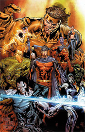
This story is filled to the brim with hyperbole, dialog that only serves to keep its characters relevant. Where the book highlights almost two-dozen characters, no more than three or four are integral to the issue’s plot. The rest merely hang around and produce rambling, unnecessary contributions to the conversation and, supposedly, give the story additional depth. I think Christopher Yost expected that, by increasing the head count, he could give this story that sense of intergalactic necessity and scale. It doesn’t work.

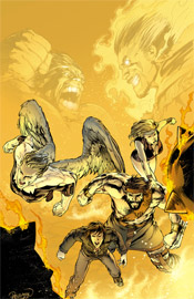
I never felt the galaxy was in any kind of peril, even if the Scy’Ar Tal were threatening to destroy the planet holding the almighty M’Kraan crystal. I’d never even heard of the thing before this issue’s introduction, and I’m sure I’m not in the minority there. If you’re catering to a niche audience (X-Men fans) and only a fraction of that audience has a clue about the impetus behind this story, then you’re targeting a niche within that niche. It’s elaboration into a corner of the X-universe that I think would’ve been better off left untouched.

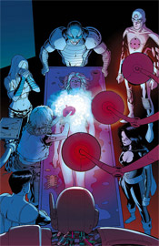
Paco Dia Luque’s pencils continue that theme. They provide the reader with detail on top of detail, but lack the personal touch and excitement that’s crucial to any comic’s success. When he sketches Havok’s team, sitting around a table to discuss Vulcan’s proposed truce, they’re just sitting around a table. There’s no life to the proceedings, nothing to entertain the reader while these characters ramble on and on about the benefits and pitfalls of such an alliance. Even when the team charges into action, powers flaring, it’s not an exciting read. If anything, it’s even more humdrum. It’s awful work, but I guess I should be glad that it’s relegated to an awful book, rather than murking up the efforts of a better writer.

This is a miserable series, dealing with characters who weren’t interesting enough to land a regular spot on one of the main X-Men books. The story is confusing and unrewarding, the artwork is second rate and dry, and ultimately the only thing that drove me to finish the issue was a commitment to finish this review honestly. Skip this, for all that’s holy. Don’t give Marvel a reason to produce a sequel.

On a scale of 1 to 10, where 1 is poor and 10 is amazing...
Overall Score: 1

Wolverine: Origins #19

Since the death of Captain America, Wolverine has been doing a lot of thinking about his interactions with the American icon. The two actually have a lot in common: a magnetism to battle, a strong sense of justice and feelings displacement in modern civilization. And, having crossed paths more than once in the past, there’s a lot to reminisce about. The current story arc in Origins focuses on Logan’s memories of one such run-in.

Daniel Way’s take on that chance meeting between Cap and the Canucklehead is a nice nostalgia trip. He drops both characters, seemingly at random, into the midst of an early assembly from the then-fledgling HYDRA organization. Through Logan’s memories, he actually builds the group up significantly – he’s pointing out the organization’s similarities to the Nazi party, praising their leadership and strategy and presenting them as a real force for the first time in ages.

Even more appealingly, he’s doing so with a minimum of words. Way seems to have a knack for this: throughout his run on this series, he’s never overwhelmed the reader with needless explanation or description. He sticks to dialog, both internal and external, and leaves the particulars to the artist. He really understands the medium in this sense, and his work is a breeze to read and enjoy.

Steve Dillon’s artwork is kind of an acquired taste. I know I wasn’t crazy about it when I was first introduced to it in the pages of Preacher, but after only a few issues I couldn’t imagine that series succeeding in anyone else’s hands. He brings a wealth of personality to each character he illustrates, no matter how faceless or unimportant they might be. Take the horde of HYDRA underlings in this issue, for instance – for all intents and purposes, they’re a bunch of clones, only there to blindly serve their master. But in Dillon’s hands, we see that they’re each unique underneath those masks. One solider’s eyes even betray a sense of fear and uncertainty. The artist has a tremendous knack for establishing and maintaining that individuality, whether he’s working with a central character or an underling.

One thing he’s never been great with, though, is superheroes. He can put together a fist fight that’ll knock your socks off, but if there’s a guy there in spandex, something looks weird. In his most high-profile gigs, he’s been fortunate to avoid these situations – Preacher and Hellblazer don’t have a lot of non-civilian characters, and even Logan is running in street clothes throughout this issue. Cap, on the other hand, is in full red, white and blue regalia, and as a result something’s off. It’s not enough to cripple Dillon’s effort, (in all honesty, it’s largely some of his most consistent stuff) but it is distracting and that’s a shame.

Origins is in a unique position at the moment, in that it’s revealing untold details about a period in Marvel history that’s never been fully explored. Not only that, but the stories it’s telling have a real relevance to the present, not just with Wolverine and Captain America, but also Bucky, the Winter Soldier. The series has had its ups and downs already, I’d written it off after a sharp decline in the storytelling about ten months ago, but it’s currently on an upswing. Borrow this from a friend and see if you can get into the mood and style of the story it’s working to deliver. Chances are good you’ll be back for another shot next month.

On a scale of 1 to 10, where 1 is poor and 10 is amazing...
Overall Score: 7

The Incredible Hulk #111

You’ve probably got a pretty good idea of what the Hulk’s up to these days, what with the gigantic World War Hulk crossover finally wrapping up last week. Well, if you’ve already finished the final issue of that series, prepare to take a step back because Incredible Hulk #111 takes place between issues 4 and 5 of World War Hulk.

Not that this story is much more than an addendum to that larger picture. The Hulk himself only appears fleetingly throughout the issue, with the focus squarely on the ragtag team of Namora, the Angel, Hercules and Amadeus Cho. They’re basically on cleanup duty, wrapping up the loose ends from the Hulk’s fight with Dr. Strange a month ago. Evidently, when Strange’s demon-possessed body was defeated in World War Hulk #4, Zom (the demon in question) was freed to search for a new host. Naturally, we can’t have a mace-fisted monster roaming the streets of New York, so the four renegades set about containing him before he can wreck too much more of the city’s infrastructure.

Although the storytelling directly relates to his adventures, it’s a tough sell for an issue of the Incredible Hulk to be so completely barren of the Hulk himself. Granted, when Brian Bendis wrote a recent issue of Ultimate Spider-Man in a similar fashion, focusing exclusively on the Green Goblin and only spending a courteous page and a half on Spidey, I loved it. There’s a difference here: in that issue of USM, the story set up and enhanced an obvious future collision. No matter what, you knew that at the end of the day that story would make the eventual clash of the two characters that much more important.

But in this instance, the Hulk has already dispatched of the enemy. The story expands on a battle that took place a while ago, and that’s just not as exciting to read. It’s a somewhat interesting aside, set against the backdrop of the Hulk’s assault on New York, but it would’ve been better relegated to a mini-series spinoff like World War Hulk: Front Line. I’d expect Incredible Hulk to be right at the heart of the warzone, not on the sidelines cleaning up the spillage.

Leonard Kirk’s artwork is just mediocre. Where Zom was a menacing behemoth in the hands of John Romita, Jr., he’s fairly passé here, like a heavier, spikier Ghost Rider without his bike. To his credit, he tells a very aggressive, detailed story with a limited fuss. There’s a lot happening on every page of this issue, but his work never seems overly complicated or hard to read. It’s clean and professional, if not particularly exciting.

If you’ve found yourself completely absorbed by the WWH saga, this is a nice expansion upon that main storyline. It serves to reinforce just how big a deal it was for the Hulk to take out Dr. Strange’s possessed form, and by that merit alone works as a nice extra source of information within the grand scheme. As its own standalone title, though, it’s really nothing worth getting excited over. Fans unfamiliar with the giant crossover will have a lot of reading to do before this issue makes any sense, and even those up-to-speed on the proceedings may deem these events to be needlessly extraneous. Flip through this in the store, it’s not garbage but it’s also nothing exceptional.

On a scale of 1 to 10, where 1 is poor and 10 is amazing...
Overall Score: 5

Powers #27

While his production has skyrocketed since the first issue of Powers hit the shelves three quarters of a decade ago, this series is most definitely writer Brian Michael Bendis’s baby. He’s poured so much of himself into this cast that they’ve become about as close as a fictional being can be to the real thing. Even secondary characters, such as the chief of police, are so carefully defined and developed that they could easily be the focus of their own series. When he speaks, you can almost hear his voice reading his lines in the back of your mind.

Now, with such a solid foundation of characters at his disposal, one might think that Bendis would hesitate to take risks, to change things up, to throw caution to the wind once in a while… when in actuality nothing could be further from the truth. Since day one, readers have been shown that nothing is out of bounds, and this story arc has been no exception. Sometimes these risks pay off, as in the “Who Killed Retro Girl” arc, sometimes they don’t (the infamous “humping monkeys” issue). The current story arc is more of the former, less of the latter.

I wasn’t crazy about the intergalactic theme of the last storyline, because it was such a wild change of perspective from what I was used to in this book. Thus far, this arc has addressed my qualms and returned the narrative to a smaller, more approachable scale. Maybe it’s personal preference, but I’m much more inclined to become emotionally invested in a story that deals with true detective work on street level than a wide, universe-spanning epic saga, overflowing with alien beings and mystical disembodied voices. At the end of the day, what brought Bendis to the dance in the first place was his work on detail-rich crime noir stories, and this issue is just further proof that he can still rock and roll in that genre whenever he feels like it.

After sixty-four consecutive issues and a pair of specials, Mike Oeming’s visuals are the beginning and the end of these characters. While his work has seen its share of peaks and valleys over the years, (particularly when the book’s running behind schedule) his style has largely remained the same since day one. He’s the definition of gesture and simplicity, often refusing additional linework even if the layout seemingly needs it to survive. His dark, shadowy tendencies have constantly given the book a distinctly grimy, downtrodden look and feel, but he’s delivered the goods in lighter, happier moments as well.

With the recent change to a larger monthly page count and a more regular (fingers crossed) shipping schedule, Oeming’s work has taken a mild turn for the worse. His artwork still carries a lot of weight and atmosphere, so it doesn’t feel like I’m reading a different book, but his style was never this rough and rushed before. Mike is still just one solid issue away from reaffirming himself in my eyes, but at the moment the quality of his work is beginning to slide.

Oeming’s artwork is perfectly matched by Nick Filardi’s colors, page for page, issue for issue. The colors of Powers have long been one of the book’s greatest successes, and though the job has been passed between a small handful of colorists, the strength of their work has never wavered. These hues are treated as almost a character unto themselves, they’re so frequently and effectively introduced. Most comics never seem to grasp the kind of magnitude that colors can carry, where Powers is constant living proof. They’re used so effortlessly to set a scene, like the deep reds, purples and maroons do for a strip club midway through this issue, that it’s hard to imagine the series working nearly as well without them.

Reading this book has become something of a treat. There really is nothing else like it on the market today, both in terms of subject matter and execution. Bendis and Oeming have been working together so long that it’s hard to imagine one without the other within these pages. They’ve got, arguably, the best cast of characters in comics and they aren’t afraid to use them, hurt them, evolve them or kill them if it’ll help further the storyline. Buy this, add it to your pull list and catch up on any issues you may have missed along the way.

On a scale of 1 to 10, where 1 is poor and 10 is amazing...
Overall Score: 9

Sunday, November 11, 2007

Ultimate Fantastic Four #48

Tensions are at an all-time high within the Baxter Building of Ultimate Fantastic Four. After Reed’s unsettling obsession with an otherworldly Cosmic Cube drew the Silver Surfer to Earth, he’s taken a surprisingly isolationist approach toward continuing his work. He’s lashed out at anyone who dares set foot in his lab, driving Sue to the brink of exhaustion. Finally completing his work on the Cube, he rejected an invitation to attend a scientific symposium in frozen Siberia… an offer Sue accepted. When her plane went missing en route, her teammates sprung into immediate action.

Mark Brooks’s artistic contributions, while generally very strong, miss the essence of these characters. Part of what made the Ultimate version of this team more approachable than their regular universe counterparts was their age. These weren’t stuffy old scientists who’d been to the negative zone and back enough times to consider it a routine event, they were brainy kids with a penchant for exploration and adventure. There was a charm to them, a danger to their toying with things they didn’t fully comprehend, and it was reflected in their physical appearances as much as it was their actions.

Brooks doesn’t visualize them as a cluster of teens outside their element, he sees them as that tired old group of experienced veterans. Reed and Johnny are needlessly muscular. Ben is war-weary and unmoved by the opposition. Sue’s a full-grown woman. The difference between illustrating a group of teens and a group of adults can be very subtle, but it should consist of more than the lead character’s hairstyle and choice in spectacles.

This is a shame too, because like I’d mentioned, the majority of the artwork is pretty good. His method of enhancing the impact of Johnny’s flame, his design of the menacing Crimson Dynamo… they’re great. He doesn’t skimp on the backgrounds, and his take on the menacing enemies the team faces is just what the story needed. It’s just tough to take the rest of that in stride when he misses so badly with the lead characters.

This is a problem that carries through, in a way, to Mike Carey’s writing. The bane of any Fantastic Four story is a tendency to get overly technical and overlook the importance of understandable storytelling in favor of scientific credentials, and Carey commits that sin several times within this issue. Did we really need two full pages of debate about the risks and rewards of sending a dead body into the N-Zone? Did we need half a dozen pages of combat strategy and backstabbing explanations immediately after that? The basics of a good story are here: a damsel in distress, a rescue mission in enemy territory, frequent and inventive use of the team’s powers… but there’s so much excessive dialog that it’s difficult to really acknowledge all of that.

This series remains a tale of untapped potential, of a solid foundation spoiled by needless excess and a few artistic mistakes. The laborious explanations behind what’s happening to these characters makes actually reading this issue a slow, drawn-out experience. The artwork shines in spots, but fails in the most crucial areas. This isn’t bad stuff, but it’s not something you’re going to want to instantly add to you collection, either. Flip through this in the store, it’s not worth a very long look.

On a scale of 1 to 10, where 1 is poor and 10 is amazing...
Overall Score: 5

Thor #4

It’s no secret that Thor has recently made his much-anticipated return to the Marvel Universe, following more than two years’ worth of hibernation in an interstellar void. He’s got a lot of catching up to do, too, between the Civil War, the Hulk’s melee in Manhattan, Tony Stark’s rise to power in SHIELD and the split of the Avengers. First, however, he must locate his lost Asgardian brethren, who are scattered around the mortal plane.

It’s a shame that J. Michael Straczynski’s scripts have so far not lived up to the expectations for this major character’s long-awaited return. The story he’s provided hasn’t been without its impetus, (that hunt for scattered Asgardians) but it’s missing a hook. Thor is kind of sleepwalking through this title, randomly wandering to spots on the globe and (surprise!!) finding his brothers there without much of a search. And the locations he “randomly” chooses have already been covered so extensively in the news that they’re becoming something of a cliché. Last issue, he was trying to help Katrina survivors in New Orleans, this month he’s mediating a tribal war in an impoverished African city. What’s next, a trip to see the tsunami survivors in Thailand?

Thor himself is so stoic and reserved outside of a battle that it’s tough to empathize with him, his battles so short and decisive that there’s no question how they’re going to play out. This book feels like it’s merely treading water, going through the motions expected of it and little more. If Marvel is serious about relaunching the character and allowing the writer to take his own spin on these ancient mythos, why isn’t he doing something a little riskier? I guess there’s the chance that this is all slowly building to something phenomenal, but we’re now four issues in. At some point it’s time to quit setting the stage and start producing something.

Olivier Coipel’s visuals, on the other hand, are downright breathtaking. When I bought issue #3 on a whim last month, it was due exclusively to the preview art I’d seen beforehand. He’s taking everything that Chris Bachalo did during his heyday in the late ‘90s, adding his own twist and bumping it up to the next level. His backgrounds are just detailed enough to fill the page with eye candy, but not so line-heavy that they detract from the foreground. His work is superbly realistic, but also overwhelmingly alive and stylized. When he sets the scene of the first page with an exterior shot of a hotel’s sign, he fills the skyline behind it with a flock of birds and a few scattered clouds. It’s shockingly simple, but it also immediately sets the identity of that location: a lazy town in the middle of nowhere, nondescript and happy. Every line he provides to the page is necessary, none excessive.

His work isn’t strictly beautiful, either. He renders quiet nature scenes and violent gunfights with the same attention to detail and explosive vigor. His take on Thor is treated with the same amount of respect as his rendition of the more human characters populating the rest of the book. But, at the same time, he gives the Norse God an air of dignity and undeniable power that can’t be overlooked. Coipel is already well on his way to becoming a major player, and his work on a high profile series like Thor is only serving to further catapult him to popular recognition.

The new Thor is a mixed bag. The writing won’t be considered among Straczynski’s best, but it’s at the very least headed in a distinct direction and easy to follow. It’s perhaps too easy to follow, actually, because this issue was some really light reading. But Olivier Coipel’s artwork is so astonishing that many readers might want to pick these issues up on its merit alone. On the whole, the “safe” writing makes this an ultimately missed opportunity, but you’ll probably want to borrow it all the same. I can’t hate it, but I can’t unconditionally love it, either.

On a scale of 1 to 10, where 1 is poor and 10 is amazing...
Overall Score: 7

Punisher #52

Frank’s been throwing down with the Barracuda again. Already perhaps the Punisher’s toughest enemy, this time ‘Cuda has made things personal. Upset over the way Castle dispensed of him in their last encounter, (he’d never tasted that kind of a defeat before) he’s gone out of his way to make Frank regret ever meeting him. He’s dug up an infant girl, the daughter of an old flame, taken her hostage and revealed that the Punisher himself is the father.

Barracuda is a character who really doesn’t work unless he’s being illustrated correctly. When this arc kicked off in Punisher #50, it left a bad taste in my mouth for that very reason. Goran Parlov, who actually co-created the character alongside Ennis, wasn’t the artist of choice in that issue and his absence was a major detriment. Where the fill-in artist for that month rendered the villain in great detail, he also took a much more realistic direction that eliminated a lot of Barracuda’s charm and personality. Parlov’s loose, cartoony style is perfectly suited to a four-hundred pound black man with no fingers on his right hand, a grenade launcher on his hip and a gold-plated set of front teeth inscribed with the phrase F- -K YOU (Frank punched out the other two in their last meeting). Sketch him too realistically, and he’s just another stereotypical gang-banger on steroids. When in Parlov’s care, he’s somebody you see on the page and just smile, because the shit is about to hit the fan.

Likewise, I don’t think the character could work without Garth Ennis there to write him. He’s quickly become one of the author’s signature creations, to the point that I’d compare him to Herr Starr in Preacher. Ultimately he’s a terrible guy, but because he’s so driven and self-assured, you can’t help but pull for him a little bit.

Despite his cold, all-business demeanor, Ennis’s take on Frank Castle is clearly very human. He’s frequently reminded of his previous life, whether he’s remembering his service in Vietnam or lamenting the death of his family. This story in particular has really emphasized that portion of the character’s psyche, as he tries to deal with the prospect of fresh fatherhood when his first pass at it ended so disastrously. He’s reacting to Barracuda’s attack with the same kind of precise, strategic mindset he always brings with him, but for perhaps the first time he isn’t quite sure how it’s all going to end, how he even wants it to end.

Parlov and Ennis are becoming quite the team on Punisher, writing the lead character with military precision and dedication, then illustrating him as a larger-than-life monster of a man. They’re pairing him off with a phenomenal series of foils, of which Barracuda is easily the strongest. They’re taking risks with established names and faces (in this arc alone, Frank’s been thrown out of a building, shot, stabbed, freed from police custody and revealed as the father of an infant girl) and wrapping up each story with a distinct set of consequences. This is the kind of material that’s going to find itself collected into a “Marvel Milestones” paperback in a few years, so if you aren’t currently buying it, get with the program. The last page of this issue is the stuff legends are made of.

On a scale of 1 to 10, where 1 is poor and 10 is amazing...
Overall Score: 9.5

Nova #8

Richard Rider, the current torch-bearer of the Nova Corps, has found himself right in the middle of the Annihilation War, the ongoing conflict between the Kree and the Phalanx. In the midst of fighting the good fight, he found himself infected by the Transmode Virus, rendering him subservient to the Phalanx. But, using the power instilled within him by the Worldmind, he managed to force that virus into remission and escape the warzone. The good news: he’s free of the prison that is Kree space. The bad: he’s been transported to the edge of the known universe, with no clue where to turn next.

Dan Abnett and Andy Lanning have been putting Nova through the wringer over the last few issues, maximizing his involvement in the huge Annihilation and taking plenty of risks with the character. This issue is just a continuance of that latter trend – while he’s no longer directly involved with the war, they’ve handled his potentially jarring transition into another tale beautifully. Where the last few issues had focused on the futility of a battle against overwhelming odds, this month’s story shifts that attention to the concept of an outer boundary to our universe and what, exactly, exists there.

In the process of expanding on that idea, Abnett and Lanning introduce a compelling suspense / horror storyline in the same vein as Ridley Scott’s Alien. When Nova “washes ashore” aboard a supposedly abandoned living, breathing spacecraft, it’s quickly made evident that nothing is as it seems. No one has ever dared explore that section of the universe, for fear of what they might find, (does everything simply cease to be?) and the pair of writers do everything in their power to heighten the drama and suspense of these first few moments of cautious exploration. Yet they never lose sight of the narrative that had been established in previous issues. When Richard walks into a firefight, he’s reminded that more than 80% of his energy is being used just to contain the Phalanx virus he still carries. Rather than stand his ground against difficult odds at less than a quarter of his usual power, he swallows his pride and runs. It’s a little detail in the grand scheme of things, but it’s just enough to let you know the authors haven’t lost sight of where the character has been.

Handling the art chores, Wellington Alves has his ups and downs. When he’s given a giant, important spread, (as he is around the three-quarter mark of this issue) he performs phenomenally. His best work shows hints of Jae Lee, with a tremendous attention to lighting and shadow, but he does display a tendency to lose his focus and mail in his effort on slower-moving pages. Since a lot of this issue is dedicated to a series of conversations inside a giant, soulless spacecraft, those seams in his attention span are probably more evident here than they would be in a more stereotypically action-centered book. At the very least, the abundance of these slower, less visually-stimulating pages serve to further heighten the power of those few giant, important panels scattered throughout the issue. Alves does fine work, but he’s not quite a superstar.

Nova is one of the most surprisingly entertaining books Marvel’s producing at the moment. Although the last page left me a bit concerned about the direction it’s heading, I’ll give this writing team the benefit of the doubt for the moment because they’ve already delivered so much with a character I didn’t always have the time of day for. If strong adventure, science fiction and horror are your thing, you’re going to want to buy this. Don’t let the word-heavy “previously in” page fool you, despite a few weighty concepts this really isn’t a tough book to read and it never allows itself to get too caught up in terminology and scientific details.

On a scale of 1 to 10, where 1 is poor and 10 is amazing...
Overall Score: 8.5

Ghost Rider #17

It hasn’t been an easy time of late for Johnny Blaze, the Ghost Rider. When the original spirit of vengeance recently escaped from the depths of hell, he inadvertently freed Lucifer himself in the process. With the devil’s consciousness split into 666 recently deceased human bodies, Blaze has taken it upon himself to eliminate every last one before they can do much harm. One catch: for every body the Rider destroys, the demon’s remaining avatars become that much stronger.

Daniel Way’s storytelling in this issue is blunt and happenstance, almost like he’s making it up as he goes without any sort of big picture in the back of his mind. When the Rider’s cell phone is destroyed in the midst of a battle, it’s treated like a major roadblock for all of two panels, then forgotten until he randomly finds a replacement later in the story. Blaze himself makes so many boneheaded decisions throughout the issue that he’s almost a parody of a superhero. He acts first, then responds with shock and horror when he realizes that maybe there were a few consequences for doing so, even when the flaws of his actions were painfully obvious to the reader. I can’t sympathize with somebody so patently stupid, and I sure don’t feel compelled to follow his adventures any further.

Even the title character’s face-offs with two of Lucifer’s possessed human bodies in this issue don’t produce any moments worth remembering. When the very foundation of the plot doesn’t result in any fireworks or intrigue, there’s something wrong with your story.

The artwork of Javier Saltares is disappointing at best, and certainly no substitute for Mark Texeira, the book’s regular artist prior to this issue. Saltares, who had previously been employed as Tex’s inking partner, feels like a bad fill-in artist throughout the issue. His style is so mundane, lacking of any personality, that it’s often difficult to look past it to the story it’s trying to tell. I actually have a suspicion that Texeira lent a hand in the first page or two of the issue, because there’s a sharp drop-off after the introduction. It’s a quick downward spiral, not only in terms of the actual illustrations but within the composition itself. Page one tells a great story, complete with vivid background imagery, dynamic shadows and an appropriate amount of linework. Pages two through twenty-two are precisely the opposite.

Saltares doesn’t seem to grasp the concept of a good action panel. When Ghost Rider hurls himself through the roof of a barn midway through this issue, it’s shockingly lacking in excitement – the artist merely illustrates the obvious, without taking any artistic license or adding his own twist on the character. His perspective is way off. He leaves a distracting block of dead space at the bottom of the page, which sticks out like a sore thumb. His rendition of Ghost Rider isn’t fearsome or demonic, it’s downright goofy. Saltares is a bad fit for this book, and really for any book.

This is some real garbage. I’ve never been a fan of this character, but I’m not sure if that’s because the concept of a leather-clad biker with a burning skull for a head isn’t up my alley, or because he’s never been given any respect within the pages of his own book. I think I can safely say I’ve never read an issue of Ghost Rider that’s left me interested in the next chapter, and this issue did nothing to change that trend. This is poorly written, inconsequential material, matched with an awful artist. Worse yet, the creative team is going to stay together for at least the next three issues. Skip this, consider it a favor to yourself.

On a scale of 1 to 10, where 1 is poor and 10 is amazing...
Overall Score: 1

Monday, November 5, 2007

The Order #4

As California’s representative of the Initiative, Tony Stark’s dream of housing a government-trained superhero team in every state of the union, The Order is an important squad. As government-appointed guardians of one of the most populous states in the union, they’re the closest thing to a public face the Initiative has, and as such are under tremendous public scrutiny every time they make a move. Recently, that’s been more of a curse than a blessing, as the team caught hell for unwinding after a battle by holding a drunken party and various members have begun to crack under the pressure inherent in such a high-profile gig.

The big problem with this story, and with the ongoing story of the Initiative as a whole, is in the sheer number of previously undeveloped characters involved. Before this issue, what was Anthem doing with his life? Had anybody even heard of the Supernaut? What about Calamity? It’s a collection of new faces and also-rans, and it’s tough to empathize with them when I’ve never heard of them before. Writer Matt Fraction is a guy I’ve been a big fan of thus far into his career, but he isn’t given a whole lot to work with as far as starpower is concerned.

Fraction takes an approach to his characterization that’s very similar to Marvel contemporary Brian Michael Bendis. He takes these larger than life action heroes with superpowers and gives them a decidedly human slant, giving them lengthy opportunities to introduce themselves to their readers and distinguish their personalities from the pack. The first two pages are a frank discussion with Veda, a former Hollywood starlet-turned superheroine, and provide tremendous insight into her motivations. Unfortunately, Fraction can’t exactly fill the book with these “getting to know you” segments, and when the focus shifts back to the battlefield we’re left with one recognizable face and six nobodies.

Barry Kitson’s artwork is solid throughout this issue, never something I’d call spectacular but always impressive. His treatment of the women of this issue frequently reminds me of the work of Frank Cho. Where the trend in the past was to illustrate superpowered ladies as tits, ass, legs and muscles, Cho and Kitson share a softer, more realistic approach. The T&A is still there, for better or worse, but much more attention is paid to the characters’ faces and surrounding physique. Rather than inhuman androids with off-center nipples and blank facial expressions, these women are confident and intelligent. Their musculature doesn’t look out of place, they just look like they hit the gym a lot.

This is a book that could really do something with a more identifiable cast. I’m not even talking about upper-tier characters here. Even a former West Coast Avenger castoff would be enough, the story just needs one or two faces with some visibility. Matt Fraction is slowly building a good story here, but that lack of star power is really holding it back. The one page in which Tony Stark appears is probably the most successful of the book, for that very reason. He brings a recognizable personality to the proceedings, and when that bounces off of one of the team’s unknown characters, good things happen. Without that kind of presence, the book feels wishy washy and kind of dull. Flip through this, think it over and maybe give it another look in the event of a shakeup in the cast.

On a scale of 1 to 10, where 1 is poor and 10 is amazing...
Overall Score: 5

Omega: The Unknown #2

Without a “previously in” blurb, this book assumes that you’ve read the first issue (I haven’t) and that you’ll be able to hit the ground running alongside the story (I couldn’t). The primary characters have a strained relationship to say the least, and the majority of this issue is spent establishing how awkward they are around each other and their ineptitude at the most basic forms of conversation. Meanwhile, in the background of most of these scenes, there’s a superhero throw-down in the streets.

It says a lot that the non-powered characters don’t even deem this to be worthy of closer examination, (or even surprise) and that opens up a few interesting possibilities for future storylines (a world where superpowers are the norm, so run of the mill that two guys throwing each other into buildings is as everyday as a traffic accident). Unfortunately, because that possibility isn’t really explored in this issue, it only serves to cast a deadening tone over the book. If the everyman characters don’t see anything worth getting excited over during a quick battle between superhumans, why should the readers?

Farel Delrymple’s artwork is very loose, to the point that it seems quite hurried. It reminds me a lot of the style common to DC’s early Vertigo books in the first half of the 1990s: very straightforward, very old school and more than a little outdated. His paneling style is straight out of a textbook, adhering to a strict grid, and while he grants his characters a fair amount of individuality and personality, there’s no emotion in what he brings to the page. I don’t think this issue could’ve taken him more than a day or two to lay out, and it shows. I think he was aiming for a quaint, simplistic style that would help him stand out from the pack, but instead it feels more like a loose series of proposed layouts than a finished book.

Delrymple doubles as the issue’s letterer, which works as both a positive and a negative. On one hand, this association ties the style of the lettering directly to the light, airy style of the artwork, giving the book a single, unified look and feel. On the other, that look and feel really isn’t anything to get excited about. The artist’s lettering is far from professional grade, especially compared to his computer-aided modern contemporaries. It’s too thick, tougher to read than most of the books on the shelves today, but I can’t say it doesn’t have personality.

That’s something I could say for this book as a whole. It’s trying so hard to have a unique take on an overanalyzed concept that it loses sight of simply telling an interesting story. The artwork wants so badly to be noticed among its more dynamic peers that it goes too far in the opposite direction and comes off as unfinished and unrefined. There’s still room for growth here, and the slow-paced story is laying the groundwork for a few long-standing plot threads. Still, it’s a long way from fruition and I’m not entirely sure the series is doing itself any favors by taking such a slow moving approach one issue into its existence. Flip through this on the store shelves and see if it’s your cup of tea. I remain ambivalent.

On a scale of 1 to 10, where 1 is poor and 10 is amazing...
Overall Score: 3.5

Howard the Duck #2

Howard the Duck is back in Marvel’s regular rotation with a new monthly series. Last month, the feathered title character had a run-in with a pair of struggling scientists in the back seat of his cab, a disagreement that escalated into an all-out brawl with various foreign objects randomly thrown into the mix. This issue follows Howard and his longtime lady friend (and YouTube costar) Beverly Switzler’s fifteen minutes of fame, as a video of the beating becomes a viral hit online and the pair suddenly find themselves internet celebrities.

The premise is a little thin, and the characters who constantly invent an excuse for Howard’s appearance get to be pretty redundant, but the book’s really in its element when it’s playing around with oddball humor and random situations. The way these characters float through life, oblivious to the strange shit that’s going on around them, is actually a lot of fun in the same vein as Flaming Carrot. The driving force behind this comic has always been social and political satire, and on that front it doesn’t shirk.

When the title character first appeared in the early ‘70s, the climate was perfect for that style of humor. Pop culture was in a sad state and it was fashionable to hate on the political scene. When the ‘80s and ‘90s rolled around, a lot of things changed (including the way the character was written) and Howard lost his relevance. The mindset of today’s world bears a striking similarity to that of the ‘70s, though, and writer Ty Templeton has noted and reacted to those social changes by returning the character to his jaded, sarcastic roots.

I realize that’s probably a lot more elaboration than is necessary for what’s ultimately a cartoon about a humanoid duck and his overly-buxom partner, but those underlying themes are ultimately what keeps the book moving. When the duo make an appearance on a faux-Bill Mahr late night panel discussion, for instance, the satire kicks into overdrive and the issue finds its groove. Templeton has a firm grasp of what makes this character relevant, and he’s venting most of the public’s shared disdain for the current state of things by presenting a parody of pop culture that’s shockingly similar to the real thing.

Juan Bobillo’s artwork does a fine job of masking the issue’s venomously sarcastic mood with a bright, colorful façade. He brings a lot of flair to the proceedings, and the no-rules nature of the story allows him a lot of creative liberty that would be lacking in a more structured, serious book. In those situations, where the plot couldn’t have contained more than a simple instruction like “Howard climbs aboard the wooden train with a taser in his hand,” Bobillo takes control of the story and grants it a personality all its own. He’s giving us wild, tilted camera angles, great silhouettes, stylized backdrops and surprisingly developed characters, which somehow match the mood of the story perfectly and bring it to life.

This isn’t tearing down any walls or anything, it’s not a landmark achievement in the art of comics, but it’s still an entertaining read. If you’re as fed up with the current state of society as I am, whether it’s the 24-hour Paris Hilton watches on CNN or the talking heads on Fox News who press their own agendas ahead of the facts, Ty Templeton shares your pain. Don’t be ashamed to ask a buddy if you can borrow this, it’s lots of fun wrapped inside of a genuinely relevant package.

On a scale of 1 to 10, where 1 is poor and 10 is amazing...
Overall Score: 7

Annihilation: Conquest - Starlord #4

The Kree and the Phalanx, a pair of extraterrestrial races, are having one hell of a knock-down drag-out. Actually, it’s more of a slaughter: the techno-organic Phalanx have decimated the Kree, virtually conquering their entire population in record time and barricading them off from the rest of the civilized universe. As a last-ditch effort to overcome these stacked odds, the Kree have recruited a former galactic civil servant, The Star Lord, and a small group of adventurers to overthrow the opposition with a last-ditch suicide mission. So far, it’s worked wonderfully: one member of the team lies dead, while the others have already surrendered to the enemy.

If that sounds complicated, that’s because it is. There’s so much going on at any given moment in this book that I constantly found myself trying to comprehend what happened on the previous page, while the story barrels headfirst into the next meticulous proceeding. This is a much bigger problem in the first half of the issue than the second, where the characters finally quit talking and do, but it sets a bad initial tone that carries through those more action-heavy later pages.

My biggest problem was identifying with the members of Star Lord’s attack squad, who admittedly didn’t get much of a chance to distinguish themselves in this issue. Where the majority of this month’s focus was on Mantis and Captain Universe, an analytical being with a zero on the personality-meter and a dull intergalactic superhero, respectively, the fleeting moments we got with Rocket Racoon, Bug and the Star Lord himself were enough to tell me who the real driving personalities behind the issue should’ve been. There’s room for growth here, if Giffen chooses to take notice.

Timothy Green II’s artwork is inconsistent and tough to put a label on. When the getting’s good, his stuff is downright breathtaking. He channels Travis Charest and Leinil Francis Yu at the same time, texturing backdrops and environments in the style of Yu and detailing characters’ expressions and body language like Charest. While he frequently displays a mastery of these styles, he just as regularly throws his abilities into question by dropping an awful panel or page from out of nowhere.

He routinely struggles with posturing, wasting a beautiful rendering of Captain Universe early in the book with a dull, emotionless pose. His textured shading style has the potential to be incredible, but hasn’t been refined to the point that it’s really clicking yet. It’s maddening, really, to look at the third page of this issue, which is just amazing, and then the fourth and fifth – both atrocious. If he could really hunker down and deliver twenty-two pages of consistent artwork, (he’s good for about a dozen here) Green could be a major force. Until then, he may be best relegated to covers or background work.

Ultimately, this is an above-average book... inconsistencies, excessive details and all. Despite their subdued personalities, the team actually has a fairly interesting rapport with one another, especially in the middle of a firefight. Keith Giffen still knows how to write a nicely paced action scene, and the issue’s parting shot hints at similar adventures for the team in the very near future. Borrow this from a friend if you’ve got the chance, it’s not a long read after you’ve made it through the first six or seven pages, and once it starts moving, the plot provides for good entertainment.

On a scale of 1 to 10, where 1 is poor and 10 is amazing...
Overall Score: 7