Tuesday, September 30, 2008

War Heroes #2

There’s been a lot of hype around this book, with Mark Millar announcing that it was a good indication of what he’d wanted to do with 5. But while I can see some very subtle connections to the Ultimate line’s premiere superteam, the similarities stop after the first paragraph. In a world where superpowers are available in the form of an easy-to-swallow gel cap tablet, it should come as no surprise that the military was quick to claim the technology for themselves. The US Army is a different place now that men and women can lift tanks, blast fireworks from their fingertips and sail through the air. But while their abilities may have been augmented, at the end of the day the armed forces still need their soldiers to show discipline, and it’s that hardcore boot camp atmosphere, not the battlefield itself, where War Heroes has dedicated its focus.

Mark Millar’s writing usually walks a thin line between groundbreaking originality and excessive vulgarity. It’s only natural, I guess, that sometimes pushing the boundaries of good taste sometimes carries a reward and sometimes comes at a cost. This series is, largely, the price without the benefits. It’s Millar both at his creative best and his raunchy worst, amusing himself with crude impropriety and crazy ideas, and hey, if his readers are cool with that, they’re welcome to climb aboard and enjoy the ride. This issue is composed so loosely, it descends into bad language and uncensored activity so quickly, that it really feels like he’s just writing it to entertain himself.

So it shouldn’t be unexpected that I have to warn you: War Heroes #2 surprises its readers with an enormous, floppy cock around the middle of the issue. It’s so completely surprising and totally out of left field, even after all that had come before, that it’s hard to focus on the story afterwards, of which there still isn’t much. One moment we’re watching just another public display of super powers, the next… two panels of John Holmes. So, ah, don’t leave this lying around where your little bro, sis or anyone else you love or respect will find it, and if you’re going to have a problem with a big honkin’ manstick in your reading material, you may want to turn away. Kudos to Tony Harris for the taint’s-eye camera angle he employs in the second panel, though. I don’t think I’ve ever seen that one before.

As an avid reader of Ex Machina, (though recently I’ve given thought to dropping it) I’m fairly familiar with the artwork of Tony Harris. When he’s on, there’s nobody else in the industry quite like him. Harris gives his characters a level of depth, dimension and substance that I really enjoy, a certain roundness that grounds his work in real life. But when he isn’t giving it his all, as was the case in Spider-Man: With Great Power, it really shows. Regrettably, it’s the latter that defines his work in War Heroes. Harris leaves backdrops severely under detailed, struggles with consistent proportions and even seems to reuse a few character designs from some of his other work. While the artist can be counted on for a couple of really impressive visuals in this issue, particularly those involving military vehicles, at large it’s among his weakest efforts.

Were it backed by a solid foundation, I could overlook the excesses Mark Millar seems to enjoy dwelling on between War Heroes’ covers, but it’s not. It’s a potentially great idea that probably didn’t flesh out as well as he’d imagined, padded out to fill a six issue series with so much explicit material Larry Flynt might blush. If it’s going to help tell a story, if it’s necessary, even if it’s a good punchline, I’ve got no problem with a cock or two poking their heads out in the middle of my reading material. When it’s just the latest in a series of segments meant to show you how outrageous the series is and little else, I’d rather look at something else. Skip this if you want substance. On the other hand, if you’re after something with shock value alone, nothing else can even compare.

On a scale of 1 to 10, where 1 is poor and 10 is amazing...
Overall Score: 2

Sub-Mariner: The Depths #2

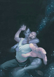
As a lifelong debunker of all things mythical, fantastic or otherwise unbelievable, Dr. Randolph Stein has heard his fair share of tall tales. Thus far, he’s been successful enough at proving their inaccuracy that he’s become widely accepted as one of the world’s leading experts. So it’s only natural that when a deep sea voyage in search of the fabled city of Atlantis goes missing, Stein is the first man to sign up for the next dive into those same deep waters. But when the state-of-the-art submarine he’s aboard starts to experience unexplained phenomena, the professor decides to test the certainty of his beliefs by climbing into a one-man pod and personally inspecting the dark walls of seawater outside.

It isn’t often that a mainstream comic inspires the kind of awe and wonder that must have been prevalent during the birth of the superhero genre. These days, we’ve become so accustomed to the very idea of a man with wings or a hero with the ability to create fire from thin air that such acts have lost their luster to a certain extent. How does a writer capture his audience’s imagination when such spectacular feats have become so commonplace, they inspire more yawns than gasps?

The Depths author Peter Milligan’s answer is simple in concept, but infallible in execution: limit our exposure. When something as ridiculous as an undersea monster has been seen so frequently that it’s no longer a shock or a surprise to the reader, it loses its value. In centering this story on the overly cynical Dr. Stein, Milligan has given the series a flavor that has more in common with the daily news than its illustrated contemporaries. Stein speaks as I’d imagine you or I would when confronted by such baseless superstition in the real world, and the effect is disarming. It takes us out of the typical comic book mindset, convinces us this is a different form of entertainment, and only then introduces that sense of the unknown.

Esad Ribic provides gorgeous painted artwork that’s different enough from his contemporaries to finish driving that point home. His work doesn’t aim for precise realism, a trap that snares many painters within a comic’s format. Instead, he focuses on toeing the fine line between cartoony exaggeration and grounded realism. His characters are vividly lifelike, but simplified enough to maintain the tone of the story. Ribic’s style is perfectly suited for a tale set entirely underwater, and he makes the most of it. Combining unique lighting opportunities with a cool, calming color palette, he immediately convinces us that we’re aboard the submarine right alongside the doctor and its crew. The scenes that take place alone in the abyss are mesmerizing, overflowing with blacks and deep blues. From cover to cover, Ribic concentrates on solid storytelling and fills the page with soft, ethereal waves of color. He’s a great find, and I can’t wait to find out what he’s working on next.

In this series, Namor is less the wing-footed egomaniac that we all know, and more the spooky, unexpected blur of motion in the corner of our peripheral vision. He appears for all of one panel, and even then only as a silhouette, but the effect he has on the nearby crew tells us everything we need to know. Sub-Mariner: The Depths needs all but two pages to capture its readers’ hearts, minds and imaginations. It’s extraordinary, a welcome return to the very basics of the medium, and something everyone can enjoy. Buy it and share it with your friends. Stories like this one are what comics should be all about.

On a scale of 1 to 10, where 1 is poor and 10 is amazing...
Overall Score: 9.5

Conan the Cimmerian #3

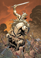
With the conclusion of Dark Horse’s first Conan series after issue #50 earlier this year, Conan the Cimmerian takes up the mantle as the publisher’s new ongoing series for the legendary character. For the pop culture challenged, Conan is a legendary wanderer, a reaver who walks the land with sword in tow, ready, willing and able to throw down should the opportunity present itself. There’s really little else in the way of back story here – all you need to know is Conan is here, he knows his way around a battleground, and you should probably get out of his way if he looks at you funny.

One of my biggest problems with period pieces set in the dark ages, such as this one, is the tireless Olde English that usually goes hand in hand with both the narration and the dialog. I’ve never been much for an excess of “thous” and “arts,” and find that such strict dedication to an older way of writing does nothing but test my patience. Mercifully, that’s an opinion that Cimmerian author Timothy Truman seems to share. In his script, Conan’s players speak in a much more familiar, conversational style. They aren’t dictating prim and proper literary masterpieces with each statement, and that makes actually hearing what they have to say much, much easier. Naturally, he’ll still slip in a period-specific phrase or two to remind his readers of where and when the story takes place, but he’s not bluntly beating them over the head with it in every single word balloon.

Truman seems to have a good handle on what you’d expect from an issue of Conan, too. He doesn’t waste a lot of time with back stories or personality quirks when everybody knows that most of these new faces will probably be cut in half before the issue’s through. He gives us the barest of introductions; just enough to differentiate one face from another, and then throws us right into battle. The issue has just enough depth to feel like it means something, and more than enough action to satiate your hunger for swordplay.

Tomas Giorello and Richard Corben team to bring some outstanding original artwork to the classic character. The rough, grainy texture that fills most of Giorello’s work provides a rich, warm quality to both the characters and the surrounding landscapes. His layouts seem to float between the sharp edges and stark contrast of fully inked artwork and the more lush, free-flowing nature of the original pencils. Perhaps most impressively, Giorello’s work is delivered with a conscious limitation of detail. That focus on storytelling and simplicity without sacrificing quality immediately reminded me of the Kubert family. His work carries their same knack for strong characterization, easy legibility and flowing motion, all the while resisting the urge to become lost in an excess of detail. It’s just right.

Corben’s artwork isn’t quite as good, but still follows many of those same guidelines. Its detail is kept in check, and the artist’s similar focus on fine storytelling and easy legibility makes the transition between styles an easy one. Corben’s work lacks the sensitive touch that Giorello brings to the table, but his hard edges and dense pointillism provide an excellent counterpoint.

I wasn’t expecting much here, since I’ve traditionally had little time for the character, so I was surprised to find that the series is actually pretty entertaining. It avoids many of the stereotypical pitfalls that had led me to write the character off in the first place, and while it isn’t the most involved book I’ve read all month, it’s not meant to be. Conan brings a fine mix of adventure and action, and has never been easier to pick up and read. Borrow it and keep an eye on it going forward.

On a scale of 1 to 10, where 1 is poor and 10 is amazing...
Overall Score: 7

Anita Blake, Vampire Hunter: The Laughing Corpse – Book One

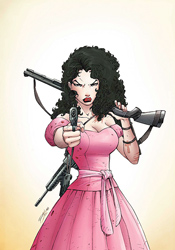
What good is our legal system if it doesn’t apply to each member of the population? More specifically, why have the living dead been exempt from any and all legal persecution up to this point? That’s the question the city of St. Louis was asking itself when it appointed Anita Blake to the shiny new position of vampire executioner. Hey, if these night walkers can’t observe regular business hours and refuse to defend themselves in a court of law, we as a society have no choice but to hunt them down in the streets, to speak to them in the only language they seem to understand. Am I right?

Jess Rufner’s adaptation of a Laurell K. Hamilton novel provides an unexpected and awkward blend of genres. Having never read the original series, this marks the first time I’ve been privy to a story that mixes courtroom drama with back-alley horror, hard-boiled action and crime fiction. It’s constantly struggling with this identity crisis, and while the frequently shifting mood provides a lot of variety, it can also be difficult to navigate. This issue can’t settle down to tell one central storyline, so it scatters its thoughts across a handful of side-plots and tries to pass it off as one single, cohesive arc.

For a series that’s based on a popular series of novels, this isn’t even all that well written. The issue doesn’t make it through its first sentence before slipping over a typo, and outside of Anita herself, the characterization is extremely shallow. The book’s dialog is another stumbling block – once again with the exception of Anita herself, everyone speaks in perfectly proper, stiflingly straightforward English. On one hand, it makes the lead character seem much more down to earth and relatable than everyone she shares the page with. On the other, the rest of the cast seems to have been scripted by third graders. I couldn’t name two people I’ve ever met who speak this rigidly, but Anita knows a whole roomful.

Ron Lim provides smooth, serviceable artwork that’s stylish but not entirely fitting. He gives each member of the cast an original look and feel, which is easier said than done when you’re dealing with this many attorneys. Anita doesn’t have a very broad range of facial expressions (she’s either smiling ironically or grimacing) but she at least maintains an air of intelligence, which is crucial to the story. Since every panel from cover to cover is narrated, typical of a novel-to-comic translation, Lim is never really given a moment to cut loose and impress us. What he’s left to illustrate instead is often dry, straightforward and visually uninteresting. He doesn’t do as much as he could to improve the situation.

For a book featuring a smart protagonist, a trio of wildly different, colorful situations and a bloody murder scene, this really wasn’t all that exciting. Sometimes what works in type doesn’t always translate to an illustrated work, and I fear that’s the case here. Because Anita, our eyes and ears into this world, is always kept strong, solemn and physically unresponsive, it’s tough to develop a reaction of our own to the story. Whether she’s trying on a new dress or walking in on a dismembered corpse, Blake wears the same businesslike demeanor, and her readers follow suit. There’s a lot going on here, but I couldn’t get excited about any of it. This is worth a flip through at best.

On a scale of 1 to 10, where 1 is poor and 10 is amazing...
Overall Score: 3.5

Monday, September 22, 2008

Deadpool #2

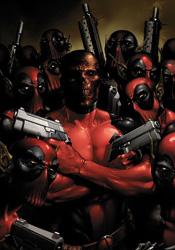
It hasn't even been one month since the launch of Deadpool's own self-titled monthly series, and already the Crimson Merc has stirred things up significantly. Attending a summer baseball game at the very moment the Skrulls unleashed their terran invasion, (undercover as a team mascot, naturally) Wade Wilson single-handedly took down an entire unit of green skins. But when it came time to deliver the deathblow, he hesitated… and then defected. Now he's aboard the mothership, yakking it up with the folks in charge, while the Earth burns beneath them.

An introduction to a very wary Skrull empire provides Deadpool with all the excuse he needs to share the story of his origin, which is thankfully kept quite simple. When you can whittle the very core of a character down to four easy-to-digest pages, that either means his story has been streamlined to perfection or he's a very shallow individual. Writer Daniel Way leaves little doubt in his reader's minds - it's the former. While retelling Deadpool's origins so early in the series may seem a bit excessive, Way ties it into his relationship with the Skrulls admirably. Although his new bosses are suspicious of his intentions at first, by the time he's finished relaying his tales of woe and explaining how his unique set of abilities can aid the empire, Wilson has the entire Skrull empire drinking his Kool-Aid. Wade is such a personable, fast-talking, wheelin', dealin' SOB that it's easy to root for him, even when he's working against humanity's best interests.

I think what's most impressive about this issue is the delicate balance it maintains between comedy and action, two genres that don't always mix well. Many of Wilson's puns are either ignored or written off as cultural misunderstanding by the Skrulls tasked with analyzing his threat level, which means the aliens play a great straight man. They also keep the narrative moving forward when Deadpool would have otherwise spent most of the issue goofing around and amusing himself. It's a shame this invasion has to end at some point, because ‘Pool and the Skrulls make for a better combination than Wilson ever enjoyed in Cable and Deadpool. Never underestimate the value of a creature that can't tell when it's being made fun of.

Paco Medina is given plenty of toys to play around with in his artwork this month, and he capitalizes on almost every occasion. His work, a nice blend of Ed McGuinness's substance, Mark Bagley's action and Travis Charest's gorgeous posturing, brings a lot of personality to the page and never relents. Medina always brings a light visual humor of his own to the proceedings, whether it's in the body language of a frustrated Skrull with a speaking part or something subtle that's going on in the background. Many of Daniel Way's jokes would have fallen flat in the hands of a less-skilled artist, but Medina not only enables them to connect, he enhances them in his own way. He delivers great action scenes, spices up the conversational scenes and keeps the whole package easy to read and exciting to navigate. Thumbs up.

It's rare that a character who's supposed to be funny actually accomplishes that feat, but the current iteration of Deadpool hits the mark with surprising accuracy. This month's issue is an absolute joyride, fun and games from the very get-go, and while that kind of story never really seems to accomplish much of anything, this is an exception. It's a rare mix of raw entertainment, genuine substance and timely relevance, not to mention something you really ought to see for yourself. Buy it. It's a blast.

On a scale of 1 to 10, where 1 is poor and 10 is amazing...
Overall Score: 8.5

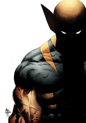
Wolverine: Origins #28

Life's little more than one great big circle, really. Take Wolverine for instance: the man's spent most of his adult life uncertain of who he is, where he's been and what he's done. Logan didn't even know he had an adult son, Daken, until recently. And while the kid doesn't accept his old man's excuse that years and years of brainwashing and torture have robbed him of his memory, that might be about to change. The two have come to blows repeatedly since finding each other but now that Daken, in captivity, has forgotten his own name, it seems father and son may have finally found something in common.

While this storyline with Daken has drug on for what seems like ages, Daniel Way's writing has constantly found a way to keep the character (and his strained relationship with his father) fresh and unpredictable. Every time I start to think he's overstayed his welcome, Daken's story replenishes itself, with the most recent twist being this sudden bout of amnesia. Was the gimmick necessary? Not entirely, but it does add an interesting new dynamic between the two, and that's good enough for the time being. This long arc does need to start thinking about wrapping itself up in the near future, but for now it's still got a bit of gas left in the tank. Whether Way is content to keep driving until it creeps to a halt on the side of the road remains to be seen.

Mike Deodato's art is quite moody, shadowy and atmospheric, but he works with such detail that the ongoing narrative is frequently in danger of being lost. His characters carry enormous weight, almost to the point of distraction. Logan looks and feels like a short, stocky warrior, and when he recalls his final battle with Sabretooth in a flashback, Creed may as well be the boogie man. He's treated so ferociously, towering several feet over Wolverine, that it pushes the boundaries of good taste. Does it make for a striking visual? Absolutely, but it's also so close to the line between believability and imagination that it threatens to pull me out of the moment. Deodato's style immediately gives this arc an entirely different tone and flavor than the series had enjoyed under Steve Dillon's watch previously, which suits the sudden change in the dynamic between Wolverine and Daken. The issue is fogged over by a much darker, more complicated atmosphere, and that's as much a result of the change in artists as it is the revelations in the storyline.

The actual storyline takes a back seat to Logan's memories for the better part of this issue, and it's those flashbacks that provide the real entertainment value. At the expense of moving forward with a storyline that's already gone on a bit too long, this month's Origins allows Wolverine an opportunity to lose himself in the past. The alternate perspective this issue offers to some of the character's older battles are valuable and entertaining, but they're anchored by the nagging knowledge that eventually we'll need to shift our attention back to Daken. As a standalone reflection on past adventures, this would've stood fine on its own. As a random step away from the primary story, it's not quite as successful. Borrow it anyway.

On a scale of 1 to 10, where 1 is poor and 10 is amazing...
Overall Score: 6.5

X-Force #7

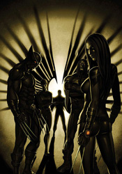
When there's a mutant menace that needs containment, one usually needs look no further than the X-Men. But when that deed is too foul, too risky or too controversial for the regular team to handle, Cyclops calls up X-Force. A lean, mean squad of select mutants that isn't afraid to get its hands dirty, the team is one of the Xavier school's most closely guarded secrets.

Following the imprecise success of their first mission, X-Force is back at home this month, resting and recuperating from the physical tolls suffered in the field. It's a dramatic change of pace from the breakneck action of the first arc, and despite what the narration would have you believe, the team doesn't seem to be at ease within the supposedly friendly environment. It's like watching caged predators stalk back and forth inside their pen, restlessly waiting for their first opportunity to break free and do what they want.

This isn't a series that should be focused on domestic issues. We get enough of that with the dozen other mutant books Marvel publishes each month. If the publisher wants to sell me on a series that promises to explore the dark, uncharted corners of the X-Men universe, they're going to need to pull in the reins a bit on the heavy handed BS that's prevalent in X-Force #7. I don't want to see Warpath commune with his dead brother in a heart-breaking moment of grief, I want conspiracies and action. Something that tells me why this isn't just another rendition of the same old story. I'm not getting that this month.

In providing a break from the lush painted artwork that Clayton Crain had brought to the first arc, Mike Choi doesn't benefit from the comparison. With the aid of colorist Sonia Oback, Choi tries to mimic Crain's style as much as possible, but it just isn't working and in the end he'd have been better off trying something new. His renditions of familiar characters look and act more like wax models than living, breathing individuals. Even the typically rough-edged Wolverine wears a smooth, unblemished face during his strolls around the mansion. Maybe this is just how Logan looks when he's got time to shave? Either way, there's something unsettling about the combination of blank, faceless expressions and oddly reflective skin tones worn by this issue's combatants. Under Choi's watch, the series has lost the jagged, violent visual undertones that set it apart from the other books in the X-Men family. It feels artificial, forced and far too conventional for what the series is trying to do.

This is a change of pace issue, and from all indications it's back into the fire next month. I'm aware of that, but it doesn't mean I have to like it. Writers Craig Kyle & Christopher Yost are much better suited to the dark action of this book's first six issues than the moments of internal strife depicted here. The slow pace and dull subject matter drag this issue into the depths, and the weak artwork makes sure it stays there. Skip it.

On a scale of 1 to 10, where 1 is poor and 10 is amazing...
Overall Score: 2

Monday, September 15, 2008

Marvel Apes #2

It can't be a good sign when my weekly quotient of review material arrives with a sympathetic apology from the powers that be. Such was the case with Marvel Apes #2, and with good reason. It's tough to remain impartial about a mini-series when the very premise seems to be no more than a thin, bad joke, but such is my task this afternoon.

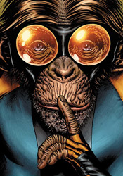
Behold the Marvel Apes: discovered through a chance series of events involving a scientist, DNA, a villain masquerading as a lab monkey and an interdimensional portal, these simians populate a universe in which man never rose to rule the Earth. Naturally that means the responsibility of dressing up in spandex and fighting crime has fallen to the chimps, and they've embraced that call of duty.

In the two stories crammed into this extra-sized issue, Karl Kesel and Tom Peyer each take a turn at penning the apes' adventures. The authors are virtually indistinguishable, delivering two heaping armloads of bad puns and a surplus of shamefully unfunny parodies of mainstream superheroes. Doctor Ooktavius? The Mighty Thorangutan? Are you serious?! This is a collection of the very worst elements of Marvel's history, the homage to a path blazed by Spider-Ham that I'd been dreading for years. While there's an undercurrent of serious plot running beneath the ridiculous gimmicky faux-humor, it's bargain basement at best and utterly buried beneath a mountain of cheese.

That's not to say that the book's tone is its primary handicap. There's certainly a place for comedy in mainstream comics, even lowest denominator-targeted goofball humor like this. Deadpool has been the star of that style of book, off and on, for years and he's no worse for wear. No, where the Marvel Apes train sails off the tracks is about six inches away from the terminal: the problem is with the premise itself. Was there really a need for this? Was anyone banging on Marvel's door, demanding a horror-tinted world of simian superheroes? Even if they were, is this actually entertaining them? Every time I think the story can't get any dumber, it manages to top itself on the very next page. I think this level of stupidity would insult even Rain Man.

Ramon Bachs and Karl Kesel provide the artwork for this month's stories, and they too produce very similar results. Neither can decide if this issue should be filled with apes who walk like men or men who act like apes. They lumber around the page with strange proportions and stretched anatomy, rarely resembling monkeys so much as they do strange, furry, flat-faced humanoid aliens. Each successfully delivers the light tone that the bulk of the story demands, just not in a way that I found even remotely appealing. Maybe I was disturbed by the image of the more scantily clad ladies of the Marvel line as apes, or maybe these artists just had a tough time coming to grips with what they were being asked to illustrate (unlikely, since Kesel actually wrote the primary story). Either way, this ain't pretty to look at.

Marvel Apes #2 is punishment. If you've been reading Marvel Comics for any length of time, chances are good that at some point you've come across a moment that made your eyes involuntarily roll. I'm a die-hard fan of the line, but I can't deny its lasting tendency to cross the line occasionally and grow a bit too silly for its own good. This issue is like a roundup of every such moment, capitalized by a cast full of overdressed gorillas. It's terrible. Just terrible. SKIP.

On a scale of 1 to 10, where 1 is poor and 10 is amazing...
Overall Score: 1

Moon Knight #22

Ever since the conclusion of the Civil War, Marc Spector has been struggling to come to terms with his place in the new superhero paradigm. His violent nature and frequent public brawls made Spector less than an ideal candidate for registration, but he was surprisingly accepted into the program anyway after passing a psychiatric evaluation. However, it wasn't long before the Knight was butting heads with Iron Man over his return to brutal methods. When Iron Man revoked his registration card, Spector merely went on the lam, continuing his violent crusade on the wrong side of the law. But now that he's raised the ire of Stark's immediate superiors, the Moon Knight is faced with his most difficult challenge yet: the assault of the Thunderbolts.

Mike Benson's storytelling immediately benefits from the inclusion of the government-sponsored ‘Bolts. In Norman Osbourne's team of reassigned villains, Benson finds a ready-made spoiler for his confused, unstable lead character. While it's been difficult to take the Knight's troubles seriously of late, with Stark wearing his kid gloves and most of his enemies unwilling to go to the same rough-and-tumble lengths that Spector is, the government's hit squad of reformed bad guys have no such qualms or limitations. These are the guys that big brother calls in when he's had enough of you, and if they're let off their leash there's no telling how ugly things could get.

Fortunately, Benson doesn't rush into any sort of final showdown. In carefully setting that stage beforehand, allowing Stark and the Thunderbolts to race each other for the chance to take down the Knight, he's captured my interest and imagination. Of course, he still trips over many of the same basics that have plagued him since day one, but at least there's finally more to this than endless sterile conversation between uninteresting characters, occasionally interrupted by a random ass whuppin' or two.

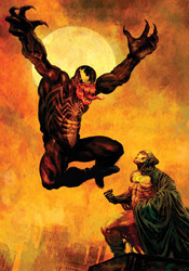
Mark Texeira remains Moon Knight's regular artist, working over the layouts of Javier Saltares, and continues to stomp all over his legacy. In the mid to late '90s, Tex was one of the finest artists in Marvel's stable: largely delivering cover artwork, his infrequent ventures into full-blown interior work were beautiful. One would imagine that his traditionally rough, violent style would make an excellent counterpart for the carnage that's followed Marc Spector for the last few years, but it's not. Strangely, Tex has abandoned that style in favor of a much more dull, lazy take for the duration of his run on this book. His artwork feels incomplete and boring, not to mention tough to follow – backgrounds are left untouched and characters that aren't speaking stare at nearby walls like robots. When Texeira introduces his readers to Venom in one of this issue's first pages, it's almost laughable. Not really the effect I think he was going for.

I've loathed Moon Knight for the last year and a half, and while it still contains many of the faults that led me to hate it initially, the new faces and surprising storyline twists have reinvigorated my interest for the time being. Extremely poor artwork and cumbersome dialog continue to hold the series back from realizing its potential, but at least the storyline is finally going somewhere. Worth flipping through at best... it's still miles from a recommendation, but we're finally heading in the right direction.

On a scale of 1 to 10, where 1 is poor and 10 is amazing...
Overall Score: 5

Squadron Supreme #3

It's been five years since the world's greatest heroes – the Squadron Supreme – vanished without a trace, suddenly leaving a beaten up, worn down planet to fend for itself. As a means to move on with their lives, humanity has shifted its sights to lunar exploration. But when the first set of astronauts return from their voyage and begin demonstrating super powers of their own, it sparks a new superhuman age. The skies have begun filling with costumed warriors once again, whether the Earth is ready for it or not.

Howard Chaykin is just the latest in a line of big names to pen the adventures of this notorious squad, and quickly demonstrates he's a much better writer than he is an artist. Of course, I don't think I could care any less for his artwork, so that isn't much of a compliment. Regardless, his writing here is solid, if somewhat slow moving. Chaykin works with an extra-sized cast in Squadron Supreme, but still manages to give each of them a unique voice without weighting down the issue with a lot of meaningless dialog. That's not to say there aren't a lot of word bubbles in this edition, because there are, but the strength of Chaykin's cast and his knack for believable dialog ensure that the book is never a laborious read.

Where the heroes of Mark Gruenwald's original Squadron Supreme were clearly based on prominent members of the DC family, the four astronauts at the center of this story bear more than a passing similarity to the Fantastic Four: a set of space explorers (three guys, one gal) return to Earth and exhibit powers, one of the four is freakishly disfigured, the loudmouthed blonde brat creates crystal from thin air (which somehow enables him to fly), the squad's leader has an intimate relationship with the lady, and all four of them flee into the desert to figure things out. Fortunately, most of the similarities end there. The group is nowhere near as closely knit as the Four is, bickering and steaming when Reed, Johnny, Ben and Sue were giving the old “all for one” pep talk, and speak more like the self-absorbed generation of today than the classic 1950s nuclear family. What's more, they've each got secrets darker than anything Reed Richards could ever imagine. If he was going to borrow from a well-known origin, Chaykin could have chosen worse. At the end of the day, this more modern, relatable take on a classic tale benefits from the comparison, rather than feeling like just another knock-off.

Artist Marco Turini adds a flavor to the book that's hard to describe. The simplicity of his linework and effective use of crosshatch is often reminiscent of John Romita Junior's efforts, but Turini's work lacks the vibrancy and constant sense of motion that sets Romita's style apart. While Turini's compositions are generally very effective and easy to follow, he does have a strange tendency to hide central figures in the scenery. Whether they're turning their backs to the camera or hanging around behind a few props, his cast never seems that interested in taking center stage for any length of time. To a certain extent, that gives the issue a subtle voyeuristic angle, as though we're merely a casual passer-by, eavesdropping on these events – and that works well with the tone of Chaykin's storyline. Turini's work with architecture and city skylines is spectacular, far and away his greatest strength, but he doesn't bring that same level of ingenuity and dedication to the rest of the book.

I enjoyed this issue – it's a smart read, mature and analytical in the same vein as Warren Ellis's New Universal, if not quite as well written. Chaykin's work holds up a funhouse mirror to many of Marvel's most well known individuals, distorting and altering a few very important details and coming out the other side with a fresh, if strangely familiar, cast of characters. Marco Turini's artwork has room for improvement, but does enjoy its moments in the sun throughout the issue. If Chaykin can deliver some fireworks on the home stretch, this could be something to keep your eye on. For now, just borrow it.

On a scale of 1 to 10, where 1 is poor and 10 is amazing...
Overall Score: 6.5

Monday, September 8, 2008

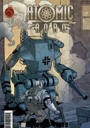
Atomic Robo 2 #2

One of Nikolas Tesla's finest (and quietest) creations, Atomic Robo is the first and so far only example of artificial intelligence to walk the planet. Granted American citizenship in exchange for his occasional cooperation with the US military, Robo spends his time battling enemies either dubbed too powerful or too strange for average troops to approach. It's a bit of the former, a bit of the latter this time around, as the metal man is dropped into the heart of Italy during World War II. While his primary goal was to trash a set of walking panzers before they could slaughter our boys, he was instead ambushed and taken captive, to be presumably tinkered with to no end by those pesky Nazi scientists.

Writer Brian Clevinger maintains a breakneck pace from cover to cover, spicing up the action scenes with a constant touch of humor in the same vein as the Indiana Jones movies. And while this keeps the issue from feeling like the one big, long 'splosion-fest it pretty much is, every once in a while that comedy feels a bit inappropriate. The Nazis are presented as the battle-hungry war machines they always are in this kind of a situation, and while they're serious about annihilating the enemy, the Americans (usually Atomic Robo himself) are more concerned with firing out one-liners at the right moment than quickly and safely containing the enemy threat. When one soldier catches a bullet in the face and Robo is back to cracking bad puns less than a page later, it doesn't seem very fitting.

Scott Wegener's fast paced, gestured artwork blends well with the issue's comical slant and frequent action scenes. Although his work does occasionally trip over its own simplicity, (when one of those walking tanks I mentioned earlier appears before a squad of US soldiers early in the issue, for instance, I wasn't sure if the enemy was a hundred yards down the road or five feet to their left) Wegener's frequent and effective use of subtle plumes of smoke and scattered dust is usually enough to fill in the blanks. Not only that, but they add an element of extreme mass and substance to the clunky, heavy machines that populate most of the book.

For the majority of this issue, when the action is fast and the flavor is cheerful, Wegener is all you could ask for in an artist. On the few occasions that the narration turns more serious, such as the issue's outset, when a war-weary veteran dictates a letter home and struggles to find something hopeful to write about, the artwork is much less appropriate. Wegener never changes gears to match the mood and effect of the story, but fortunately he isn't asked to do so more than once or twice a month.

If it sounds like I'm down on this series, I apologize. For the most part, this issue was loads of fun, a wild ride through a chapter of history that's usually caught up in the atrocities of war and little else. While the characters' dialog feels a bit too modern to be era-appropriate, (did Robo just quote Ghostbusters?) that's just a minor qualm, as are most of my problems with the issue. It's an enjoyably original take on a period in American history that's usually kept stiflingly sober, an excess of action and a wealth of personality. It doesn't set out to change your life, but it provides an excellent distraction if nothing else. Worthy of a borrow.

On a scale of 1 to 10, where 1 is poor and 10 is amazing...
Overall Score: 7

Civil War: House of M #1

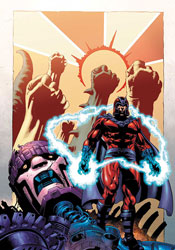
As with the Age of Apocalypse before it, the temptation of revisiting the land first concocted in the House of M mini-series just over three years ago has finally proven to be too great. In this self-contained mini, we'll return to a time when Magneto was king, the mutants were in charge and nearly every hero on the planet was granted their heart's deepest desires.

In particular, this month we're examining the origins of old man Magnus, at least this reality's version of him, and his unlikely rise from infant Jew in Nazi Germany to beloved king of all modern civilization. Of course, a lot of this is territory that's already been covered several times before. Though the Scarlet Witch significantly rewrote history for a brief time during the original House of M, the vast majority of those alterations were only evident in the present, with her meddling in major past events kept miniscule at best. It was understandable in the grand scheme of things: Wanda could change what she knew and only guess about what she didn't. Even if you have the power to alter the very fabric of our existence, you still need to know the specifics of what you're modifying before anything can actually take effect.

That disconnect is evident almost from the very get-go with this issue. Writer Christos N. Gage makes plenty of ticky-tacky little changes to the status quo, even meddling with the master of magnetism's personal life before Wanda was born. But while he's testing shallow new waters throughout the issue, his storytelling remains very bland and the heart of his story is basically unchanged from the present canon. When Gage faces Magneto with a baseball bat-wielding bigot, out for the blood of a mutant, it's tough to shake the feeling that we've seen it all before. By the time the issue draws to a close, that's a sensation you'll be growing accustomed to. For an alternate reality, this land certainly has a lot in common with the present state of affairs.

I found Andrea Divito's accompanying visuals to be similarly lacking. Perhaps best known for his work on the recent Annihilation crossover, Divito brings a decidedly old school flavor to the book, especially when he's dealt a page filled to the brim with colorful costumes and radiant displays of mutant power. These scenes just aren't impressive, neither in execution nor composition. When a big splash page gives him an opportunity to really impress his readers, he draws yawns instead. His workman-like contributions are technically sound, but lack an emotional punch, a personal touch to draw readers into his work. What's on display here is nothing to get excited about.

Free from the bonds of regular continuity, both creators had a chance to really cut loose here, which makes their failure to do so all the more disappointing. There's really no call for this series at this point: it feels like little more than a return to familiar territory, land that was better suited in the rear view mirror. House of M was a compelling story in 2005, but it was a story with a specific beginning and ending. I can't see further elaboration doing anything more than complicating that. Skip it.

On a scale of 1 to 10, where 1 is poor and 10 is amazing...
Overall Score: 2

Ultimate X-Men & Ultimate Fantastic Four Annual #1

As the opening volley of this fall's big "Ultimatum" crossover, which will be supplanting the regular Ultimate X-Men and Ultimate Fantastic Four books for the entirety of its run, this issue hurriedly throws the entire imprint's current state of affairs out of whack. When the X-Men of the future arrive in the present, they do so with one clear and simple objective: find the present iteration of the Fantastic Four and blow them to smithereens. And, considering the extra years' worth of experience these old vets have over their much younger targets, it really shouldn't be much of a fight… that is, until the future Fantastic Four also appear to join in the fray.

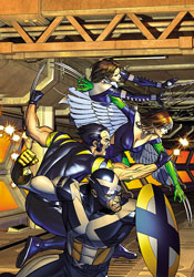
Collaborative writers Aron E. Coleite and Joe Pokaski don't pull any punches, throwing their readers off the deep end from page one with an unfamiliar team of mismatched X-Men from the future driving a commuter train off its tracks. The team's names are recognizable, but their faces and powers are all wrong: Rogue has wings, Kittie Pryde shoots webs, and Captain America is wearing an X across his chest. I guess that's one way to quickly, convincingly teach your readers that nothing's off limits in this series and no one is safe. No one except Spidey, that is, as Marvel has already announced that Ultimate Spider-Man will continue uninterrupted beyond this series.

The issue never really slows down long enough to let its readers catch their breath. One jolting, unexpected scene segues directly into the next. Each member of the cast speaks a mile a minute, without individuality. This isn't a cast of characters, it's one voice spread over about twenty different bodies. This issue is a wild ride, not without its moments of inspiration, but it's far from being anything I could call well written. It's a lot of good ideas and a lot of bad ideas all thrown into the same bag and shaken around a bit.

Dan Panosian and Mark Brooks take turns holding the artistic reigns this month, and have so little in common that the jolt the reader receives upon jumping between their styles is akin to hitting a speed bump at sixty miles per hour. Brooks plays the bookend, penning both the issue's opening pages and its conclusion, and is the better of the two. His bold, textured style is heavily influenced by the work of Chris Bachalo, and while it lacks the flair for the spectacular that Bachalo brings to the table, he makes for a fine stand-in during more static, postured moments. Brooks's characters never seem comfortable, however, and their battle poses are so awkward and strangely composed that his work is sometimes difficult to traverse.

Panosian's artwork is comparatively much more cartoony, often to a fault. While he's being asked to deal with very serious moments that could have long-reaching implications, (rumor has it that one or more major Ultimate books will end following this crossover) his thin-lined, exaggerated work often betrays the story's intended tone. His contributions are like a more over-the-top J. Scott Campbell, lumpy and curvy and stylized beyond the point of no return. Not so good.

In fact, that phrase pretty much embodies my thoughts about this issue as a whole: not so good. It's a lot of hot air, plenty of chances for the superheroes to flaunt their powers without that compelling of a plotline. Although the writers have tried everything they can think of to convince me that the sky's the limit here, that important characters will meet their end an there's no limit to how far they're willing to go, I couldn't shake the feeling that a lot of this storytelling is extremely safe. An uncertain artistic offering doesn't do much to improve that situation. Ultimate X-Men or Ultimate Fantastic Four fanatics might find something of value here, but the rest of us would be better off skipping it.

On a scale of 1 to 10, where 1 is poor and 10 is amazing...
Overall Score: 2

X-Men: Magneto Testament #1

Looks like Civil War: House of M isn't the only book to reexamine the birthplace of Magneto's psyche this week. Set once again against the backdrop of Nazi Germany, Magneto Testament takes a closer look at the formative years and early personal tragedies of one of mutant-kind's loudest voices.

There's always been a ready-made connection between the bigoted racism inherent in the Nazi party and the harsh, cruel treatment Marvel's mutants typically receive from humanity at large. It's one of about a dozen real-life movements and tragedies echoed by the currents that underlie every issue of X-Men, regardless of the physical threat they may be facing in that issue. The civil rights movement, the persecution of foreign religion during the Spanish Inquisition, even today's struggles surrounding homosexuality, they can each be tied to the same closed-minded group thinking that's at the core of these books. Writer Greg Pak understands that simple allusion to the real world, and makes the connection abundantly clear with this tale. When a young Magnus sees an angry mob of swastika-bearing neighbors punishing his family, the correlation to future events in the mutant timeline is obvious.

Pak tells this story from the right perspective, at the right pace. He sets up his cast in a quiet corner of the city, establishes their simple, understated personalities within just a handful of pages, and then throws the family into the fire almost as soon as his readers have accepted them. The sheer power of the unthinking, unyielding mob that changes these characters' lives shares a powerful message. It's handled carefully, but unrelentingly, and is easily some of the best work Pak has ever produced.

Carmine Di Giandomenico's contributed artwork is also captivating. His loosely detailed rendering style and prevalent focus on storytelling bears more than a passing resemblance to the work of Tim Sale, which is a big compliment in my eyes. Were this predominantly a capes n' tights tale, the tone of his work would be out of place, but as a largely pedestrian story focused more on the tragedies surrounding Magnus and his family than his ability to manipulate metal, Di Giandomenico feels right at home. Although he has an obnoxious tendency to grant younger characters abnormally large eyeballs, if that's the worst complaint I can level against an artist, he's doing just fine. The vast majority of this artwork is tremendous, and gives the story the extra personal touch that it was reaching for. And once the civilian nature of Di Giandomenico's illustrations help its readers make that emotional connection to the characters, the story reaps the benefits of their eventual downfall. When the Nazis flex their muscles near the middle of this issue, it's already unsettlingly personal and disturbingly powerful.

If you read one Magneto origin story this week, or this year, or maybe ever, make it this one. It's a fine combination of rich, emotion-charged artwork and a story that captures the simple brutality of a closed-minded oppression that's run through human history time and time again. This is as smart as the X-Men have been in years. Buy it.

On a scale of 1 to 10, where 1 is poor and 10 is amazing...
Overall Score: 9