Monday, March 24, 2008

Spider-Man: With Great Power... #3

It's hard to believe, but there's actually an area of Spider-Man's past that hasn't already been exploited by half a dozen retrospective mini-series. Until now, the brief period between Peter's run-in with a radioactive spider and the sudden death of his uncle had been left to readers' overactive imaginations and the deepest, darkest corners of his creators' minds. In With Great Power, the all-star tandem of David Lapham and Tony Harris set out to finally explore that short, influential period in the web-slinger's career.

I don't know that I've ever read a David Lapham story I didn't like. Ranked among his more recent work, With Great Power isn't his finest hour, but it's at least an interesting angle on a character who's been largely the same for the last forty years. It's actually so original a take, though, that I had trouble just identifying Peter. Spidey's always been a bashful, nerdy kid at heart, but the way he acts when he's in-costume throughout this issue is totally out of line with that. He's a dog, rushing from lady to lady, excess to excess, which doesn't exactly cast him in the same kind of light he's enjoyed for his entire existence. I can understand the need to beef up on the character's immaturity – after all, he's just a kid enjoying the spotlight for the first time in his life, and the wilder his adventures at this point, the greater his regret after his uncle's eventual death – but he's basically unlikeable. Lapham is a genius when he's writing hard-edged action and drama, but he seems uncomfortable with a more wholesome, mainstream story like this one.

I'm also a big fan of Tony Harris's artwork, having followed his contributions to Ex Machina over at WildStorm since the series launched. He brings a certain authenticity to the table, granting his cast a realistic, approachable appearance that doesn't try to hide its flaws. Although he's been enhancing the political atmosphere of New York's City Hall with that style in Machina for a couple of years now, I can't imagine that climate differing too much from the one found in J. Jonah Jameson's war room, and that makes his transition between titles a natural one. Harris's style is equally at home in an editorial conference as it is in a mayoral debate, and he brings exactly the right blend of false authority and bravado to his rendition of Jameson and the rest of his staff.

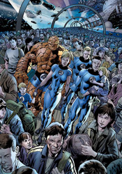
But while his take on the Bugle staff, the scenery, the supporting cast and even the Fantastic Four are outstanding, his rendition of Spider-Man himself is a bit off. He doesn't feel right, doesn't match his surroundings. Harris's work is a fine blend of detail and simplicity – he conveys every important wrinkle in a lady's blouse, but never gives the rendition so much attention that it feels complicated. His Spider-Man takes that latter technique further than necessary, and comes across as empty and overly simplified. He doesn't look like he fits into his surroundings, and he's certainly not as exciting as he could be. Harris's work here is tremendous, but only when Spidey isn't a part of the picture.

Considering my opinion of the talent involved with this issue, I expected a lot more than I got. David Lapham's story is missing the touches of personality and detail that I'm used to, and it simply doesn't feel like a Spider-Man story. Tony Harris's work is largely on par with the rest of his efforts, doesn't show any signs of being rushed out despite working on two books this month, but he never gets a handle on the main character. At the end of this issue, I felt like I'd been promised something that was never delivered. It's a fine premise, but it never turns into what it could. Flip through this if you need to see what I mean… it's missing a few key elements.

On a scale of 1 to 10, where 1 is poor and 10 is amazing...
Overall Score: 5.5

New Warriors #10

While the rest of the New Warriors have been going about business as usual, growing together as both a team and as a family, one member has been conspicuous in his absences. Although her teammates haven't caught on just yet, Jubilee has taken note of Night Thrasher's regular, convenient disappearing acts, and she wants to get to the bottom of things. But Night Thrasher himself is aware of her investigation, and has started taking steps to make sure she keeps quiet about her discoveries.

Kevin Grevioux has written the team into an interesting corner, despite a few hiccups with his dialog. He's built tensions to a boiling point, with field leader Jubilee openly questioning the actions of the team's captain, and the rest of the squad uncertain about whose side they're on. The group shares a certain unspoken bond, but aren't above bickering amongst themselves like a family. They share a recent origin, having each lost their mutant abilities during House of M, and as such are all still learning to rely on weaponry to achieve what they'd always been able to do by themselves. The primary conflict of the issue, Jubilee vs. Night Thrasher in a battle of wills, is well-written and cast in a light that gives them both a strong argument and makes the team's ultimate decision between the two understandable. The narrative does jump around a bit, disrupting the flow, but for the most part it's decent.

The artwork, provided by Paco Medina, alternately shines and recedes, like the sunlight on a cloudy day. When it's working out, it's some high quality work – he's got a light touch and a great knack for dynamic layouts. He clearly loves detailing a breathtaking backdrop, and he's given several occasions to do just that in this issue. But when he isn't giving it his all, as is the case on several pages, it's middling at best. When they're in the middle of a battle, the team strikes dramatic, expressive poses and puts on a show… but immediately afterward, the Warriors stand in forced, awkward positions and never seem to be at ease or comfortable. It's easy to pinpoint the precise moment the artist loses interest in the subject, which is too bad because he has talent to spare when he's motivated.

Medina never seems to have a handle on these characters. They lack identity, and outside of the intricacies of their outfits, all share the same body types. It's been a while since I've seen Jubilee in an ongoing series, but I don't seem to recall her ever having giant knockers and bulging biceps. It's something she shares with the rest of the women on the team, who could basically swap heads and uniforms without a change in the status quo. They're all the same height; the same weight; the same shape… surely there has to be more to them than that.

For the most part, that summarizes this issue – the feeling that there has to be more to it than this. Both the writing and the artwork are good, but not great. Grevioux and Medina do enough to maintain your attention, but not enough to capture your interest. Unless you already have a vested interest in these characters, there probably isn't enough here to merit reading it regularly. Flip through it and see for yourself.

On a scale of 1 to 10, where 1 is poor and 10 is amazing...
Overall Score: 4.5

Mighty Avengers #11

Tony Stark's team of government-approved Avengers haven't had much chance to rest since they came together. Whether it's the threat of a new Ultron, the attack of Venom symbiotes in New York City or a time-traveling adventure with Dr. Doom, the action has been pretty much non-stop for these guys all year long. As if the endless battles weren't headache enough, when Iron Man and the Sentry returned to the present last month, their time-traveling companion, Dr. Doom, was nowhere to be found and an enormous explosion seemingly engulfed Stark.

Although I loved this book at its inception, I've soured on it over the last few months. Brian Michael Bendis has given the series a different flavor than New Avengers, focusing more on cartoony action in contrast to NA's more adult tones. And while it's cool to have such a unique pair of voices for Marvel's premiere super-group(s), I think he's gone a bit too far over the top with this series. It feels like Mighty Avengers is his way of apologizing to older fans who may have been turned off by his radically different take on the team in Avengers: Disassembled, which is noble but ultimately not something he's all that good at. The adventures are too stereotypical, the dialog too casual, the thought balloons too frequent – the gimmicks are starting to wear thin.

Seriously, Bendis's thought balloon experiment in particular is out of control. About a third of this issue is a chat between Doom and the Avengers, and the imaginary bubbles are so frequent and overdone, I wanted to scream. It was a cool idea when he first introduced it with the launch of this series, but at this point it's become Frankenstein's monster, overpowering its creator and causing a big mess. Paired with a story that centers on time travel, (a tricky proposition of its own) that means this issue is seriously tough to read. I'm not even entirely sure what really happened.

Marvel legend Mark Bagley is providing the artwork for this storyline, one of his last for the publisher before he becomes exclusive DC property, and he's had much better showings. When he took on Ultimate Spider-Man for the book's first hundred issues, he clearly stepped up his game. His work was phenomenal month in and month out, possibly the best of his career, and it was a perfect match for the tone of that series. Thus far on his brief stretch with Mighty Avengers, he's taken just as big a step in the opposite direction. His work here is nothing compared to what he proved he could do elsewhere. It's not exciting, even in situations that one would assume would almost fill in the action automatically. He doesn't have a feel for the characters. His renditions of the Black Widow, Ares and the Wasp are nasty, and his Doom is missing the impressive, showy nature that's always made him stand out. Bagley's working with an incredible cast, but he just isn't doing anything with it.

I wish I could say I loved this issue, but I just can't. The story never really took hold, the resolution was sudden and coincidental at best, and those damned thought bubbles were everywhere. Paired with a sub-par effort from Bagley, that means the entire issue came across as a disappointment. I expect more from these guys, but I guess not every experiment can be an unbridled success. Flip through it to stay current, but don't expect much.

On a scale of 1 to 10, where 1 is poor and 10 is amazing...
Overall Score: 4

Marvel Illustrated: Picture of Dorian Gray #4

The latest in Marvel's series of adaptations from famous stories, Oscar Wilde's Dorian Gray is the story of a portrait, a young man and a wish. When Dorian Gray commissioned a famous artist to produce a portrait, he loved the finished product – but also openly lamented that the painting would remain youthful forever, while he was doomed to fade into old age. After openly wishing he could trade places with his reflection in the painting, overnight it became clear that his dream had come true. Over twenty years, the portrait began to show the ravages of time and the alterations in his personality, while Dorian himself remained youthful and handsome.

Of all the literature Marvel's adapted recently, I think this is the most apt to succeed in its new format. The story is spread out over such a long period of time that the regular monthly chapter breaks are more at home than they are in, say, Treasure Island or The Dark Tower. Writer Roy Thomas, aware of that peculiarity, has embraced it. The pace of this series is a good match for the medium, and Thomas does a nice job of carrying over crucial parts of the book's narration without burying every panel in it. A lot of the dialog is stilted and overly proper, but since the book is set in a historic period and the characters are clearly upper-class rich folk, it's not that big a deal.

Although he already has a nicely developed cast of characters to deal with, Thomas gives them each an extra touch of individuality and personality that makes up for the series' relatively short page count. His writing is concise but effective – he's able to effectively tell a giant story in a tiny package without sacrificing anything valuable – and that's extremely important in this situation.

Sebastian Fiumara's art is a nice partner for the story – he brings a good understanding of the era, complete with accurate wardrobe and scenery, but keeps the book from getting too bogged down in it or out of touch. Where the artists on previous Marvel Illustrated books have treated the imprint as a second rate job, Fiumara shows a lot of pride in his work. While he occasionally has problems with basic proportions and anatomy, (in one panel, Dorian's hand is small enough to belong to an infant) I could never question his effort. His work is awesome when it's kept simple, which it is for most of the issue, and even when he gives in to the urge to add a few excessive details, his linework remains unique and interesting. Action is infrequent in a book like this one, but on the brief instances that he's given something active to work with, he maximizes their potential. He especially blossoms in the dark, near-colorless atmosphere of this series, and uses that to his own benefit in the same way that Alex Maleev did during his run with Daredevil.

I was both surprised and impressed by The Picture of Dorian Gray. The writing captures the mood and the drama of the Oscar Wilde original, while granting the series its own personality. The artwork perfectly captures Dorian's slow descent into madness, at the same time placing readers in a specific time period without boring or losing them along the way. I'm as surprised as you might be when I recommend you buy this issue, along with the three that came before. It's not without its blemishes, but it's as strong a title as the Marvel Illustrated line has ever produced.

On a scale of 1 to 10, where 1 is poor and 10 is amazing...
Overall Score: 8.5

Monday, March 17, 2008

War is Hell: The First Flight of the Phantom Eagle #1

If there's one thing Garth Ennis doesn't fear, it's boundaries – the concept of doing something that's out of fashion, or something that hasn't been done before, it doesn't faze him. War is Hell is a prime example: the shelves aren't exactly overflowing with stories about the world's first fighter pilots, confusedly strafing the skies during World War I before the inclusion of parachutes were deemed appropriate (higher-ups feared that the aircraft would be abandoned too quickly if pilots were provided an escape route). But Ennis has a story to tell, and when he's motivated like this, it's best not to get into his way.

He's clearly done a good bit of research, too, because while the storytelling itself may be fictional, its backdrop is draped in authenticity. Bits and pieces of trivia, tidbits and facts dating back nearly a full century are scattered about this issue, and they do nothing but enhance the story. While the actual storytelling is about as subtle as a butcher knife, coated with the writer's trademark gallows humor, (the personality and ultimate fate of Captain Clark is pure Ennis) that historical backdrop gives it the right dosage of reality to keep things grounded and generally readable.

One of the writer's longstanding faults is his passion for foreign accents and regional dialects, and that's especially noticeable here. When a pair of British officers share a conversation near the issue's outset, it's bathed in a combination of military jargon and eastern European lingo that I found borderline illegible. That the dialog is so tough to follow is a bad thing, too, because there's so goddamn much of it. When the action is focused on the skies and the war taking place up there, it's pure adrenaline and straight action, but once the squadron's wheels touch grass, it's wall to wall discourse.

Handling the artistic chores is Howard Chaykin, who I've had absolutely no time for recently. His work on Wolverine was so bad, I audibly groaned when I opened this issue and discovered that he was the artist. Surprisingly, though, his work within this issue is much, much stronger than his efforts with the hairy mutant. Chaykin is still a long ways from my good graces, and his panels are still very difficult to read on a few occasions here, but he's at least proven that he does have something to contribute. While he often struggles to accurately portray a human subject, his work with aircraft and the landscape is absolutely gorgeous. When he illustrates the unbridled madness of a dogfight - explosions, gunfire and bodies floating around the page in a chaotic slow dance - the result is both horrific and beautiful. It's obvious that the skies are where his passion lies, and it's a shame that he doesn't get more of an opportunity to show that off in this issue.

Ultimately, your opinion of The First Flight of the Phantom Eagle is going to depend on your opinion of Garth Ennis. If you share his black sense of humor, as I do, you'll laugh out loud a handful of times throughout the issue. If you don't, well, you might want to turn your attention elsewhere, because despite the aid of some great research and a compelling subject, much of the issue exists solely to set up the next morbid punchline. It's not the writer's best work, but it's an entertaining and original jaunt through the history books all the same. I'd recommend you borrow it if just to try something different, although your mileage may vary.

On a scale of 1 to 10, where 1 is poor and 10 is amazing...
Overall Score: 3.5

Thor #7

Following the events of his first arc since returning from "the sleep of the gods," Thor is completely and utterly exhausted. I suppose rebuilding the mythical settlement of Asgard and individually seeking out its inhabitants is a bit more work than one man can handle in a single storyline. This month, the Thunder God rests, which releases his mortal counterpart, Donald Blake, into the Asgardian streets.

I'd enjoyed the few preceding chapters of this new Thor that I'd read, mainly because writer J. Michael Straczynski had been spinning a different type of yarn than I was used to. Where the book's previous runs had lost my interest by focusing on long speeches in Middle English and deep, frequent ventures into Norse mythology, Straczynski grabbed my attention by placing Thor in a modern environment. I liked the comparison between the modern perspective and the ancient sentiment of the Thunder God himself, and felt it was a fresh take on a character that I'd long since grown tired of.

With this issue, Straczynski veers from that path and returns to territory that should be familiar for long-time fans of the character. While he tries to balance this shift with an alternate storyline that focuses on Donald Blake's adventures in the modern world, the bulk of the story belongs to Thor. Within just a few pages of the story's return to high-and-mighty mythical themes, I was once again turned off to the character. I can understand that there's an audience for this kind of long-winded, complex storytelling with an ancient flavor, but I don't count myself among its followers. This issue feels like a huge step back to the status quo after the series had taken such a decidedly different direction with its first story arc.

Marko Djurdjevic, most recently known for his work as Daredevil's cover artist, provides the visuals this month. Djurdjevic's style is something of an acquired taste, particularly when he's dealing with the actual Asgardian denizens. He never seems to fully take hold of the mythical setting, at least not in the same way he does the scenes taking place in the modern world. When we're following Donald Blake around America, his work is very good – his personality shines through in the details, which are abundant, and he constantly fills the frame with unique, inspired camera angles. When the setting switches back to Thor's perspective, be it in Asgard or another mythical setting, Djurdjevic's work stumbles. His characters grow stiff and overcomplicated, while his backgrounds lose those great touches of personality. He's a completely different artist when he's illustrating civilians than he is when he's portraying the heroes themselves, and I greatly prefer his work with the former.

I'm sure many fans will rejoice at the release of this issue, hailing it a return to form for the series, but I found myself disappointed. Marko Djurdjevic's artwork has the unfortunate task of following up a run by Olivier Coipel that I absolutely adored, and though it has its own merits, it can't compare to what came before. J. Michael Straczynski's storytelling has slowed down markedly since the last time I read Thor, not to mention the change in direction, and before long I found myself counting the pages until the issue was finished. I'd flip through this, especially if you're a longtime fan of the character, but in my eyes it fell short.

On a scale of 1 to 10, where 1 is poor and 10 is amazing...
Overall Score: 3.5

Ghost Rider #21

Since Johnny Blaze reprised his leading role in the pages of Ghost Rider almost two years ago, he's been hit with a series of revelations that have changed the way he looks at himself. Particularly surprising was the realization that the spirit of vengeance which shares his body wasn't of demonic origin as he'd always presumed, but was actually assigned to him as part of a heavenly “black ops” program. When God doesn't want to get his hands dirty, I guess, he dials up the guy with the flaming skull and a magic motorcycle. Only now, the angel in charge of the whole program has developed grand aspirations, including but not limited to the highest post of them all. The angel, named Zadkiel, wants to evict God from his throne and rule heaven in his place. I guess some people never learn…

Roland Boschi contributes the artwork this month, and while he's certainly a step up from what Javier Saltares was producing the last time I read an issue of Ghost Rider, he's got a few rough patches of his own. His work blends the simple, gestural qualities of Tim Sale with the composition style of the Kubert family, but doesn't compare favorably to either. On the occasions that he seems to get it, such as an early scene-setting panel that portrays Blaze's morning campsite, the artwork is vividly Kubert-inspired, but missing a sense of life and identity.

When his style emulates Tim Sale's, it retains that sense of mesmerizing simplicity, but totally misses the beauty of the Long Halloween artist's linework. Where Sale's illustrations live and breathe, painting their way across the page, Boschi's work is unrefined, jerky and often clumsy. Often, his characters' facial expressions don't match what they're saying or doing. Yet, every once in a while a flicker of hope will peek through. Boschi has the tools to make something of himself… he keeps a good pace, and can tell a story with or without the aid of word balloons. He isn't there yet, but with a bit of refinement and a more discernible identity could become someone noteworthy.

Like his partner, Jason Aaron's writing is a marked improvement over Daniel Way's efforts a few months back. His storytelling is much easier to follow, despite a few awkward shifts from inaction to sudden, jolting fireworks and knife fights, and he shows restraint and a knack for legibility in much of his dialog. I can safely say that this month's conflict is one of the more unique pairings I've ever stumbled across, and while it occasionally gets a bit too close to cliché for my liking, it never actually carries itself over the top in that respect.

Even though it directly involves a battle between angels and repeated references to biblical material, the story really isn't what I expected. That's both a good thing and a bad thing – on one hand, Aaron is exploring new territory with a character that's badly needed that kind of a vision for decades. On the other, his quirky writing style and oddball situations have almost completely reversed the book's personality in a very short period of time. In my eyes, it's a welcome change because what came before was just rotten, but he runs the risk of alienating older readers by changing the game on them so drastically with little warning.

Ghost Rider is grasping for an identity right now, and while both Boschi and Aaron certainly provide something different in that arena, I'm not sure they're a permanent solution. But, to be fair, they are at the very least a step in the right direction. Flip through this, even if the character has never appealed to you. It's trying to reinvent itself, which is more than I can say for a lot of books in a similar predicament.

On a scale of 1 to 10, where 1 is poor and 10 is amazing...
Overall Score: 4

Monday, March 10, 2008

Punisher #55

This month's Punisher serves as an epilogue to the gigantic “Barracuda” arc that climaxed last month, a sort of tying up of loose ends... as if tearing the villains nose off, slicing away both of his arms, sticking an axe in his chest and unloading a full clip, point-blank into his face wasn't conclusion enough. At the same time, it also serves as an introduction to Garth Ennis and Goran Parlov's next (and final) arc together – a nice segue from one horrifically violent war zone to the next.

There have been a lot of takes on Nick Fury over the years: Stan Lee's James Bond-style portrait, Jim Steranko's legendary surreal, experimental version, Brian Michael Bendis and Mark Millar's mastermind of the Ultimate Universe; in the opening pages of this issue, Ennis adds his twist to the patch-eyed veteran, and it's just as inspired as the creators who have come before. His Fury is angry at the world, at his friends and at himself, and seems to be constantly three inches from a blind rage. While that's a very different side of the character, it's not an altogether unbelievable one either, considering what he's gone through in the last few years. His Fury has a lot in common with the Punisher, which also makes a lot of sense. These two have been working with and around each other for years, and it's understandable that they've become so similar in the twilight of their lives.

While Fury's physical appearance in this story is fairly fleeting, his impact is felt throughout the issue. With this storyline, Ennis gives the indication that he intends to wrap up every single remnant from his four year run with the character, (in MAX format, that is) even those that readers may have thought were already dead and buried. In just the first few pages, he ties the Punisher's constant run-ins with Barracuda, along with almost every misadventure since the series launched, to one specific source... and Fury's every bit as pissed about the culprits as Frank is. If Punisher MAX were a video game, this issue would be introducing the final boss. While the breathless explanations and revelations grow a bit too wordy and involved around the midway point of the issue, it comes off as a necessary evil. Three pages of intense dialog and references to countless back-issues are a fair price for the mother of all story arcs.

I'm not sure what more I can say about Goran Parlov's work that I haven't already said before. I love the guy's work, which was particularly well-suited to Barracuda, and while he occasionally stumbles in his first issue since that character's elimination, the majority of his work is still firing on all cylinders. He doesn't dominate the reader's attention unless the story calls for it, and in an issue that's as word-heavy as this one, that's a godsend. His greatest strength is his ability to almost effortlessly give each character a unique, consistent face, even amongst the masses, and that skill has never shone brighter than right here. He's good enough to know what part he needs to play in the process, and for this issue that's to introduce a metric ton of new, unique faces and try to stay out of the way of the word balloons.

As first chapters go, this one wasn't Ennis and Parlov's best. It's got a lot of potential to deliver the goods as the storyline unfolds, though, and after what they've put together over the last few years, I'm willing to give this team the benefit of the doubt. It's a strange premise for a Punisher story, but sometimes those offbeat, unexpected arcs are the ones I look back on the most fondly when a run like this one concludes. Give it a borrow, especially if you've been reading the series, even erratically, during Ennis's run. It could be his finest hour or his meager last hurrah, but you'll no doubt be lost if you try to come in halfway through the arc.

On a scale of 1 to 10, where 1 is poor and 10 is amazing...
Overall Score: 8

Fantastic Four #555

Following their critically acclaimed work together on The Authority and, more recently, The Ultimates, Mark Millar and Bryan Hitch have turned their collaborative attention to Marvel's first family, the Fantastic Four. For Millar, it's somewhat familiar territory – he portrayed the team as teenagers in the inaugural issues of Ultimate Fantastic Four, but it's fresh territory for Hitch, not to mention a more deliberate prod into sci-fi for them both. Their previous work always had that intellectual, adult twitch, but it's been constantly set against the backdrop of a fast-paced action scene. With Reed, Johnny, Sue and Ben, the story's always been much more focused on the act of exploration and adventure than the fight at the end of the road.

Fortunately, that fact isn't lost upon Millar, whose writing shifts almost effortlessly to suit the situation. I've found that all of the best F4 stories share the ability to transcend pen and paper, to carry that sense of awe and wonder all the way off the page and into the reader's imagination. In Fantastic #555, it took about six pages to hook me for the rest of the issue. While I'm sure it'll change at some point in the near future, for now this story has no specific villain, no evil force that must be stopped... and the world doesn't stop turning in its absence. If anything, it's twice as interesting because there's nothing to distract me from the weighty concepts at the story's center.

If I'd read this book when I was younger, I don't think I'd have enjoyed it all that much. Millar fills the page with big language and heavy ideas. This isn't the bright, cheery squad of adventurers you'll find in the F4 films or cartoons, and in my simple opinion, that's a very, very good thing. While the story is generally lacking in action, (none of the Four even put their powers to use until the last few pages of this issue) it remains a fascinating read. It stands entirely on the strength of its concepts and the characters' reactions to them, and while that's far outside of the norm for a mainstream superhero book, the change of pace is welcome.

Bryan Hitch's artwork remains constant from his contributions to The Ultimates. In anyone else's hands, I don't know that the nature of Millar's words would have carried the same weight. Hitch brings a certain validation to this book, which justifies the written word his talent accompanies. He goes a long, long way toward making Millar's high-concept story a much more believable experience. His characters have weight to them, they're muscular, but they don't come off as a cluster of Adonises, either. They look like I have to imagine real people would, if real people spent their days spontaneously engulfed in flame, sailing effortlessly through the sky.

The level of detail in his backdrops is one of a kind, simple enough to keep the panels legible and moderately clear, but tightly rendered enough to mesh beautifully with the foregrounds. When he pulls back the camera and allows the scenery to dictate the storytelling, as he does on a few occasions here, there's simply nobody in the world like him. When the Human Torch tackles a mysterious assailant full-force, driving her through buildings, most artists would choose a tight shot of the pair grimacing, flexing and hurling through space. Hitch puts them far in the backdrop, an almost incidental detail in his portrait of New York's evening commute. It's every bit as striking a visual, but it also ties that moment to the real world. As a result of these kinds of decisions, none of his work can be mistaken for pin-ups, (it's simply not something that suits his style) but that doesn't mean they carry any less impact. He's a great partner for this kind of a story and Millar's lucky to have worked with him so frequently.

In case you didn't get the picture from what I've said so far, this is some dynamite work. After Ultimates 2 slowed down near the end of its run, I thought about skipping the duo's take on this book, but that's a mistake I plan to correct immediately. I can't recommend you buy this book any more strongly. Millar and Hitch's Fantastic Four is exactly what you'd expect it to be... fantastic.

On a scale of 1 to 10, where 1 is poor and 10 is amazing...
Overall Score: 10

Avengers Fairy Tales #1

If the mere title of Avengers Fairy Tales doesn't summarize the story's themes clearly enough for you, I don't know what more I can do to help that process along. In this original one-shot, writer C.B. Cebulski does his best to tie the Avengers universe to the mythos of Peter Pan in the same vein as Neil Gaiman and Yoshitaka Amano's The Sandman: Dream Hunters. On a few spectacular occasions, the comparison works, especially in the finer details, (The Wasp, for example, fills the role of Tinkerbell) but the big picture has a few snags.

Since it's relegated to just a single issue, the story feels like it gets off the ground much too quickly, and numerous opportunities for big, impressive visuals and amazing moments are passed over in favor of completing the story within the all-too-brief 23 page format. Some of the characters' counterparts in this story just don't seem to be a good match, either, and rather than eliminating them from the narrative, (or, perhaps, taking a little more creative license and inserting some new faces to the mix) they're just crammed into the picture anyway. That's a real shame, too, because for the most part the story is working really well, and the majority of the comparisons between Lost Boys and Avengers are surprisingly suitable… but just those few moments of weakness are enough to put a damper on the whole thing.

Joao Lemos's accompanying artwork is marvelous, and would feel right at home behind the cover of any number of children's books. Which isn't to say his style doesn't translate well to a more adult palette, either… quite the opposite, to tell the truth. Lemos's artwork is so clean and easy to comprehend that it allows the reader to really pinpoint and enjoy the grace and elegance of his gestures and compositions. His light, airy style is even further polished by Christina Strain's gorgeous colors, which respect the simplicity of his work while enlivening its surroundings. The issue's visual style casually floats from ethereal, dreamy watercolor to crisp, sharp separations between darkness and light, in the same vein as a good manga. The pair works together to create a visual that's frequently on the same level as the best Miyazaki films, the most fantastic Moebius comics. I don't think I could sing much higher praise.

This is quite an interesting concept, and in a few specific moments it really seems to click and deliver on its boatload of potential. The artwork in particular is genuinely beautiful, a perfect fit for the aura that should be surrounding this kind of a story, and the writing gives it as much opportunity to impress as it can afford. It's greatest downfall is its page count, however, and it frequently seems to be screaming at the top of its lungs for another issue or two to really flesh the concept out appropriately. Still, when it's working it's really working. Go ahead an borrow this if you get the chance, it retains all the finer aspects of a great old-fashioned fairy tale, while pairing them with a strangely familiar cast of characters.

On a scale of 1 to 10, where 1 is poor and 10 is amazing...
Overall Score: 7

Tuesday, March 4, 2008

ClanDestine #2

ClanDestine tells the story of Adam Destine, a normal human turned immortal after a dream-clouded encounter with an ethereal, angelic woman. In the eight hundred years he’s survived since being granted with such overwhelming longevity, Adam has fought wars, toppled dynasties and produced more than a dozen children... each of whom has a special power or two of their own. As Writer / Artist Alan Davis’ long-forgotten pet project, ClanDestine ran for a dozen issues in the mid ‘90s (not to mention a few high profile one-shot crossovers) before being cast aside for nearly fifteen years. Like its namesake, however, the story lives on and Davis has finally returned to resume it’s telling.

A good amount of this issue takes place through a series of flashbacks, which have the potential to be especially cool, considering the lead character’s rich history during landmark moments throughout human history. Those stories are kept so brief and fleeting, though, that before I could begin to immerse myself in them, the narrative would suddenly snap back to the present, abandoning the ancient tales before they’ve even begun. When the storytelling is set in the present world, it’s kept so busy and overfilled with new faces, new attitudes and overlapping storylines that I never felt like I was truly given a chance to gather my bearings. Davis is trying to cram four issues’ worth of story into the first dozen pages, and the result is a big mess.

The dialog, especially during the opening battle scene, is so tough to follow and continuity-laden that it led me to shake my head more than once. Who has time to shout something like “You are more than human, but I do not recognize you as sons of Attilan... whatever your origin, you defy the will of Tral, so you must die” while being charged by a tiger/man with a scythe on an open battlefield? On top of that... Sons of Attilan, the Will of Tral, the Shalu Monastery... these are all openly discussed within the issue’s first four pages, but as a new reader I have no idea what any of them mean. How can I appreciate the importance of these events if they’re referencing a cluster of events that presumably took place in a series that was published in 1994?

Davis’ artwork, sadly, has lost much of its luster. His layouts are still fairly strong, although they occasionally grow too complicated and difficult to read (he’s a big fan of crowding the panel with unnecessarily close shots of the characters in action) but his decades in the field have taught him a lot in this regard. It’s his actual rendering that’s slid recently. When he was paired with Chris Claremont on Excalibur years ago, Davis effortlessly gave his characters rich personality, individuality and depth with a minimum of strokes. It’s something that really set him apart in the late ‘80s and early ‘90s, when excessive detail was the norm, and is a lot of the reason why I remember that run with Captain Britain, Nightcrawler and Kittie Pryde so fondly.

That Alan Davis has evidently been left in the past, as these artistic contributions are largely overthought and excessively complicated. While his signature dynamic action poses are still evident throughout this issue, they’re paired with an unfamiliar abundance of extra textures and unneeded details. While much of the industry has seemingly moved to embrace a style that the writer / artist helped to develop earlier in his career, he’s shifted closer to the style evidenced by the “serious” strips in a Sunday newspaper. There’s a small degree of playfulness remaining in his work, but it’s hidden deeply behind a frequently drab, surprisingly hollow façade. For years, I’ve loved this guy’s art, but it’s just not the same.

ClanDestine is a classic example of a good concept that’s been allowed to outgrow its boundaries. Alan Davis’s imagination remains sharp, but his self-censorship has evidently gone to lunch. On the fleeting moments that his ideas are an unbridled success, (like when Walter, the gargantuan intellectual, must use a pair of pencils to strike the keys of his typewriter) they’re quickly overshadowed by a reckless abundance of word balloons and more dangling plot threads than could be resolved in a full trade paperback. This isn’t without its moments of inspiration, but you’ve got to dig pretty deep to find them. Flip through this if you’re a fan, otherwise don’t waste your time. It’s not intended for new readers.

On a scale of 1 to 10, where 1 is poor and 10 is amazing...
Overall Score: 3.5