Monday, June 30, 2008

Punisher War Journal #21

No longer satisfied with tackling the mafia, drug smugglers or gang members that frequent the city streets, the Punisher has shifted his focus to include the superhuman community. Backed by the technology of Rampage, a reformed evil genius, Frank has taken his fight to a whole new level. But in so doing, he’s made a lot of angry people even angrier, particularly his old nemesis Jigsaw. Framed for murder (why would he need to be framed?), on the run from the NYPD for what must be the sixth time this year, Castle was surprised by an attack from the Hand. Though he managed to cut through the guild’s ranks in last month’s issue, the victory came at great personal expense. Now on the verge of unconsciousness, the Punisher has one more battle in front of him: the Hand’s mighty leader, Lady Gorgon.

Earth-2 whipping boy Howard Chaykin is back in the saddle, personally handling the artistic chores for the whole of War Journal’s current story arc, and I do not exaggerate when I say that his work here may be the worst Marvel has ever published. I mean ever, as in, throughout the company’s entire publishing history. Good lord, this is bad. Chaykin’s characters are so under-detailed, so hurriedly thrown down to the page and rushed to the press, that they reminded me of Frank Miller’s disgraceful artwork on The Dark Knight Strikes Again.

Chaykin’s work is painfully awful, not to mention quite telling in several circumstances – Lady Gorgon has a sword with a lopsided blade and hair that can’t have taken more than thirty seconds to render, but her nipples are carefully highlighted in every panel. Two characters share a facial expression, though one is taking a kick in the stomach and the other is actually doing the kicking, but their ass cheeks are treated with the utmost care and attention to detail. By the time I finished the first six pages, I’d seen enough to fill an entire issue of Penthouse.

Writers Matt Fraction and Rick Remender have actually pieced together a wonderful conundrum for Frank, but it’s so lost behind the atrocity of Chaykin’s artwork that I imagine it’ll be completely overlooked by the readers. The internal narration that opens the book is personal, emotional and suitable to the situation, but matched with artwork that a nine year old would’ve tossed away. These writers give Lady Gorgon a legitimately chilling personality and powers to match, but paired with her assless outfit and inconsistent appearance it’s hard to take her seriously. Noticing a trend? I did too.

Fraction and Remender’s story isn’t perfect, and it would have to be to overcome the hurdles that Chaykin distributes throughout the issue. While they deliver a cast comprised almost entirely of strong female characters, (a real rarity in comics, even today) it’s almost impossible to take them seriously when the artwork focuses so exclusively on their sexual adequacy. And, in the end, that’s what it all boils down to: a very good story that’s absolutely spoiled by hideous artwork. I wouldn’t wish this on my worst enemy, so naturally I can’t recommend you do anything but skip it. If you accidentally touch it on the shelves this week, wash your hands. Fast.

On a scale of 1 to 10, where 1 is poor and 10 is amazing...
Overall Score: 1

Cable #5

The baby-wearin’, time-skippin’, gun-firin’ madness continues this month in Cable. Taking possession of the first mutant born after M-Day and swearing to protect it with his life, Cable has hurled himself into the timestream and emerged roughly 35 years in the future. But it wasn’t long before his plans to hide from the child’s would-be assassins in another time and place fell apart. Bishop found the pair with relative ease, and while they escaped their assailant in the end, that momentary safety came with a heavy price – the death of a former X-Forcer, Cable’s old protégé Cannonball.

The writing on this book is little more than an excuse to transition between crazy action scenes and striking futuristic settings. The man in charge, Duane Swierczynski doesn’t have a knack for dialog. His characters are about as deep as a kiddy pool, interested in looking badass, firing guns and little else. Reading this issue was like watching a terrible summer action blockbuster – a glut of action, screaming, posturing and suicidal special effects, and… oh yeah… there’s a plot buried somewhere underneath all of the rubble. It’s like rubbernecking at a bad car accident on your afternoon commute: you bitch and bitch when everybody in front of you slows down to take a peek, but then can’t help yourself from doing the same as you cruise past the wreckage.

Cable treats his infant companion with about as much care as he does the weapons he straps to his back. The two share almost no emotion connection, when in reality that relationship should be the backbone of this story. If Swierczynski wants to mimic Lone Wolf and Cub that’s cool, but he’s missing the biggest piece of the puzzle. If nothing else, that relationship (or lack thereof) provides a bit of unintentional comic relief to the series, as Cable cares so much for the child that he’s taken to wearing her on his torso during battle. It’s an absolutely hilarious image, this would-be bodyguard doing everything short of painting a bullseye on her forehead in his quest to get the kid killed. Well, that gets even better this month when it suddenly occurs to the war-weary old veteran that gee, maybe I ought to do something about this baby on my chest. Literally the moment he acts to protect the child, all of his enemies commence firing directly, repeatedly, at the center of his chest. If it weren’t meant to be so deathly serious, it would never be so absurdly funny.

Ariel Olivetti, perhaps most widely known for his recent work designing a gun that shoots swords on Punisher War Journal, brings a very similar style to his artistic duties on Cable. Olivetti digitally colors his own work and, as is the case with most artists who do so, that results in a much more cohesive visual identity. His work is extremely rich and vivid, a strange mashup of realism and stylization that captures the best of both worlds and blends them together to create something completely original. While his compositions will occasionally leave something to be desired, the unusually spectacular nature of his efforts and, naturally, the excess of eye candy he brings to the page make this issue a visual pleasure. If Olivetti’s style were to become more widespread, I could see myself tiring of it relatively quickly. But because he’s the only one doing anything like this in a mainstream series, it retains a certain charm, an appeal that’s hard to pinpoint but easy to enjoy.

I don’t know whether I loved this issue or hated it, but it’s certainly one of the more original comics I’ve read this year. Either Duane Swierczynski is a moron who’s watched one action movie too many or he’s a genius, swinging for the fences in the most adrenaline-soaked action / adventure satire on the market. His partner in crime, Ariel Olivetti, has moments of glory and moments of weakness, but always manages to hold the reader’s interest. I’m going to go out on a limb here and recommend you turn off your brain for a while and flip through this. It’s a strange, stereotypical beast, but there’s this oddball allure that kept me smiling from cover to cover.

On a scale of 1 to 10, where 1 is poor and 10 is amazing...
Overall Score: 4

Avengers / Invaders #3

It’s old vs. new in this crossover between Marvel’s most ancient super-team and their most recent, as the dueling squads of modern Avengers face off against the Nazi-hunting original Invaders. After a mysterious green mist transported the greatest heroes of the 1940s to the present, they unwittingly took a decisive stance in the ongoing conflict over the registration act. Now deemed enemies of the state by Iron Man and his Mighty Avengers, the Invaders have been felled in battle and imprisoned by SHIELD. So when’s a good time for Luke Cage and his New Avengers to step in? How about right now…

Alex Ross & Jim Krueger do a serviceable job of whittling down this potentially complex storyline into a digestible mini-series with some perks. A lot of the draw of this series is the interactions between these age-old characters and their more modern counterparts, and when the story focuses on that aspect of the tale, it’s intriguing. How well does the original Namor get along with his older, wiser counterpart? The answer isn’t entirely unexpected, but it’s still a lot of fun to read.

However, the duo’s story has the bad luck of falling right in the middle of the major revelations hidden in Secret Invasion, so readers familiar with that narrative will notice some inconsistencies in the behavior of certain team members. Six months ago, I wouldn’t have given their actions a second thought, but now that the level of detail and intricacy in the imposter heroes’ plans have been revealed, many of the key plot points in this book feel completely inappropriate.

Krueger handles the script entirely on his own, and it’s generally awful, particularly the lines he gives to Spider-Man. He gets the idea that Spidey likes to frequently lighten the mood with bad puns, but seems to forget that his jokes are at least amusingly bad. In Avengers / Invaders it feels like the author is stretching to make everything Parker has to say into comedy gold, and clearly that isn’t his forte. After the first six pages, I was ready to start ignoring everything the character had to say, and I probably would’ve been better off if I had.

Artist Steve Sadowski seems uncomfortable illustrating superheroes, which makes his assignment to this series, literally overflowing with costumed warriors, a bit puzzling. None of the heroes look comfortable wearing their own skin, between the awkward poses they’re constantly striking and the weird, often inappropriate facial expressions they display. His rendition of Namor is generic and unrefined, while his Wolverine looks like he’s wearing pants that are three sizes too small and struggling with the consequences. Logan seems to have it pretty good, though – I don’t know how Spider-Woman has room to breathe in her outfit. By contrast, Luke Cage looks fantastic, if completely out of place alongside so much spandex, in his black leather coat and T-shirt. When he gets a chance to deal with a more civilian subject matter, Sadowski’s skills become much more pronounced, but such opportunities only come in small doses and his work with the Avengers and the Invaders is so bad that you’ll quickly forget all about such strengths.

While it has its moments in the sun, this series isn’t something I’d go out of my way to continue reading. The concept of a younger, more naïve set of heroes interacting with their older, wiser selves in the future makes for a few good moments, although it never really capitalizes on its full potential. It’s a fine premise, but a slow pace, rotten dialog and mismatched artwork hold it back from becoming anything worth reading. Skip it unless you’re desperate to see Steve Rogers back in action.

On a scale of 1 to 10, where 1 is poor and 10 is amazing...
Overall Score: 2.5

Monday, June 23, 2008

Uncanny X-Men #499

Despite their decision to disband following Messiah Complex, the X-Men have remained pretty active. And, although there are former members scattered to every corner of the globe, a few clusters of Xavier’s former students have hung together. Cyclops and Emma Frost have gone to San Francisco in search of Angel, while Wolverine, Colossus and Nightcrawler have journeyed to Europe, and neither group’s travels have been uneventful. In Scott and Emma’s case, the landscape looks an awful lot like it did forty years ago, thanks to the Mastermind and her powers of illusion. Logan, Piotr and Kurt, on the other hand, have been taken prisoner and subsequently barreled chest first into an angry Omega Red.

Ed Brubaker’s swan song with Uncanny X-Men, (Matt Fraction debuts in issue #500) is sadly not his finest hour. The writer never really clicked with the mutants like he did with Daredevil or Captain America, and his final chapter with the team is just further evidence of that. This month’s dueling teams of X-Men aren’t very compelling; Scott and Emma explore the offbeat and bizarre while the other three sail thoughtlessly into a cover-to-cover brawl with Wolverine’s old nemesis. There’s no individuality here - outside of their powers, each of these characters are interchangeable with the others. They fire off bad one-liners faster than they do optic blasts, and there’s always, always a reason to leap into action right around that next corner.

Each assigned to their own group of splintered X-Men, Mike Choi (Emma and Scott) and Ben Oliver (Wolverine, Colossus and Nightcrawler) bring vastly different artistic styles to the book. Choi’s artwork is more concerned with expression and simplicity, while Oliver’s contributions are darker, more reliant on excessive coloring, and overflowing with details. If you remember the old “Marvel Masterpieces” line of trading cards that were all the rage in the early ‘90s, I get exactly the same impression from Oliver’s work as I did from that series. It frequently goes way, way over the top to the point that the page is awash in so much visually that I had trouble following the action and understanding what was going on. Mike Choi’s artwork doesn’t suffer from that problem, but because it’s so much simpler and cleaner, the seams in his style are much more pronounced. Something about his White Queen doesn’t feel right, and he often leaves out too many details in his quest to rid the page of inessential linework. I really don’t think the two could be much more of an opposite to one another, and although my preference is for Choi’s take, neither artist seems like they’re ready for this kind of a high profile book.

There’s not very much worth thinking about here. Ed Brubaker’s story is skin and bones, simple housekeeping before he departs the series for good, and lacks every bit of the intelligence he brings to his other big Marvel stories. His tandem of accompanying artists deliver work with a similar ethic – they’re just here to kill some time before Greg Land and Terry Dodson step in next month. This issue is in a holding pattern, here to fill in a gap before the next regime sweeps in. Skip it, even if you’re a big fan of the X-Men.

On a scale of 1 to 10, where 1 is poor and 10 is amazing...
Overall Score: 1.5

Daredevil #108

Reeling from the most recent set of intense personal setbacks, Matt Murdock has found himself without a direction. While he was dealing with the consciousness-altering villain the Grim Reaper, Matt’s wife Milla was drawn into the conflict and hasn’t been herself ever since. Accused of manslaughter and attempted murder, Milla has been committed to an asylum as she can’t rid herself of the Reaper’s demons. Matt’s taken the news hard, and in an effort to snap him out of his funk, his coworkers have asked him for help in overturning a client’s case. Unfortunately, this seemingly simple legal maneuver may be more risk than it appears…

Ed Brubaker and Greg Rucka have taken Daredevil readers on quite a ride since wrangling the book’s storytelling duties, and this arc looks like a chance to slow things down before the next major super villain comes to Hell’s Kitchen. In most cases, that would mean a skippable throwaway change-of-pace tale… but that’s Brubaker and Rucka’s bread and butter. A lot of the allure of this character lies in his civilian life as a lawyer, and how his other role as a vigilante operating above the law represents such a distinct conflict of interests. It opens up a vast field of opportunities for great storylines, and in this instance the writers have reached in and grabbed hold of something really meaty.

If you’re looking for a lot of acrobatics and fistfights, this isn’t your book. Daredevil doesn’t even appear until the waning pages of this month’s story, so you’ll be waiting a while for that big throwdown at the end of it all. But if you’re down for a lengthy look at the professional life of Matt Murdock, if the dual nature of the character is a big part of what interests you about him, this story is the mother load. Long-time readers will notice a lot of similarities between this story and the one Brian Michael Bendis wrote a few years ago dealing with the trial of the White Tiger. They both offered a heavy dose of legal rhetoric, balanced by just enough extracurricular activity to keep your attention. It’s a tremendous story, an instant classic in the more mature, dramatic style that’s swept through several of Marvel’s higher profile books over the last few years, but it isn’t for everybody.

Providing the visuals this month is the team of Michael Lark and Stefano Gaudiano, who bring their best Alex Maleev impression but leave a little something to be desired. Don’t get me wrong, their work is largely just fine, but they suffer from the comparison to their predecessor. The duo seems too committed to retaining the noir-ish qualities that Maleev successfully brought to the title, and not enough to adding their own dose of originality to the equation. They do a very nice job of retaining the mood, the atmosphere and the character of this series, but I just couldn’t shake that feeling that I’d seen it all before and at this point the repetition is beginning to wear thin.

It’s become characteristic of Ed Brubaker’s books that you can’t really jump in mid-stream and appreciate the intricacies of his storytelling, and Daredevil #108 is no exception. As somebody who’s followed the series for his entire run, I’m noticing a lot of little seeds beginning to sprout that were planted at the outset of his run, and if I’d begun reading with this issue or with the beginning of this arc, most of that would be lost on me. This has the makings to be no less than the latest in a series of staggeringly good storylines, but it requires a lot of dedication to fully appreciate. Despite a disappointing showing from Lark and Gaudiano, I’ll be buying this issue and recommend you do the same. Just make sure you come prepared.

On a scale of 1 to 10, where 1 is poor and 10 is amazing...
Overall Score: 9

Captain America #39

There’s so much going on right now that I hesitate to even attempt an explanation. In short: Steve’s still dead, a despondent, imprisoned Sharon Carter is pregnant with his child, Bucky has claimed the red, white and blue wardrobe as his own, Soviets are sabotaging the American economy, the Red Skull has saved his pennies and bought his own politician, and there’s a brainwashed imposter Cap running around in search of his old shield. Got all that? Yeah, thanks for being honest, because I’m not entirely sure I do either and that’s just the tip of the iceberg.

Yet despite the complexity of what’s going on behind the scenes, actually reading this issue wasn’t the chore I expected it would be. Ed Brubaker is taking a different approach to this series: rather than keeping the readers in the dark, he’s filling them in on every detail of the enemy’s plan before it unfolds, then allowing the characters’ reactions to those plans provide the drama. If you’ve been keeping up with the series recently, you aren’t surprised by the appearance of another Captain America who looks and sounds a lot like Steve Rogers, but Bucky and the Falcon certainly are. It’s their response to these developments, not the developments themselves, that bring the suspense and keep the readers guessing.

Brubaker keeps the story set firmly in the present, discussing a lot of the hot button political issues that are all over the American media. He offers a smart take without coming off as preachy or giving the impression of working on an agenda. Bru keeps a lot of pots simmering on the range top, but they’re all given an appropriate amount of attention. While he’s covering a large set of congruent narratives, he keeps things legible and doesn’t give the impression that he’s handling more storytelling than he can handle at any one time. Which, I’ll be honest, was my biggest concern after the digest-sized recap that opened the issue.

Rob De La Torre’s artwork is wonderful throughout the issue. He brings a gritty, cinematic look to the page that’s beautifully framed but still explosive. Where Torre’s style of precise posturing and painstakingly composed panels often carries with it the risk of feeling overly sterile and lacking fluidity, this artist’s efforts are an exception. While his characters hang in the air realistically, mimicking Jackie Chan’s just-this-side-of-lifelike acrobatics, they’re also given enough artistic license and natural body language that they don’t seem too perfect. While I fear that a lot of the intricacies of his artwork are lost behind the bright coloring job they’re given here, that he’d benefit from a more subdued, atmospheric palette, the work is good enough to shine despite that minor handicap.

De La Torre gives each character their own face, treats the backdrops sensibly, and really brings the goods when asked to make an impression. This is a guy who was born to deliver stunning splash pages, but also knows how to make an impact within the tighter confines of a page filled with panels. His take might feel too realistic to some, but in my eyes he’s just right, giving the book an instant visual identity and setting the tone so the narration doesn’t have to.

This is a fine issue, although I’d think twice about jumping onboard in the middle of the storyline. The opening blurb at the beginning of the issue covers most of the fine details, but there are quite a few points it takes for granted that wind up being pretty important as the story plays out. If you’ve been a loyal reader for some time now, this issue is just a continuation of what’s becoming an epic saga. If you’re fresh to the scene, give it a borrow and see if you can find your bearings first. It’s very rewarding if it doesn’t lose you somewhere along the way.

On a scale of 1 to 10, where 1 is poor and 10 is amazing...
Overall Score: 8

Black Panther #37

Life is never simple when you’re a former Avenger, an opponent of the registration act and both the costumed champion and ruler of an entire nation. Since concluding their adventures with the Fantastic Four, the Black Panther and Storm have left the United States in protest of Tony Stark’s Initiative, proudly returning to Wakanda. But once there the couple was troubled to discover that an old enemy, Erik Killmonger, had overthrown a neighboring government and begun taking hostages, including the Panther’s sister and former Avenger Monica Rambeau. Naturally unsettled by these actions, T’Challa has launched an assault of his own on this forgotten nemesis.

In returning the character to his roots, Reginald Hudlin has brought a much-needed sense of identity to the title. OK, so a great deal of the Black Panther’s time has always been spent bouncing around with the Avengers, throwing down with supervillains and straight-up adventuring. The problem is, I can buy one of two dozen books that follow that same premise and do so with more appealing, interesting, recognizable characters. Last time I checked, T’Challa was still the only Marvel hero in charge of his own African nation, and by ignoring that facet of his personality for so long, the series had lost its way.

That’s not to say it’s out of the woods yet. Hudlin still has a few issues with relatable dialog and pacing, but he’s at least making progress. He’s given the book a legitimate direction and personality for the first time I can remember, and along the way he’s concocted a villain that’s a fine fit for the tone of this story.

Killmonger makes for a curious foil to the Panther’s more straightforward political persona. He fancies himself a revolutionary, not a plain-brained gym monkey, hungry for a fight. When he calls T’Challa out, he does so in a public place, surrounded by his country’s loyal population. Killmonger talks the Panther into a corner, ensuring that no matter the outcome, he’ll be seen as the righteous leader and T’Challa the asshole. He’s a fine character, both a physical and political superior to his rival. After almost a year adventuring with the Fantastic Four in alternate universes, the return to familiar territory and the shift in storytelling it represents makes for quite a change of pace for Black Panther, and a welcome one at that.

Artist Francis Portela still has a few wrinkles left to iron out. His work is nicely textured, but often stiff and strangely postured. In one panel, three characters run through a hallway together, striking virtually the exact same pose. It reminded me of the canned animations Hanna-Barbara would use in Scooby Doo when it was time for the crew to run away from something, and once I made that connection it was tough to remain objective. Portela is much more at-ease with individuals wearing everyday clothing than he is with spandex, and while he’s afforded that luxury for most of the issue, his take on the Panther needs a lot of work.

Although it’s taking steps in the right direction, Black Panther still hasn’t decided what kind of stories it wants to tell. It’s at the stage in its development where it’s throwing everything it can fathom at the wall and keeping an eye on what sticks. It’s a political / action / adventure / sci-fi / espionage tale, and that’s a whole heck of a lot to expect a reader to swallow. This series will probably be in a better place after this arc is over, but for the time being it’s still in the midst of a painful series of growing pains. Flip through it, but don’t pay it any serious attention.

On a scale of 1 to 10, where 1 is poor and 10 is amazing...
Overall Score: 3.5

Tuesday, June 17, 2008

Marvel Adventures: The Avengers #25

Like a good Saturday morning cartoon, the Marvel Adventures line has a simple set of goals at the start of every episode. They aim to deliver an entertaining action tale, to raise a few issues along the way, and to answer every question and restore the status quo before reaching that final page. If you’re looking for a quick, entertaining read without all the strings of a mainstream series, this is your best bet.

Jeff Parker’s story fits the mold perfectly. This is a quick, enjoyable ride alongside just about every marketable face in the Marvel Universe. His story this month, of a service that allows its clientele to momentarily take over the minds of a celebrity (superheroes included, naturally) is straight out of a cartoon, something that wouldn’t fly within the 616 Universe. It’s a simple concept, treated imaginably enough to entertain young and old alike, and doesn’t worry itself with any explanations. It works, it’s keeping the Avengers from doing their jobs, and that’s about all you need to know about it. Clearly, Parker subscribes to the “unstable molecules” scientific method – tell ‘em as little as you can and move on with the story – a true Marvel staple.

But while I can’t fault his concept for getting a little silly and playing around with the format a bit, I did have some problems with the finer points of his storytelling. His dialog, for one, is extremely cheeseball throughout the issue. A lot of that is a tongue-in-cheek parody of the Paris Hilton generation, granted, but just because the joke is funny the first time doesn’t mean it's something you should carry throughout the issue. He also has a tendency to insult his characters' intelligence that's mildly disturbing. Iron Man takes the Wrecking Crew for granted before their battle, for example, when the villainous team typically deserves a lot more respect than that. Later, when the team goes incognito into the brain-snatching service's headquarters, they don't stop addressing each other by their superheroic identities, even when they're standing right in front of the company's executives. Just because the characters in the story don't notice doesn't mean the readers don't, either.

Artist Ig Guara has been on this title for some time now, and he's really starting to come into his own within the format. His style is perfectly suited to the lighter storytelling that's expected of books within the MA line, and instead of growing tired of the kid-focused, out of the spotlight nature of such a book, he's using it as his own personal playground. A lot of the things he's trying would seem excessive in a more mainstream book, but because the rules here are a bit more lax, he's really able to cut loose and try some new things.

I won't lie: sometimes his experiments don't work. But when they do, they make any and all preceding failures absolutely worth it. His contributions here are tremendous and innovative: for instance, when Wolverine is slammed into the roof of a museum, Guara tilts the camera backwards to make that moment of impact as disorienting as it is powerful. Even off the battlefield, in the more mundane environment of the post-fight meeting room, he brings an original slant to the book's visual identity. The guy's always looking for an excuse to try a new perspective, a fresh pose, and the enthusiasm he brings to his work is infectious. Guara still has a few wrinkles in his style, struggling particularly with his cast's facial expressions, but he brings so much to the title that such shortcomings can be overlooked for the moment. With any luck, he'll remain on this book for a long time.

This series, and this issue in particular, is a blast. Both the writer and the artist are having the time of their lives playing around with these characters without repercussions, and it shows. While the story does occasionally border on the ridiculous, and the artwork has its moments of weakness, as a whole, this is more fun than I've had reading a comic in some time. Buy it if you need a distraction. It's childish, but it's still a great ride.

On a scale of 1 to 10, where 1 is poor and 10 is amazing...
Overall Score: 8.5

Iron Man: Director of SHIELD #30

Everything’s been getting a bit too radioactive in Iron Man's world lately. While Tony Stark himself is entangled in the threat of a nuclear threat somewhere in eastern Europe, one of his SHIELD agents is tinkering around with a forgotten relic of the cold war: the Overkill Horn. Designed to activate any nuclear device in the world (US or otherwise) without the need for a launch code, the Horn provides the power of a god to anyone fortunate enough to lay their hands on it. So how honest are the intentions of this SHIELD underling? Turns out, he's only human…

With three different pencilers and just as many inkers, it's easy to classify this as a filler issue, dropped in during the regular artist's month off. And, to an extent, that's exactly how it looks. None of the artists in question are delivering work that's really top-tier, and I don't see anything here to merit a jump in status. Writer Stuart Moore does his part to limit the damage by segmenting off each artist's contribution to a specific moment in time; a unique artistic team handles the flashback that opens the story, Iron Man's appearances in Europe, and his SHIELD underling's ongoing interactions with the Overkill Horn, respectively, but that can only accomplish so much.

This artistic team misses countless opportunities for gigantic visuals and complicates the story with clunky, inconsistent paneling. Their work is universally ho-hum, even when it's meant to be flying off of the page, and as such they do a disservice to the story. It's not easy to siphon the energy from a scene that features a man in a flying robotic suit of armor exchanging gunfire with a platoon of foreign soldiers, but these guys find a way. I never felt excited by what was going on, never felt motivated to turn the page in any kind of hurry to see how things played out. It was just business as usual, both for the characters in the story and for the reviewer reading it. Not everything can be a home run, I guess.

Stuart Moore's story is fresh, if not always compelling. His take on overseas sentiment against American ideals is timely, and I don't have a hard time believing that a foreign army would take potshots at a visible US target like Iron Man. He's delving into the tough grey area that exists between clean-cut right and wrong answers, and Stark's hesitance to engage these troops for merely defending their territory is understandable. It's a brave new world out there, and it's no longer cool or appropriate to shoot first, or even second, without a valid reason. Moore understands this, and while it's not the centerpiece of the story, it's a welcome addition all the same.

Unfortunately, despite the exhausting amount of detail and modern relevance it involves, I had a hard time getting into Moore's story. His characters all seem to lack humanity. They flat-out refuse to show any sign of weakness, or really anything beyond bold, absolute certainty. He allows himself to get too caught up in the particulars of the concepts he's imagined, which are admittedly pretty cool, but he loses sight of the main narrative along the way. I found myself intrigued by his interest in those small concepts, but bored silly by the slow movement of the plot itself.

Even in more capable artistic hands, this story would have stumbled… but matching a slow, dreary pace with a team of unexciting, lower-level artists is a recipe for disaster. There's something of value here, but you have to do a lot of digging to uncover it, and you'll wind up casting the majority of the storyline by the wayside in the process. It's not really worth the effort. Skip it.

On a scale of 1 to 10, where 1 is poor and 10 is amazing...
Overall Score: 2

Guardians of the Galaxy #2

Fresh off his own self-titled mini series during Annihilation, the gunslinging human Star-Lord and his galactic running buddies are back to protect the cosmos from a shadowy threat in this, their own self-titled ongoing series. I found the aforementioned Annihilation: Conquest – Star-Lord series to be good fun, and while a majority of the squad has returned for this spin-off, they're in the hands of an entirely new creative team so there's reason for a bit of uncertainty.

Fortunately, Dan Abnett & Andy Lanning have remained true to the tone that Keith Giffen had written into the original mini-series. This is an adventure title, mixed with healthy doses of action and good humor, and while it occasionally gets a little carried away, much of its appeal lies in those moments of excess. It tests the limits of what its readers should be willing to accept in the name of a good taste, maybe pushes them a bit beyond that level of tolerance, and then reins it all back in with a well-timed pun or sudden, unexpected resolution. I won't lie, there are moments in this issue where you'll roll your eyes and think "I can't believe they're trying this," but when it's all said and done, you'll look back and relish the ride.

Abnett and Lanning have also done a nice job of tying in several minor plot points and characters from the enormous Annihilation saga. That serves to give the series a ready-made backstory and a deeper, more diverse cast than most new titles ever get to enjoy. The duo even ties in a few pleasant surprises for readers familiar with the wealth of books that came before, which makes the experience quite rewarding. When you see Cosmo, the space-faring canine from a few issues of Nova, you'll think "Hey, I know him..."

Yes, there's a talking dog. He's wearing an old Russian cosmonaut's helmet. There's a talking raccoon with a hand cannon, too, but surprisingly enough neither feels overly cutesy or cartoonish. What's more, they're absolutely vital to the team, who would be little more than just another gathering of grim, stone-faced superheroes without them. This new team of Guardians offers a great balance between the serious, the certain and the ridiculous, and in the end that combination is what keeps the book so interesting.

Paul Pelletier picks up the artistic duties relinquished by Timothy Green II, and approaches the book a bit differently than his predecessor. Where Green lavished the mini-series with a rich, hyper-detailed style in the same vein as Travis Charest, Pelletier's work is very close to the lighter, more expressive work of Mark Bagley. Actually, his stuff is so akin to Bagley's that when I opened up the first page, I was surprised to find his name absent from the credits. Which isn't necessarily a bad thing – I've long been a fan of the man's work, and Pelletier's rendition of it is a loyal homage – it's just a little unsettling at first.

Despite his obvious inspirations, Pelletier's artwork is quite strong overall, and makes a fine match for the fast paced, popcorn-stuffing flavor of the story. When Abnett and Lanning are playing up the tension in the moments before a large battle, Paul is right there with them, absorbed in the moment and delivering the appropriate atmosphere. When the story takes a serious turn, he changes the mood to match. When it needs humor, he's on top of it. He's a great fit for the sudden, repeated changes of tone that the plot requires.

While I'm worried by the more serious, generic bits of foreshadowing that are strewn throughout this issue, as a standalone tale I really enjoyed this issue. Guardians of the Galaxy never does what you expect, and proves to be a refreshingly different read. Its strange pace and sudden, jarring changes in style mean that it's probably not for everyone, but it's worth a borrow anyway to see if it connects with you in the same way it did for me.

On a scale of 1 to 10, where 1 is poor and 10 is amazing...
Overall Score: 8

Monday, June 9, 2008

The Last Defenders #4

As their mini-series heads into the home stretch, Nighthawk and his ragtag group of rogue heroes are finally face to face with the piper, and he's looking for a little payment. After going behind the government's back to assemble his own team of Defenders without approval, Nighthawk has finally drawn the attention of Initiative leaders Tony Stark and Henry Peter Gyrich, and they have a few choice words for him. Can the team carry on despite their frequent bending of the Initiative's rules?

Writer Joe Casey is doing a fine job of testing the limits of the very theory of a government-operated superhero program. He's poking and prodding at the little details that wouldn't have been defined by the broad, sweeping us-versus-them ideology of this kind of a program, the real world exceptions that couldn't have been imagined when the Initiative was being concocted. Of course, along the way he's filling the page with giant robots, men in spandex with guns and Altantean warrior princes, but you've gotta have a little something for everybody... it can't be all bureaucracy, all the time.

Casey does a fine job of overlapping his subject matter, too. His superpowered fist fights are generally tempered with a fair dose of intelligence and government-instigated caution, while his explorations into the finer points of the registration program are kept short, meaningful and easy to comprehend. He's asking some difficult questions, but he isn't killing his readers with a series of long-winded, complicated answers afterwards. He also manages quite well considering the cast he's given. Sometimes the big names of the industry can be the most difficult to write, considering the vast histories and continuities they drag along with them. Working here, with a team of comparatively clean slates, Casey is free to explore new directions, to more concretely define who these guys are, what drove them to become that, and where they're headed from here.

Jim Muniz has brought a tight artistic direction to the book, light on actual linework but not on substance. His characters bounce off the page with an animated vibrancy, displaying their emotions with little hesitation. Each individual carries themselves differently, reacts to adversity differently, and Muniz effortlessly gives each Defender a unique identity, while still keeping the layout clean and easy to navigate. His action scenes are wonderfully composed in the same vein as Joe Madureira, a fine blend of billowing smoke clouds, falling bodies and firing superpowers. He knows how to balance the weight of his lines to emphasize the shapes of his characters without oversimplifying their appearance. His one glaring weakness is a tendency to overlook his backdrops, but there's usually enough going on in the foreground that any amount of attention to the surroundings would only serve to complicate and overdo an otherwise-beautiful composition. This is a really strong showing for Muniz, who I'm hoping to see more from in the near future.

This is a fine read, a different look at the Initiative program and the Marvel Civil War in general. We've seen the perspectives of the dedicated pro-reg and anti-reg heroes, but here we get a peek at the much more vast grey area in between the two. The Defenders agree in principle with the idea of government-sponsored super teams, but they don't think the Initiative has it right. It's a more realistic look at what would surely be a polarizing real world issue, and as a result it's quite refreshing. With intelligent writing and crisp artwork, Last Defenders is easily worth borrowing, and may yet transition into a must-buy. Keep an eye on it.

On a scale of 1 to 10, where 1 is poor and 10 is amazing...
Overall Score: 7

Secret Invasion: Who Do You Trust? #1

Looking for a set of short one-offs with a vague tie-in to the big ongoing Secret Invasion crossover that's devouring the Marvel Universe as we speak? Well, your dream's come true. Because the whole story couldn't be told in the limited series, nor the dozen related spin-offs in individual titles, this month Marvel brings us Secret Invasion: Who Do You Trust?, a one-shot that dares to delve even further into the current Skrull invasion. A whole mess of creative teams has poured out of the woodwork in this giant-sized collection to maybe, hopefully, help you to answer the question posed by its title. Who do you trust? Let's find out...

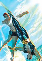
Brian Reed and Lee Weeks offer a contemporary take on Captain Marvel in "Farewell," an all-too brief peek into the character's inner workings. For such a short tale, it covers quite a bit of ground but suffers undeniably from the strict page restriction. Reed's story barely manages to gain traction when it's hastily drawn to a conclusion. Weeks, meanwhile, is an artist I've seen floundering around the outer rim of mainstream comics for years now. I'd never been particularly taken by his contributions before, but he shows quite a bit of improvement here, especially near the end of the tale. Truthfully, his style seems to click around the third page and improve rapidly through the story's end.

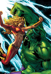
Mike Carey and Timothy Green III's "In Plain Sight" is a bit more suited to the medium, offering a handful of brief flashbacks through the green-haired SWORD Agent Brand's life as she floats helplessly through space. If nothing else, it's a good fit for the format, and it makes for a fine change of pace from the more straightforward superheroics of the preceding tale. Green's artwork fits right in with that motif, delivering a tight, highly gestural style that reminds me a lot of Peter Chung's work with Aeon Flux when it was still on Liquid Television. It's totally different from what Lee Weeks was doing earlier in the issue, and that suits the tone of this story just fine.

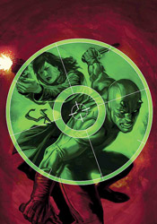
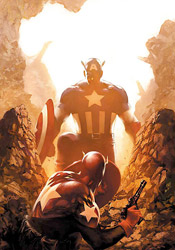
Christos N. Gage and Mike Perkins follow that up with a throwback to the old days, as they follow the Skrull Beast and the real(?) Wonder Man in an adventure immediately following the T-Rex attack from Secret Invasion #2. For fans of the characters in their heyday this might tug on a few heart strings, but as a reader with little interest in either of their shared histories, I found it to be quite a drag. Gage's writing is excessively verbose and not all that captivating, while Perkins's artwork is cheesy and antiquated.

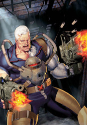
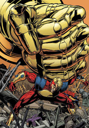
Zeb Wells and Steve Kurth tackle Marvel Boy in "Master of the Cube," which focuses on the Kree warrior's adventures since being set free from a lengthy imprisonment by the same Skrull virus that crippled Iron Man's personal technology. Artist Steve Kurth must count Bryan Hitch as a heavy influence, because his work here is almost a carbon copy of the current Fantastic Four artist's style. But while his linework is very similar, Kurth is missing all of the enthusiasm and knack for the spectacular that really sets Hitch's artwork apart. Sadly Zeb Wells does little of his own merit to keep the story interesting, and the whole mess sinks like a stone. This is an infuriatingly dull story through and through, which is surprising because it features no less than two exploding heads and a full-scale prison riot. Not your typical recipe for boredom.

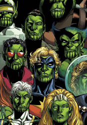
Finally, Jeff Parker and Leonard Kirk bring you "The Resistance," focusing on the Agents of Atlas and their own small-scale struggle to repel the invading alien forces. Parker uses this short story as a brief introduction to the team for unfamiliar readers, and while he occasionally gives in to the temptation and fills the page with an excess of narration, for the most part the effort is worthwhile. Any global invasion would have to tackle the smaller cities sooner or later, so it's nice to see someone documenting that side of the story. Leonard Kirk's accompanying artwork serves more as a series of inked breakdowns than a fully polished final effort. The layouts are decent enough and easy to follow, but there's something unfinished about this work. It's like he fired it out over a pair of lunch hours when he had nothing better to do.

All things considered, there was really nothing wrong with most of the individual stories contained within this issue, but as a whole I found it to be a disjointed, confusing read. The Captain Marvel tale encourages us to pick up Secret Invasion #1 to continue the story, but the Beast / Captain Marvel adventure takes place after the events of Secret Invasion #2. I have no idea where some of the other stories fit into the timeline. The creative teams, too, deliver work that is generally very good on an individual level, but doesn't match what had come before, and universally suffers from a lack of consequence. If you're really, really crazy about the alien invasion that's going on right now, you may be interested in the additional back-stories contained in this issue. But if you're like me, curious about the main plotline but not quite all that taken by the variety of tie-ins, you'll want to give this a pass. It's more than forty pages of filler. Entertaining filler? Occasionally... but it's filler nonetheless. Skip it.

On a scale of 1 to 10, where 1 is poor and 10 is amazing...
Overall Score: 2

Hulk: Raging Thunder

Crossover time! The time-traveling warrior Thundra is back, and her most recent leap through time and space has dropped her right into the middle of a heavy-duty throwdown between the US military and a rampaging Hulk. So what happens when the mightiest warrior of the twenty-third century faces off with the unbreakable green-skinned monster of today? Well, that's what we're here to find out.

Writer Jeff Parker may have been asked to tell too specific of a story here, and the end result is a slow-moving story that promises the world with its narration but delivers on very little. Although he's meant to be reintroducing Thundra to regular continuity, Parker doesn't do much to modernize the character... it's like he's been given a paint-by-the-numbers set and gone out of his way to stay precisely inside of the lines. She's a noble warrior, going out of her way to help her comrades even at great personal loss, but I've seen that a dozen times before and it's not really enough to excite me any more. The Hulk, likewise, is treated with kid gloves throughout the issue, and shows the reader nothing out of the ordinary. This is such a generic take on the character that if it weren't for the modern technology he's faced with, I couldn't tell you whether this was set in the present day or the 1970s. Hulk meets military, hulk destroys a few tanks, military flees, commence crossover. Yikes.

Parker spends so much time introducing the characters and repeatedly comparing them to each other that the issue is halfway over before the two even lay eyes on one another. But then, sadly, when they do, the end result made me yearn for the empty, repetitive storytelling that preceded it. There's an interesting story to be told with Thundra, about how her time, with its central battle between man and woman, was shaped by the sexism of our current era. Jeff Parker just isn't the man to tell it. His heavy-handed approach and relentless narration beats readers over the head with the concept until it loses all meaning.

Mitch Breitweiser's artistic contributions follow that same path. His work is hollow, rigid and hard on the eyes. His characters lack personality and enthusiasm; his splash pages rob the story of its already-infrequent moments of impact and importance. This is a genuinely ugly book, cover to cover. Breitweiser's inconsistencies are blatant and repeated, and his action scenes are stiff, unimaginative and tough to follow. I'd recommend you avoid it based on the artwork alone, if the story weren't every bit as bad.

For the sake of relevance, this issue is backed up by a classic Thundra tale from an old issue of Fantastic Four, evidently to remind readers of who she actually is. Don't be fooled by the appearance of a double-sized one-shot, because this is twenty three pages of original story and a reprint that's about thirty years old. It's probably a cool flashback for any old-timey fans of the character, but to me it seems like a cheap way to add to the cover price without developing additional content.

Something is rotten in Denmark, and its name is Hulk: Raging Thunder. There's no reason for this book to exist, save the obvious reintroduction of an old face to modern times. It's written poorly, illustrated poorly and conceived poorly. Skip it unless you need to punish someone for a heinous act... and even that might be considered cruel and unusual.

On a scale of 1 to 10, where 1 is poor and 10 is amazing...
Overall Score: 1

Tuesday, June 3, 2008

Invincible Iron Man #2

Last month, ol' Shell-head's new series jumped straight into action. When a horrific suicide bombing massacred hundreds in eastern Africa and forensic evidence seems to finger some of Tony Stark's Iron Man-exclusive technology, it's naturally of great concern to the current director of SHIELD. After some research indicates that the culprit is a splinter group known as AGM, (Advanced Genocide Mechanics, naturally) Stark pinpoints their HQ, dons the gold and crimson armor and fires headlong into battle.

Writer Matt Fraction's take on Stark is a good one, in line with the character's more recent, patent-happy persona elsewhere in the Marvel Universe. The best part of the character lately has been the peeks we're given into his psyche, into his tendency to analyze the flaws and shortcomings of his inventions right in the middle of a firefight. Fraction has a firm handle on that aspect of the character, and even manages to slip in a good-sized dose of dry humor and self-deprecation along the way. It's easy to see that Stark is his own worst critic, and while he's talking to himself about the problems with his designs, the readers are granted a first-hand example of why those mistakes could lead to death out on the battlefield. In this issue, as Tony announces that he needs "to not have giant rockets strapped to my feet anymore," heat-seeking rockets lock onto their targets and chase him into the atmosphere. Easy to see why that would be a problem...

Fraction has a flair for good action scenes and impressive freeze frames, which he gladly carries over to each character he touches. Sure, the concept of Iron Man blasting through the sky to grab MODOG by the hair is plenty dramatic, but the added emphasis of a sonic boom that strikes at precisely the moment of impact makes it that much more impressive. Sure, it doesn't exactly make perfect sense (why wouldn't the power of that impact just tear his enemy's hair out by the roots?) but if you're already willing to accept the existence of a giant floating head bent on world domination, why not make a few exceptions for dramatic effect as well? Besides, Matt is gifted enough as a writer to capture his audience's attention with a good action scene, distracting them from such real-world questions through sheer ingenuity. While the story slows down near the midway point, the abundance of fresh ideas and high concepts keep it an entertaining, intriguing read.

Salvador Larroca's accompanying artwork, however, is much harder to get a handle on. Everything is so shiny and unblemished that it gives the entire issue a fake, plasticky flavor that's not entirely welcome. Tony's moustache is trimmed so neatly that he's either got a robot dedicated to maintaining a perfect arc from nose to mouth or he's straight-up glued the thing to his upper lip. Larroca's take on MODOG early in the issue is inconsistent and spotty, not to mention totally out of line with the excessively clean environment he's thrust into. It doesn't look like he and Iron Man should be occupying the same universe, let alone the same panel. On a few occasions, specifically during the more pronounced action scenes, the artist really brings his "A" game and delivers a great panel or two, but for the most part this is a forgettable contribution. It's a pity, because I've enjoyed Larroca's work when I've seen it elsewhere, but this just isn't his finest hour.

It's still early in this book's life, so I'll give it some leeway, but it doesn't seem like it's really found an identity or deliberate direction yet. Matt Fraction is trying a few things, and most of them are working, but it's lacking a distinct course, the feeling that we're doing more than treading water from month to month. Pair that with a sub-par appearance from Salvador Larroca, and you've got an issue that isn't necessarily a bad read, but is worlds away from being anything more. It's worth a flip through and maybe a bit more, but I'm not exactly frothing at the mouth in anticipation of what's going to happen next month.

On a scale of 1 to 10, where 1 is poor and 10 is amazing...
Overall Score: 4.5

Haunt of Horror: Lovecraft #1

Following up his recent MAX mini-series Haunt of Horror: Edgar Allen Poe, longtime Heavy Metal artist Richard Corben turns his attentions to another famed horror writer in this three-issue mini-series. With Haunt of Horror: H.P. Lovecraft, Corben puts his own unique spin on three of the author's wildest tales, then reprints the original source material immediately after. Lovecraft's influence has been notable in comics for ages now, so it should be interesting to see how well his stories make the translation from the written world to the illustrated.

For this premiere issue, Corben has chosen two poems and a short story; "Dagon," "Recognition" and "A Memory." While he's changed around a few details in each story, it's never done maliciously or offensively – rather, it merely feels like an alternate telling of the same story. Some of the details are different, but the overall picture is very much the same.

I love the decision to include the original text in its entirety, immediately following each of Corben's renditions. While I chose to read them first, no matter which order they're read in, they provide great insight and further depth to each of these stories. Where Corben's tales must frequently sacrifice specific details for the sake of brevity, those clipped words make the written verse more than just a repetition of s story that's already been told. Much in the same way that a feature-length movie can never reach a viewer in quite the same way as a novel, there's no way a seven-page comic strip can go into the same amount of detail as a five-page short story. Here, it's a mutually beneficial relationship: the paneled rendition enhances the story with its mood, style and personality, while the written stories add substance and further detail to the illustrated work.

Richard Corben has been active in comics for decades, and his mastery of the form stands evident throughout this issue. While his illustrations may not be picturesque, they aren't intended to be so – his rendering style is exaggerated, overflowing with texture and identity, drawing the reader into the story. Much of what's so striking about this work is that it doesn't fit into any of the standard mainstream archetypes. It has a feel to it that's dated, but still relevant... like it's straight out of the underground comix movement of the late ‘60s and early ‘70s, but it takes itself more seriously than that. Truly, these are some stunning layouts – rich, toned, easy to read but still startlingly original. Corben knows how to lead the reader's eye across the page, noticing every detail along the way, and how to bathe the book in a sharp contrast between black and white. In full color, this work wouldn't have been nearly as effective nor half as beautiful.

This is a rare beauty, a literal translation of an existing work that isn't afraid to make the story its own. After more than thirty years in the field, Richard Corben's work is magnificent, worthy of far greater attention than it's granted. While his writing may take these disturbing tales to new places, the mood and the outcome is still the same, and his artwork gives them an incredible identity that the original tales never could have delivered. Buy this, even if you aren't a fan of horror in comics. It's a lesson in great storytelling.

On a scale of 1 to 10, where 1 is poor and 10 is amazing...
Overall Score: 9.5