Monday, March 30, 2009

Sherlock Holmes & Kolchak: The Night Stalker #1

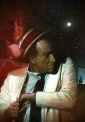
There's not much I can say about this book's plot that its title doesn't already answer. In Sherlock Holmes & Kolchak: The Night Stalker, a certain pair of relatively well-known fictional detectives team up to crack the case and send everyone home happy. Of course, this isn't your usual pairing - by the time Kolchak is introduced to the situation, Holmes is long dead and so is the original client. It's only through the efforts of a particularly insistent (and lovely) young relative that he even agrees to open the case. But once the Night Stalker does dig in, he quickly realizes this isn't the kind of story that's easy to put back down.

Interestingly enough, Holmes and Kolchak never meet face-to-face. I'm not even sure how that would've been possible, but it was a relief not to see any time machines or mysterious teleporting phone booths scattered throughout this issue. No, the two detectives communicate strictly via print. Holmes enlists the Night Stalker's help through an aged, century-old old journal that, as fate would have it, miraculously finds its way right into the modern detective's hands. How the famed British sleuth knew this would be the case, or that Kolchak would even exist a full generation before his conception, are questions for another day.

Writer Joe Gentile treats both characters with care, ensuring their words and actions stay true to each distinct personality. As a beat writer for The Hollywood Dispatch, Kolchak's scenes are primarily told through his writing, which takes the form of a continuous stream of narration boxes. While this is somewhat obnoxious at first, it doesn't take long to adopt them as a substitute for the kind of running monologue common in film noir pictures. Holmes, on the other hand, is accompanied by little more than Dr. Watson, his wit and his spoken dialog. Similar touches are scattered throughout the issue, simultaneously pointing out both the similarities and the sharp distinctions between these kindred spirits.

Carlos Magno and Andy Bennett split up the artwork chores, with Magno taking on the bulk of the work and Bennett filling in for a small scene at the story's onset. I wasn't particularly taken by either of them. Bennett's style is akin to a less-disciplined Michael Gaydos, uncomplicated and pedestrian, but also very dry. To his credit, there's only so much you can do with five pages of banter in a newsroom, but he certainly didn't liven things up much. Magno's work, which is set about a hundred years in the past, takes an era-appopriate Victorian slant that does a fine job in changing the setting. His artwork is more sophisticated, but likewise not especially dynamic. I'm not sure the story calls for anything more energetic, but this issue needs something more and that isn't being delivered by its artwork.

This first issue is basically a Sherlock Holmes story with a small handful of Kolchak panels thrown in for good measure. That's neither a positive nor a negative; the detective work is enthralling and right in line with Holmes's other cases, but it does seem like it's missing a sense of balance. Maybe Gentile intended this to be more of an even split, then just got so caught up in the Holmes story that he lost track of time? That would explain a lot, particularly the issue's abrupt ending… regardless; it's a still fine story that could have benefited from a better artistic showing. Ultimately, it really depends on your opinion of the characters. If you're familiar with either and enjoyed their previous adventures, it's worth borrowing. If not, you might not like what you see.

On a scale of 1 to 10, where 1 is poor and 10 is amazing...
Overall Score: 7

Groom Lake #1

It's been two years since Barnabus Bauer (and his furry buddy, Scruffs) disappeared on a drive along a rural route somewhere in New Hampshire. His family's moved on, left him behind, carried on with their lives… but now there's a federal agent on his son's doorstep, claiming dear old dad is, in fact, still breathing. He's alive, but he certainly isn't well – you see, the experiments he endured on that flying saucer have left him somewhat physically impaired. And by somewhat, I mean the man now has six arms and an interesting growth on his forehead. From there, things start to get a little weird.

While the subject of grey-skinned, black-eyed visitors from another planet with a penchant for probes may look like something straight out of the early '90s, the material feels fresh enough that this trip down memory lane is a pleasant one. If anything, I admire Groom Lake's gumption for taking on a theme that's all but taboo at the moment and meeting it head-on without a flinch. I'm sure we've all been burnt out on aliens and extraterrestrial culture since the subjects were run into the ground some time before 2000, but it's refreshing to see them again in such an imaginative, mildly satirical modern story. Chris Ryall's plot draws from both The X-Files and Men in Black, matching the constant unease of Scully and Mulder's investigations with the oddball characters and large alien population of MIB headquarters. It's strangely grim and somber in tone, but keeps an energetic pace and constantly works to surprise its audience. Ryall's cast is colorful and interesting, a broad mixture of different personalities that's already begun to gel into a single unit. If the first issue is any indication, I'm anxious to see the twists and turns they'll endure in the next few months.

I've been a big admirer of Ben Templesmith's artwork since I picked up the first issue of Fell, his collaboration with Warren Ellis. If you're already familiar with his abstract, textured style, it should suffice to say he stays that course in Groom Lake. If this is your first time, well, you should really grab a few issues of Fell or Wormwood: Gentleman Zombie while you're out, because you're probably going to want to see more. Templesmith's ability to take control of the page is a sight to behold, and it's in full evidence here. Coloring over his own artwork, he subtly sets an early tone with an eerie, unsettling green tint that slowly rolls in over the first few pages. It's a gentle change, like the shift from sunset to dusk, so casual that I didn't even notice until the little green men materialized to surround the narrator.

I could swoon over some of Templesmith's larger compositions. The simplicity of his rough, sketchy line drawings is balanced neatly by the sharp graininess and dirty tendencies of his coloring and additional effects. He's one of the few real talents out there who's able to not only produce something I'd be proud to hang on my wall, but to do so on a very regular schedule.

Groom Lake was a nice surprise. I feared the worst when I first laid eyes on the cover, which looks like something that was left behind when I moved out of my old high school bedroom, but it was worth the risk. This is an unusual mix of black humor and disturbing science fiction that features a strong, small cast, simple, believable dialog and one of my favorite current artists. Buy it.

On a scale of 1 to 10, where 1 is poor and 10 is amazing...
Overall Score: 8.5

Monday, March 23, 2009

BPRD: The Black Goddess #3

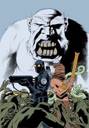
Spinning out of the pages of Hellboy comes BPRD, an ongoing account of the adventurous organization who provides our last line of defense in the battle against the occult, the paranormal and the just plain unknown. Perfectly willing to fight fire with fire, the Bureau itself retains the services of a number of friendly supernatural beings, including but not limited to demons, amphibious men, telekinetics and pyrokinetics. This time the international organization is on the case of Martin Gilfryd, a museum curator from the early 1900s whose fascination with Eastern folklore bordered a bit too closely on the unhealthy. Reborn in the present as Memnan Saa, the legendary master of fire and dragons, Gilfryd has already proven to be more of a threat than any member of the Bureau could have predicted.

Though Hellboy himself doesn't make an appearance this month, writers Mike Mignola and John Arcudi pack the issue with the same sense of curious adventurism and jolting action that have come to characterize the big red guy's escapades. Something I've always admired about Mignola's writing is his ability to effortlessly intertwine fact with fiction with folklore, blurring the lines between the three and convincing his audience that what they're witnessing, no matter how unbelievable, is actually rooted somewhat in reality. Although the peak of the fairy tale is more than a generation behind us, the books in the Hellboy family have done everything in their power to remind us of what we found so endearing with them in the first place. The marriage they provide between the limitless possibilities of those old yarns and the factual basis, strong characterization and stunning visuals demanded by modern readers is one of a kind. The Black Goddess draws from that same pool, and if that hasn't grown old by now I can't imagine it ever will.

Industry veteran Guy Davis continues to provide BPRD's artwork, bringing with him a style that's at the very least reminiscent of Mignola's simple, unmistakable work with the characters. And though Davis's efforts are inarguably simple and technically sound, he really doesn't benefit from that natural comparison, no matter how unfair that may be. He lacks the fine control of Mignola; his compositions seem more uncertain and free-flowing. While that looser take works to his benefit on a few occasions this month, particularly when the narrative shifts to look back at the path that led Gilfryd to become the Memnan Saa, it doesn't always fare so well. His work has trouble with facial expressions (faces in general, actually), and really isn't the best way to depict an enormous battle scene. Davis is playing the right song; he's just a hair out of tune.

Still, the Black Goddess is just what you think it is. Mignola's universe continues to impress me with its versatility and uncompromising high quality, which is amazing considering how long it's been around. As long as there remain unexplored myths and legends somewhere in the world, the BPRD will be around to investigate their origins and cast new light on an old subject. Although the series could do with a tad more consistency in its artwork and you'll want to read the preceding two issues before bothering with this one, it's still worth your time. Borrow it.

On a scale of 1 to 10, where 1 is poor and 10 is amazing...
Overall Score: 7.5

Batman: Battle for the Cowl #1

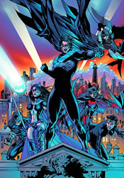
In the aftermath of Final Crisis, Gotham City is in tatters. With its shadowy guardian presumed dead, the city's criminal element has been energized and mobilized, leaving the remainder of Batman's associates struggling to keep up. Thus far Nightwing, Robin, Oracle and friends have managed to stem the tide, but a looming showdown between the rival gangs following Two Face and the Penguin, not to mention a diabolical jail break outside the gates of Arkham Asylum, may prove to be too much for any number of heroes to tackle. And that doesn't even account for the in-fighting and conflicting emotions surrounding the very cape and cowl that Bruce made famous.

Sadly, despite a steep, heavy-handed narration that tries desperately to instill a sense of gravity and weight to the issue, in the end this goes almost nowhere. While writer / artist Tony Daniel delivers no less than three gigantic giant fireballs, a wrecked Batmobile and a random Singapore cane match between Nightwing and Alfred, so much of the chapter is spent treading water and covering old ground that I was downright begging for some semblance of forward momentum as the final pages trickled by. I have to imagine that the road toward selecting a new Batman involves more than a series of fistfights with nameless, faceless goons and a thin “Imposter Bats” storyline, but this is just a three issue mini-series and that's all the first issue's provided.

I was expecting a more proactive stance from these characters, a more animated debate about the positives and negatives of replacing Bruce freaking Wayne, but instead they seem content to just hang back, watch what the enemy is up to and react when the situation demands it. Was Bruce the only one with any balls in this family? If so, who was the character I used to enjoy reading so much in Nightwing a few years ago? This is a rudderless ship right now, steering directly toward a jagged coastline, and the crew seems more interested in staring off into the distance and waiting for a new captain to announce himself than turning the wheel themselves.

Daniel's artwork isn't the worst DC has to offer, but it also isn't the best. While his work has improved notably since our paths first crossed during his brief run on Spawn, it's also become much more generic. His linework is tighter, more refined, more detailed, but the poses his heroes strike and the constant scowls they wear come straight from the book of overused superhero clichés. The constant overlap between panels may help his work to stand out, but it also tends to be confusing and unnervingly busy, particularly during the fight scenes. On the few occasions Daniel's story slows down enough to allow for a quiet panel or two, it forces so much onto the page that the fleeting moment is lost. I don't hate the way this series looks, but I certainly don't love it, either.

Try as the publisher might to convince me Battle for the Cowl is a landmark event on par with The Death of Superman, in the end it's really much closer to that story's meager follow-up; The Reign of the Supermen. While this issue offers plenty of acceptable choices for the role of Bruce Wayne's immediate successor, it does nothing to get me excited about a single one of them, nor does it convince me any are ready or even willing to accept the responsibility. At the end of the day I was left thinking the best possible outcome would be a sudden, suspiciously explained return from the grave and an abrupt return to the status quo. Which, come to think of it, is precisely how Reign of the Supermen ended. This is a lot of hot air. Flip through it if you're curious and want to stay current, but don't let the publicity take you for a ride.

On a scale of 1 to 10, where 1 is poor and 10 is amazing...
Overall Score: 3

Monday, March 16, 2009

Killer of Demons #1

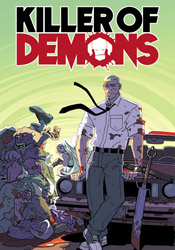
I'm sure we've all imagined what the end of the world might look like in a purely Biblical sense. Angels and demons throwing down in the streets, hellfire and brimstone devouring the nonbelievers, the whole nine yards… but what if that final battle between good and evil was a bit more subtle? More pointedly, what if Hell has already invaded Earth and nobody bothered to notice? That's precisely the predicament envisioned by mild-mannered account executive Dave Sloan. Goaded on by his own personal guardian angel (complete with sandals, toga and cigar) Sloan's taken on the responsibility of ending that battle before it's begun, hunting down the Earthbound demons and executing them before they can shed their human disguise.

Of course, there's no telling whether he's actually saving the world from an invading force of legendary monsters or just madly slaughtering anyone who looks at him the wrong way. And don't think he isn't aware of that conundrum. Christopher Yost's smooth storytelling plants the seeds of doubt early, promising a road with plenty of twists and turns before it delivers its final analysis at the conclusion of this three-issue mini-series. Sloan is a fine lead character, sure of what he's seeing but not of his own state of mind. Is the senior VP really sporting a pair of magnificent, curled horns around his temples? Did those pills his therapist prescribed solve his problems or amplify them? Dan isn't sure, and neither are we – the only thing that's obvious is the ever-increasing body count accumulating around his feet.

Atomic Robo veteran Scott Wegener provides the artwork, which takes an even looser, more stylized form than his previous works. His contributions give Killer of Demons an immediate, distinct personality that's tough to look away from. Clearly having a great time with both the subject matter and the sheer volume of blood n' guts, Wegener's artwork is every bit as much fun to take in as I'm sure it was to pencil in the first place. His action scenes in particular are outstanding, with Dan transforming from a worn-down, confused working stiff into an honest-to-god action hero somewhere in the pause between panels. He's found a great fit in colorist Ronda Pattison, whose bold, appropriate shifts in palette keep the issue looking fresh and expertly manage the wild shifts of emotion intended by the story. This is a damn fine looking book.

Yost and Wegener's black comedy is a rousing success. If you enjoyed the sick sense of humor and crazed, "Did that really just happen?" twists of Shaun of the Dead or Army of Darkness, this is meant for you. It doesn't deliver any punchlines, but that won't stop you from grinning ear to ear for the duration. Buy it.

On a scale of 1 to 10, where 1 is poor and 10 is amazing...
Overall Score: 9

Ultimate Wolverine vs. Hulk #3

This crossover began way back in December of 2005, quickly capturing readers' interest with a teased double-page spread in which the Green Goliath literally tore poor Logan in two. The second issue arrived not long thereafter, and then… nothing. Remember when Image was the publisher most associated with constant delays and missed deadlines? Marvel has assured us that this lengthy hold-up was to ensure the completion of Damon Lindelof's scripts for the remainder of this series, but I won't believe it's fully back on schedule until I'm actually holding the penultimate sixth chapter in my hands. At this rate, that'll be some time in 2015.

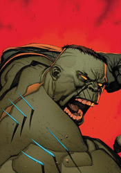
Picking up the pieces of the "Execution of the Hulk" story, told in Ultimates 2 #3, this series follows Bruce Banner in the months and years after that failed public execution. Upon learning of Bruce's whereabouts, Nick Fury sends his most ferocious contact to finish the job – a certain scrappy mutant with claws. And, unlike similar confrontations in the past, this Wolverine looks ready, willing and able to finish the job. No pulled punches this time around, no miracle last-second realizations that “hey, we're all on the same side here,” just two cornerstone characters with a grudge and a desolate wilderness in which to unleash their fury. This is the kind of predicament that made the Ultimate universe so appealing when it launched, the chance to see your favorite characters cast in a new light, freed from the chains of decades' worth of continuity and six ongoing monthly titles. Maybe things didn't exactly pan out that way for this line in the end, but Ultimate Wolverine vs. Hulk provides a great reminder of the optimism and anticipation that surrounded its launch.

Lindelof's take on the title characters is very different, but they're still recognizable. An outsider to mainstream comics, he brings a new perspective to the men behind the costumes (or, in the Hulk's case, the mass of green muscle) and offers an original take on what they can actually do with their powers. As you'd expect, the majority of this fight is one-sided. The Hulk is the living embodiment of power and fury, while Wolverine's greatest strength is his ability to absorb punishment and keep coming back for more: you do the math. Outside of the specifics of just which wounds Logan will be licking afterwards, that part of the story pretty much writes itself, (and it's a lot of fun watching a human wrecking ball thrown down the side of a mountain) but that only eats up a fraction of the issue. The insights Lindelof provides into each character are the real emphasis this month: the reasons why the Hulk can suddenly read above a third grade level, Logan's motivations for taking the job; for my money those are just as fascinating as a tumble off the cliffside. On both fronts, Lindelof's script brings the goods.

Chances are, if you're even vaguely familiar with the work of Leinil Francis Yu, you've already developed an opinion of your own about him. Myself, I see a lot to like about his grungy, sketchy, obsessively detailed artwork – he delivers the striking freeze frames of Travis Charest in half the time, decorates the stage with fantastic scenery and can dictate a ferocious battle scene. I can see why Yu's style is so polarizing with fans, but he's one of Marvel's big guns for a reason and he's brought his "A" game to Wolverine vs. Hulk.

Look, I know what you're looking for here, because I was after it too. A reason to skip this issue, a confirmation that it wasn't worth the wait, that you should just stick with the two issues you've already bought and enjoy them for what they were, because the third chapter ruins everything you enjoyed about them. Sorry, but I can't do it. I'm not going to say it was worth waiting for, because nothing can really ease the pain of a three-year rain delay, but this is every bit as entertaining as verses one and two. It could still trip over its own feet when the next issue ships some time after the rapture, and the teaser at the end of this issue could go either way, but for the time being all remains well. Better than well, in fact. Buy it.

On a scale of 1 to 10, where 1 is poor and 10 is amazing...
Overall Score: 8.5

Wednesday, March 11, 2009

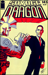
The Savage Dragon #145

In these rough economic times, it isn't easy for anybody to keep up with the rent – even walking, talking action figures with fins on their head. The Savage Dragon is feeling the crunch, both personally and professionally, and after accidentally punching Solar Man to death (whose powers were unexpectedly shut off, rendering him unusually vulnerable) the Dragon's public image is at an all-time low. He's had to settle for inconsistent work as a bounty hunter, juggling his time between single dad care sessions and visits to the local villains' favorite hangouts.

As made blatantly obvious by the cover, this is the requisite "Hooray, America didn't vote for the Republican this time, I'm so motivated by these developments that I will include our new leader in my comic book" issue. I'm not sure if this is Larsen stealing Marvel's idea, Spider-Man thieving the Savage Dragon's concept or just an innocent coincidence, but either way we're looking at more than one Obama tie-in at the same time. The man gets around, and from the looks of things he keeps athletic, garishly colored company.

I didn't read Marvel's “Obama Meets Spider-Man,” (wasn't planning to check this one out, either) so I can't really compare the two, but I can say the President's appearance in this issue reads very much like the gimmick the cover makes it out to be. With the Dragon stationed in Chicago, having actually endorsed Obama during the election, I'd hoped for more than two pages of ass-kissing dialog, a thin excuse to get the two into the same room, and a telegraphed supervillain attack. And though the Prez only shows up for a pair of fast pages, the remainder of the issue doesn't fare a whole lot better. I'll never fault Erik Larsen for a lack of creativity – he's constantly finding ways to throw his cast into the fire, sparing no one, but his process of actually getting from start to finish really needs some work. When the Dragon himself is so unimpressed by a mega-powered bar room brawl that he carries on a wordy conversation with his old police chief without even slowing down, how can the readers feel any differently?

Like his writing, Larsen's artwork has grown lax over the years. It's unusual enough for a writer to stick with a series for nearly 150 issues, but to do so while also doubling as the book's artist is almost unheard of. It's only natural to expect that the man's work would evolve over the years, but in the case of The Savage Dragon it looks more like a slow erosion. Larsen still has a talent for composition, and his storytelling bears the fruits of his years in the industry, but the illustrations themselves are tough to get past. Never the most detailed, disciplined artist in the first place, the decade-plus of self employment has made him lazy behind the pencil. His work looks excessively rushed, overly simplified and dramatically unbelievable. On the few panels he really hunkers down and delivers this month, Larsen shows that he still knows how to do things the right way, but his efforts throughout the rest of the issue are propped up by his layouts and nothing else.

Looking back over that review, it sounds like I came in wanting to hate and got exactly what I was after. In fact, I desperately wanted to like this book – I followed it passionately for its first few years, but the reason I left it behind is precisely the reason I can't enjoy it today. Larsen's efforts, both in his writing and in his artwork, are lackadaisical. I can't believe that he's put his all into this book, on either front. At his best, he's a gifted talent – his plots prove this – but when he loses focus and lets the quality of his work slide, the results are almost always underwhelming. Flip through it but don't pay it any serious attention.

On a scale of 1 to 10, where 1 is poor and 10 is amazing...
Overall Score: 4

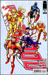
Youngblood #8

Relaunched yet again, (what is this, the fifth time?) the latest, greatest Team Youngblood is standing on the verge of widespread public acceptance. With a heavyweight PR team, heavy government support and a specially-selected enemy presence delivered right to their front doorstep, all the heroes need to do now is dress up, KO the threat and smile for the cameras. Shame, then, that nothing's ever quite that easy – especially when nobody remembers to tell the bad guy he's supposed to be throwing the fight.

Truth be told, the concept behind Youngblood was never its downfall. In fact, the thought of a federally sponsored team of oblivious superhumans alone inspires countless ready-made storylines from the word go. The trouble has always been Rob Liefeld's writing, which never seemed concerned with that central plot point. He always seemed more interested in one-upping himself in terms of tasteless cliché and horrific dialog than planning any sort of sensible, forward-thinking storylines. Thankfully, this isn't a failure that's mirrored by the book's current writer, Joe Casey.

A handful of redesigned Youngblood originals are still hanging around to tie the team's new adventures in with their old ones; namely Shaft, Badrock and Diehard. They're joined by a troupe of new faces who, while not nearly as well-designed visually, bring a degree of depth and individuality to the squad that was sorely lacking in the past. One of the new characters, Cougar, has the facial features of a hairless house cat but still manages to grow a long, braided goatee. This gives the impression that he's constantly working on swallowing Mario Batali.

Under Casey's careful watch, though, the team has finally blossomed. At its heart this remains an action story, so if you're looking for rocket science prepare to be disappointed, however it's ultimately graduated to something I can read without rolling my eyes every third panel. Casey knows better than to make things too complicated, at least within the team's first story arc, and the end result is a straightforward, exciting throw-down in the heart of a major metropolitan area. The pair of villains he's created to oppose the new team are original (a real feat considering the sheer number of characters already out there) and it's a lot of fun watching the heroes work together to discover the best way to take them down.

It's no longer a prerequisite that you turn off your brain before opening this series, but it still might not hurt. My one gripe is that Casey closely echoes Liefeld's love of celebrity, throwing in a half-dozen cameo appearances by recognizable stars that do more damage than they do good. Really, did this issue need appearances from Oprah Winfrey, Howie Mandel and Ron Burgundy?

Derec Donovan's accompanying artwork is also quite nice, providing the stylistic change of pace the series needed to distance itself from the dark days of the '90s and Liefeld's overdone, confusing visual mess. Donovan's work is restrained and free flowing, casual and inspiring. Where Liefeld's squad consisted of two unique male body types, (one of which was reserved exclusively for Badrock) the book's new artist allows small but important variations from one team member to the next. His action scenes bounce right off the page, but he can still manage a quiet, personal conversation between a poisoned Badrock and his concerned father. Donovan is a nice find and his bouncy, Saturday morning cartoon style is a great match for the sugar-infused storytelling that Casey's brought with him to the title.

But, as if two identical gimmicks by other comics weren't already enough, this month's issue of Youngblood closes with a back-up story that covers the team's meeting with, you guessed it, President Barack Obama - written and illustrated by Liefeld himself. It's terrifying. Six pages of hyperbole, hyperextended lower backs and a curious lack of feet that made me want to cry. This was like going back to the stone ages after catching a glimpse of the airborne highway in Back to the Future II.

Seeing the contrast of the new creative team against the back-up story provided exclusively by Liefeld is incredibly telling. Casey and Donovan have finally delivered the breath of fresh air that the book's creator has been looking for all along, but if next month's solicitations are to be believed, this marks the end of their run. The almighty Liefeld returns to both write and pencil the series with issue #9, and that's sure to kill any traction the new series had developed thus far. It was fun while it lasted. Borrow this one while it's still around, because I fully expect the wings to fall off almost immediately next month.

On a scale of 1 to 10, where 1 is poor and 10 is amazing...
Overall Score: 7

Monday, March 2, 2009

In Brief - February 2009

A quick glimpse at what else I've been reading this month...

New Punisher #2 - Pretty much took everything I liked about last month and threw it back out the window in favor of another cookie cutter Punisher story. I get that every month can't be a slobberknocker, pitting two unlikely adversaries against one another with nothing to do as far as the plot is concerned beyond finding new and interesting ways to beat each other up. I also get that Frank's new partner is supposed to inject a dose of humanity to the mix, to give readers a familiar perspective and maybe return a sheen of cold, hard badass to Castle's veneer. That doesn't mean the end result needs to be as dry and redundant as this was. I was really looking forward to seeing how long the new series could continue its breakneck pace, and as it turns out that number was just about one month. This isn't bad, but it's so much of the same old stuff we're getting elsewhere twice a month that it also isn't necessary.
6/10


Epicurus the Sage TPB - Old school Sam Kieth and William Messner-Loebs, repackaged and reprinted in '03 with an extra story and three pages of sketchbook material. I never really noticed how deeply the 1970s underground comix influences ran in Kieth's work before, which is odd because I've followed him somewhat religiously forever and they're plain as day here. Overall, he's had much better showings - both in the earlier stories, which were printed between '89 and '91, and the later tale which was created specifically for this TPB. He churns out a few gorgeous spreads but indulges his lazier side wayyy too often which gives the whole book a secondhand, unfocused flavor. The story is kind of rambling and really gets caught up in itself from time to time, but I guess that's to be expected when both lead characters and half of the supporting cast are Greek philosophers. When it gets away from informing readers of how wacked out most of these guys' theories really were and focuses on adventures through the era's mythology, it's great. Doesn't happen nearly as much as it should.
6/10


Punisher: Frank Castle #67 - A mild improvement over last month, but it's still more brainless action than I'd really like. What I loved about Garth Ennis's run on this book was the way he transformed Frank from an ageless wonder with a bottomless armory and an itchy trigger finger into an older and wiser, more collected, conniving character. Two issues into this new creative team, and he's back to his old ways. As thirty-odd pages of random killings go, this was fine, but it's lacking the depth and heavy atmosphere that's kept me on board this long. The new characters feel like pale impersonations of the supporting cast Ennis completely wiped out before he left, and the thin premise is already working on borrowed time.
4/10


Ultimate Spider-Man #131 - Wow, this was actually fantastic. Bendis has this weird way about writing tie-ins to major events that are twenty times more fascinating than his writing on major events themselves. This was entirely a reaction piece to the big tidal wave of Ultimatum, focusing on the common man's reaction around the fringes of the catastrophe, rather than the superheroes duking it out in the middle of the crater, and it was a hundred times more poignant than the muck that Loeb is crapping out in the primary series. If you've ever read a Spider-Man comic before, you owe it to yourself to read Jameson's monologue in the first quarter of this issue - it's something we've been waiting almost fifty years to see, and Bendis just plain nails it. Peter's interactions with the Hulk border on slapstick from time to time, but they never cross the line and it's so much fun to watch the two cautiously interact that I can overlook it. Great issue, undoubtedly the best of the crossover so far.
10/10


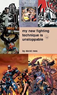
My New Fighting Technique is Unstoppable - I've had this for years, and worried that it wouldn't be nearly as funny the second time around. I was wrong. Basically just a compilation of David Rees web comics from years ago, before he went all political with "Get Your War On". If you love inane humor, a metric ton of profanity and homemade production values, this is your ticket to an hour of pure ecstasy. Wish it were longer, and some of the strips are pure filler, but when it's on there's nothing else like it. Fast reading, but god is it worth it.
8/10


Dark Avengers #1 (Second Printing) - A lot better than I expected, it was actually somewhat fascinating to watch the pieces fall into place for these guys. I love that there are enough mirror-image villains out there to make this concept fly, although I still don't think it's got the legs for more than a dozen issues. For now, though, Osborn alone makes for tremendous material alone and the series rides routinely on his coattails. Deodato's artwork took some getting used to, and is actually the reason I skipped this issue the first time it hit the shelves, but I was feeling it by the last page. The team's transition to power and immediate public acceptance is a tough pill to swallow (it's actually still jammed halfway down my throat) but otherwise this was enjoyable enough.
7/10


New Avengers #50 - Billy Tan's artwork gets worse by the minute, and none of the extras they've brought in to help him for this anniversary issue offer any kind of an improvement. After getting used to Deodato's rendition of Daken as a lean, prolific figure in Dark Avengers, Tan's take on the character here as a barrel-chested carbon copy of dear ol' dad would've been funny if it weren't so pathetic. I wish I could say Bendis's story fared any better. This book is like a case study for all the things he's been doing wrong lately; weak characterization, a heavy emphasis on heroes standing around and shooting the shit in full uniform, herky jerky pacing and a big lack of consequence. A misleading cover, ten pages' worth of Avengers loitering before their TV set and another nasty showing from the visual team - yeah, I wish I hadn't bought it.
2/10

X-Factor #39

It’s the biggest day in the lives of Madrox and Siryn, as the arrival of this month’s issue also marks the delivery of their child. Typically, that isn’t the only cause for concern around the team’s central hub, however. At the close of last month’s issue, moments after Siryn had departed for the hospital, series mainstay and government watchdog Val Cooper took a bullet during a sudden firefight between Rictor and a gang of Federal Agents. Maybe they should’ve carpooled…

This month’s chapter is noted as the beginning of writer Peter David’s attempt to revitalize the book via a series of surprise twists and turns. Hey, I’m all about upping the ante a bit if it makes for better material, but does that mean he’s conceding that the last few years’ worth of X-Factor was crap? I’m not sure I agree, really. Either way, he’s so convinced you’re going to flip out over the shocking conclusion to this issue that it opens with a “personal plea” in which he begs his readers to resist the urge to go online and share, lest the moment be cheapened for subsequent readers. For what it’s worth, he’s right – the big twist in question is a major dramatic turn that shakes the book to its foundation. I’m still waiting to flip out, though, and I’m not sure I’d have immediately been moved to sign on and spill the beans to anyone who cares to listen (if that isn’t what I’m doing here) but he promised big and, for my money, he delivered.

Although it’s a team book at heart, for obvious reasons the spotlight shines a little brighter on Madrox and Siryn than their peers. It couldn’t ask for a better pair of leads – their connection is vibrant and emotional and they play off each other like a traveling act. Peter David spends much of the issue convincing us that they’re just an average couple in love, then suddenly reminding us that in actuality they’re anything but ordinary. A contraction forces Siryn to scream, the force of which shatters the hospital windows. When a nurse takes his child to the nursery, Madrox leaves a clone behind to comfort the new mom. Little touches like those serve the issue well: they keep things from straying too far from the X-Men universe and, surprisingly enough, add a bit of humanity to both characters. David knows these guys inside-out, and that pays dividends each month but he’s also not afraid to rattle the cage for dramatic effect.

Valentine De Lando’s artwork is worthwhile, if not especially memorable. His backgrounds are often flat and underdetailed, and his camera angles lack a real visual punch, but he mostly makes up for that with a firm grasp of facial expression and body language. Although he gets some pretty rich material to work with this month, I found his contributions to be universally bland and unmoving. Maybe he’s more at home with lasers firing and mutant powers warming up, because while he’s technically sound, emotionally he just doesn’t bring anything to this issue. You won’t remember this one for the artwork, but chances are that isn’t why you were buying it in the first place.

As the first in a long line of proposed shakeups, X-Factor #39 gets things started on the right foot with a risky, unexpected twist. The issue switches into slow motion just afterwards, which serves to initially soften the blow, but a few minutes after I finished it, the weight of the situation really began to sink in. If the goal was to hook new readers, mission accomplished - I’ll be tuning in next month to see where things go from here. This is great, imaginative, character-driven drama from an old master, and I’m suggesting you buy it.

On a scale of 1 to 10, where 1 is poor and 10 is amazing...
Overall Score: 8.5

Dynamo 5 #0

When you’re a big name, whether it’s on the basketball court, in the movies or up in the sky with a muscle-hugging wardrobe, that level of celebrity carries with it a certain number of, shall we say, temptations. Even the biggest, noblest superhero on the planet, Captain Dynamo, wasn’t immune to some play on the side – as evidenced by the five children he bore with different women throughout his career. But now that he’s dead and gone, the world needs protection more than ever, and with each of his children inheriting just one of his fantastic powers, it doesn’t seem like this can be just a one-man job any more.

I like this premise, a quintet of rookie heroes with a tenuous connection trying to keep the world safe at the same time they’re still learning the ropes, but the execution feels a bit flat. While I’d imagine the murky circumstances around each kid’s conception would lead to a bit of animosity and tension within the team, that isn’t the case with any member of Dynamo 5. They get along swimmingly from the very first panel, like a flyin’, fightin’, spandex-stretchin’ Brady Bunch. Either these are the most well adjusted people on Earth, or the Captain blessed them with additional powers of super tolerance and ultra rationality. Even the group’s leader, the widow dear ol’ dad was cheating on to produce this little family, seems immune to any feelings of jealousy or anger over the way this whole thing came about. She’s half caretaker and half business, like Aunt May and Nick Fury rolled into one.

Jay Faerber writes a story that’s shockingly brief in this mini-sized zero issue, even taking its dollar price tag into consideration. It doesn’t really feel like a fully finished plot, it’s more like an outline with some rough dialog thrown in so the letterer has something to do with his time. Although the teaser text on its back cover proclaims that Dynamo 5 #0 features a story that’s slowed down enough to provide a “perfect jumping-on point” for new readers, I’d be more inclined to say it came to a screeching halt. The only lesson I learned here is that outside their power set, each character is pretty much the same and they can instantly solve any problem through the use of the handy-dandy dimensional portal that’s kept front and center within the team’s HQ.

The issue’s artwork, provided by series co-creator Mahmud A. Asrar, gets the job done well enough. A garish red and blue color palette spoils his character designs for the primary team, but the more subdued scheme sported by the issue’s villain is proof that he knows what he’s doing. Asrar’s action scenes are sometimes tough to follow, especially when he tries to get cute and strays from traditional paneling, but I only saw that once or twice this month. For the most part, he’s a solid contributor with a healthy mix of realism and exaggeration that faintly reminded me of Alan Davis.

If you’re looking for a lot of depth and substance, this won’t hit the mark. It’s the barest of introductions with a quick brawl thrown in for good measure, and gave me little reason to investigate the regular series. If the ongoing picks up on some of the juicier threads promised by the book’s premise, it could be all right. But if it’s just lengthier doses of the same formula, I’ll keep my distance. Flip through this and leave it on the shelf; it isn’t bad at all… just quite generic.

On a scale of 1 to 10, where 1 is poor and 10 is amazing...
Overall Score: 5