Monday, June 21, 2010

Captain America #606

There may not be a single character more directly affected by the outcome of Marvel's recent Siege event than Bucky Barnes, formerly known as The Winter Soldier and today donning the legendary guise of Captain America. When Steve Rogers made his unsurprising return from a year-long dirt nap last winter, I had some concerns over where Bucky would fit in the pecking order. Now, with Steve firmly entrenched in his role as the head of U.S. security, his shield (and the focus of this series) has been passed officially to Barnes.

In a lot of ways, that feels like the impetus for a fresh new start. Even though Bucky's been at the center of this series since Steve's "death" three years ago, there's always been a prevailing sense that he merely had the spotlight on lease until the original Cap strode back into the picture. Now, with the identity of the star-spangled Avenger decided - at least for the short term - longtime writer Ed Brubaker has turned his focus on the stark differences between Steve's take on Cap and Bucky's. It's a very liberating time for the series, which is beginning to move past the half-century of continuity that had been burdening it at the start of Brubaker's run. Where the audience knew just about everything worth knowing about Steve Rogers, the current mantle-bearer carries a slate that's much less decorated.

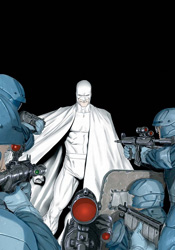
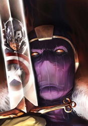
The first step in Bru's process of etching that stone is introducing a new major foil for the series, which ultimately takes the shape of Baron Zemo. The Baron isn't exactly unfamiliar with Captain America, nor with Bucky himself, but it's been quite a while since he's been directly involved with either. Now, with the Red Skull momentarily out of the picture, the stage is set for something different, and as first challenges go, Zemo's a great place for Bucky to start. In Brubaker's hands, he has the potential to become a major player once again, and the issue ends with the message that the ride is just getting started.

Butch Guice's artwork is the latest in a series of great matches for the series. Like Daredevil when Brian Michael Bendis (and later Brubaker himself) were at the helm, Captain America has enjoyed a remarkably consistent art style despite a routinely shifting creative team. Both have employed a shadowy, gritty look and feel that isn't particularly detailed, but also isn't excessively streamlined and simplistic. Guice shakes things up a bit with a series of clever, unusually organized pages that take their hints from Jim Steranko's brief work with the character. In many instances that makes for a direct homage to the famed artist, although it also occasionally results in some difficulties navigating the action. In addition, there's a real disconnect this month between the panels set in near-darkness and those in direct sunlight. In the dark, Guice's style is sleek, restrained and captivating. In bright light, his work feels more dated, clunky and awkward. Fortunately, the bulk of this issue takes place after midnight.

Captain America hasn't felt this wide open in my lifetime. With his mentor occupied elsewhere and the looming threat of the original marquee player reclaiming this series finally off his back, Bucky's chance to run with the ball has officially arrived. There's enough potential for change to appeal to new readers, but enough reverence for previous tales and the long, storied history of these characters to keep old-school fanboys happy as well. As long as Ed Brubaker sticks around, this series is in a great place. Buy it.

On a scale of 1 to 10, where 1 is poor and 10 is amazing...
Overall Score: 8

Nemesis #2

You'd have to look far and wide to find a more polarizing figure in this industry than Mark Millar. He's a hot-or-cold prospect, an author the greater fandom can't seem to make up its collective mind about. Many view his writing as distastefully as they did the prospector-flooded era of the early '90s, a scourge upon the industry with no respect for what came before. Others see his work as a breath of fresh air in a typically stagnant mainstream. It's generally pretty lonely here in the in-between. I've read, and adored, my share of Millar but I've also been turned off by his habitual pursuit of excess, sometimes at the cost of a better story.

No matter which side of the camp you might find yourself in, Millar's new series is not going to change your mind. Nemesis may not share a threaded, overarching storyline with Wanted, Kick Ass, Old Man Logan or any of the writer's other preceding works, but you can bet your ass it's every bit their spirtual successor. If anything, it's one of his most honest concepts: in no way is he even remotely trying to convince his audience this guy is in the right: morally, legally or otherwise. He makes no apologies, cuts no corners, and delivers a protagonist that's rotten to the core. Thing is, he's also an utterly fascinating character, glistening with charisma and completely impossible to take your eyes off of. In the promotional materials that hyped this series, Millar promised "Batman as the Joker," and that's exactly what he's delivered. The Nemesis is a great creation, albeit one borrowed from a number of sources, who carries the series on his back with every panel.

On the occasions that the issue does force our eyes from the white-garbed embodiment of criminal mischief himself, Nemesis becomes one of Millar's more stereotypical yarns. With the exception of Blake Morrow, the target of our anti-hero's loathing, the agents behind the government response are completely interchangeable and crass to a fault. Something tells me that's kind of the point, though. If there's one thing this author could never be accused of, it's a sense of restraint and subtlety.

Joining Millar is his Civil War and Old Man Logan counterpart, artist Steve McNiven. Though his contributions on Nemesis are a bit different from what we've seen from him in the past, the shift in style is completely appropriate. I can't say this work is more subdued, because let's be honest here, there's nothing subdued about a man pulling a back flip off a speeding motorcycle while firing a rocket launcher at a pursuing helicopter. The book's got punches in bunches and McNiven is responsible for more than his share of their power, but he's taken a more tactical approach to delivering those moments. His compositions are more carefully orchestrated, offering an excellent blend of neutral space and rich texture. His renderings are more detailed, more grounded in reality than ever before, but they're no less explosive or extravagant. McNiven makes this book appallingly fun to read, managing to realize all of Mark Millar's craziest ideas while still finding a way to evolve as an artist.

One thing Millar's work never seems to lack is an intriguing introduction. And while several of his stories have started strong and fizzled out near the end, an equal number have somehow managed to one-up themselves with a fantastic conclusion. Nemesis is a proud continuation of the first half of that trend. Where it goes from here is anyone's guess, but no matter the outcome I don't think we could have asked for a more entertaining introduction. There's really nothing quite like this on the shelves today, and no creator more in touch with what they're trying to do. Millar is writing for himself, critics be damned, and if you just so happen to have a remotely similar taste in entertainment, you'll be hanging on his every word. He's got me hooked like a prized catch. Buy it.

On a scale of 1 to 10, where 1 is poor and 10 is amazing...
Overall Score: 9

Monday, June 14, 2010

Hawkeye and Mockingbird #1

Wasn't that long ago, both Hawkeye and Mockingbird were seen as things of the past. Left behind, killed in action, mourned and buried. The same could be said for the more cheerful, happy-go-lucky style of Marvel storytelling. Left behind as passé, it was good for its time but not for the present; beloved but outdated. It's appropriate, then, that both are enjoying their rejuvenation, their return to relevance, at around the same time. Last month Marvel rolled out their optimistic new storytelling direction, and now Clint and Bobbi are back with their own ongoing series.

Jim McCann's tale is a throwback in a modern setting. It's a retro-styled look back at the classic Marvel method – breathless action scenes, wisecracking heroes, firm base of operations in New York City – expertly mixed with a more enveloping threat and dialog that's a bit more legible. McCann's captured and continued the bright tone featured in Brian Michael Bendis's new Avengers #1 in this issue, which I'd suppose is kind of the point of this whole "Heroic Age" movement. These aren't grizzled, war-weathered tragic figures, they're people you'd actually want to hang out with. Interesting that the very culture the gritty anti-hero was created to rebel against is now being used to move the publisher forward into a new age. Archetypes are in vogue again.

This story's excesses are also a good part of its charm. Sometimes it's tough to look past the fact that Hawkeye just jumped from a car doing 60mph down a narrow city street, landed on his feet and nailed a perfect shot with his bow. In the detail-centric culture that's sprung since the last time Marvel was this merry, we've been trained to expect elaboration on that kind of situation, whether it's a moment's stumble captured on-panel or a quick note about the pair of steel underpants the hero's wearing for just such an occasion. McCann provides neither, and frankly he doesn't need to. That off-panel discard of what might seem like vital information actually inspired me to lose myself in the story. The writer focuses on moving the plot forward, not getting caught up in the details, and that inspires his readers to suspend their disbelief and buy into the moment.

The artwork, provided by Catwoman alumnus David Lopez, matches that lighter tone at every turn. Lopez works a curvy, energetic style that's ideal for a fast-paced action scene. No coincidence, then, that he gets precisely that kind of situation to make his first impressions in this issue. By the time the story moves into less explosive territory, you'll have already accepted him as a good match for this book. His influences softly transition from Steve Dillon to Tim Sale to Stuart Immonen, with a few extra stops in-between, but at the end of the day his work is fresh, sharp, exciting and wholly appropriate.

I don't know if the Heroic Age will have the legs to stick around for the long haul, but for the time being it's getting the job done. Although the issue does get bogged down around the midway point, when the story's moving Marvel comics haven't been this much fun to read in some time, and it's not like their throwback style has resulted in a sacrifice in quality or modernity. This month, Jim McCann nails the difficult dynamic between the title characters, gives them each an ulterior agenda that's kept hidden from their counterpart, and doesn't forget to tie in the rest of the Avengers family. It's light enough to read in one sitting, but deep enough to bring its audience back for another installment. This isn't an issue that's going to redefine the way you think about comics, but it's inarguably a fine foundation for future issues to grow upon. Borrow it.

On a scale of 1 to 10, where 1 is poor and 10 is amazing...
Overall Score: 7.5

Monday, June 7, 2010

X-Men: Blind Science

It's time for a field trip with the science class! Taking a break from cracking the mutant genome and solving the present repopulation crisis, the X-Club (aka Xavier's pet science division) has been thrust into the heart of the field team's battle with Bastion. Tasked with sneaking aboard the enemy's mysterious oil rig and sabotaging it from within, the science team has inadvertently stepped right into a trap. Now, deep inside an unfamiliar stronghold that's outfitted with technology years from being discovered, they're watching an alarmingly short-fused timer swiftly count down to zero.

Of course, the problem with dedicating an entire issue to resolving the team's ultimate fate is that we've already seen them leap to safety in X-Men Legacy #236. What could've possibly happened between "timer counting down to annihilation" and "leaping clear of a fireball" to fill out a full-length issue? Actually, quite a bit more than you'd think, although nearly all of it is immediately spoiled by a half-baked, telegraphed twist ending.

This isn't to say it's a completely bad trip. Look past the craptastic climax and you'll find this is actually an unusually offbeat, interesting story, especially considering its location near the epicenter of the greater X-Men mythos. The X-Club is an entertaining mix of personalities and capabilities, a group that offers a more pragmatic, less plasma-blasting, adamantium-slashing answer to the kind of problems the X-Men have been facing for the last decade or so. Dr. Nemesis in particular gives the group a decidedly different flavor than I'm used to seeing from the X-Family, threading irony and sarcasm into his remarks so effortlessly it begins to resemble an entirely different language. Writer Simon Spurrier may not nail the characters exactly as they've been seen in other titles, but he does maintain the group's fascinating dynamic and feeds them plenty of solid lines and unexpected problems throughout the issue.

Paul Davidson and Francis Portela team up on this one shot's artwork, which varies wildly in subject and atmosphere from page to page. One panel may feature the sleek, clean backdrop of a sterile laboratory while the next overflows with decrepit, collapsed buildings, living shadows and constant strikes of static electricity. The two manage these sudden flying leaps decently enough, changing styles like an experienced bicyclist shifts gears on an incline. The dark treatment that coats most of the issue is its most successful, with a detailed, shadow-hazed look demanding immediate comparisons to Jae Lee, but it's also missing a beating heart. Each member of the team comes off as a stiff, soulless marionette, posed for the scene but looking and feeling more than a little bit unnatural. That's not enough to spoil the fine work that's done on scenery and composition, but it does take away from an effort that's otherwise quite strong.

Blind Science is nothing if it's not inventive. Simon Spurrier's fever dream of the club in an unusual post-apocalyptic setting is a fully functional mind dump that yields a frequent, fruitful harvest. Just don't expect it to answer any questions or reveal any new information about the team, their actions during the crisis, or the X-Men as a whole. This is a fully self-indulgent fantasy, and nothing is out of bounds... even contradicting itself at the end of the third act. It's a good time, but most readers will find themselves too busy feeling betrayed by the ending to realize that. Flip through it.

On a scale of 1 to 10, where 1 is poor and 10 is amazing...
Overall Score: 4

Dazzler (one shot)

The latest spawn of Marvel's early summer fling with femme-focused one shots, this month we spend a few minutes with Dazzler. A former member of the X-Men, Ali Blaire was most recently involved in the family's Necrosha event, to which this issue is meant to serve as something of an epilogue. Thing is, while the character is loosely tied to the events of that crossover, (Ali's sister was actually more intimately involved than she was herself) very little of its plot and almost none of its mood is all that tightly connected.

At the outset of the issue, writer Jim McCann is at least kind enough to grant his audience a token nod towards present continuity. As usual, Ali's between a rock and a hard place, trying to get her career back on the fast track and hunt down her rogue sister all at the same time. By somewhere around the fourth page, though, most of that has been swept under the rug in favor of a more timeless, run-of-the-mill romp through one of Arcade's expansive, confusing obstacle courses. Longtime fans of the character may find something familiar in that premise, and it won't be the last time they're escorted down memory lane. While newer readers won't have any trouble accepting this issue as a bouncy, if haphazard, little action tale, it's really intended for long-term fans. The fistful of references and throwbacks to Ali's self-titled series from the early '80s will sail right over most folks' heads, while the die-hards will eat them up. It's pure fan service.

McCann's a good choice for that kind of story. A self-proclaimed lifelong admirer, McCann cut his teeth with Dazzler on a short story in Marvel Heartbreakers, but hasn't really had the chance to show how well he knows her before this month. His understanding of what makes Ali tick and what she's gone through earlier in life are major positives. The actual power of the story itself, however, doesn't quite reach the emotional peak I think he was searching for, even when the fireworks cease and the story takes more of a focus on its characters.

Kalman Andrasofszky and Ramon Perez handle the artwork within the first chapter, detailing Ali's big action scene in Arcade's playground. The two have complimentary styles, but it's still clear as day when they swap panels. Andrasofszky's work is more vivid, his splash pages more striking, while Perez's work is a bit rougher around the edges. Kalman's action scenes are more organized and easy to read, with an emphasis on a few very specific dynamic poses. Ramon's are more like weakly orchestrated chaos.

The book changes gears in its final pages, introducing the ultra-minimal style of Francesca Ciregia for the wrap-up. Ciregia's work is more stylized and interesting than the others, often taking its cues from Eduardo Risso's efforts with 100 Bullets, although about once every page I caught myself wishing she'd shown a bit less restraint. Particularly in close-ups, of which there are several during Ali's emotional phone call with her mother, it felt like Ciregia was sacrificing sentiment for the sake of an extremely low line count.

Your enjoyment of this issue is going to depend on your existing knowledge and appreciation for the character. Jim McCann reinforces Dazzler's personality, but he doesn't give her anything new to play around with. He also doesn't spend a lot of time spelling things out for less-invested audiences. Simply enough, what you take out of this one is going to depend on what you put into it. Big fans will find enough to make them flash a retro-induced smile, and longtime haters will only see more fodder to ignite. Neither can claim it's one of the better issues of the character's lifespan. Flip through it. There's something here, but its success is conditional and fleeting.

On a scale of 1 to 10, where 1 is poor and 10 is amazing...
Overall Score: 3.5

Wednesday, June 2, 2010

Legion of Super-Heroes #1

Following in the footsteps of their recent rejuvenation within Legion of Three Worlds and Superman and the Legion of Superheroes, everybody's favorite futuristic platoon of super powered alien humanoids has returned from hiatus with a new ongoing series. Residing on and around an Earth that's rescinded its recent objections to extraterrestrials, the new Legion has been asked by their former persecutors to prove the strength of their morality. The Terran government may have moved on from the anti-alien sentiment that gripped it all too recently, but the road to redemption isn't without its twists and turns. More pointedly, they've already given the new LoSH an ultimatum: adopt and rehabilitate Earth-Man or find a new base of operations.

Of course, the real focal point of this issue – at least in terms of personnel – is the return of longtime writer Paul Levitz, who penned the Legionnaires for a lengthy stint in the mid-to-late ‘80s. It's not often you'll find an author so intimately familiar with his cast and their historical significance, particularly within a first issue. Levitz's past relationship with many of these characters helps it to feel less like a reboot and more like a direct continuation of a story that's many times larger than it initially lets on. Although his dialog often comes off as somewhat clunky and dated, I have to admit this writer's choice of an initial storyline, the forced redemption of Earth-Man, is intriguing in its complexity. Having apparently realized the error of its past ways, the Earth's government is looking to the Legion for both inspiration and validation. If the LoSH is going to preach universal acceptance and equality, what better way to test their conviction than to demand they adopt the man responsible for the very anti-alien discrimination that recently plagued them?

Like his partner's writing, artist Yildiray Cinar's work is a rich blend of old and new, exaggeration and realism. His style, a blend of Gary Frank's tight rendering, Art Adams's playful compositions and Mark Bagley's casual body language, seems like a nice fit for the series, flexible enough to deal with a large cast but restrained enough to keep the pages easy to navigate. Cinar's work is constantly dodging an onslaught of word bubbles, but despite the intrusions it retains a simple, uncomplicated look and still finds time to properly detail the background scenery. That's no easy task, and while his success with some cast members is more successful than with others, for most of the issue Cinar goes above and beyond what's expected of him.

My fear going into this issue was that it, like many of the Legion's past runs, wouldn't be written with fresh readers in mind. That it would exist to pay lip service to dedicated followers at the expense of gaining any new ones. In a way, those worries were both embraced and resisted. Paul Levitz is smart enough to include a very brief identifying blurb each time he introduces a Legionnaire, but their numbers are so great, their histories so rich, that it's tough to boil everything down to fit inside a simple narrative box. Really, the best way to appreciate an issue like this one (and the method that's actually suggested by a note in its final pages) is to do a bit of homework online. That's not exactly a good means to an end for new readers on the fence about a fresh ongoing series, but it's about as much as I think could've been expected for a book that seems to be more interested in moving forward than looking back. The new Legion is open for new minds without feeling redundant to the experts. Borrow it.

On a scale of 1 to 10, where 1 is poor and 10 is amazing...
Overall Score: 7

Avengers #1

With the conclusion of Siege also came the end of the modern Avengers and an era for the publisher. To commemorate the beginning of "The Heroic Age," as Marvel has already dubbed it, they've relaunched the entire fleet of Avengers books, shuffled their rosters and even let the metaphorical sun peek its way through the clouds again. That new direction begins right here with a new team, a new first issue and, naturally, a new threat.

As the active transition point from the nightfall of the last decade to the dawning of a new epoch over at Marvel, it shouldn't be much of a surprise that a large part of this issue is spent on establishing shots, cameos and introductions. It also shouldn't be that shocking to see that the tone is very noticeably different from what we've seen from the Avengers family of late. Missing are the dark corners, back alleys and secret hideouts that served as scenery for the majority of New Avengers and Dark Avengers, with the public adoration and round-table discussions that have more traditionally been team mainstays taking their place.

In a lot of ways, this issue feels like a major league throwback to an era when the skies were always shiny and our heroes always wore a smile. It's like the kind of dreams I'd imagine a comic nerd like you or I having if they fell asleep in a time machine aimed at the 1960s. Bearing that in mind, it's also worth mentioning that Brian Michael Bendis has his fingers in every panel of this issue – particularly (and predictably) in the conversations that drive it. The story is a sort of half-breed; an old school, chest-puffing superhero team-up with modern off-the-cuff dialog. In that way, it's got a lot in common with the first arc of Mighty Avengers, when the pro-registration heroes still enjoyed public adoration and government appreciation before Norman Osborn took over. That's quite a change in scenery from where we stood just last month, but Bendis does a good enough job of reminding us that a lot's changed for these characters since then.

He also doesn't ignore the trials they've endured nor the bridges they've burned. Particularly interesting are the few panels shared by Steve Rogers and Tony Stark, whose tenuous relationship is the heart of this team. Bendis doesn't wait long before he throws the team right into a conflict, but what time he does spend elsewhere is wisely invested. Those icebreaking moments are vital to convincing his readers that this team could actually work, even after all they've been through and everything they've said and done to one another.

Looking to guarantee the new series gets off on the right foot, Marvel has assigned a resident legend to handle the artwork, studio mainstay John Romita Junior. Romita's had his ups and downs over the years, but one constant is that the titles he's on generally tend to be important, either because they're legitimately big events or because his name value gives them that extra nudge toward "can't miss" territory. In this case, he nails both targets. Although his weak cover artwork may not give any indication, this issue is one of his most complete showings in recent memory. Romita's really taken the time to make this premiere shine, whether he's fleshing out a landscape with detailed background scenery or blowing us away with the payoff to a powerful action scene. His work doesn't seem as loose and carefree as it's been lately, and such a return to form couldn't have happened in a better place. I'm tempted to announce JR Jr. is back, but that would suggest he'd gone away in the first place. Maybe it would be more appropriate to say he's awoken from hibernation.

This issue is good news for Avengers fans of all shapes and sizes. It's got the colorful veteran roster, cosmic scale and heavy-duty feel of the most classic Avengers stories and the lighter dialog, quicker plot and ongoing continuity of the more recent stories. Bendis does occasionally stick a distracting word or two in an unexpected place, but his first test drive with the new team makes for a great ride and John Romita, Jr.'s artwork looks as good as it ever has. Buy it.

On a scale of 1 to 10, where 1 is poor and 10 is amazing...
Overall Score: 9