Monday, August 25, 2008

Marvel Adventures Super Heroes #2

The Earth is once again in danger, this time from an incoming meteor shower, and it's up to Spider-Man, Iron Man and the Incredible Hulk to board a spacecraft, shoot them out of the sky and come back down, safe and sound. Sounds simple enough… that is, until they open fire on the first asteroid and it screams "Ouch!" Turns out these meteors are actually men, and they're bombarding the Earth as a form of extreme sportsmanship. When the Marvel Super Heroes confront them, they agree to hold off on the shower on one condition: that Spidey, Shell Head and the Green Goliath join them on a tour of the craziest stunts and death-defying experiences the universe has to offer.

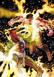
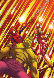
That should pretty much tell you all you need to know. Where many of the other Marvel Adventures titles I've read recently have been carefully scripted to appeal to both kids and adults alike, this month's Marvel Adventures Super Heroes provides something on par with a mediocre Saturday morning cartoon. It's thin storytelling, full of zany personalities, outlandish situations and wacky adventures that probably sounded way better in concept than they do in execution. I'm not sure if Paul Tobin has a lot of experience with these characters, but his renditions of the three identifiable heroes are so out of touch with who they are, I'd highly doubt it. The Hulk is senseless and always smiling, Iron Man doesn't seem to have much in the way of powers outside of flight, and Spider-Man's puns are laughable in all the wrong ways. This really is the kind of story I'd flip on at 8AM and zone out to over my bowl of Fruity Pebbles. It's excruciating.

Tobin doesn't bother with explanations or even the promise of a legible storyline. Why did Spider-Man and the Hulk need to come along on Tony Stark's mission to shoot down rogue meteors? Why did they immediately agree to head out on tour with a group of obnoxious alien rocks? Don't they have other, more pressing responsibilities? When Tobin steps on the gas on the issue's third page, he doesn't let up until he slams the conclusion home, literally, at the last minute. The story's ending is such a ridiculous afterthought that it unintentionally provides the only real laugh of the entire issue.

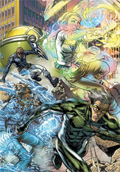
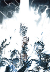
Alvin Lee's artwork is something of a bright spot, making the most of the dozens of cheesy, over-the-top ideas he's asked to put into play. Lee gets the chance to flex a lot of his underused creative muscles this month, illustrating such scenes as a Kree Gong Show and "Black Hole Bungee Jumping." Auspiciously, his work shines nonetheless, as he's obviously having a lot of fun with the crazy, offbeat mood of the storyline.

If you're looking for anything more than a creator's sandbox, there's absolutely nothing of merit here. Tobin and Lee were given a little more than twenty pages to pretty much do whatever the hell they wanted, and that's precisely what they did… dragging their readers along, kicking and screaming all the way. If you're the kind of reader who can go back and watch an old episode of Denver, the Last Dinosaur without scratching your head and wondering how in God's name you ever watched this crap, well, you might find something you can identify with here. Otherwise, run away screaming. Despite a workman-like effort from Alvin Lee, you really need to just skip it.

On a scale of 1 to 10, where 1 is poor and 10 is amazing...
Overall Score: 2

Wolverine: First Class #6

The last time I sat down with an issue of Wolverine: First Class, I was impressed by the book's casual glimpse at life in the Xavier mansion between super powered fistfights. And, judging from this month's issue, that seems to be one of the cornerstones of the series. I love how matter-of-factly Kitty Pryde explains that the Danger Room actually isn't the most secure place in the mansion, that despite its strict security guidelines it gets "invaded and trashed quite a lot." I was thinking the same thing myself, actually, and it's nice that the characters don't have such a degree of tunnel vision as to ignore the room's constant use as the backdrop for enemy onslaughts over the years. If the same device has been used enough times for the readers to roll their eyes when confronted by it, certainly the book's characters should respond in a similar fashion. Because they do, they're granted a certain degree of honesty and believability.

While the title's out-of-continuity status leaves a slightly bitter taste in my mouth, as if we're just treading water here and never really accomplishing anything, Fred Van Lente's simple, identifiable dialog and spectacularly everyday plot ensures that such worries are relegated mostly to the back of his readers' minds. Even if the in-continuity Kitty isn't even close to a teenager any more, assuming she's alive in the first place, the issue's brief, relatable glimpses into her psyche add enough depth to her personality to entertain readers with even a passing interest in the character. Van Lente not only shines with his characterization, his strong sense of comedic timing brings a lot to the table on its own. While the visual puns do sometimes run the risk of going a bit too far, in the end they're kept in check and don't subtract from the experience.

Salva Espin delivers relaxed artwork that fits the cozy nature of the issue. His lightly detailed, casual art direction and focus on his characters' facial expressions and body language reminds me of Stuart Immonen's efforts on Ultimate Spider-Man, although Espin lacks that certain flair for the spectacular that's seen so commonly in Immonen's work. Espin also doesn't bring the kind of care and attention to detail in his backdrops that his USM contemporary consistently delivers, but that's not something I'd say is necessary here. Where Spidey is usually fighting for his life in between petty teenaged arguments with girls, the worst thing Kitty, Siryn and Amp can do in this issue of Wolverine: First Class is disturb Logan from his session with the TV set during the Stanley Cup Finals.

This series isn't going to dazzle you with its long, intricate plotlines or shock you with its sudden, unpredictable twists and turns. If you're looking for that style of storytelling, you won't need to look far to find it. Wolverine: First Class isn't your typical X-Men series; it's more interested in the characters than their powers, in adding a touch of humanity to a team that's usually dealing with deeper, darker matters. It's rare that I'll enjoy a light-hearted, semi-serious series as much as I do this one. It's not perfect, and it sometimes reads like a teenaged girl's manga, but it never lags and I found my attention rapt from start to finish. I'll recommend you give it a borrow, which is more than I can say for most of the other titles in the X-Men line.

On a scale of 1 to 10, where 1 is poor and 10 is amazing...
Overall Score: 7.5

Wolverine #68

Mark Millar is giving us a glimpse into the future with "Old Man Logan," the big time current storyline in Wolverine. And, as seems to be the case any time an X-Men book turns its sights forward a few years, things could be a whole lot better. In this case, fifty years have gone by since the heroes lost their final battle. While the bad guys have divided up the United States in the years since that fateful day, the former heroes have either disappeared or submitted to their former enemies' rule. Logan counts himself among the latter.

In "Old Man Logan," Millar has effectively captured the mood he was aiming for. Rather than a traditional superhero tale, this arc takes place on the spot Fistful of Dollars meets Mad Max. Whether it's Logan's staunch refusal to pop his claws or the low, defeated tone in which its characters speak, it's clear right from the onset that this is a different kind of story. With the narrative set so far into the future, Millar wastes no time in letting his readers know that the gloves are off, nothing is sacred and little can be assumed. His treatment of both Daredevil and the Punisher this month can attest to that. When this writer sets out to impress and surprise his readers, he delivers like few others. I must've grunted my appreciation for this fact a dozen different times this month, turning the page to be kicked right in the gut by yet another incredible, unexpected twist.

With the slate effectively cleared, the story's central plotline gladly takes its readers on a bumpy ride across the unfamiliar countryside. The story's fresh take on familiar characters and exciting, young new faces are equally enthralling. We've known for years what these heroes looked like when they were in charge, things were going their way and nearly every adventure ended with the villains safely behind bars. How they look after the effects of a devastating loss with the highest of stakes… well, that's not so familiar. Great loss changes different people in different ways, and while its effects on many of these heroes may be initially shocking, they're also completely understandable.

I've been a big fan of Steve McNiven's artwork since he took center stage in the primary Civil War mini-series. If you're familiar with his work during that run, then you should already know what to expect of his contributions here. McNiven's work is gorgeous, uber-descriptive but strangely organized. He's able to load a character or environment with an incredible level of detail, all the while introducing a firm sense of legibility and cleanliness to the proceedings. His characters show years' worth of scratches, scrapes, scabs and scars, perfect for the bleak prognosis Millar has painted for them here. Likewise, his backgrounds also show their age – in the decades since the baddies took over, there hasn't been a lot of room for fresh construction – and cry aloud for renovation. They look lived in, used and often abused, and that gives the issue a wealth of character.

Mark Millar's storytelling is in top form with this arc, and Steve McNiven's artwork gives the book the visual punch and proven star power it needs to be successful. While this month's chapter absolutely screams by, it's not for lack of substance. I didn't feel ripped off, like the issue was purposely withholding content to pad the saga out a bit. There's just so much going on here at such a breakneck clip that I was merely disappointed I'd have to wait another thirty days for the action to commence. If the series has a flaw, it's that there's a whole heck of a lot of action and I worry that its conclusion will lack adequate depth, but that's a critique for another day. For now, this is a wild ride, a playground for both writer and illustrator, and a fine display of what can be done when Marvel's premiere characters are unshackled from the restraints of present continuity. Buy it up and catch up on the first two chapters if you've missed them. So far, so good.

On a scale of 1 to 10, where 1 is poor and 10 is amazing...
Overall Score: 9

X-Force #6

With Xavier presumably out of the picture, Cyclops has finally taken the big step from field leader to strategic leader of the X-Men. But to say his methods stray from those of his instructor would be an understatement: take X-Force as a prime example. No longer the playground of Cable and his young recruits, the team is now Scott's black ops hit squad, here to complete the tasks that are deemed too dirty and too dangerous for the regular team. In last month's issue, the group's knack for getting their hands dirty came with a high cost. Having rescued Wolfsbane from a torturous imprisonment, the team brought the injured mutant back to the relative safety of Angel's home. But once there, their refugee snapped, suddenly lunging at her host and tearing the wings from his back. Now, with their Angel suddenly reverted to his darker, more macabre personality as Archangel, X-Force suddenly has to deal with battles on more than one front.

Clayton Crain, providing both artwork and colors, brings a dark, grainy style to X-Force that really hammers home the title's decidedly mature flavor. With the current storyline testing the waters in the genre of horror, Crain's blotchy-skinned, filthy characters fit almost perfectly. His rendition of Archangel, a character I've never felt was treated as visually ferocious as he deserved, is clearly unstable and borderline terrifying.

However, Crain's tendency to overcomplicate the page reveals his unfamiliarity with basic page layout. His panels bounce around the page so recklessly and unexpectedly that the task of actually directing the reader's eye often falls to an overstretched word balloon. His disorganized storytelling may have been given some leniency were his illustrations a bit simpler, but with this kind of detail and this many moving pieces, there's frequently no way to tell which direction my eye is supposed to move. That makes the issue something of a chore to read, and spoils what would otherwise be a very solid artistic contribution.

Writers Craig Kyle and Christopher Yost are thus far succeeding in their efforts to create an official X-Men title that doesn't feel like an "Official X-Men" title. The story's shadowy tone and constant bloodletting set it far apart from the more straightforward, flashy, gaudy books that have personified the line for so long. But because he's borrowing many faces from those other series, something just doesn't sit right. When Wolverine grins and mutters "Sixteen apiece. Kill 'em all," it feels like a totally different character than the one we've been following in Uncanny X-Men for so many years. "Kill 'em all"? What happened to rehabilitation, or even a simple berserker rage? In some instances, such as Archangel or Wolfsbane, these characters were stagnant, in need of a change, and the fresh take is necessary. However, both of those examples come off as secondary characters in this issue, guest shots who ultimately give way to the focal points of Wolverine and his two buddies, X-23 and Warpath.

I can't fault X-Force for striving to create something different within the mutant landscape. That's something it's needed for years, something with enough of an edge to uncover some unexplored corners within the X-Men universe. However, this issue seems like little more than the right attitude driven in the wrong direction. The story and artwork team up to deliver tons of atmosphere, but a thin angelic-themed plot feels more like a recent issue of Ghost Rider. Flip through it if you like, it holds a few surprises, but it's not what it should be or what the publisher needs it to be.

On a scale of 1 to 10, where 1 is poor and 10 is amazing...
Overall Score: 4

Monday, August 18, 2008

Incredible Hercules #120

While the vast majority of the Skrull population occupies themselves with a full-scale invasion of the Earth, Hercules is discretely taking the fight to a different level. He's gathered a ragtag crew of immortals, Gods and cosmic entities and shifted his focus from defense to a surprise offense – leading a gutsy assault on the realm of the Skrull gods. It's been a long, brutal road, but in this month's concluding chapter, they've finally reached their goal. The religious leaders of the Skrull pantheon lie battle-ready in their path, and suddenly these guys look a lot tougher… and angrier… than Herc and his God Squad had anticipated.

Greg Pak and Fred Van Lente have done fine work here, draping their storytelling in a steep, spiritual lore without getting carried away with long-winded Biblical dialog. If you've been waiting to discover who the Skrulls were talking about when they said, routinely, "He loves you," then you might be surprised to hear that the answer is here, rather than within last week's Secret Invasion #5. And while that entity's identity is left somewhat murky this month, it's at least nice to have some answers.

While Pak and Van Lente have a firm grasp of the kind of fervor this character seems to draw out of his followers, a not-so-subtle allusion to nearly every form of modern religion, I wasn't impressed by the blunt solution they present to this situation. How do you defeat an endless army of shape-shifting religious zealots, bent on the eradication of your species at all costs? Why, you gather a few of Earth's least-known deities, travel to Skrull heaven and get into a fistfight with the man in charge. Who knew it could be so easy?

This looks a lot more like an issue of Spawn from ten years ago than it does a modern series from Marvel. I don't necessarily mean that as a bad thing, because McFarlane's green-eyed devil has enjoyed some fine visual moments over the years, but it's a bit outside the boundaries of the publisher's typical illustrative style. Rafa Sandoval's work contains about as many lines as I can stand on any given page, but retains a certain charm all the same. His renditions of Hercules and Amadeus Cho, the book's dueling leads, are distinct and vibrant, and when he really needs to stand up and deliver a crisp, impressive splash page, he cashes in. When he's on point, Sandoval is a real talent, but troubles with consistency are ultimately his downfall. He can't decide if he wants to be Travis Charest or Chris Bachalo, often alternating between styles three or four times in a single page, and that's not going to fly for very long.

There's a lot of pomp and circumstance in this issue, but I found it to be ultimately unsatisfying. The way we reach the arc's climax is happenstance and coincidental, which leads me to wonder why we needed three issues to set it up first. Isn't the point of a lengthy story arc to lay sufficient groundwork and back-story so that the final chapter can put it all to use effectively? Why was the tide-turning weapon found randomly on the ground in the middle of this issue, immediately put to use and then forgotten? Incredible Hercules is well on its way to becoming a quality series, but this tie-in wasn't a step in the right direction. Flip through it to enjoy the sporadic bright spots, and cross your fingers that next month's return business as usual also signals a return to form.

On a scale of 1 to 10, where 1 is poor and 10 is amazing...
Overall Score: 4

Iron Man: Director of SHIELD #32

Even if the recap page hadn't clued you in, there would have to be no question that this month's Iron Man: Director of SHIELD is the concluding chapter of the story arc. When a cluster of nuclear weapons aboard the SHIELD helicarrier are remotely ordered to detonate in less than three minutes' time, that doesn't leave a whole lot of wiggle room. It's either the end of the threat, the end of the world or some screwed up, time traveling, slow motion-dependent garbage. My money is on the first.

Stuart Moore's nuclear-themed drama has provided some compelling reading while also posing some unsettling real world questions. The notion of a military device devised to usurp control of the entire world's nuclear arsenal isn't that far-fetched an idea, and the very thought of it falling into the wrong hands is a legitimately pant-wetting proposition. Where the concept loses a bit of steam is in its execution. Sure, I can imagine a couple hundred Pentagon employees coming together to try to build something like this in the real world. What I have a little trouble imagining is the thing taking the form of a purple, building-sized floating brain with flashing lights and an automated self-defense system. But I suppose such peculiarities are to be expected considering the medium… ditto for the Tetsuo-like tendrils that hook the brain's pilot to its control system.

Beneath the cartoony excesses, this really is a sharp, smart storyline. It's not quite as grandiose and world shaping as the premise would lead you to believe, but at its core it's still a fine example of a brand of storytelling that's a perfect fit for Iron Man's unique characteristics. Stark gets equal opportunities to shine mentally as he does physically, and his dialog is layman-friendly. It's far from uncommon for one of Marvel's mightiest to lose his readers when he uses brainpower to solve a complicated problem (Mr. Fantastic and Dr. Strange have been doing it to me for years), but that's a trap that Stuart Moore avoids this month with Tony Stark.

Dueling artists Carlo Pagulayan and Steve Kurth don't prove to be much of a match for one another this month, although neither left me particularly impressed. Pagulayan's work is the better of the two, showing the influence of Frank Quitely in the care and precision he grants to the page if not the overall composition and pacing. His characters have real depth and personality, although they don't always look comfortable on the page. When the narration switches gears and Kurth takes over, the issue loses a lot of momentum. Pagulayan's artwork wasn't perfect, but compared to Kurth's awkward, ugly illustrations he's a saint. Kurth is given more chances to visually surprise us, as the story twists and turns much more frequently in the issue's second half, but his work is so stiff and clunky that they provide little more than blown opportunities.

With a regular artist, I think Stuart Moore could be making some real progress with Iron Man. He's found a nice blend of action, adventure, technology and espionage here, based it in a world that's a little bit too familiar and given it a slightly outrageous slant to keep his readers entrenched in the storytelling and not in its parallels in the real world. With a regular rotation of artists, he's never had a chance to really dig in his heels and make a mark, and sadly, that's a trend that continues this month. Flip through it but don't pay it any serious mind until Marvel can lock down a better illustrator.

On a scale of 1 to 10, where 1 is poor and 10 is amazing...
Overall Score: 4

True Believers #2

So, be honest, when you saw the title True Believers, did you expect this series to be about a small group of counter-culture "warriors of the information age," dedicating their lives to revealing every last lie, conspiracy and cover-up on the planet? If so, good for you… myself, I was expecting some kind of goofy buddy road trip, hitting the roads in search of a mythical golden Stan Lee statue or something. But nope, it's conspiracies, lies and cover-ups, like The X-Files, only with a decidedly superheroic flavor.

But the surprises aren't simply relegated to the book's theme. Writer Cary Bates is using this series as an opportunity to poke and prod at a heretofore-unexplored segment of the Marvel universe. This issue wastes little time in letting its readers in on that fact: its cold open features scenes from a leaked DUI video starring a (literally) wobbly-legged Reed Richards. The message rings loud and clear: if we're going to dig deep into the secret scars of Marvel's superhero community, nothing can be sacred. Even one of the publisher's most respected and honored characters.

While those ambitious first few pages set the stage for something truly original, the follow-through proves to be somewhat of a let down. After its shocking first few pages, True Believers loses its nerve. It regresses into a simple mystery story, and its quick solution leaves lingering questions about the significance of the case in the first place. The issue is overfilled with dialog, half of it needless, and outside of a heavy-handed accent here or there, I had trouble distinguishing one character's personality from the others'. The actual squad of True Believers only appears for a brief segment, coming and going so quickly they felt like guest stars in their own series.

As long as Paul Gulacy's artwork focuses on True Believers' cast, it resides somewhere between good and very good. He tries something new with every page, whether it's a challenging camera angle, an original texture or an entirely different illustration style, and while that often reveals his weaknesses, it also unveils a variety of strengths that I otherwise wouldn't have credited him for. Gulacy can't draw a car to save his life, but he can effectively use pointillism to indicate a change in lighting and atmosphere. He channels Jae Lee, Eduardo Risso and Tony Harris, all within a three page span, and while some of those homages are more successful than others, it's a change to see this kind of public experimentation. It's not the best-looking series on the market (Gulacy's Ben Grimm is just plain terrible) but it's something different, which is in keeping with the title's theme.

There's room for a series as ambitious as True Believers would like you to believe it is, this issue's opening pages prove that, but it really needs to commit to that direction and stick with it. Instead of the ballsy, nothing-sacred image that this series projects for itself, it's really just a new coat of paint slapped on top of an old jalopy. Original concepts are where this series shines, but when it's time to follow up, it loses its nerve. Flip through it for Reed's joyride in the Fantasticar, but don't bring it home with you.

On a scale of 1 to 10, where 1 is poor and 10 is amazing...
Overall Score: 4

X-Factor #34

What's that, another Secret Invasion tie-in? Yes indeed, with Skrull mania sweeping the nation it would seem that no series, no matter the shape or size, is immune to a special appearance from the green-skinned, wrinkle-chinned shape shifters from outer space. X-Factor's involvement comes in the form of Darwin, a mutant whose father has charged the team with locating and returning his prodigal son. The good news: they've found him. The bad: he's sitting tight with Longshot, who just so happens to masquerade as the Skrull named Talisman. It gets worse – the She-Hulk and her partner, Jazinda, are after Talisman, too. And we all know how well superheroes typically mingle when their plans unexpectedly coincide.

Long story short, the team is already brawling with She-Hulk in the city streets when the issue begins. As usual, Peter David does a great job of blending serious action with tension-splitting narration. He keeps the book's individuality at the forefront, even when the team's getting their ass handed to them. As Madrox is hurled through the air, he quips "the whole 'She' part tends to make you overlook the 'Hulk' part," and suddenly I completely understand his frustrations. David has had a connection with these characters for so long (he first wrote for the series way back in 1990) that their little personality quirks and individual peculiarities can be taken for granted. Peter David knows Strong Guy like no one else knows him, and while I'll admit that sounds absolutely ridiculous, its importance in this series can't be overstated.

But the writer's best days with the book are behind him. When the series was at its best, it would match a biting wit with a set of legitimately moving storylines and themes. He could balance the jokes with serious moments that brought his readers closer to the characters themselves, instances of humanity and weakness that made them endearing, relatable, real. These days, the series has ramped up the goofiness and lost touch with those subtle, honest undertones. David remains a compelling author, and his writing here is no exception, but perhaps I've been spoiled by his earlier run(s) with X-Factor.

Artist Larry Stroman certainly gives the series a personality, although it's not one that I'm particularly crazy about. While his work has a quick, sketchy nature and persistent lightheartedness, his compositions often seem unfinished and underdeveloped. His renditions of She-Hulk were so far from the mark that I couldn't tell if this was supposed to be Jennifer Walters or some other nameless, green-skinned, purple-garbed behemoth of a woman. The character in this issue has a different hairstyle, different body language and the face of a middle-aged Asian woman.

That's not to say Stroman doesn't have his moments. When he pulls himself together, quits with the deliberate sketchiness and really sets his mind to delivering something cool, he can get the job done. Talisman's first appearance this month looks like something Jim Lee put together between issues of WildCATs in the mid '90s. For that matter, almost every moment Talisman is in the panel, Stroman's work shows marked improvement. Pity he couldn't be around from start to finish.

I remain a fan of Peter David's work, although he's lost a bit of momentum over the years. While the modern form taken by X-Factor doesn't compare favorably to its brightest moments, the series is still more entertaining than the majority of its modern competition. Larry Stroman's artwork provides a stumbling block, but the issue's worth borrowing in spite of that.

On a scale of 1 to 10, where 1 is poor and 10 is amazing...
Overall Score: 7

Monday, August 11, 2008

Marvel Adventures Spider-Man #42

The Marvel Adventures line has the ability to produce some of the publisher's most rewarding stories or its most forgettable. The format of one issue / one story cuts away the excess and allows a writer to sink or swim based entirely on the merits of their central plotline. Some find it difficult to adjust to the smaller timeframe, where there's little room for the crutches, padding and gimmicks that are beginning to characterize more and more mainstream books. I can remember when a multi-issue story arc was something special, but now it's become so frequent that they've become the norm, while the standalone tales provide an infrequent change of pace.

This issue's author, Marc Sumerak, gets that concept half right. He doesn't waste our time with an excessive background, cuts right to the chase in setting up and delivering some web slinging action, and keeps his cast small and uncomplicated. What he doesn't achieve is a reason for this issue to stand apart from every other that had come before. This is very much a stale, redundant, run-of-the-mill Spider-Man story. He plays it so safe with these characters that I think they're sometimes afraid to interact with one another, fearful that they'll somehow upset the status quo and won't have enough time to reset it before the issue draws to a close.

Worse, the entire issue is so clearly telegraphed that I caught myself predicting the benign twists its plot would take, several pages before they actually went down. Sumerak's dialog is equally dull and predictable. Nobody speaks like an actual human being any more than they act like one, casually strolling around the rooftops in spandex until suddenly the light turns green and it's time to fight. The issue's central conflict doesn't come off as a chance encounter between Spidey, the Black Cat and the Puma so much as it does a mock stage recital. These guys aren't talking to each other, they're delivering their lines.

Sumerak's artistic partner, Vincenc Villagrasa, doesn't do much to improve the situation. He takes the author's drearily written material and simply converts it to linework without enhancing or refining it. Villagrasa's work is stiff and awkward, his lines thick and blunt with no finesse or personality. This looks like an issue that was rushed out in little more than a weekend. It's short on composition, detail, pride and purpose.

That means this issue is both a chore to read and a drag to look at. It's not an example of what can go wrong within the confines of a Marvel Adventures story, it's evidence that sometimes a bad story is just a bad story. This wouldn't have been any more successful in a multi-issue story arc than it was in a single, self-contained adventure. I can't find anything truly redeeming here. Skip it, even if you're really hard up for a Spider-Man story.

On a scale of 1 to 10, where 1 is poor and 10 is amazing...
Overall Score: 1.5

Punisher #60

Frank's finally crossed the wrong people. In a group of US Army generals, Castle has met an enemy who knows who he is, where he came from, and all of his strengths and weaknesses. They've confronted him with a combatant he refuses to fight, (United States soldiers) chased him from his most secure safe houses, survived his booby traps and plundered the vast economical reach of the entire American army along the way. And, surprise surprise, they've got their wish: he's in captivity. As it turns out, though, the real question isn't how they plan to capture him, but how they intend to keep him there.

The last issue of Punisher under the watch of longtime scribe Garth Ennis is a conclusion in every meaning of the word. Since launching the series under the MAX imprint, (I'd just as soon forget what he did with later issues of the Marvel Knights title) Ennis has left dozens of plot threads dangling, confrontations unresolved and burnt men breathing, and it's all come to a head in this arc. Naturally, that means if you're picking up the series for the first time, you're going to be left almost completely in the dark, but if you've been following it all along (as I have) then you're reaping the benefits of years and years of build-up. It's a rewarding payoff, if not the most instantly accessible.

Strangely, this penultimate chapter in Ennis's skull-chested career isn't his finest hour with the character. The brunt of the action took place earlier in the arc, and this issue is really little more than one last chance to wrap everything up, provide a sense of closure, and talk about it. Yeah, let's all sit down with Frank freaking Castle and have one long, introspective chat... not exactly what I think anyone would expect from an issue of Punisher. If that weren't drab enough Ennis breaks up the issue with full-text chapters of "Valley Forge, Valley Forge." The biography of a soldier who fought in Vietnam, the book provides an interesting look at the birth of the Punisher through the eyes of a man who was there to see it personally. It's insightful reading, but it's also infuriatingly distracting. I understand that this was probably something Garth wanted to get out in the open before he washed his hands of the character, but it doesn't match the present-day story that it's interrupting, and it feels like an excess of copy, dropped into an already slow-moving narration.

Goran Parlov, Ennis's most recognizable partner in crime during his stay on Punisher, delivers another strong performance on the artistic side this month. Parlov has caught his share of grief during his work with the character, and while I'll concede that his artwork isn't for everyone, I've enjoyed his stay. In the same vein as Steve Dillon, Parlov's simple, blunt style provides an excellent counterpoint to Ennis's brutal, action-packed storytelling. While his work has shown some signs of decay recently, (some of this month's contributions show either a lack of time or effort) his compositions remain strong and I continue to enjoy his work. Even when he's tasked with long, dreary scenes of conversation and not exploding muzzles, sailing body parts and thick fountains of blood, Parlov keeps things interesting and I appreciate that.

This is a rewarding conclusion, no doubt about it. The bad guys get what's coming to them, walk right into it, and you'll be surprised at how easily it all comes together. Unfortunately, it isn't the crowning moment I was hoping it might be. Upon concluding this sensational five-year run with the series, I'd thought maybe Ennis would give himself a better sendoff. Instead, he's produced something that's worth a borrow, but not a buy. It's a fine tale, with roots planted long ago, but that doesn't instantly make it a great read. The excruciatingly slow pace and abundance of words keep this from being all it could be.

On a scale of 1 to 10, where 1 is poor and 10 is amazing...
Overall Score: 7

Secret Invasion: Runaways / Young Avengers #2

If you don't know the full story behind the Skrull invasion by now, just walk away because you're hopelessly behind and this book isn't going to make a lot of sense to you. With that said, the angle Runaways & Young Avengers takes on this big event is both pertinent and unique. More than just a random tie-in that spotlights unrelated heroes, their brawls with the bad guys and a miniscule part of the story, both of these youthful squads actually count a green-blooded Skrull among their ranks. The Young Avengers' Hulkling and the Runaways' Xavin, each localized former members of the Skrull empire, were caught off-guard by the sudden, jarring assault of their brethren. Now, they find themselves caught between the invading power of their own flesh n' blood and the resisting force of their longtime friends and teammates.

After just a single issue, Chris Yost has dropped both teams into the heart of the conflict, given them an original say in the proceedings, and put the whole ordeal into perspective. He never misses an opportunity to remind the reader that children populate both teams, and that kids (even superpowered ones) have a tendency to absolutely freak out when the status quo is thrown into question. The Skrull attack is so sudden, so unexpected, that it's easy to identify with those characters who do lose it during that moment of revelation, and to look up to those who keep it together and take command.

Yost keeps the action moving at a breakneck pace, bouncing to a new conflict as soon as the last is resolved, but that doesn't mean this is purely an action book. While the tempo may be fast and furious, there's enough room for conversation within these pages to keep the reader emotionally involved in the proceedings and retain the distinct personality of both teams. Where Brian Bendis's primary Secret Invasion title is more concerned with what led to this moment, and the diversions involving the big named heroes in the Savage Land, Runaways & Young Avengers is focuses on the here and now, ground zero of the attack. In that way, it reads more like a primary narrative than the main series, which came as quite a surprise.

Artist Takeshi Miyazawa and colorist Christina Strain make a tremendous visual pairing. Miyazawa's clean, animated style is both dramatic and simplistic, while Strain's colors are vibrant, dramatic and perfectly matched to her partner's work. Hidden within a simplistic grid layout, the issue's inhabitants bounce around the page recklessly, but in the end it's an ordered form of chaos. Miyazawa's layouts are fantastic, constantly testing his boundaries with extreme close-ups, daring, effective new angles and a friendly excess of motion. My eye raced down the page, led through the action brilliantly by the fluid motion of this artwork, before bouncing back to the top to further appreciate the power of each composition. The issue's characters are individualized, easy to tell apart, and amazing to see in action. They display little touches of personality not just through wardrobe and facial expression, but also through body language, and Miyazawa magnificently plays up their relatively miniscule size in comparison to the sinister Super Skrulls. It's great work from top to bottom.

While I came in with low expectations, it took all of four pages for this issue to hook me up and reel me in. It's simple, effective storytelling matched with incredible artwork and blow-away colors. Secret Invasion: Runaways & Young Avengers is more than just a side dish, it's an attraction all its own. Buy this up, I had more fun with this issue than I've had with all three episodes of the regular Secret Invasion.

On a scale of 1 to 10, where 1 is poor and 10 is amazing...
Overall Score: 9

Secret Invasion: Thor #1

So you thought the Skrull invasion was limited to the human-occupied sections of our planet? No, in case you've forgotten, Thor and his Asgardian brethren have recently taken up residence in the air above a small, sleepy Oklahoma town… and from the green skins' perspective that means they're just another earthbound civilization in need of demolition. In a two-pronged attack, the Skrulls are moving at once on both Asgard and Broxton, Oklahoma, and Thor can't be in two places at the same time. For this fight, he'll need to call in the reserves.

Matt Fraction's connection between the Skrull empire and the rulers of Asgard is surprising and effective. He gives the aliens a sadistic, downright evil persona that's missing from many of the other Invasion tie-ins. The method in which the Skrulls deliver their warning to Thor and his people is shocking in its brutality and its simplicity, and that gives them a harsh edge that motivates the reader to see them utterly annihilated. Honestly, I've never had the time of day for Thor and his people, but in Fraction's hands I found myself sympathizing and pulling for Beta Ray Bill, of all people.

I was especially impressed by the human element that Fraction added to this issue. When Thor summons a storm to help extinguish the fires ravaging Asgard, it would be easy to overlook the reaction of the common folks on the ground. Instead, he uses it to add a compelling extra layer to the proceedings, gives us a glimpse at a TV weatherman frantically announcing the sudden storm clouds to the city's population. He relates the startling composure of the city's populace, beaten into submission by the regular late-summer storms that personify life in the guts of tornado alley. Thor and Asgard's lives are intertwined with these people, and it's refreshing to see them treated as primary characters on the same level as the Gods themselves.

Doug Braithwaite's accompanying artwork fluctuates between outstanding and humdrum. His greatest strength (and, clearly, his primary interest) is in architecture and scenery, but he has a hard time with humanity in general. When Fraction tasks him with a two-page spread of Asgard in flames, what he delivers is downright staggering. He captures the epic, towering beauty of the mythical city, counters it with the disturbing visage of flames in its heart and unnatural plumes of smoke floating through its streets. And then he plants it firmly in reality by adding the simple touch of a flock of frightened birds, scattered in the distance. But then, just one page later, Braithwaite is asked to impress us with Thor's transformation from human to God of Thunder, and he flat-out misses on every front. When the getting's good it's great, but when it's bad it's almost unbearable.

Secret Invasion: Thor is told in a style that's markedly different from the rest of the Invasion tie-ins, but that doesn't mean it doesn't fit. It's a much darker, more disturbing take on the central events, and that's an angle that the big picture sorely needed. Matt Fraction's writing this month is spot-on, and if he'd had a more consistent artistic pairing, I'd be recommending you buy this. Unfortunately, Doug Braithwaite's weak moments are more numerous than his strong ones. This is certainly worth borrowing if you can, and provides an excellent compliment to the main Secret Invasion limited series.

On a scale of 1 to 10, where 1 is poor and 10 is amazing...
Overall Score: 8

Monday, August 4, 2008

Criminal #4

While this may be the opening chapter of the second arc in Ed Brubaker and Sean Phillips's Criminal ongoing, there's actually no better time to jump into this series than the present. Thanks to the book's format, which spotlights different characters in each arc, new readers don't need a crash course in the title's history to understand and enjoy its contents.

This month we're following Jake, a reformed criminal who'd made an honest life for himself before a fruitless police investigation sent him right back down into the gutter. Years later, missing his family and unable to sleep for more than a few hours at a time, he's fallen into a deep, dark hole of self-pity. Brubaker gives us such a profound, unyielding look at the man's mind that it's hard not to find something to identify with. Even if you've never suffered through the dread of a sleepless night and an overactive imagination, just a few pages of Jake's thoughts are enough to make the incident relatable.

And, just when he's led you to see a little bit of yourself in the story's lead character, Brubaker throws him into the fire. He shares enough of Jake's daily routine for us to understand just how deep of a rut he's in, before tossing in a twist that neither reader nor character expects. Once you've taken that plunge, it's a twisty, bumpy ride the rest of the way.

Sean Phillips has been slamming the ball into the stands so routinely on this series that it's become almost too easy to take his artwork for granted. His style, a blend of the emotion-charged simplicity of Tim Sale and the dark, grimy mood of Alex Maleev, is a perfect soul mate for the tone and personality of Brubaker's story. Phillips's work is subdued and pedestrian enough to duck under the spotlight, but adds so much to the series that I can't say it could be successful in another artist's hands. His connection with the book's routinely shifting cast members is almost hauntingly accurate. This month, for example, he captures perfectly the empty, piercing stare of Jake's insomnia in the midst of a long night. Not quite awake but certainly not asleep, he stares right through the reader like a ghost. He's looking into your eyes, but he doesn't hear what you're saying. Phillips has really settled into this role, and his familiarity with the material is beginning to pay dividends in his already-strong artwork.

After being disappointed with the last arc, I was pleasantly surprised by the return to form evidenced by this storyline. Sean Phillips's artwork has never wavered, and though he's survived some ups and downs elsewhere, this is all the evidence you'll ever need that Ed Brubaker's writing can be, at times, absolutely perfect. This arc of Criminal should be in your permanent collection. Buy it and enjoy it.

On a scale of 1 to 10, where 1 is poor and 10 is amazing...
Overall Score: 10

NYX: No Way Home #1

NYX has had a somewhat colorful publishing history. From the original proposal, greenlit and then suddenly canceled before production could begin, to the finished series, marred by so many delays that its artist split for an exclusive contract with DC after four issues, it hasn't been smooth sailing so far. With this new #1, I'm sure Marvel's goal is to leave all that chaos behind in favor of a more regular publishing schedule, a more reliable creative team and a closer focus on the events contained within the book, rather than those surrounding its creation.

Marjorie Liu picks up where Joe Quesada left off, scribing the adventures of a close-knit group of homeless mutant teens in Manhattan. She takes her time reintroducing us to the cast, and while that gives the new artist a lot of room to familiarize himself with the players, it doesn't exactly make for compelling reading. In fact, there isn't really anything of substance here until the final pages of the issue. It's great that the new writer is displaying her commitment to characterization, sharing with us the minute ways each mutant's life has changed for the ordinary, but if the primary goal of this first chapter is to capture on-the-fence buyers' imaginations and sign them up for the remainder of the series, this isn't a success. The kids' mutant powers, which should be what sets them apart and drives the reader's interest in their personalities, are barely touched upon. This is about ten pages' worth of drab, conversational storyline stretched over the course of an entire issue.

Original series artist Josh Middleton has long since moved on to bigger and better things, so it's up to Kalman Andrasofszky to fill his shoes and help readers move past the shake-up. Fortunately, the new guy produces fine work, and the transition is an easy one. He doesn't try to mimic Middleton, but the two do work a similar style so there are a few natural similarities. Both artists depend on a lush, stylized, organic treatment, and where Middleton would often rely on his own colors to provide much of the page's detail, Andrasofszky is much more dependent on traditional pen and ink. Josh's work is often painstakingly detailed, but his ability to show restraint at opportune moments keeps it from feeling too busy.

The new series artist shines most brightly in his backdrops, although that's not to demean his work in the foregrounds, either. His New York is bustling with activity, alive and unmistakable in every panel. I'm sure Liu didn't mention that panhandler wordlessly seeking a buck or the junkie passed out in the stairwell anywhere in her script, but their addition does a whole lot to tether the book in the real world. There's always something going on, the lead characters aren't above interacting with the extras, and I like that.

This new launch for NYX isn't an unbridled success. Where my initial fears were for the change in artists, it turns out my greater concern should have been for the writing. While Kalman Andrasofszky's artwork is genuinely intriguing, Marjorie Liu's storytelling leaves its counterpart hanging. With a little more direction, this could be outstanding. Right now it's just worth flipping through.

On a scale of 1 to 10, where 1 is poor and 10 is amazing...
Overall Score: 6

Secret Invasion: Front Line #2

We're now into our third major, superpowered crossover and Front Line, Ben Urich's infant newsprint endeavor, is rolling with the punches. Between the Civil War, the Hulk's downtown tirade and now the Skrull invasion, Urich's barely had time to climb out of the trenches, but like a good reporter, that hasn't stopped him from digging to unearth the truths behind these historic events.

Front Line has always been a collaborative piece, with one or two featured storylines and a set of short stories and smaller narratives scattered around to broaden the book's perspective. For the Secret Invasion series, that formula has been tweaked: the short stories are gone, and the pair of dueling main plotlines has been split into six equal points of focus around the city. Instead of just Ben and Sally, now we're keeping tabs on Urich, an ER doctor, a cab driver, a designer, his daughter and a police officer. And while that sounds complicated on paper, in practice it does a lot to pull the whole book together.

I was never a fan of the previous format, as I found that none of the chapters were given enough room to breathe and the experience was asking too much of a reader. It's one thing to spotlight four different stories from four different creative teams, like Marvel Comics Presents offers, but when you're also jumping from a traditionally paneled comic to plain text with illustrations and back again, it gets tough to find the proper frame of mind. In the book's new layout, writer Brian Reed is able to tie each of the six primary characters together without losing his readers along the way.

While Reed does tend to overdo it with his dialog, the heart of his story remains interesting. In the same vein as previous editions of Front Line, he portrays the civilian perspective of the Skrull invasion, the view from street level as New York is blindsided by a sudden, jolting alien onslaught. While that's not exactly a fresh concept, as Marvels brought the idea to the forefront almost fifteen years ago, it's used infrequent enough to remain an effective alternative to the flashier, superhero-focused point of view presented in the primary Secret Invasion series.

Marco Castello's accompanying artwork has its moments. He brings an animation-influenced simplicity to the page, which keeps the issue easy to navigate, but lacks the emotion and drama that's usually inherent with such a style. In a few specific panels, his characters' emotions are almost laughably mute, like the woman who casually diagnoses a police officer's injuries as though she were writing a grocery list while a twelve-story spaceship zaps the streets behind her. I had trouble getting into Castello's work for the same reason I never really fell head over heels for the Luna brothers or Dreamwave productions – I admire the simplicity of what they're doing, but I can't really get into a story when it seems like its world is populated by robots. The inappropriate emotions and stiff, unnatural poses are such a distraction that I had trouble appreciating the finer qualities of Castello's artwork. That's a shame, too, because what few action scenes he's granted are very well done.

This Skrull-focused chapter in the Front Line story is, overall, a much easier read than the two runs that had come before it. The series benefits from the change to a single creative team, and while it's far from required reading, this at least provides a fresh take on the big picture. Flip through it, nothing more.

On a scale of 1 to 10, where 1 is poor and 10 is amazing...
Overall Score: 5

Warhammer: Condemned by Fire #3

The Warhammer comics aren't for everyone. Let's get that out of the way right off the bat. Frankly, even that isn't specific enough to really get the point across: these comics are for existing Warhammer fans, folks who know the details of the series through and through, and all others need not apply.

Dan Abnett & Ian Edginton don't make it easy on their audience. This story, set in a medieval fantasy world, wastes no time in driving that point home with both the tone and sheer quantity of its dialog. After just the first page, I'd already read more period-specific vocabulary than I could stand. Take this beauty, for instance; "The others quail and weep, lamenting their lot. There's nought to be served by such Maudlin vanity." I'm not even sure what that's supposed to mean. As with Shakespeare, I spent the majority of my time with this issue attempting to pick out a word or two that I recognized, deriving some sort of meaning from the narration that way. It's a slow, agonizing experience.

Perhaps with a brief setting of the stage, I wouldn't have found myself so completely lost within the plot of this issue. Then again, considering the vast number of allusions and references to the past that the story makes, I worry that such a recap may have eaten up an entire issue or two unto itself. This series clearly takes place within a deep, well-developed mythos, but because I've been privy to precious little of it, I have no frame of reference.

Rashan Ekedal does his part to dress these pages up, and sets a bleak tone for the story from the very first panel. His work is ideal in dark settings, such as the prison that opens this issue, where he's free to play in the shadows and use the infrequent light sources to paint strange shapes on faces and bodies. When his characters are bathed in full light, Ekedal loses his way and turns into just another mediocre talent. Gone are the intricacies on each character's face, the bold lighting choices and sharp touches of personality that we enjoyed in the darkness. On the battlefield, where such lighting is most predominant, his work is at its worst. As was the case with Damnation Crusade, the last Warhammer series I covered, this issue's fight scenes are excessively gory, which gives the book an immature flavor. When I was in middle school, I was all about spattered ink, errant eyeballs, severed heads and red-soaked steel, but nowadays I prefer something a bit more subdued. Handled effectively, blood on the battlefield can make for a spectacular visual, but in the wrong hands it's just another excess.

I can't recommend this series, whether you're a fan of Warhammer with an encyclopedic knowledge of its backstory or a fresh face looking to get his feet wet in time for Age of Reckoning. If you're the former, the slow pace, bad dialog and weak characters will put you off... the latter won't even get that far. Skip it. Condemned by Fire holds little of value.

On a scale of 1 to 10, where 1 is poor and 10 is amazing...
Overall Score: 2