Monday, January 28, 2008

Ultimate Spider-Man #118

Ultimate Spidey has been rocking and rolling for a long while now, but it’s seemed invigorated since the arrival of new regular artist Stuart Immonen. Writer Brian Michael Bendis had been testing the limits of good taste near the end of his monumental run with Mark Bagley, but the new partner in crime may have been the kick he needed to rein in his more off-kilter ideas and return to form. With that said, although I absolutely loved the build-up to the previous storyline, “Death of a Goblin,” I found the conclusion to be very rushed and unrewarding.

If you haven’t been following the book, what started out as a brilliant interpretation of Norman Osborn on a rampage concluded with a random firefight between the Goblin and his son Harry. When the smoke cleared, the frenzied elder Osborn had beaten his boy to death and, upon realizing what he’d done, asked SHIELD to put him down for good, a request which they obliged. That didn’t really sit well with me, and felt like a cheap way to deliver a shock where one wasn’t altogether necessary. Both Osborns were a vital part of this series from the get-go, and for them both to be written out of the storyline within two pages of each other felt like highway robbery.

Maybe Bendis understood that a lot of his readers would be thinking along those lines, because he took this issue as an opportunity to really flaunt the cast members that remain and even introduce one or two “new” faces from other books in the Ultimate line. It’s really little more than a getting to know you issue, a chance to further flesh out a series of faces that are already pretty much top-notch. After all the over-the-top theatrics of the previous story arc, an average day at school with Peter, MJ and Kitty is a welcome change of pace and a reminder that these guys are still human.

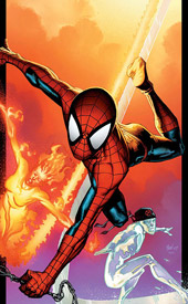
Bendis is at his best when his characters are just shooting the shit and talking through what’s bugging them, and that’s what he’s doing in this issue. And, when Iceman suddenly enters the equation, the writer continues his trend of doing more for characters borrowed from another book in a back-up role than other writers have done with them as a focal point. He’s given so much more depth to Kitty, Bobby and Johnny Storm here than they’ve ever had in their own books, that it’s almost hard to believe they’re the same people. You’d never hear Spidey, Iceman and the Torch having a conversation like the one they have on the beach in this issue in another Marvel book, and that’s what’s always made Ultimate Spider-Man a bit different from its peers.

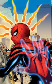
As an ongoing artist, most titles should be so lucky as to have a regular contributor like Stuart Immonen. This is a guy who came into a tremendously difficult situation, taking over from a popular artist who’d almost become synonymous with the series, and has utterly flourished, to the point that I now actually prefer his work to Bagley’s. His artwork is picture perfect, no matter the situation – if the scene is a long, colorful conversation, then he paints the foreground to match the characters’ emotions and the background to further emphasize the situation. If it’s an action scene, he knocks it right out of the park. When Iceman drops in on Peter and MJ’s school on a Friday afternoon, the main characters may have already moved on to another topic, but in the backdrop the faceless student population rushes to marvel at the leftover ice-slide. Immonen has been flawless since his arrival, and this issue is just a continuation.

After a mild letdown last month, Bendis and company have rebounded nicely with this month’s story. He’s replaced the characters lost last month with new faces, and the book’s looking up again. Although he’s leading us into something that could be super cheesy next month, if his treatment of the subject this month is any indication, he’ll come through with flying colors. Ultimate Spider-Man remains one of my favorite ongoing reads. Buy this if you like good comic books.

On a scale of 1 to 10, where 1 is poor and 10 is amazing...
Overall Score: 9.5

New Avengers Annual #2

This year’s New Avengers Annual has a bit more relevance to it than most. Brian Michael Bendis has introduced a new villainous mastermind over the last few months in the regular New Avengers ongoing, The Hood, and this issue is a direct continuation of his first clash with the team. It’s nice to see an annual used as the large-format conclusion to a story that started in the smaller monthly book for a change.

I love what Bendis has created in The Hood, a bad guy with a seriously useful power (mystical invisibility) and the balls to bring the fight to the heroes, rather than sitting back and hoping they don’t notice him. He’s got a sharp wit (don’t all of Bendis’s characters?) and a great strategic mind, but more importantly – the lower-powered bad guys trust him. They’d go through an awful lot for this guy, clearly, and that makes them a much more serious threat to the Avengers.

Speaking of which, the thing I like best about this team is the way they relate to one other, like one big dysfunctional family in tights. They talk about the things that you always had to assume heroes talked about, but never seemed to happen on the page. When the team returns to Doctor Strange’s home, for instance, Wolverine makes a beeline for the kitchen… to the chagrin of Wong, Strange’s longtime man-servant. When he complains that Logan destroys the order of his kitchen and physically stands in his way, it says a lot more about both characters than any one-liner in the midst of a superpowered battle royal could.

And, ultimately, those casual, quiet moments where the team is disarmed make the superpowered battle royal that explodes around the middle of this issue (yes, complete with one-liners) twice as jarring and impressive as it would’ve been otherwise. Those relatable, petty arguments over the state of Wong’s kitchen make it clear just how off-guard the heroes are caught by the attack, how serious a fight they’re in for. And it’s a major fight, too, because once that shoe drops, it’s on for the remainder of the issue.

Artist Carlo Pagulayan picks up where Leinil Francis Yu left off in the main book, and he doesn’t prove to be a bad a replacement. Pagulayan is a fine artist, but he’s taking over from one of the publisher’s marquee names, and he just doesn’t benefit from the comparison. Where Yu works a very sketchy, action-friendly style, Pagulayan’s work is much more detailed, realistic and stationary. He seems to invoke the style of his predecessor for a few panels (notably the pages featuring Jigsaw) but for the most part his artwork is markedly different. His framework can get a bit difficult to follow at times, but he’s being asked to jam a whole lot of content into the page at any given time. His compositions are often brilliant, like the panel early in the book where The Hood’s gang roughs up Tigra in her own bedroom, but his super-busy layouts never really allow the reader’s attention to dwell on those spots.

At the end of the day, this is really little more than one long, glorified fight scene, but the writing takes it a step beyond what’s usually expected of that kind of book. Not only does the issue tie into the existing arc in New Avengers, it covers ground from a handful of other Marvel books, too… most noteworthy the events surrounding Dr. Strange in World War Hulk. Bendis is a master at weaving these threads together, at compressing the gargantuan Marvel universe into something that actually seems like it could exist in a single world, and he merely displays that ability once more here. At the end of the day, he’s written better material, worked with better artists, dealt with more entertaining characters… but it’s still a very good read. Buy this if you’ve been following any of the heavy hitters in the Marvel U lately, because it answers a lot of questions and adds depth to a lot of stories. As far as annuals go, it’s outstanding.

On a scale of 1 to 10, where 1 is poor and 10 is amazing...
Overall Score: 8.5

MidKnight #2

Set in modern Philadelphia, MidKnight is the story of a married pair of costumed crimefighters, David and Tarilyn D’ville - also known as MidKnight and Knightingale. Recently, times have been tough on the couple: crime is up, and their day jobs as an ER medic and assistant DA, respectively, aren’t doing them any favors. They’re exhausted, and as fate would have it, armed assailants have chosen this moment to invade the waiting room at David’s hospital.

Paul Ens’s writing is tame and totally lacking in depth or substance. What was evidently a cliffhanger at the end of last month’s issue is taken care of in a single page here and then dismissed. David and Trilyn casually abandon their day jobs in favor of spandex-clad adventures at the first sign of trouble, although it had just been stressed how busy they both were. Ens sets up a small handful of conflicts for the pair to navigate, and I have no idea how they got through any of them. They’ll stumble into what seems like a corner, and then suddenly they’re out of trouble and on to the next situation. It’s awful writing, and seems like it was pieced together in about three hours. How did Tarilyn excuse herself from her meeting with the mayor’s daughter? How did David explain his midday absence to his superiors? Better yet, why did he just so happen to have a gas mask with him at the hospital? Don’t look to the story for any answers.

This reads more like a parody of a comic than a serious effort to add to the genre. It never takes itself seriously, so how can the reader? Ens sends the heroes randomly through the city, forgetting about what happened on the previous panel and introducing new faces at every turn. While most of the cast may be wearing different faces and alternating wardrobes, they speak with a common voice and have next to no personality. Nothing I saw made me want to back up MidKnight and Knightingale or pull for them to emerge victorious… I was just counting the pages until it was over.

Artist Tom Hodges has a crisp, clean style that’s reminiscent of Bruce Timm, but it’s very loose and lacking in polish. Some panels are so under-detailed and poorly illustrated that they felt like bad amateur work. Hodges pays no special attention to his backgrounds, which are generally left very bland and vacant, and the book’s colors do him no favors there, usually painting the scene with a weak gradient if anything. The artist does have a knack for gracing the characters with a flavor and personality that makes them easy to identify, which is much easier said than done, but largely I found his artwork to be very lacking and unrefined. He didn’t convince me that he knew what he was doing for the majority of the story… at his best, I’d say he’s almost average, no more. Most of the time, he isn’t even that.

This is bad stuff. The writing is passive and lacking of consequence, with disposable characterization and nothing to say. The artwork is passable in a few sporadic instances, but largely intolerable. Is this fan fiction? It certainly doesn’t seem to be professional… skip it without a second thought.

On a scale of 1 to 10, where 1 is poor and 10 is amazing...
Overall Score: 1

Monday, January 21, 2008

Young Avengers Presents #1

As the first of what I can only presume will be several issues to delve deeper into the individual stories of the team of Young Avengers, this premiere is a very solid introduction. Eli Bradley (Patriot), the team’s leader, is the first to enjoy the spotlight, and allows a telling glimpse into his psyche. As a standalone chapter of Young Avengers, I don’t think this would’ve worked – it’s far too individually focused, with the rest of the team appearing as accessories at best. In the format of a specialty title, though, it does the job nicely.

Ed Brubaker takes the opportunity to elaborate upon the character and runs with it, as would be expected. In his hands, Patriot is an interesting individual, much more so than I’d given him credit for in the past. His grandfather, Isaiah Bradley, was the “Black Captain America” from the series Truth: Red, White & Black. Isaiah’s treatment as an unknown, overlooked, un-credited cult figure has shaped the boy’s personality. He overcompensates in an attempt to right the wrongs committed against his bloodline, and he’s extremely hot-blooded and emotional when questioned. He sees conspiracy in everything, sometimes with good reason, others not so much, and he comes off as a guy who’s paranoid and constantly spoiling for a new cause to fight for.

Paco Medina’s artwork in this issue is beautiful, like a blend between Chris Bachalo and Steve McNiven. It’s crisp, dynamic and energetic, whether he’s flashing back to Isaiah’s battle against the Nazis in World War II or relating Eli’s speech to his high school English class. His artwork has depth and substance, he brings atmosphere when it’s needed and focus when it isn’t. While his characters all seem to be fairly short and stocky, it’s easy to tell them apart and his visuals are never lacking in texture or appeal. He also knows how to visually separate a teen from an adult, which is crucial in a story that focuses on an adolescent character. Eli and his classmates look like kids in high school, (although one of them has a goatee… and I don’t think I saw even an inkling of facial hair throughout my schooling) but they don’t lose any credibility for it. They aren’t adults, but they aren’t little kids, either… and that’s something that’s easier said than sketched.

This issue provides a fine introduction for readers who may not be familiar with the character, and a nice elaboration for those who are. It’s not a theme that I could see lasting an incredibly long time, but as an infrequent opportunity to explore the individuals that make up the team, it’s a nice break. It’s nothing overly groundbreaking, and the story is largely internal monologues, but it’s well crafted and entertaining. If the following issues are as solid as this one, Young Avengers might get a mild influx of new readers. Fine writing, quality artwork, good characterization… it all leads me to want to explore the YA mythos a bit more thoroughly. And that, ultimately, should be the goal here. Borrow it from a friend if you can, it’s a good book but I can’t imagine myself reading it over and over again.

On a scale of 1 to 10, where 1 is poor and 10 is amazing...
Overall Score: 7

Punisher #54

While I’ve heard a lot of talk about Garth Ennis’s work with The Punisher tapering off lately, I don’t think I could disagree more. In fact, I’ve enjoyed his work with the MAX imprint more consistently than anything he’s written since Preacher. It seems that the writer is prone to boredom and sloppiness when his hands are bound by a more mainstream archetype, as evidenced by his terrible run at the end of the Marvel Knights Punisher series. When he’s really allowed to cut loose and tell a story without restraint, though, he writes some absolutely incredible material. That was the case with Vertigo and Preacher, and that’s the case here with Marvel MAX and newer issues of Punisher.

He really pushes those limits in the current arc, too, featuring what’s shaped up to be the penultimate battle between Frank and the Barracuda. As the conclusion of that arc, this issue is downright brutal – a bloody, gory, balls to the wall action fest. After just the third page, you’re treated to one of the most grotesque moments you’ll ever see in a Marvel comic. If there’s one thing this writer does best, it’s following through on the promise of a gigantic conclusion, and that page of Punisher #54 is all the proof you’ll need of that. Of course, it’s easy to write something that’s horribly violent… although it does take someone exceptionally twisted to imagine something so creatively disgusting. But what makes that excruciating moment so amazing is the way Ennis has set it up.

This fight is downright nasty, but it makes sense. The Punisher and ‘Cuda were destined to reach this moment of critical mass from the moment they first met, and while it’s been a bumpy ride to get here, it feels like there’s really nowhere else for them to go now. Ennis has built to the moment long enough, added enough personal assaults, that both men feel like they have no alternative but to go all-out in their quest to destroy the other. Thing is, they’re both such war-hardened, never-say-die sons of bitches that it would be a catastrophic disappointment if they went out with a whimper, rather than a bang. The stakes are already astronomical when the issue opens, and they do nothing but skyrocket as the story unfolds. Garth Ennis takes these guys to hell, and then he sends them somewhere even worse.

I couldn’t have hand-picked a better artist to accompany this story than Goran Parlov, the man who brought Barracuda to life in each of his previous appearances. He has a mildly comedic edge to his work that matches the book’s gallows humor, but can really bring the heat when the fur starts flying and the action picks up. His style of rendering is strangely reminiscent of John Romita, Jr.: clean enough to let the readers see what’s going on, but tightly detailed at the same time. If I’m skimming over his contribution it’s because Ennis’s story is so clearly the star of the show, but the writing simply wouldn’t have reached that level without Parlov’s aid. He’s as much a perfect counterpart to this writer as Steve Dillon was in the late ‘90s. It’s an outstanding pairing, and I’ll mourn the end of their collaboration.

The current arc of Punisher has been one of my favorites, and in my opinion one of the character’s best. It captures everything there is to this man: his intelligence, his drive, his motivations, his emotional detachment, his impossible dedication… and it’s highlighted them all against the backdrop of what has to be the character’s toughest battle. This may be one of the most shocking, incredible conclusions I’ve ever read. I think I breathlessly mouthed “Oh, holy shit” six times in this issue. It’s unbelievable. If you have even the slightest interest in the Punisher, his nemesis or action stories in general, you need to buy this. Freaking awesome.

On a scale of 1 to 10, where 1 is poor and 10 is amazing...
Overall Score: 10

The Invincible Iron Man #25

When two adolescent heroes are killed in service of the Initiative, the sheer guilt drives Iron Man to continue the pair’s investigation into an apparently small-scale Missing Persons case in the great plains. Naturally, nothing is nearly as low-key as it seems. The case has a strong hidden tie to the development and deployment of the Extremis virus, the latest evil scheme of the Mandarin, and Tony’s stepped right into the middle of it.

The Knauf brothers have developed a strong story here, one that’s complicated enough to lend depth, but not so detailed as to lose its readers’ interest. They work with a moderately-sized cast of characters, which seems to be without a single weak link. Everyone has a reason to be, a distinct personality and motivation that gives them a purpose within the story.

As Stark’s constant foil, the Mandarin is a sneaky bastard, and that’s much of his appeal. He’s working undercover at the moment, as the benevolent owner of the laboratory that’s developing the Extremis virus, and he’d actually be quite charming if his goal weren’t the immediate, irreversible infection of the entire world’s population. In the opening scenes of this issue, as he’s smoothly manipulating one member of his staff, I was simultaneously loathing and respecting him. His machinations are plain as day to the reader, but it’s still understandable that a character without knowledge of his devious past would buy into his rhetoric. That’s the mark of good writing, not to mention strong characterization, and it pays off when his identity is revealed midway through the story.

Rob De La Torre’s artwork is in keeping with the more mature, serious nature of Marvel’s recent style. Dark and gritty, with an emphasis on facial details and reactions, it reminds me of what Alex Maleev, Sean Philips and Steve Epting have established elsewhere in the upper echelons of the publisher’s roster. When he’s working with civilians, regardless of the setting, his work is outstanding. When they appear, costumed heroes (or, in this case, men in robotic suits of armor) look a bit out of place alongside such realistic surroundings, but not so much as to take you out of the story. If anything, I think that disconnect between our reality and that of a comic book is partially bridged by this style. It was becoming a bit too commonplace to see a man in tights sailing through the skies above New York City, and the direction taken by the art both here and in a few other select spots within the Marvel Universe is restoring a little bit of that sense of wonder, of disbelief.

It’s been ages since I read Iron Man, but this issue was a pleasant surprise. Although it’s extremely detailed, with lots of twists and turns, I was able to come into the current story at the midway point, and it still captured my imagination. The writers have carefully developed a situation that’s come to a head at just the right moment, keeping new readers in the loop without alienating those that have been there since the beginning. The artwork is top notch, both explaining and elaborating upon the storytelling. This should be mentioned in the same breath as Captain America and Daredevil, because it’s told in a very similar style, with an equal success rate. Buy this if you’re into the direction Marvel’s been taking lately. It’s quality.

On a scale of 1 to 10, where 1 is poor and 10 is amazing...
Overall Score: 8.5

Monday, January 14, 2008

Marvel Adventures: The Avengers #20

Ultimately, this is a team book, but the way Marc Sumerak writes many of the central characters seems just a little bit off – Wolverine cracks a bad joke, Spider-Man opts for a ride in a limousine, and the Hulk has no problem with slowing his rage when the battle ends. They’re little things, but they were enough to momentarily take me out of the story and sometimes that makes all the difference. Fortunately, those characters’ inclusion in this issue were little more than guest spots, since the real story is focused on Hank Pym’s disappearance from his lab and Giant Girl’s search for his immediate whereabouts.

Sumerak’s story is pretty bare bones, but he somehow manages to make it work. As the focal point of this story, Giant Girl gets a lot of time to define herself as a character and stand out from the pack, which is an opportunity the writer doesn’t waste. He grants her a great series of personality quirks, and ultimately the process makes her a much more identifiable, appealing character. By the end of the issue, I was pulling for her to win the big fight, where before I didn’t have a lot of time for her, so Sumerak must have done something right along the way. His work has a lot of holes, such as his knack for writing awful dialog, but he’s covered those up here about as well as can be expected.

Ig Guara’s artwork, on the other hand, was nearly a constant highlight… which was a real surprise considering the quality of work I’ve come to expect from the Marvel Adventures line. His art has a lot of depth and personality, and while he doesn’t seem to be completely at ease with the all-star cast of the Avengers, his take on Giant Girl is terrific, ditto for Hank Pym, and he really excels when he’s illustrating normal civilians. For an issue that’s largely focused on… well, Giant Girl, Hank Pym and an array of normal civilians… that’s pretty important.

His best work is late in the issue, when the story climaxes in a giant-sized throw down in downtown New York. His storytelling during that action scene is top notch, and more than makes up for the cheesy dialog it accompanies. When Giant Girl hits the floor, knocking cars into the air and snapping trees as though they were twigs, it’s great stuff. Guara seems to have a gift for moments like that, and he made a fan out of me with this issue.

The thing that struck me the most about Marvel Adventures Avengers is how it’s treated with a lot more respect than the other titles in the youth-oriented line. While Marc Sumerak’s writing frequently bordered on the smiley-happy, it never felt like it was talking down to the audience. He didn’t tread on any iffy subject matter, but he also didn’t pull any punches – this was a simple story, but it had just enough substance to make it worthwhile. It’s just about a perfect fit for the format of a single, self-contained story outside of the mainstream continuity. Borrow this from a friend, admire the artwork, snicker at some of the dialog and enjoy the ride. It’s a fun little story.

On a scale of 1 to 10, where 1 is poor and 10 is amazing...
Overall Score: 6

Amazing Spider-Girl #16

Spider-Girl has been delving a bit into the mob scene lately, although that isn’t necessarily by her own choice. While the Black Tarantula and the Hobgoblin have been making bold moves to take and maintain control of the underworld, a mysterious disc containing the secrets of the legendary Wilson Fisk has been floating around, eventually winding up in the arms of the Spider-Girl herself. With recent adventures introducing a version of the Carnage symbiote and the Mindworm somehow mixed up in the struggle for criminal control of the city, there’s no shortage of superpowered beings in May’s life at the moment.

The storytelling is quite a bit dated, but it’s not really all that bad. Tom DeFalco has been around for years, and while that’s tripped him up in some of his more recent books (like Fantastic Five, which I reviewed a few months ago) it’s a good enough fit here. Spider-Girl has been his highest-profile book, attracting a loyal following that’s brought the title back from cancellation (or the brink thereof) on more than one occasion, so it’s no surprise that it’s where his style of writing fits best. This isn’t something that’s going to go blow-for-blow with the best, but as a small scale, not-so-serious ongoing series it meets the criteria. Sure, at the moment Spider-Girl is being tailed by an invisible killer, but that doesn’t mean everything has to be grim and dreary.

DeFalco knows these characters well, as he should since he’s been writing them for close to a decade. That familiarity opens a lot of doors, and though his approach is often heavy-handed, (May’s constant internal monologues, for example) he has a large, well-developed cast of characters to bounce his ideas around. The story is slow-moving, but not dull.

Ron Frenz has also been with the series since its inception, and brings a casual, clean, distinctly Marvel flavor to Spider-Girl, which won’t exactly knock your socks off but won’t drive you mad, either. His work reminds me of Ron Garney’s in that it’s easy to read, but not exceptionally dynamic. His characters are easy to identify and despite a few scattered errors, his style is solid enough. He doesn’t crowd a scene with excessive details, and the characters themselves never seem out of place or awkward in their environment. He’s just missing that “it” factor, that knack for the dynamic that sets the superstars apart from the fill-in artists, which is where the similarity with Garney ends. When he’s given a chance to open the book with an impressive splash page, Frenz stumbles and never quite regains the reader’s trust.

If you miss the innocence and simplicity of comics from the Silver Age, Amazing Spider-Girl is right up your alley. Tom DeFalco’s storytelling is a strange blend, in that he’s telling a retro story that’s set several years in the future. It definitely isn’t for everybody, and I’m not entirely sure it was for me, but for what it sets out to be, Spider-Girl is largely successful. Flip through this in the store, chances are that’s all you’ll need to determine if this is worth your time.

On a scale of 1 to 10, where 1 is poor and 10 is amazing...
Overall Score: 4

2 Guns #5

2 Guns is your prototypical heist tale. It’s the story of a pair of thieves with high expectations, brass balls and complicated histories. When they target a mafia money-laundering operation, this duo thinks they’ve found the perfect crime: big money, a single location, next to no police presence. Naturally, things don’t exactly go according to plan…

Writer Steven Grant has created a complicated plot here, but he hasn’t done a great job of catching new readers up on the proceedings. I’m sure if I had the whole story, (or even part of it) the long conversation around the midway point of this issue would have meant a lot more, or the peril that the main characters find themselves in moments before that would have been a bit more strenuous of a read. Without the assistance of so much as a “previously in” blurb, I had to resort to the Boom! website to catch up… albeit fleetingly.

Grant’s characters are nicely developed and relatable, although I don’t think they’re quite as charming as he intends them to be. He’s dropped them into a fine mess, but I’d take issue with the intelligence of anyone who’d find a heist from the mafia to be a safe bet, and once I filled in some blanks it was interesting to see their attempts to work their way out of it. While his pacing is a bit off, (the story constantly jumps from pure action with zero dialog to lengthy monologues without an inch of movement and back again) at least he’s never boring. And when the action scenes get moving, they really bring the goods.

Artist Mat Santolouco brings a flavor to the table that’s completely his own, which is something that’s becoming increasingly hard to find in an artist. His work is clearly animation-influenced, in that it’s excessively simplistic and leaves much of the shading and depth of the visuals to the colorist, but he also doesn’t shy away from detail when it’s necessary. When it isn’t, which is more often than not, he almost always takes the opportunity to tell the story through negative space. I’m not sure if it was Santolouco’s artistic choices or the remarkable shortage of word balloons at the outset of this issue, but that constant presence of dead space quickly becomes a big part of 2 Guns’s identity.

Naturally, when a significant portion of the story is told without narration, the weight on the artist’s shoulders increases twofold. Santolouco flourishes in the spotlight, and his contribution during those nearly silent first few pages is the best of the issue. He can tell a fine story through artwork alone, through both the natural progression of the scene and the facial expressions and natural reactions of the cast. When he’s stuck with talking heads, though, as he is for a few pages in the middle of the issue, all of that vanishes. I guess there are only so many ways you can draw two guys in a mini van having a heart to heart.

As far as conclusions go, this one is pretty brisk. When the shit starts to hit the fan, it makes a mess pretty quickly and before I knew it, things had coincidentally sorted themselves out. Maybe in trade paperback, this would be a better experience... but as an individual issue, you won’t know heads from tails without a pretty lengthy explanation. The artwork ranges from pretty good to outstanding, but the story is a bit too complicated for my taste. Borrow this from a friend if possible, but don’t be in any kind of a rush. It’s good, but not great.

On a scale of 1 to 10, where 1 is poor and 10 is amazing...
Overall Score: 7

Tuesday, January 8, 2008

Wolverine #61

I've just read the introduction to this book three times and have to say I legitimately have no clue what it's rambling on about. Evidently, Logan's been fighting a lifelong battle against an angel of death named Lazaer, which has extended his already-lengthy lifespan. What that means is if Wolvie gets his head lopped off or suffers some other sort of life-threatening wound, he goes all Samurai style on this creature and then returns to the mortal plane. If that sounds like a bunch of garbage, it's because it is — and such has been the tone of what I've seen of this book during Marc Guggenheim and Howard Chaykin's run.

This arc is called "Logan Dies," and if nothing else it's delivered on that promise — more than once. The focus of this story is on death, the afterlife and how certain characters can seem to avoid it. I haven't quite worked out how yet, and should've known better than to turn to the storytelling for an explanation. Guggenheim seems content to merely dole out a series of lame, two-page fight scenes, which are then followed by a momentary break for nonsensical ramblings before returning to violence.

Even the fights don't make sense, though! In one panel, Wolverine pops his claws, charges his enemy and swiftly ducks beneath the swipe of his sword. He then lands a vicious uppercut, but his claws have mysteriously retracted. Why pop them in the first place? Presumably so he could carry on a lengthy conversation with the guy while they continued to attempt to knock each other's eyes out. I couldn't follow a minute of this, and I think I'm proud of that fact.

Howard Chaykin's artwork aims to recreate Frank Miller's classic take on the character. He works with extremely thick lines, harsh shadows and flat, underdeveloped backgrounds, and it's easy to see the influence. For all of about one page, it works. That's how long it takes for the artist to lose his patience and return to his habit of physically impossible poses, hideous layouts and downright awful musculature. I have to take the narration's word for it when Wolvie faces off with Lord Shingen Yashida on the book's big opening splash page, because the bad guy is both turned away from the camera and blocking his face with his own shoulder.

That splash page is rather telling, really, because unless Yashida's hands are twice the size of Logan's feet, there's no way those proportions are even close to correct. Never mind the awkward tripping, toppling, contorting pose Wolverine is spontaneously striking in the middle of a swordfight. It's hideous. I don't know how this guy is getting work, let alone on a presumably upper-tier book like Wolverine. It's an utter failure, and would drag the book down to the depths with it if the writing hadn't already done so.

This is garbage, complete and utter crap. I couldn't make heads or tails out of the story most of the time, and on the rare occasion that I did, I quickly wished that I hadn't. The artwork is as bad as I've ever seen in a major comic: tough to read, punishing to observe and flawed in the most basic of ways. This is bad on all fronts. Skip it. God, just skip it.

On a scale of 1 to 10, where 1 is poor and 10 is amazing...
Overall Score: 1

The Twelve #1

The Twelve is the story of 12 (go figure) costumed avengers and their adventures near the end of the European front of World War II. Days before Hitler's death, the superhuman community could smell the blood in the water, as the final tide turned in favor of the Allied forces. Eager to share in a historic moment, everyone with a mask and an alter ego flooded the streets of Berlin. In search of a nest of snipers, 12 such heroes entered a decimated bunker, but found an ambush in its place.

J. Michael Straczynski does a tremendous job of introducing the group. It's a terrific challenge to launch a new book based around 12 heretofore unheard-of characters, but he pulls it off. The historic setting is a plus, too, and provides a sound excuse for some of the characters' more needlessly eccentric tendencies. The 40s were a different time, and these guys are clearly a product of that era, which is something the story really hinges on when the issue's first big twist hits.

Straczynski shoots for the sky with this story, and for at least this first issue he hits the target. I can't really say much about the subject matter without giving away some major spoilers, but around the midway point of the book, when you realize where it's going and what kind of issues he's planning to confront, it suddenly dawns on you that there hasn't really been anything quite like this before. He's delivered an opening chapter that lays the groundwork, establishes the cast and gives readers just enough of a tease of what's on tap to hook them for the next few issues.

Chris Weston works an extremely strict, detailed style that's a welcome change of pace from the cartoonier fare filling a majority of the other books on the market. I can't help but think his work would be better suited to a non-superheroic subject, since his costumed vigilantes usually look awkward and uncomfortable within the super-realistic environments and backgrounds, but he isn't exactly narrating an issue of Infinity Gauntlet here. In fact, most of the heroes he's working with are dressed rather casually (that means a minimum of spandex), which should keep readers from noticing how bad his work on that type of wardrobe really is.

His backdrops are just breathtaking, though. He almost never skimps on that front, and actually seems to welcome the challenge of a new locale. When the heroes invade a ravaged war shelter, for instance, the floors are littered with fallen trophies, burning embers and cracked support beams. He doesn't need to go into so much detail, but since he does it gives the book an added dimension that's rarely seen and even more rarely successful. The closest thing I can compare it to is Gene Ha's contributions to Top 10 or Geof Darrow's Shaolin Cowboy. So much time clearly went into the backgrounds that I constantly found myself refusing to move forward in the story until I could absorb it all. This is about as closely as I can imagine anyone coming to an accurate representation of a gang of costumed men doing battle for the Allies in Nazi Germany.

This has the potential to be a real barnburner, which is typical of the writer's previous work. I've yet to read a first issue penned by JMS that hasn't fascinated me with a strong premise and the promise of bigger things to come, and this story continues that trend. His problems in the past, at least with both Rising Stars and Midnight Nation have come with following through. If he can match the tone he's set in this first book with forthcoming issues of The Twelve, it's set to be a fantastic, landmark series. However, if the writer's track record continues, it'll immediately dive into a plodding series that never matches the intensity of its premiere and eventually grinds to a halt. But hey, that's neither here nor there. As far as first issues go, this is pretty damn good. Buy it and see what I mean.

On a scale of 1 to 10, where 1 is poor and 10 is amazing...
Overall Score: 9

Marvel Adventures: Hulk #7

This month's Marvel Adventures Hulk boasts appearances by a handful of characters who should be familiar to the Marvel faithful: the Silver Surfer and galactic threat Terrax, along with perennial sidekick Rick Jones. Of course, since the Marvel Adventures line is supposed to be about simple, out of continuity storytelling, this means there's a page or two wasted on explanations and introductions. Typically, those moments are where a book like this one lives and dies: if they're handled quickly and concisely, the story doesn't miss a beat. If the process goes on for a while and doesn't feel conversational, it's tough to get the tale back on track. This issue is closer to the former, although that doesn't mean it's all wine and roses.

Paul Benjamin's dialog is awful, almost a parody of Marvel's Silver Age comics. These characters are written as stereotypes, without motivation or personality. The good guys stand for everything righteous and true, and the villains are there to aimlessly thwart them. When the Hulk shouted, "With great power comes great smashability," I nearly choked on my drink. The unbelievable nature that brings all of the characters together in the first place only adds to the indignity.

I understand that this is ultimately a kid's book and there needs to be a certain degree of dumbing down to meet that audience, but that can be achieved without losing any characterization or turning back the clock to the dark ages. Hayao Miyazaki's films manage to appeal to a young audience without sacrificing any individuality or insulting older viewers, why should I expect any less from a Marvel Adventures title? This is so poorly written that I'd be embarrassed if anyone caught me reading it. It's everything that comics have been fighting to get away from for the last 20 years.

David Nakayama handles the issue's artistic chores, and has his moments. When he's at his most raw — quickly sketching a clean, notably under-detailed superhero — his work is at the very least interesting, slightly reminiscent of Phil Hester. Too frequently, however, he moves in for the kill with an abundance of linework, awkward angles and an uncertain grasp on the characters. The size of the Silver Surfer's board varies throughout the issue, as do the proportions of Terrax's face. His work has a few merits, but largely reminded me of something you'd see from a fan, not a paid professional. When he's on, he's almost average, but he's rarely on — and when he's off, it's by a mile.

On just a few glittering occasions, this issue shows promise. The resolution to the big conflict that drives the story is an original concept, but as always seems to be the case with this imprint, it's very light reading. Paul Benjamin's story sets its sights far too highly for the format, and as a result its conclusion carries no weight. Avoid this issue. Even if you're interested in getting a young friend involved with comics, there are far better stories to do it. Skip it and keep looking.

On a scale of 1 to 10, where 1 is poor and 10 is amazing...
Overall Score: 2

Thursday, January 3, 2008

Witchblade #112

Sara Pezzini, the original bearer of the Witchblade gauntlet (or rather, the first such individual to star in a self-titled comic book), is now a proud momma. Her daughter, conceived with Darkness-bearer Jackie Estacado, symbolizes a truce between the forces of darkness and light, and has momentarily halted the age-old battle between the two sides. But some wounds, it would seem, run deeper than others. With Jackie already out of the picture, Sara must fend for herself as rogue agents of both the dark and the light aim to eliminate the child and replenish the battlefield.

Writer Ron Marz does a fair enough job of covering the basics in this issue, although I didn't find myself particularly motivated to continue reading the saga or catch-up with what I'd missed. He merely accomplishes what he sets out to, never taking that next step from understandable storytelling to compelling drama. Even when the two bearers of the Witchblade are fighting tooth and nail against the invading forces of both good and evil, it felt like it was strictly a ho-hum affair.

Sara's personal life is the real focus of this series, with the actions of Danielle (who shares the burden of the Witchblade) little more than an aside. That's fine by me, because from what I gathered Sara is far and away the more interesting character. Having said that, her conversations throughout the issue, especially those with Danielle, frequently border on Lifetime made-for-TV movie material. Sure, she just had a baby, so it's understandable that she's going to want to share her new feelings of motherhood with someone. She's also fighting to save the child from the constant threat of otherworldly creatures. I'm going to wager that most comic book readers would be more interested in elaboration on the latter than the former. Instead, the demons and angels are dealt with quickly and then left in the background, while Sara and her friends tell us all about how they'd totally die for this kid and being a mother isn't all that easy and hey, did you know that parenthood changes your life? Marz discards the elements of the story that are working so he can dwell upon those that aren't.

Rick Leonardi's artwork isn't what I expect from a Top Cow book. That's neither a good thing nor a bad thing — it's just not what I expected. Ever since Marc Silvestri founded the imprint back in the first days of Image Comics, it's maintained an artistic style that's very detailed and dynamic. Leonardi breaks that trend with an extremely light, crisp style — often rendering an entire character with just three or four precise, smooth lines. His characters have plenty of personality, they look comfortable in their surroundings, they're consistent. He's quite good at what he does, but again, it's not what I expected when I first looked past the cover. He's taken more of a Joe Quesada approach, while everyone else who I've ever seen work with the character has leaned much more toward the style made famous by Silvestri himself. For the most part, it's a nice change.

Ultimately, this issue is fairly passé. None of the storytelling seemed to carry any weight, not even when spears were being hurled and angels impaled. The artwork was largely successful, but never felt completely suited to the characters. It wasn't really bad enough to recommend you skip it, but it wasn't good enough to go out of your way to enjoy. Flip through it if you're curious about what the characters have been up to recently, I guess. Just don't expect all that much.

On a scale of 1 to 10, where 1 is poor and 10 is amazing...
Overall Score: 3.5

Ultimate Human #1

Tony Stark and Bruce Banner are as different as any two men can be — at least, as far as brilliant scientific masterminds go. Stark is the supreme success story, achieving miracles through technology that were previously thought to be impossible. Banner is the classic underachiever, constantly failing to reach the potential of his world-class brain, leaving chaos and destruction in the wake of his mangled experiments. How the two have never been paired as such is a terrible oversight, but also something I hadn't even considered before Warren Ellis laid it all out in the first few pages of Ultimate Human.

Truly, the Ultimate universe is the perfect playground for this kind of uncharted territory. Neither individual carries with him the deep, developed history that surrounds their counterparts in the standard 616 universe. As characters, they're both still infants — complete with untapped strengths and unexplored weaknesses. Stark has an addictive personality, and unless he can satiate that appetite with worthwhile scientific breakthroughs, he fills the void with alcohol. Banner is painfully aware of both his intellectual potential and his tragic track record, but it kills him to turn to another to ask for help. In this new series, that's exactly what he does.

Banner knows that Stark was literally born with tiny robots in his bloodstream, the subject of his parents' experiments while he was still in the womb. He also knows that Tony's taken a deep personal interest in the nature, modification and technology behind these nanomachines. In plain English, he wants Iron Man to inject him with more of the same, in the hopes that it will help him control his transformations into the Hulk. Naturally, not everything is going to go according to plan.

It's my humble opinion that Warren Ellis is at his absolute best when he's writing this kind of a story: fantasy wrapped in just enough scientific and medical detail to flip that switch in the reader's brain and convince them that what they're reading is more than just science fiction. While Stark is experimenting on his comrade, in the midst of his horrific transformation into the grey behemoth, we're discovering what's going on inside the man's body during the change. Ever wondered what happens to the Hulk's guts when he shrinks back down to Bruce Banner's size? His skeleton? Ellis explores these concepts and more, and it's just captivating reading. And that's not even the half of it; at the same time, he's introducing new characters and sliding them into the fray, stirring things up from afar even as they grow more heated in Stark's personal laboratory.

Cary Nord's artistic contributions go hand in hand with the writer's reality-grounded storytelling. His style is almost pedestrian, accenting the humanity of two of Marvel's most relatable characters. When Banner's big transformation into the Hulk actually happens, he highlights the physical strain and grotesque, jolting nature of that change. It isn't the simple, pretty fade from tiny man in glasses to tall green man in torn clothes that it's always been; here it's a violent, obviously painful growth. When Banner's eyes stare, unfocused at the floor midway through the change, it really hits home just how vile the process really is. Nord has never been one of my favorite artists, but his work in this issue has led me to believe that he may have been merely working with the wrong type of story. He's great, and fits the bill perfectly here.

This series was a surprise, since I'd never even heard mention of it before it arrived in my inbox as review material. I wouldn't have it any other way — it's surpassed even my wildest expectation, and given me yet another title to add to my monthly pull list. If you were taken by Ellis's work on Ultimate Fantastic Four, if you're a fan of the characters or if you just like an intelligent sci-fi adventure, this will be right up your alley. Take a chance on a new series and buy it.

On a scale of 1 to 10, where 1 is poor and 10 is amazing...
Overall Score: 9

Moon Knight #14

Moon Knight has been around for ages, usually within the pages of his own struggling, under-the-radar self-titled series. The current run marks the character's fourth volume of ongoing adventures (he's also had a pair of minis), dating all the way back to the very early 1980s. None of his books have lasted longer than five years. The present series is staged against the backdrop of the all-encompassing Marvel Registration Act, and the Knight's recent decision to identify himself to the government.

Honestly, I'm getting a little sick of the big fuss over whether or not to register. What started as a great concept affecting the entire Marvel Universe has slowly been watered-down and disseminated to the point that it's lost what made it so invigorating in the first place. I'd always assumed that the actual registration process (and accompanying rebellion) would be just the first act of a broad, sweeping drama, but it's stalled out. It's been almost two years since the first issue of Civil War, and with all of the publisher's big players already choosing a side in the battle, what we're seeing now in books like this one just doesn't captivate me. What worked on the larger scale of that initial crossover is becoming redundant now that it's been repeated on a much smaller scale in individual books. It time for the second act, but nothing seems to be forthcoming.

While writers Mike Benson and Charlie Huston do touch on Knight's recent registration in this issue, it's only in passing and carries little or no weight, which is strange because I don't know what else they really intended to accomplish. This writing is such recycled crap that I'm amazed it's still finding a place for publication. It's cover-to-cover excess, blood and guts with a brief respite before delving into more meaningless violence. Their characterization is nonexistent and shallow — the only difference between characters is through their glaring physical abnormalities. Marc Spector (Moon Knight himself) has a big scar near one eye. Another character has no legs and a wheelchair. Another wears red sunglasses. This is the only way to tell them apart, because everyone speaks with the same vacant bravado, the same lack of personality.

Mark Texeira's artwork is disturbingly bad throughout the issue. Here's a guy whose rough-edged, textured style set him apart and made him one of my favorites in the 1990s, but evidently the years haven't been good to him. I can't remember the last time I was genuinely moved by his contribution to a series, and he does nothing to remedy that situation with such a half-assed, trashy showing here. His work in this issue is straight-up garbage, which is something that's as painful to report as it was to observe. This is a guy that I used to put up on a pedestal beside Bill Sienkiewicz and Jae Lee — a trendsetter who pushed the boundaries and proved that comics could be both legible and abstract as an art form. How the mighty have fallen.

Although it came in at the very last possible moment, this is clearly the worst book I've read all year. It's nonsensical writing, presumably only there to entertain the writers' tame imaginations, paired with exceptionally bad artwork. It's a formerly entertaining character (and artist) at his absolute worst. It's a train wreck, honestly, and I can only hope it will follow the path of its predecessors in missing its fifth anniversary. Hell, I hope it misses its second. Skip this, skip this, good lord just skip this.

On a scale of 1 to 10, where 1 is poor and 10 is amazing...
Overall Score: 1