Wednesday, February 24, 2010

Batman and Robin #8

After taking down his successor as Robin in a previous adventure, Dick Grayson's next challenge as the resident dark knight is in the same vein. In a roundabout way, you could say his new opponent even hails from the same shadowy family. It seems like the search for Bruce Wayne has come to an end, and the original caped crusader isn't pulling any punches when confronted by his most loyal protégé. That is... if everything really is exactly as it seems.

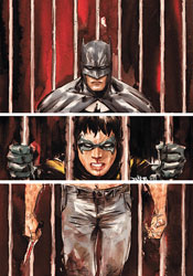
Given that this is a Grant Morrison-written series, that last statement is no certainty, with Batman and Robin #8 proving to be a perfect case in point. The front cover teases a Batman vs. Batman throw-down, with Bruce reanimated by a Lazarus Pit and Dick spoiling for the fight of his life, and with a few caveats the interior delivers. Thing is, that's not Bruce. Not exactly, anyway, but it also isn't a doppelganger.

This is a tricky plot, with a lot of close calls and moments of pause, but at the end of the day Morrison's narrative is able to pull off some tricky stunts while avoiding any major calamities. His explanation for the misleading premise actually makes a fair amount of sense, and at the same time answers a few nagging questions left over from several of the Bat's previous activities. Doting followers of the extended Wayne family will enjoy a few "Aha!" moments, while those with an expectation for self-contained yarns will more than likely see the issue's explanations as something of a cop-out. In many ways, your enjoyment of B&R #8 will depend entirely on the breadth of knowledge you carry into it.

Of course, Morrison has his problems. In particular, I've had enough of the cutesy-speaking, theme-garbed villains that have hung around this series since its start. This month's dialog, however fleeting it may actually be, is also a shortfall. The writer is so dedicated to reminding his audience that the issue takes place in England that several of its supporting characters sound like walking, talking stereotypes.

I'm not entirely sure what to make of Cameron Stewart's artwork. He's clearly the best compliment Morrison has enjoyed since Frank Quitely left the series, which I realize isn't saying much since I didn't care at all for Philip Tan's work, but he has a few hang-ups that I've struggled to move past. His very bold, composition-centered illustrations hug the fine line between stylization and oversimplification. Everything and everyone feels extremely thick and round, with the approach working better in some situations than in others. Stewart's work in the Batman vs. Batman fight scene is panicked, crazy and chaotic, which is both a positive and a negative. I'm sure the confusion was probably what Morrison was shooting for, with readers left uncertain about which brawler was the good guy, but it also slows the action way down in what should've been a very fast-paced, competitive fight.

After taking a moment's pause in the preceding arc, Batman and Robin appears to be back on the right track with its latest turn. While this issue is much more straightforward and less eccentric than the title's first few issues, the actual storytelling has more gravity and depth to it. Cameron Stewart won't benefit from any comparisons to Frank Quitely, but he's enough to get the job done and even turns in a few panels that had me wondering if he might some day begin to rival his better-known predecessor. There's some hope for this series yet. Borrow it.

On a scale of 1 to 10, where 1 is poor and 10 is amazing...
Overall Score: 6.5

Booster Gold #29

The first thing you're going to notice about this series is that it looks like something that should've been published eighteen years ago. The writing, the artwork, even the cast, has been ripped directly from the pages of DC's early '90s Death of Superman / Rise of the Supermen storyline. The style hasn't aged particularly well, but I guess it's been MIA for long enough to be considered retro, and lord knows why, but that's a trend that always seems to be in vogue with our culture. We just can't get enough of looking, acting and speaking like the past, and Booster Gold #29 is the comic book equivalent of that trend.

Of course, the nostalgia factor is a heavy trip for anyone who was reading back then, but the memories aren't always happy ones. The medium has evolved significantly since Dan Jurgens was in his prime, and though his Death of Superman was in some ways the grandfather of the more mature, intelligent slant the industry (and DC in particular) has adopted since then, it's also just as much a product of the sensationalist, prospector-friendly era that nearly killed the market for good. It's a dash of the good, a pinch of the bad as far as these memories go.

Thing is, upon closer inspection the throwback theme is more than just a cheap gimmick. In his latest role, Booster Gold has taken on the title of history's defender, a job description that sees him more often than not protecting a character he absolutely despises. This issue is a perfect example: shot back in time to the days when the Cyborg Superman was not only free, but genuinely considered as a replacement for the real thing, Booster has to ensure the maniac follows through on his terrifying destruction of Coast City. It's an odd thing for a hero to be working behind the scenes to see genocide through to its conclusion, but Booster's boss – and his conscience – have ensured him that the greater good of the ramifications from that moment outweigh the sacrifices made by its victims.

Adding to the ordeal is the presence of another traveler, Sondra Crain, who moves through time with the more noble, perhaps naïve, goal of averting the crisis altogether. Jurgens doesn't expressly endorse one point of view over the other, but he also doesn't explore the conundrum quite as thoroughly as he probably should have. Subtlety and nuance are not two of Jurgens's stronger suits, and his stiff, straightforward storytelling style (say that ten times fast) often works to the book's detriment.

Booster Gold, in its present form, is as hot and cold as they come. Under the surface, the concept of adding depth and perspective to several of the publisher's most memorable stories is wonderful. The choice of Dan Jurgens as writer / artist works well to set the tone of the era and immediately send more familiar readers on a quick trip down the aisles of their memory banks. Problem is, his writing can't keep pace with the high concepts and his artwork never delivers the wink or nod to the present that could tie the whole bag together. An early '90s style would've been perfectly appropriate in cases when the story was set in that period, but it's totally out of place when the scene changes to the modern day or the future. It's a fine idea that I could've really got behind, but in its current iteration I can't say it's working. Flip through it for the nostalgia, but leave it on the shelves near the back issues it's repurposing.

On a scale of 1 to 10, where 1 is poor and 10 is amazing...
Overall Score: 3.5

Monday, February 15, 2010

Demo #1

It's the second coming of Demo, with Brian Wood and Becky Cloonan's well-received original series of self-contained stories finding new life with a new publisher. Originally sent to press by AiT / Planet Lar, the Eisner nominee's publishing rights have recently reverted to its creators, who promptly chose DC's Vertigo imprint as their new home. Now, alongside a bells-and-whistles collection of the original series, the pair is back to launch the book's second run.

For the uninitiated, Demo is a series that primarily concerns itself with single issue storylines, following the lifestyles and interpersonal relations of a broad range of characters. It's part slice-of-life and part sharp introspection. If the primary character in your first issue doesn't strike a chord, there's a good chance the centerpiece of the next edition will. Brian Wood had originally planned to tie the whole series together by granting each figure a special ability – ok, super power – but as the series wore on and Wood's interests changed shape, that direction was cast away.

This month, that lead is faced with a different sort of crisis. Joan, a thirty-something office worker in San Francisco, hasn't slept in over a week. She's not coming to grips with her sudden ability to fly or lift a car above her head, but rather keeping her distance from a recurring nightmare that's intruded her waking life. Everywhere she goes there's a vivid reminder of something lifted directly from her nightmare, some more specific than others. Wood's storytelling fully embraces the blurred, hazy line between dream and daylight, shifting our perspective with every page until we're never sure if Joan is seeing something real or imagined. The sense of vertigo, for lack of a better word, is extremely effective, and by the end of the issue I felt like I was badly in need of a nap myself.

Of course, that fantastic element of Wood's storytelling would have probably gone unnoticed without an equally dedicated investment from his artist. Becky Cloonan, fortunately enough, proves more than up to the challenge. Her work, presented in stark black and white, steals your attention without demanding it. The lack of color lends a touch of indie credibility, but it also forces her to do more with less and she proves perfectly adept. She quickly establishes two slight variations of her style, one for when we're dreaming and another for when we're awake, and then almost immediately starts to blend the two together. Its effect in furthering the allusions Wood makes in the story is unmistakable.

Demo was a nice surprise. Its slow, casual pace may be a bit too off-the-beaten-path for some, but the earnest storytelling and razor-sharp artwork will make it difficult for anyone to turn away. There's actually very little in terms of actual plot in this issue, but Wood's focus on the details and the constantly shifting focus between dream and reality gives it more than enough substance to last the entire length of the issue. The new Demo is a very quick read, but it delivers more depth than many others can manage with thirty pages packed to the breaking point with dialog. Buy it.

On a scale of 1 to 10, where 1 is poor and 10 is amazing...
Overall Score: 8.5

Siege #2

The Bendis saga continues over at Marvel, where the author's latest focus-shifting mega-event to change the shape of the face of the Earth, dubbed Siege, is underway. As was the case with Dark Reign, Secret Invasion and Civil War before it, the seeds for this crossover have been germinating for years, with roots planted in every one of Marvel's biggest ongoing titles. Long story short: Norman Osborn is changing the system from the inside and Thor posed a threat to his authority, so Normy invented an excuse to invade Asgard. Backed by his team of Dark Avengers and the full might of HAMMER, he was successful in the sudden offensive, but that bravado may just prove to be the straw that broke the camel's back.

Osborn's recent public rise from villain to reformed up-and-comer to savior to corrupted power has been one of Marvel's best character pieces. Looking back, it's easy to see how telegraphed the man's breakneck rise to power really was, but the brilliance of his story was how off-guard it caught us at the time. No one could have predicted how long Osborn's reign would last, but we all knew it would eventually come to a spectacular end. Now that we've reached that point, the real story isn't so much his fall itself, but how the heroes intend to work around the might, both in terms of manpower and P.R., that he's accumulated while in charge.

Of course, most of those intriguing aspects of this storyline are hidden away between the panels. In the foreground, Bendis caters more regularly to the popcorn-munchers in the audience. Set in the middle of a war zone, it should come as no surprise that the bulk of this issue concentrates on a lengthy fight scene, particularly the sudden skirmish between Ares, who feels betrayed by Osborn, and the Sentry, who's drunk on the Goblin's Kool-Aid. The fight scenes get plenty of room to breathe without the constant word balloons that had become Bendis's trademark, and quickly assume a surprisingly dark tone. These aren't the playful, jab-swapping fisticuffs that constitute most superheroic battles: it's a straight-up war. Nowhere is that hard line approach more evident than in the breath-stealing conclusion to the Sentry and Ares's heavyweight free-for-all. I'm amazed Marvel let it see print, frankly. It's a shocking, major moment that could really change the way the publisher is seen by its readers.

I've loved Olivier Coipel's artwork in the past, and when he stays on task this month it's every bit as good as I remembered during his runs with Thor, House of M and Avengers. On several occasions, though, Coipel gets carried away with a very loose, complicated paneling style that stands in the way of easy legibility. I'm all for experimentation, especially when we're challenging a set of guidelines and limitations that could stand a breath of fresh air, but when I have to go back and read over a page three or four times to figure out the order it's supposed to be read in, something just isn't working. Coipel's artwork is as magnificent as ever, especially when he gets the chance to pull the camera back from the action and accent the magnitude of the battle from a distance, but he's handicapped himself with this failed storytelling experiment.

Like the previous publisher-spanning sagas I referenced in my introduction, the gears are churning and the plot points are clicking for the opening chapters of Siege. Bendis is a master at building anticipation toward a huge moment that's always dangling just out of reach. Where he's fallen short in the past, and where the success of his latest epic will be decided, is in the follow-through. I've been down this road before, I've bought into his promises, I've been legitimately thrilled at the prospect of what was on the horizon. And I've been disappointed. This time I'm holding my breath and waiting to see how it all plays out. Despite a few trips and slips from Olivier Coipel, it's a story of so far, so good. Borrow it.

On a scale of 1 to 10, where 1 is poor and 10 is amazing...
Overall Score: 7

Tuesday, February 9, 2010

Green Lantern #50

Let's just say this: if you don't like a lot of moving cogs in your storytelling, stay far, far away from Green Lantern #50. If you haven't been keeping up with Blackest Night, the same guideline should apply. Don't have an intimate knowledge of the ins and outs of the variously colored power rings that populate the DC Universe? You guessed it; steer clear. However, if you're a hardcore devotee, an active follower of the latest, greatest world-spanning crossover or just an interested observer with more than a casual understanding of what makes a lantern tick, this issue should be sheer ecstasy.

Geoff Johns has been building to this moment since before the book's relaunch, planting many of the seeds five years ago in the pages of Green Lantern: Rebirth. That makes for an incredibly rewarding climax for devoted followers, a payoff for years' worth of dedication that doesn't leave much room for complaint. The issue is complex because it's thorough, and while that may make for a few chaotic, crowded panels – okay, more than a few – they can be at least partially justified by the sheer magnitude of parallel storylines Johns is progressing. The author truly leaves no stone unturned, at once climaxing the individual stories he'd been telling in Hal Jordan's solo series and the mega-threads that had been raging through the pages of the crossover-dedicated Blackest Night.

Johns does stray on a few occasions from the traditional DC archetype into something that's more popcorn-greased, however, especially in a few of the more striking spreads during the raging battle between Black Lanterns and the combined forces of the opposition. Personally, I welcomed the change of perspective as I generally find the publisher's stories often lack precisely that sort of panache. More invested purists may not find the not-so-subtle shit in tone to be as welcome as I did, though.

Doug Mahnke and an entire platoon of inkers tackle the artwork, which is every bit as good as Johns's writing. I don't always enjoy the DC visual style, with its more character-focused, down-to-earth technique and concentration on storytelling over splash pages or exaggerated postures. Following the writer's lead, however, Mahnke has also infused the issue's visuals with a bit more flair than I'm expected. Effectively bridging the gap between two very different styles, he's managed to spin a visual tale that's overwhelmingly descriptive, brightly narrative but also excitingly framed and beautifully composed. Mahnke has obviously busted his ass on this issue, and the end result is worth every bit of the effort he's sunk into it.

This isn't the greatest issue ever published. Sorry to mislead you if I gave that impression in my lengthy preamble. What it is, though, is a damn fine anniversary issue that also, miraculously, serves as fitting pinnacle to a major supplemental series. Not many can even manage the former with any degree of success, let alone the latter. Geoff Johns hands in one of his finest plots this month, and though his dialog has some real eyeball-rolling moments, that's not enough to stop the issue from being a major success. Paired with a spectacular artistic showing from Doug Mahnke, he's come up with a real beauty. Buy it.

On a scale of 1 to 10, where 1 is poor and 10 is amazing...
Overall Score: 9

Supergirl #49

Since returning to modern continuity, Supergirl hasn't exactly made a lot of non-costumed friends. In fact, she could count on two fingers the number of close acquaintances she knows who don't don a cape, cowl or other spandex-wrapped wardrobe once the sun drops below the horizon. As fate would have it, both are in need of her aid this month – one faced with the onslaught of a crazed Silver Banshee, and the other facing something... darker.

This month's fill-in as artist, Matt Camp, hands in an oddly inconsistent showing. At his best, Camp's style is beautiful in its simplicity. When Lana Lang collapses in a pool of her own blood early in the issue, Camp's stark, matter-of-fact depiction is staggering. I was every bit as shocked and terrified as the doorman who finds her there, struggling for life on the floor. On the very next page, however, it's like the artwork has been handed over to a completely different contributor. Camp's two-page treatment of the scream-off between a possessed Supergirl and the Silver Banshee looks like an afterthought, something that was rushed out the door in no time flat. All of the intricacies that had made the previous page's layout so striking have suddenly gone missing. The double-sized impact shot pales in comparison to the more conservative single page, four panel masterpiece.

That duality carries throughout the whole issue. Some pages, it seems like Camp couldn't care less. Others, he makes an argument for himself as one of the publisher's brightest emerging artists. His struggles are both complimented and compounded by the work of Nei Ruffino, his colorist. In certain instances, Ruffino's heavy influence emboldens the artwork – the scene featuring Lana being a perfect example. It's rich and vibrant, but not in a way that steals any of the spotlight from the panel's composition. In others, an unrelenting flood of excess color overwhelms the cleanliness of the page. Neither artist nor colorist really seems to know precisely what they're doing at any given moment, which makes Supergirl's artwork a real hit-or-miss proposition.

Sterling Gates does his best to write the issue as a character piece, especially after the battle with the Banshee is behind him, but I never found myself personally invested. While the issue's cover gives the impression that the story would be extremely heavy and emotionally draining, its interiors never get close to that target. Lana "dies," – which I'll place in quotes because, let's be honest, that word doesn't mean what it used to – and Supergirl's reaction seems much more like a non-reaction. She's barely let the moment sink in before she's asking questions about her friend's bloodstream and grimly planning to see the body. This doesn't come off as a part of the mourning process, or even something emotional. It just seems like a character trying to turn the page and get on with the next scene so they don't have to force out any crocodile tears. Gates's story climaxes on page three and then goes on vacation.

There's really no reason to read this issue beyond those first three pages. They're the strongest of the book, misleading its audience into believing the rest of the issue can keep it up when, in fact, nothing could be further from the truth. It's a breakneck kick start followed by a slow coast down the rest of the highway. Flip through it and try not to let anybody see you put it back on the shelf when you're finished.

On a scale of 1 to 10, where 1 is poor and 10 is amazing...
Overall Score: 3

Monday, February 1, 2010

Batman: Streets of Gotham #8

Amidst the constant super powered distractions, the death of Bruce Wayne, the hunt for his allegedly reanimated corpse and the revival of most of the DC Universe's dead heroes and villains in Blackest Night, it seems like ages since we were reminded that Batman is, first and foremost, a detective. That's a blemish DC aims to zap away with Batman: Streets of Gotham, a moody return to form for the caped crusader that concentrates more on the human element of crime in Gotham City and less on the garishly-garbed creatures who inhabit Arkham Asylum.

Stepping in temporarily for Paul Dini, writer Mike Benson brings a surprisingly firm grip to this series. Benson seems to know what makes Batman tick in a classical sense more than a large percentage of the hero's regular creative team. After years of elevated activities amongst the heroic elite, it's surprisingly relaxing to see Bats slumming it in the alleyways, conversing with his pedestrian sources and trying to get to the bottom of the mystery surrounding a nameless, faceless vigilante killer. Fortunately enough, that's where Benson does his best work.

The real focal point of this issue is in the dialog Batman shares, both with Commissioner Gordon and with the stream of seedy informants outside bars and strip clubs in the unfriendly corridors that line his city's limits. Benson doesn't dance around the issue: he gets Batman in and out efficiently, but doesn't sacrifice a few shreds of character development or personal insight along the way. Dick's little chats get right to the point without feeling overly concise or bland, and remind us on more than one occasion that there's a different guy under the cowl than we've seen for all these years. He's still doing an impersonation, and while the layman probably wouldn't know the difference, the character's more dedicated readers should be able to see Benson's little nods and nudges for what they are.

Dustin Nguyen's thickly shadowed, jagged-edged artwork gives Streets of Gotham an immediate identity. Throwing back to an era when noir was more a way of life, Nguyen's work is rich in character and long on atmosphere, a tight fit for the more civilian nature of the story. Like many detective films from the '40s and '50s, Nguyen deals in sharp contrast first and foremost, often leaving very little gray area in his compositions. In this instance, it works for him grandly. Not all characters would benefit from the attention of such a harsh light, but Batman absolutely thrives on it. The majority of his visual history demands a firm understanding of the importance of shadow, and in this area Nguyen is a modern master with an assist from John Kalisz's efficient, muted color palette. On one or two instances, Kalisz exhales and turns in a brightly colored page, which only serves to highlight just how critical the desaturated tones he brings to the rest of the issue really are. The artwork just doesn't look right alongside the energy that accompanies a full spectrum.

I'll be frank: this two-issue mini arc probably isn't going to be of much consequence in the long run. It's just Batman returning to the roots of his identity, doing what he does best in the shadows without throwing any punches unless they're absolutely necessary. Next to the search for Bruce Wayne or the identity of the domino mastermind, this may not seem like much, but it's absolutely necessary. Every single arc can't be an epic, and to tell you the truth I'm generally much happier with those that aren't. Streets of Gotham doesn't aspire to be more than it is, and that allows it to really hunker down and deliver a damn fine detective yarn. Borrow it and enjoy.

On a scale of 1 to 10, where 1 is poor and 10 is amazing...
Overall Score: 8

Incredible Hulk #606

In case you haven't noticed, there seem to be an awful lot of Hulks running around the Marvel U lately. Between Red versions of the regular Hulk and the She-Hulk, the barbaric son of the Hulk, Skaar, good old regular She-Hulk and The Leader, the local population of rage-induced goliaths seems to be at an all-time high. Of course, the one guy who doesn't turn into a green monstrosity when he's angry, oddly enough, is Bruce Banner. Instead, Banner's been teaching Skaar the nuances of heroism and aligning with the mysterious Red Hulk in his quest to halt the advances of The Leader. Because, really, if there's one thing gamma-infused giants aren't known for, it's their levelheaded rationality.

If that quick-glimpse peek at the status quo sounds confusing, you have no idea. Greg Pak's story has about a dozen plates spinning on its fingertips at any given moment, and this month we're compulsively checking in on the status of each one of them from start to finish. Reading this issue is like taking a peek into the imagination of a child with severe ADD. Within the first six pages, my head was spinning. When the constant leaps between locales hadn't let up two-dozen pages later, I think I was just about ready for some tranquilizers. While some of this can be blamed on my jumping in on the midst of a large-scale storyline with the requisite “epic ramifications you will never forget,” a greater part of it can be blamed on bad storytelling. Pak glosses over important details, like how certain characters make their way across the globe in the blink of an eye, and loses himself instead in the hyperbolic diss-off between Banner and Dr. Doom in the middle of a fight scene. It's scatterbrained at best, and not even compellingly so.

I had an equally hard time keeping up with Paul Pelletier's neurotically intricate artwork. Pelletier's layouts are strong enough, moving the story efficiently and legibly, but he rarely takes any risks or stretches a situation into something larger than life. Instead, he obsessively decorates almost every square inch of the page with linework, a mindset that's only amplified by Frank D'Armata's intrusive, constantly gleaming colors.

If the artwork was too busy to begin with, the colors only serve to magnify that problem. Every little wrinkle or dancing shadow is reinforced to the Nth degree, with even the most innocuous scenery rendered with painstaking precision and depth. I can't fault D'Armata for his skill level – the guy knows his way around the digital spectrum – but his sense of restraint needs a lot of development. Sometimes it's OK for a background character to just be a background character. If everyone's treated with the same amount of heavy depth and detail, the front of the page can get crowded in a hurry, to the detriment of the issue's legibility.

Strange as it may sound, returning Incredible Hulk to its original owner may have been the worst thing Marvel could have done. They'd taken an incredible (har har) risk in handing the series over to Hercules following World War Hulk, but Pak and Fred Van Lente have actually pulled an upset and made the replacements more intriguing than the original occupants. Now back in the hands of the green goliath, the series feels dated and unnecessary. It's missing the sharp, self-satirizing edge Hercules still carries in his own ongoing series and has, instead, become precisely the kind of story that Herc's series continues to lampoon. I didn't like this one bit. Skip it.

On a scale of 1 to 10, where 1 is poor and 10 is amazing...
Overall Score: 1.5