Tuesday, July 22, 2008

Thunderbolts #122

It was bound to happen. When Tony Stark was assembling the new Thunderbolts, a team of reformed super-villains dedicated to capturing and detaining unregistered super-humans, he had to know that they'd eventually have a relapse or two. Well, last month that came to pass. Songbird went after the team's psychologist, Doc Samson. Norman Osborn donned a green mask and threw down with his own team. Bullseye cleared the prison of a handful of telepaths who'd been pushing his buttons since their arrival. And then… it all boiled over. Now the entire team is licking their wounds and harboring a grudge against one another. Not exactly what I'd call a stable working environment.

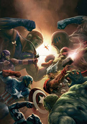
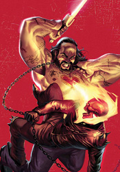
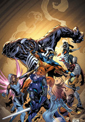
The team's first action since their little disagreement provides a good starting point for new readers. With Songbird settling into her new post as team leader, she takes the opportunity to loudly proclaim each team member's motivations and specific powers in the midst of the fray. It's not exactly the subtlest way to get new readers up to speed, but it gets the job done without holding the story back and gives each member a moment in the sun. The Thunderbolts' quarry this month, a giant, sentient mass of killer bees named Swarm, provides little more than window dressing as the team takes turns throwing weapons at him in a virtual merry-go-round of ineffective superpowers. It's only once the story has defined its players and their powers that the threat is squashed, almost effortlessly, and forgotten. Although the focus is clearly on familiarizing new readers with the cast, even from that perspective it's difficult to ignore the cliché.

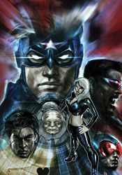
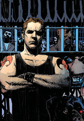
Although he's relinquished a bit of authority after last month's romp, Norman Osborn is still the heart and soul of this team, and the only character with an even remotely interesting personality. Without his cutthroat decision-making and volatile, harshly honest personality, the series would be lukewarm at best. Writer Christos N. Gage seems to acknowledge this, as he gives Osborn the focus on almost every single page this month. While that approach is working on the short-term, at some point its time is going to run short. The real money in this story is in the team finally rebelling against the controlling former Green Goblin, and unless the rest of the team develops strong personalities of their own by that point, the book will flounder almost immediately. Osborn really is the only thing keeping this legible.

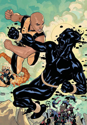
Fernando Blanco's artwork begins strong, but slowly deteriorates as the issue carries on. He shows a distinctive style, effectively spotlighting the contrast between the calm, businesslike demeanor of Norman Osborn and the more flamboyant, outlandish personalities of his underlings in the heat of the moment. However, Blanco has a recurring problem with depth and perspective, which is especially pronounced when he's tasked with rendering the lumpy, disproportionate Venom. His compositions are generally solid and he brings a certain degree of enthusiasm to the fight scene at the story's outset, though his work isn't especially exciting. Slower, story-driven moments give him trouble, but those are infrequent this month and as such aren't a very big deal.

The cliffhanger at the end of this month's issue is probably its sole redeeming moment. As such, I'm hopeful that the series will take a step back up next month, because this issue was one big, long letdown. It's not something I'd go out of my way for, but it's not offensive, either... worth flipping through at best.

On a scale of 1 to 10, where 1 is poor and 10 is amazing...
Overall Score: 3

New Avengers #43

With the Skrull invasion at its climax, both New Avengers and Mighty Avengers had ceased their ongoing narrative to focus on the events that led so many of their friends and partners to be replaced by the shape-shifters. This month, our attention returns to the present. Picking up where Secret Invasion #2 left off, both squads of Avengers have faced off against… themselves. When a Skrull ship crash-landed in the Savage Land, members of both teams expected a confrontation with the real enemy. But when mirror images of themselves emerged from the ship, wearing wardrobe from twenty years prior and proclaiming themselves liberated from a long captivity in outer space, nobody was quite sure how to react. I guess that means it's time for a brawl!

With just about every other member's stories fully explored, we've finally come back to what has to be the most compelling confrontation of the conflict: the Skrull Captain America vs. Spider-Man, Ka-Zar and half of the Savage Land's resident population. Writer Brian Michael Bendis presents this as an appropriate conflict of interests for the “real” heroes, playing up Spidey's emotional attachment to Cap and emphasizing just how hard it must be to throw down with the man he'd just buried, mourned and left behind. Spider-Man provides the readers' perspective in this issue. His reluctance to commit wholeheartedly to the fight is understandable: he wants to believe more than anything that this is the real Steve Rogers, that the one who was murdered in the wake of Civil War was the imposter, but deep down inside he knows that the chances of that fall somewhere between slim and none.

Around its midway point, the story changes gears to cover even more of the imposter Skrulls' backstage planning sessions. It's at that point that the issue takes a turn for the worse, from which it never recovers. As a reader of both regular Avengers books and the primary Secret Invasion mini-series, I've already seen enough back-story. I understand that the aliens drape some sort of mystical cloth over their heads and suddenly believe without hesitation that they're human, specifically a member of the superhero community. I must've seen it half a dozen times already, but Bendis insists we trudge through it yet again right here. It's something that I don't think the issue needed, but it's there all the same, and it eats up the majority of the issue. Which is a shame, because it started off on such a strong foot.

I didn't particularly care for Billy Tan's artwork this issue. While much of his work this month is focused on an emotional, explosive conflict, his artwork never reflected the excitement of those moments. It felt like he was merely documenting the moment, not collaborating with the writing to take the whole package to the next level. When the foreign Cap flings Ka-Zar over his shoulder and into a crowd, Tan treats it so nonchalantly that it nearly lost my attention. Where I'm prone to enjoying a good action page much longer than I should, enjoying the intricacies of each pose, freeze frame and moment of impact, Tan's work led me to have precisely the opposite reaction. I rushed to the end of the fight scene, which left me feeling somewhat robbed. If this is Marvel's premiere book, they need to routinely feature premiere talent. And, despite a good page or two here and there, Tan just isn't on the right level for this kind of work.

This month's New Avengers provides little more than a footnote in the big picture of the Skrull invasion. It answers your questions about the Captain America that crash-landed in the jungle during Secret Invasion #2, but that turns out to be short on substance and the rest of the issue offers little else. Flip through this to get the jist of it, but stop short of bringing it home with you. It's not a high water point.

On a scale of 1 to 10, where 1 is poor and 10 is amazing...
Overall Score: 3.5

Marvel Comics Presents #11

I found the original Marvel Comics Presents to be wildly inconsistent, and that's putting it mildly. While most of what you'd find between the covers was badly written, hideously illustrated leftovers that focused on a character or squad that you've never heard of, there was always that glimmering chance of a diamond in the rough. Joe Madureira made his big-league debut in an old issue of MCP, Barry Windsor-Smith delivered an almost legendary arc with Wolverine and Sam Kieth enjoyed a high-profile run on the book that brought him out of the shadows and into the spotlight. This new take on the series continues in that vein – it throws so much at the wall that something is bound to stick, but you've got some trials ahead if you hope to unearth any buried treasure.

Marc Guggenheim and Francis Tsai's Vanguard is a good example of a fine concept that doesn't work within the format. By all indications, their story would've made for a good one-shot. Its cast is about as deep as possible, considering the length of its appearance, and the plot moves along briskly. So much so, in fact, that when its nine pages had passed me by, I was left with the impression that I'd missed something. This is an easy, visually impressive read that feels like it should have a bit more meat than it does. While it takes full advantage of one of the benefits of a lesser-known set of characters, switching allegiances and terminating faces at almost every turn, in the end I was left feeling empty.

With Ivan Brandon and Niko Henrighon at the helm, Machine Man has taken a playful new direction. Henrighon's light, manga-influenced artwork sets the tone early, and Brandon's odd concepts and offbeat pacing carry it the rest of the way. Yet I had a feeling that a lot of the time the story was just being weird for weirdness' sake, and while that makes for a nice change of pace, it isn't particularly easy to follow. When the storytelling and artwork manage to pull their act together for one beautiful two-page spread in the middle of the story, this creative pairing shows a lot of potential. It's the rest of the book, when the writing leaps and lurches around the page and the visuals show their inconsistency, which concerns me.

B. Claymore and Lee Weeks are up next, to introduce us to former Avenger and full-time oceanographer Stingray. More than any other, this single-issue tale is a great example of what can be done with a short page count and a simple idea. The former Avenger's run-in with an undersea monster is just long enough to feel substantial, but short enough to maximize what it's got without any padding. I'd been a critic of Weeks's artwork for years, but recently his style has matured, and this tale is just more proof of that fact. He displays a knack for fantastic action scenes, shows a touch of grotesque creativity in imagining the story's grotesque villain, and echoes the story's pacing with his compositions. This is the best work of the issue… it doesn't ask for more than five minutes of your day, and crams more into that confined space than many titles can manage in a three-issue arc.

Finally, Rich Koslowski and Marco Checchetto bring us the next-to-last chapter of Weapon Omega, which concerns itself with the Guardian, leader of Omega Flight. It's bad. Koslowski's writing is so verbose and stale; I was lost within just two pages. As the “great reveal” chapter, part eleven of twelve, the dialog just doesn't quit – this is basically one long, breathless narrative from a brainy female scientist and little else. Checchetto's artwork is given two or three opportunities to steal the show, but is largely relegated to talking heads. He doesn't exactly shine under the circumstances.

The more things change, the more they stay the same – and that's especially true for Marvel Comics Presents. Although it's been more than a decade since the first series was discontinued, the new run is virtually identical. It's still got those long, over-reaching 12-part storylines that can't hope to hold your attention in such short bursts. It's got its successes, few and far between, and its failures, more frequent than you'd imagine. This is really one good story, two mediocre ones and a single wretched failure. I can't recommend you do more than flip through it, and even in saying that I feel like I'm being generous.

On a scale of 1 to 10, where 1 is poor and 10 is amazing...
Overall Score: 3

Monday, July 14, 2008

UW1: Universal War One #1

In the distant future, the human population has spilled over to coat our entire solar system. Civilization has split between the warm core planets and the more remote, desolate outlying planets and, surprise surprise, the human race still hasn't figured out how to peacefully coexist. But in the midst of a bitter civil war between entire planets, something unexpected happened… a thick black wall suddenly materialized, dividing the warring factions and their shared solar system in two. Absorbing all light and matter, humanity's only chance to learn more about this invading, unfamiliar object lies in the hands of the Purgatory Squadron. The nearest ship to the wall at the time of its appearance, the Purgatory just so happens to be a collection of lowlifes and criminals, granted a second chance at life by serving onboard. Not exactly the kind of people you'd want entrust with the future of mankind.

Denis Bajram plays all roles in Universal War One: writer, penciler, inker, colorist… I'd imagine he'd be handling the lettering too, if he'd originally written the series in English. As a writer, he's deeply concerned with the details and intricacies of his story, and as an artist he's pretty much the same.

His storytelling is extremely wordy, but I can't say I didn't expect that coming in. Truly, that seems to be one of the staples of celestial Sci-Fi: overload them with details, so they'll believe you know what you're talking about. In this case, the trick works. The crew of one of his ships could be debating the rate of temperature increase in one of their onboard breakfast pastries for all I know, but because they speak about it with such conviction and eventually translate it to plain English, it lends them a certain degree of authority. I'm not a big fan of the sheer volume of text in this book, especially since each and every panel is treated to a minimum of twenty words, but that's clearly one of the writer's passions and it's not all stale and boring, so I can live with it.

The scope of Bajram's story is probably Universal War One's greatest strength. For the magnitude of an all-out military action between planets to be truly comprehended, it needs to be treated as a relatively big deal. This author covers almost every aspect of such a battle, from the lowly field sergeant who disregards an order to slaughter civilians to the highest-ranked colonel, strategizing from the war room. It didn't take long for me to buy into the authenticity of this story, and once you've taken that plunge you're basically hooked for the duration. It's slow moving, but the author knows how to use that pace to his advantage when the time is right.

Bajram's artwork is intricate and detailed, heavily researched and meticulously planned. He's clearly taken his time developing this series, and the depth of his investigation shows in the consistency of his illustrations. He's envisioned a fleet of spaceships, detailed so rigorously that it's almost as though he's drawn them from life. His vision of civilization on the crust of an inhospitable land is believably desolate.

This isn't a romantic prophecy, and that means it's something I can actually wrap my mind around. If humanity were indeed hurriedly populating the surface of Neptune, I'd imagine the first priority would be on sustainability and not aesthetics. Which doesn't speak well for the dynamism or excitement of Bajram's artwork, I know. To be frank, his work isn't particularly explosive, but it's not a problem because the story doesn't call for that. What he brings is an almost military precision: scenery that looks as though it were actually seen through the windshield of a space-faring craft, equipment that was built to serve a purpose, not to look pretty, and a cast that looks like normal, everyday people. While it's not a take that readers of Marvel's mainstream superheroics will probably enjoy, fans of good Sci-Fi cinematics will welcome it with open arms.

That last line pretty much sums this book up. If you're out for a wild, guns-blazing romp through the cosmos, keep looking. This book isn't for you. However, if you're in the market for a smart, detailed science fiction epic, this might be right up your alley. Fans of Isaac Asimov, Arthur C. Clarke or Philip K. Dick will find plenty to keep them entertained, and while it does have touches of Hollywood and the slow pace ultimately hurts, it's far from crippling. Borrow this and see if it's your cup of tea. It's going to be a long one, but something tells me it'll be worth the trip.

On a scale of 1 to 10, where 1 is poor and 10 is amazing...
Overall Score: 7.5

Pilot Season: Urban Myths #1

A detective tale in the same vein as Icon Comics' Powers, Top Cow's Urban Myths sets its roots firmly in the realm of fantasy. Rather than Brian Michael Bendis's city of superheroics, Myths populates its streets with every variety of mythical creature imaginable. A Centaur policeman races through the alleyway in pursuit of a terrified suspect, while a Minotaur toils in nearby traffic. The story's lead, Jack Kaklamanis, just so happens to be the private-eye son of Medusa. His steel mask a precaution against the curse of his inheritance, (remember what happened when his momma stared into that mirror?) he doesn't object to removing it when a situation warrants swift action.

Jorge Molina's artwork flat-out steals this show. It's absolutely fantastic, like watching a top-notch animated film in a printed format. His work has the simplicity of Bruce Timm, the depth and detail of Joe Madureira and the rich, moody palette of Dreamwave Productions. His noir-inspired dark, dilapidated city fills the issue's backgrounds with substance and character, but only enhances the occupants of the foreground and never interrupts the story's flow. I must've spent fifteen minutes simply absorbing and admiring the intricacies of these first six pages.

Molina's character designs overflow with authenticity and personality. Their roots set in the real world, the denizens of Urban Myths stomp around in everyday attire, offset by little touches of individuality. A steel mask here, a single glaring eye there – the absurdity of each character's nature is granted a certain amount of believability when paired with the real-world roots of the remainder of their wardrobe. When he's illustrating a pair of hillbilly Cyclopes, they look, move and act like you'd imagine redneck one-eyes actually would. Bulky and top heavy, they lumber awkwardly across the page. Their buckteeth and permanent slouches only enhance the nature of their personalities.

Fortunately, writer Jay Faerber gives the artwork all the room it needs to shine. Heavy on concept but not necessarily on words, Faerber's writing delivers imaginative ideas without an excess of narration, which leaves his artist plenty of room to play around in the panels. While this issue's underlying storyline is fairly straightforward and rudimentary, the real focus is on introducing readers to this fantastic new world and cluing them in on the possibilities contained therein. I'm not sure that detective stories are Faerber's forte, but set against this kind of a backdrop I'd read just about anything competent. He fills the reader's head with deep, visually surprising characters at every turn, which keeps the theme alive and the story truckin'. Jack's detective work gives him a rare glimpse at all of the city's highs and many of its lows, and as such provides an excellent perspective.

Urban Myths is the kind of book that lives or dies based on the reader's willingness to surrender their preconceived notions, the writer's ability to convince them to do so and the artist's talent to deliver on its big ideas. It connects big time on all fronts. It's a fantastic journey, and hopefully it's just the first of many to come. I'm signing on for the whole series if it ever gets off the ground, and with any luck I won't be alone. Buy it. Vote for it. Make it a success. Great collaborations like this one don't come around that often.

On a scale of 1 to 10, where 1 is poor and 10 is amazing...
Overall Score: 9.5

Ghost Rider #25

Everything we were taught in Sunday school is wrong. The bad guys take their orders from Heaven, the good guys are trapped somewhere further south, and the guy with the flaming skull for a head is actually the property of God almighty. Naturally, these recent revelations have left Johnny Blaze, current bearer of the Ghost Rider mantle, a little confused. Well, maybe confused isn't the right word for it. Angry? Hungry for answers and racing for revenge? Either way, Blaze is sincerely ticked off and anxious to share a piece of his mind with the big dude upstairs. Only problem is, he doesn't know where to begin.

This month, fresh off a visit to the nearby hospital, the Rider makes his way to a maximum-security prison deep in heart of the Lone Star State. And naturally, just like the infirmary before it, the jail is positively overflowing with angels, demons and religious fanatics. Writer Jason Aaron doesn't shortchange his readers on characters, that's for sure – the prison is bursting at the seams with tattooed miscreants, each one all too willing to share his own lengthy religious-themed backstory. But don't mistake that for depth. Despite their wordy elaborations, not one of the prisoners really clicks, stands out from the pack or establishes themselves as anything more than a bag of hot air.

The first dozen pages in particular are excruciatingly slow to read, weighted down with far too much dialog for their own good. Aaron wastes our time with the life stories of characters who don't even make it out of the scene alive, let alone the issue, which makes the whole mess even more unforgivable. Why spend three pages of incessant character development if your plan is to just throw it all out the window, Deep Blue Sea style, at the first sign of trouble?

Tan Eng Huat's artwork in this issue doesn't lack in style, although that doesn't mean it's particularly successful, either. His characters are rounded and exaggerated to a fault, too complex and detailed for their own good. His style is so busy, I often had trouble navigating a character-heavy panel or fight scene, and while he delivers on a few noteworthy splash pages, for the most part he brings more than any self-respecting page can handle. His work is like a blend of Angel Medina and Greg Capullo's individual runs on Spawn, so caught up in delivering something different that it loses touch with its readers. In a few specific moments, Huat gives us something truly remarkable, but to find them you'll have to wade through a lot of busy, over-exaggerated crap. He's an improvement over the stale, faceless artwork that's personified the series up until this point, especially in those infrequent shining moments, but that isn't saying much.

This is a lot of setup and no payoff. It's disjointed, awkward pacing matched with uncertain storytelling and questionable characterization. Ghost Rider uses a handful of powers I didn't think he actually had, and when they don't have an effect on his enemy, I'm left to wonder why we saw them in the first place. The artwork is infrequently glorious, but typically overdone and difficult to follow. When the stars align and the two pages of good writing match up with the three solid artistic moments, Ghost Rider is surprisingly good. It's the rest of the issue that concerns me. Skip it.

On a scale of 1 to 10, where 1 is poor and 10 is amazing...
Overall Score: 2

Foolkiller: Short Time #1

A street-smart investor in his professional life, Mike Trace had it all. He'd built an empire from nothing, played the game and come out ahead. But when one of his business decisions resulted in the loss of innocent life, Trace had a moment of clarity. Realizing that his wealth made him nearly untouchable and therefore above suspicion in such matters, he adopted the mantle of the Foolkiller and set out to punish his former peers for their own negligent crimes. When he's finished dispensing his own form of justice, Mike decorates the scene with his own brand of calling card – the tarot of the fool.

Gregg Hurwitz has made no secret of his intentions here: he wanted to write a gritty crime thriller within Marvel's MAX imprint, but Garth Ennis had the regular gig on The Punisher. So it should come as no surprise that Hurwitz's Foolkiller is basically Frank Castle, Jr. Sure, each character has their own little ticks, things that set them apart from one another, but at the very core they're strikingly similar. Both see corruption in everything and set out to remedy it the only way they know how – mass murder, justice of the eye-for-an-eye variety.

In more ways than one, Foolkiller accomplishes what it sets out to do. The seedy, grimy criminal atmosphere that pours out of most issues of Punisher MAX has been replicated authentically. While the Punisher generally stomps his way through New York, the streets of L.A. referenced in these pages are every bit the mirror image of their cousins in the Big Apple. Sadly, the story's setting is a more interesting character than the men and women who run around inside of it. Where Frank Castle has a wordless sort of charm and charisma, Mike Trace has nothing of the sort. As a personality he's paper-thin and uninteresting, just another grim face in an ocean of look-alikes, and his supporting cast is generally in the same boat. This plot shows a lot of promise, but without an engaging character or two to push it along, it loses its luster rather quickly. Hurwitz has the mood right and shows a willingness to push the envelope, but can't quite engage his readers like he should.

The new series benefits tremendously from the artistic contributions of Paul Azaceta, whose heavy, deliberate lines give the book an instant dramatic face. His thick, moody blocks of shadow provide just enough detail to remain legible, and paint each page with the kind of ambiance usually reserved for hardboiled crime fiction. He shows restraint when necessary, pulling back from an artist's natural tendency to over-render a page in that constant search for a perfect balance between simplicity and detail. His characters display vibrant personalities, even though they're never fully explored by the storytelling. Azaceta's artwork is largely responsible for most of the issue's successes, and Hurwitz couldn't have asked for a better partner for the story he wants to tell.

In its second mini-series, Foolkiller shows a lot of promise but doesn't always follow through. Its astoundingly rich environment is wasted on a meager cast and a pale impersonation of another story's protagonist. This isn't an unbridled success, but it isn't an outright failure, either. Flip through it for the exceptional artwork and strong scenery... they're the real stars of this show.

On a scale of 1 to 10, where 1 is poor and 10 is amazing...
Overall Score: 5

Monday, July 7, 2008

Young X-Men #4

This may be the worst recap page I've read in my entire life, so bear with me while I attempt to translate from third grader into proper English. With the X-Men a thing of the past and Cyclops doing his best to piece together as many covert teams as possible, it was only a matter of time before he turned his attention to reviving the New Mutants. As the last generation of mutants on the face of the planet, Wolf Cub, Dust, Blindfold, Rockslide and Ink already have a natural bond. Now organized as an active team of faux X-Men, they can use their mutual attachment for a common purpose: find the bad guys and beat the crap out of them. The only problem? Not everyone is loyal to the cause.

Marc Guggenheim's story is bare bones at best. This month's tale portrays a trip to the tattoo parlor and a fight with the Hellfire club that seems to serve no purpose. When his characters are clever, a phenomenon that happens once or twice in this issue, they show glimmers of promise, of hope that the series could turn into something worthwhile. Ink's mutant power of using his tattoos to effect actions in the real world is truly unique and potentially intriguing – how many characters literally wear their power set on their sleeve? But most of the time, the cast is so worried about looking cool and saying something cute that they give the impression they're trying too hard and spoil any positive progress they may have made earlier in the issue. OK, Ink can use the radioactive symbol tattooed on his right hand to make people sick – explain again how a tiny lightning bolt on his temple gives him telepathy?

I never found myself giving much of a damn about these characters, even when it was revealed that there's a traitor in the mix. Their dialog is so forced and hackneyed that I kept praying they'd just keep their mouths shut and get to the action, but the action scenes were so short on ingenuity that I was counting the minutes until they ended. Cyclops is presented as a strategic genius, the head honcho who's teaching the team everything he knows, but when he's taken out of the equation before his plan can even get started, it made me wonder why they'd agreed to follow him in the first place. There's no consequence to this story, no substance, nothing to keep me coming back next month.

I didn't get a lot out of Yanick Paquette's artwork, either. His work is excessively simplistic, with an obvious emphasis on minimal linework, but lacks the expression and personality to make such a direction work. Rather than giving Young X-Men a sleek, smooth, simplistic feel, he delivers something that feels routinely unfinished and occasionally insulting. When he takes it upon himself to render a page with a bit more attention to detail, his work improves marginally at best. His is a style that seems to drain much of the life from a page, regardless of its contents. His matter-of-fact renditions of what should be spectacular firefights and environments may ground the book in reality, but that doesn't mean they're much fun to look at. About once every dozen pages, the stars align and he knocks out something that's genuinely good, but such instances are so infrequent that it's tough to even acknowledge them.

There's no reason for this series to be around. It's poorly written, crammed into a corner of the X-Men universe that I'd much rather see left unexplored, and it does nothing to validate its existence from cover to mind numbing cover. What's more, it's paired with nasty artwork that can't do what it sets out to and further muddies the waters by removing any semblance of excitement from the equation. No matter which way you look at it, Young X-Men just isn't pretty. Skip it and pat yourself on the back for doing so.

On a scale of 1 to 10, where 1 is poor and 10 is amazing...
Overall Score: 1.5

Powers #29

Kids have been showing up dead on the streets. A new virus, granting the user powers for a limited period of time, is to blame. It seems that one of the bug's nastier side effects is that it needs continuous replenishment – if the user doesn't feed his or her addiction by siphoning energy from another super-powered individual, they slip away into nothingness. Thing is, nobody can survive the siphoning process and that's led to users cannibalizing their own ranks and a massive spike in deaths attributed to the disease. Deena has been infected, and it's destroyed her life... and now Retro Girl, under deep cover, is the helpless captive of a gang of addicts.

Needless to say, this isn't an arc you're going to want to jump into mid-stream. New readers will find themselves quickly overwhelmed with this issue in particular, being the culmination of several long, interwoven story threads. If you don't know who Deena Pilgrim is, why it's such a big deal that she's developed powers of her own, or what it means to see her sitting underneath a green light in the interrogation room, you're going to want to keep walking. The action is fast and furious, and Bendis doesn't have time to slow down and spell it all out for you. Long-time readers, on the other hand, will continue to find themselves rewarded for their loyalty. Powers has been building to this issue for literally years, and it's an emotional roller coaster.

This cast has never been so sharp, nor so emotionally charged. I've been following these characters for so long, I almost consider them to be distant friends. Bendis has been quietly building his toybox since day one, and the entire cast is so well defined by now that even the most fringe-level supporting character can jump right in and play a major dramatic role. What's more, he doesn't hesitate to throw major characters into the fire and, if need be, pull the trigger. I'd struggle to name a single book that's taken the kind of risks with their main characters as Bendis has with Deena Pilgrim over the course of the last twenty issues. As the peak of her latest progression, this issue is both her finest hour and her lowest point, and if you're aware of what's led up to it, it's utterly riveting.

Michael Avon Oeming, the only artist the series has ever known, is finally showing signs of a return to form. His work has been on a downward slant in recent months, and maybe the influx of outside projects he's taken is to blame. Or maybe it's the jump to a larger monthly page count that Powers has taken. Whatever the case, his work has been suffering but this month is a return to form. His work with facial expressions, with dramatic lighting, with iconic still frames, it's all handled wonderfully from cover to cover. Especially the facial expressions... without an overlying narration, this story relies heavily on its effective use to convey emotion, and Oeming hits the nail on the head every single time. The oversimplified, rushed nature that had characterized his style in recent issues is mostly gone, and it's clear that he's taken a serious interest in making this issue all that it can be. My fingers are crossed he can keep it up.

It's a shame that reading and enjoying Powers is so dependent upon the understanding of everything that came before, because this storyline has been downright phenomenal. If you're a member of the club, this issue is the cherry on top, an outstanding conclusion to an amazing arc that delivers on a dozen different levels. It's just not very welcoming to new readers, by its nature it really can't be, and that's a real tragedy. Longtime readers need to buy this, but fresh faces should borrow it, and every single preceding issue, from a good friend.

On a scale of 1 to 10, where 1 is poor and 10 is amazing...
Overall Score: 9

GeNext #3

The original X-Men you know and love are out the door. They're last year's model, outdated and retired, finally making way for their children and grandchildren to inherit the group's timeless struggle. But what if that isn't a battle these kids want to fight? Are the grandchildren of Storm, Gambit and Colossus cut from the same cloth as their revolutionary parents, or do they want to define their own legacy away from their forefathers' battlegrounds?

Chris Claremont has already developed his share of hypothetical futures within the framework of the X-Men. Hell, even without Claremont at the helm, the series has been fairly notorious over the years for its tendency to delve into this kind of subject matter. Between "Days of Future Past," "Age of Apocalypse" and "X-Cutioner's Song" alone, they've covered a lot of similar territory, so I worry that yet another book set in an uncertain future might be a case of going back to the well too often.

But the premise is a good one, and Claremont's writing within is much more concise and heartfelt than anything I've seen him produce in ages. His focus here seems more on rewarding his readers with a strong idea and a simple execution than on confusing them with endless twists and turns, terribly overwritten dialog and an overabundance of characters. Frankly, the writing in GeNext is so remarkably different from any of Claremont's work in the last twenty years that I'm having a hard time believing that he's the one responsible. By limiting his cast to five primary students and a small team of supporting characters, he's allowed himself to develop each of them as distinct individuals. Whether this was by design or not, he's recaptured much of the spirit of the first few issues of X-Men, back when the team was a small group of uncertain, unrefined teens. They didn't know who they were, where they were going or how they'd get there, and that made them relatable. In the almost fifty years since, those characters have grown and changed, and the tone of their series has followed. In that respect, the style and attitude of this book is both a breath of fresh air and a reminder of where it all started.

That doesn't mean GeNext doesn't have its shortcomings. For a series that purports to be focused on the X-Men's grandchildren, an awful lot of this issue focuses on Cyclops and the Beast, who aren't exactly recognizable in their new roles as teachers at Xavier's Institute. Of the familiar faces who make an appearance, only the Beast looks to have aged, and even he seems physically capable of jumping right into the fray at a moment's notice. In the big picture, these are just minor qualms, but they did serve to keep me scratching my head all the same.

Patrick Scherberger's artwork provides an excellent partner for the energetic, youthful tone the series takes. Much like Humberto Ramos's breakthrough run on Impulse, Sherberger's uncomplicated, personality-driven work is right at home in this world, with these characters. He ensures that things never get too serious, even when Cyclops worries aloud about the next time he'll have to inform a parent about their child's death, and gives the book an appropriate measure of childlike innocence without diminishing the magnitude of some of its more solemn moments. Perhaps most importantly, the five central characters actually look like kids. Even Pavel, Colossus's enormous grandson with arms the size of a pair of BMWs, has a bright, unblemished face that betrays his true age.

This was a wonderful surprise, the most fun I've had reading a Claremont book in as long as I can remember, and a fine look back at the team's past under the guise of a glance at its future. Both the story and the artwork have their moments of weakness, but as a whole this was a very nice package and a far cry from what I'd expected. Borrow it from a friend and relish the moment. With a little more consequence and a crackdown on those aggravating age discrepancies, this could turn into something really hot.

On a scale of 1 to 10, where 1 is poor and 10 is amazing...
Overall Score: 7

Eternals #2

Since awakening from their amnesic slumber during Neil Gaiman and John Romita, Jr.'s mini-series two years ago, the first handful of Eternals have been on a constant vigil for more of their forgotten peers. But where the big family had previously been merely racing against the boot-up speed of a sleeping god, today their troubles have multiplied. With the devious Horde on its way to devour the Earth, it's never been so important to locate and enlighten more confused Eternals... it'll take as much firepower as they can muster to repel the invasion.

I was a fan of Gaiman and Romita's Eternals back in '06. Not a frothing, sequel-hungry fanatic, but a fan nonetheless. I found the story to be inconsequential and spacey at times, but the grand scale of what was going on and both creators' knack for powerful, easy-to-read moments of grandeur kept me buying and reading the series until its conclusion. As the immediate follow-up to that tale, the ongoing series pales in comparison. Father-son duo Charles and Daniel Knauf, known for their work on Iron Man and, more notably, HBO's Carnivale, have taken the premise of the limited series and weighted it down considerably. Where I often worried that there wasn't enough going on in the mini-series, there's too much happening here. Everyone, it seems, has a secret agenda and they're all too happy to grimace, posture and tell you all about it.

It wasn't long before I'd learned to loathe any and all of this issue's dialog. Most of its cast uses such a wide vocabulary that it's tough to say whether they're speaking off the cuff or off a teleprompter. The permeating sense of awe and wonder that I loved in the mini-series has been carried over, albeit partially, but it offers nothing new. It's still cool to see a stationary celestial looming silently over the Golden Gate Bridge, but that was Neil Gaiman's contribution, not the Knaufs'. What innovations the writers do bring to the series are so focused on conveying the galactic importance of the book's message that they never slow down and think about how difficult the issue is to read. Did we really need a monotone narration from the dreaming celestial in this series? It was hard enough to follow what the more human characters were saying, now you're asking me to focus on the emotionless, almost computer-like mentality of an all-seeing, all-knowing god? No thanks.

On the visual end, Daniel Acuna does a lot of good and a lot of not-so-good. His rich, colorful style immediately gives the book a strong identity, but his troubles with consistency always get in the way just as I'm starting to enjoy myself. When he's on, visualizing the SHIELD heli-carrier or a charismatic cult figure set against the backdrop of the towering celestial in San Francisco, he's dynamite. When he isn't, dealing with hokey alien forms or the celestial's ridiculously colorful brethren in action, he'd be lucky to pass as average. It's like his readers have to pay the piper for every enjoyable moment he delivers. He shows flashes of brilliance, but they're constantly counter-balanced by surges of ugly.

There are times I think this Eternals gets what made its predecessor tick, and times I think it's hopelessly lost. The family's search for their missing siblings could make for the driving force of an epic tale, but the Knaufs shift it to the background, more interested in tying Iron Man and the Order into the proceedings. I had a lot of trouble keeping up with their excessive dialog, which always seemed to be muddying up Daniel Acuna's best illustrations, and finished this issue relieved for crossing the finish line, not anxious to see what twists the story will take next month. This isn't total garbage, but it isn't good, either. Skip it and wait to see if things improve later on.

On a scale of 1 to 10, where 1 is poor and 10 is amazing...
Overall Score: 2