Monday, August 27, 2007

The Last Fantastic Four Story

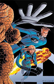
Stan Lee and John Romita, Jr. are working together on Marvel’s first family this month, with the out-of-continuity Last Fantastic Four Story. When a cosmic power beyond our understanding threatens all of humanity, (there’s a familiar concept) there’s just one team we can trust. So what happens when Reed Richards doesn’t have the answer?

Stan Lee’s actual writing is beginning to show its age, but his creativity has never been brighter. For every exclamation-laden Reed Richards scientific monologue, there’s a narrative like “In less time than it takes to read these words, the adjudicator (an invading alien force) flashes past entire universes!” Lee has an incredible gift for simplifying his message without losing touch of his audience, and this issue is just further fuel for that fire. He’s never overly wordy, always trusting in his artist to tell their side of the story, and the reader never feels confused or out of the loop. I mean, interstellar transportation powered by the strength of sheer thought? In any other writer’s words the idea would be preposterous, but when told by Stan Lee, you accept it as reality without hesitation. He presents his ideas so simply, yet believably, that you don’t even give it a second thought.

Lee’s greatest challenge is in his dialog, which hasn’t aged well in the slightest. While his imagination still blows me away, the conversations his characters share feel like they’ve been clichéd to death. It’s more like they speak just to verbalize their internal monologues, never to actually communicate with anyone. If they see something happening, they’ll make sure to observe it through word balloon, presumably in case someone nearby hasn’t been paying attention. It happened frequently enough to disturb me from the story, and really hurts what would otherwise be a surefire classic.

This tale raises a lot of questions about superheroes in general, how their first reaction is always to attack the unknown, and how they’d be lost if that strategy were ever defeated. It’s a great concept, even if the ending is a bit of a cop-out without a definitive answer. When it’s going full-steam, this is a great read with lots of depth, but it feels like its promise was never fully realized.

I’m constantly amazed by both the quality and the quantity of John Romita Jr.’s artwork, and he holds true to form throughout this double-sized issue. How the man finds time to fire off a monthly mega-crossover in World War Hulk and still entertain himself with a random book such as this one, without any noticeable drop in quality, is one of life’s great mysteries. I’ll just gladly enjoy it for as long as he’s able to keep it up.

His work with both alien and terrestrial situations is astounding, especially the former. He brings such life and style to an interplanetary setting that it becomes thoroughly fascinating, reminding me constantly of the finest efforts of Moebius. While Romita does occasionally show some wrinkles with his style (the Watcher looks more like a giant, muscle-bound Buddha than a big-headed alien sponge of information, and his rendition of the Silver Surfer is very disappointing) for the most part his stuff is dead on, whether he’s tasked with a gigantic fight scene or a simple strategic conversation. He treats these characters with such respect, such familiarity, that it’s amazingly easy to find yourself absorbed in the experience.

If just for the sake of the two legendary creators working together, this book is worth a long look. Ultimately I was hoping for a bit more closure than I got, but when it’s good, it’s quite good. This is worth a borrow, but don’t expect too much from it.

On a scale of 1 to 10, where 1 is poor and 10 is amazing...
Overall Score: 7

Black Panther #30

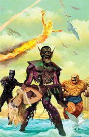
This month’s Black Panther may as well have carried the subhead “…and Friends,” because for all intents and purposes this is a straight-up Fantastic Four story. T’Challa, a recent appointee to the team, has led the four into a parallel dimension, where they’ve inadvertently stumbled upon the Marvel Zombies.

The whole story reads like a bad dream sequence – the new Fantastic Four (The Black Panther, Storm, The Human Torch and Thing) jump between alternate realities and random locations by holding a statue of a golden frog and wishing for it to be so. While writer Reginald Hudlin has a few very creative takes on the idea of undead superhumans and zombified aliens, he often pushes the envelope beyond the point of good taste. The overlying rule of the day is disorder, and while that’s a lot of fun for the first few lawless pages, it wears thin by the middle of the book. The concept of a zombie Hulk repeatedly shouting about his hunger pangs is highly entertaining until it’s stretched over the course of a multi-part storyline and overstays its welcome.

I haven’t really been keeping up with the whole Marvel Zombies phenomenon, so there’s a lot taken for granted in this story that I didn’t quite follow. The zombies can evidently think for themselves, as they’re routinely huddling up and discussing their plans, and that just serves to slow down an already-disjointed story. I think I’d have much preferred a balls-out brawl between the new F4 and a horde of hungry flesh-eaters to this.

For a group calling themselves the Fantastic Four, these guys really don’t work together all that well. The Panther’s relationship with Storm is acknowledged and comes into the proceedings nicely, but the rest of the team functions like a gathering of individuals, not a cohesive unit with years of experience together. Johnny comes off like a wide-eyed moron, the Thing vanishes from the battlefield altogether until it’s convenient to reintroduce him and Storm just floats around and randomly sprinkles rain and / or lightning on stuff. They’re familiar characters, but in name and appearance only.

Aside from a few unique perspectives, (I loved the “in the zombie’s mouth” angle) Francis Portela’s artwork is dull and unsatisfying. He displays some real problems with the lead characters, who come off as more soulless than the zombies they’re facing. Several of his pages are almost laughably bad, specifically the page and a half the team spends running full-speed into the desert. Each of his zombified characters look the same, with the exception of their costumes – dark, underdetailed faces, piercing eyes and bright white teeth that glisten in the absence of lips. At least they have a passion for what they’re doing, their faces constantly painted with a blend of fury and confusion.

The heroes often appear almost disinterested in their own adventures. When the Thing smashes a zombie Skrull with a giant stone early in the issue, he looks like he’s ready to take a nap. Sure, these guys have probably done this kind of stuff every day for the last thirty years, but it’s hard to get emotionally involved when the main characters are so sullen and stuffy.

I couldn’t get into this issue. The writing is substandard, never answering any questions or providing any sort of closure, which is odd for the third chapter in a three-part storyline. It comes off as a cheap way to tie a main universe book into the Zombies continuity, and ultimately feels really forced and unnatural. The artwork also leaves a lot to be desired, draining the life from four explosive characters. If you’re heavily into the zombie thing, this might be just what you’re looking for. I’m not, though, so I’m recommending you skip this and continue your search for greener pastures.

On a scale of 1 to 10, where 1 is poor and 10 is amazing...
Overall Score: 2

Avengers: The Initiative #5

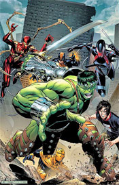
The Avengers Initiative is Marvel’s way of carrying over the ideas presented and established in Civil War. Tony Stark’s plan of introducing a dedicated Avengers unit to every state in the union has come to fruition, and their various adventures are preserved right here. This month, the series throws in their two cents on World War Hulk, with the local Initiates getting involved in the fracas.

Dan Slott’s storytelling is concise and interesting. He measures in a fair amount of action, characterization and conversation, although the introductions are kept a bit too brief for my taste. It’s never too much of an action book or a drama and the pace is consistently good, both of which are major positives for a short, self-contained tale. He handles the issue’s direct tie-in to World War Hulk #3 nicely, too, providing just enough information to educate casual readers (especially those who haven’t been reading the big summer crossover) while telling a story that works both as an original and as a continuation of the Hulk’s latest escapades. You don’t need to buy six other books to understand what’s happening here, but it’ll lend a little more depth to the experience.

The team itself is masterminded by Henry Peter Gyrich, a longtime holdover from the old days of the Avengers, who’s one of the more well-defined faceless government agents in comics. He’s living, breathing stereotype but at least it’s an entertaining stereotype, and one that fits within the confines of the story Slott is trying to tell. As a reader, it’s easy to see that Gyrich’s patchwork unit of faux-Avengers isn’t going to last that long. They have little chemistry, zero teamwork and a lack of meaningful dialog with one another. Whether that was an intentional misstep or a flaw on the part of writer I can’t say, but in the end it leads to a tamer story than I’d expected.

Because the roster is filled with C-Grade reformed villains and virtual unknowns, it’s hard to get excited about their activities. Where the original Thunderbolts took the idea of reformed bad guys and made it interesting, these Avengers fail because they aren’t granted the same level of respect. Kurt Busiek empowered his team of misfits and failed villains, immediately developed them into something worth investigating and put them into the public spotlight. Slott’s pass at the same concept is lacking that charm and personality. He throws these guys together and hopes they’ll work out on their own.

Stefano Caselli’s artwork is strong, with just a few wrinkles. He’s great with over-the-top facial expressions, and shows a deep understanding of how to display emotion. He can showcase the same sensation on a character’s face dozens of times without repeating himself. He knows when and where to insert a dynamic backdrop, and when the characters should be the sole focus. He occasionally runs into some problems with consistent proportions (the Scarlet Spiders’ arms shrink and grow a few times) and he does occasionally take his love of expression a bit too far. Sometimes the characters barely look human, their faces are so distorted to reach for that hard-to-get emotion, but it’s so infrequent that I hesitate to even mention it.

This isn’t a great book, but it’s not a bad one either. It’s one of those issues that fills space in your collection, one that’s just there. The story and artwork are both average, perhaps a step or two above, but do little to distinguish themselves from the masses. It’s not a surefire hit, but it’s at least worth borrowing. Didn’t light my world on fire, didn’t make me feel like an idiot for reading it cover to cover.

On a scale of 1 to 10, where 1 is poor and 10 is amazing...
Overall Score: 5.5

Monday, August 20, 2007

X-Men #202

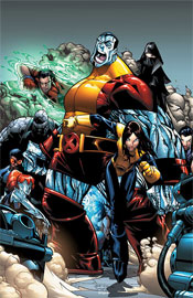
The ongoing X-Men team of Mike Carey and Humberto Ramos continues its work this month with issue 202, the third chapter of “Blinded by the Light.” Last issue, Mystique and the Marauders destroyed Rogue’s team in battle, while Exodus and the Acolytes assaulted the mansion. Only Cannonball and Iceman managed to escape unscathed, and their flight provides much of the focus of this issue.

Mike Carey is great at fleshing out a world where mutant powers are a reality. When a member of the Acolytes uses his ability to freeze time, a teammate complains that slowed time “makes the air feel all thick and slimy.” That’s a little touch that’s an afterthought to the characters themselves, but serves to bring the reader just a little bit further into a fictional reality.

His abilities aren’t just limited to the ambient, either. His pairing of Iceman and Cannonball is interesting, and gives the characters a nice opportunity to prove their growth and changes in personality. Sam plays the hot-headed, impulsive youth while Bobby does his best to maintain a level head and weigh their options. Not that long ago, Iceman would be the one in a rush to action without considering the ramifications. His restraint shows that the character has matured over the years, and the comparison to Cannonball makes a nice contrast. Past and present, so to speak.

Carey does great work at shrinking an unmanageably large population of mutants. He gives every character a purpose, whether they get ten pages’ worth of attention or half a panel. Even Sinister, a character I always used to despise for his shortcomings in this area, is given a definitive direction and personality in this story.

The ongoing narrative is still occupying itself with foreshadowing and vague insinuations, broken up by a few short battles, but if you’ve been reading X-Men for long, that shouldn’t be anything new. These books were basically founded on the idea of a slow crescendo, almost to the point that you begin to wonder if there will ever be a climax. This issue holds a steady course in that regard. There’s a lot going on, but by the final panel we’re still only an inch closer to the big, momentous occasion that’s being hinted at.

The normally solid Humberto Ramos misses a few occasions for some monstrously cool pages here, specifically a faceoff between Iceman, Cannonball and Sunfire at high altitude that could’ve been blow-me-away cool. I’m not sure if that’s due to the tight deadlines required by an X-book, laziness or something in between. Too many times, a backdrop is relegated to flat air and simple gradations, and it gives the book a mildly vacant, less substantial vibe. When it’s time to really gear up and deliver with a huge, dozen-man brawl, though, Ramos still comes through. In particular, the two-page spread in the middle of the issue is a great example of this proficiency.

As is par for the course, you’re going to fall into one of three camps on this book: you’re either a die-hard (buying this issue regardless of what I say), a hater (the precise opposite) or a tweener, who hasn’t been following the series but isn’t opposed to the concept. If you’re one of the first two, your mind’s already been made up. If you’re the latter, find a die-hard friend and borrow this. It’s slowly beginning to draw me in, and I imagine it’ll do the same for you.

On a scale of 1 to 10, where 1 is poor and 10 is amazing...
Overall Score: 8

The Sensational Spider-Man #40

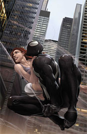
This month’s Sensational Spider-Man takes a short break from the rigors of the ongoing storyline to focus on Peter’s uncertain state of mind. He’s broken up over the gunshot that struck his Aunt May several months ago, understandably so, and once again questioning his decision to take to the streets as Spider-Man. Good timing, then, for a certain all-knowing, all-seeing deity to grace Peter with his presence.

Writer Roberto Aguirre-Sacasa’s story of the meeting between Parker and God himself is obviously meant to be very touching, yanking at the heart strings and ultimately delivering a clearer state of mind to the title character. If I’m speaking honestly, though, it just doesn’t connect. As though the concept of the almighty appearing alongside Spider-Man isn’t odd enough, the actualization of that idea is even stranger. The meeting is so nonchalant, so casual, that it puts the reader in a very strange place. One minute, Peter’s daydreaming about his origins, the next – “Hey God, what’s up? Oh, you want to help me work through this? Well, all right.” If we’re going to take such a direct approach at relieving Spidey of some of his angst and inner guilt over recent events, why does religion even need to be a part of the story? Couldn’t Peter have come to some of these conclusions himself if he’d put his million dollar mind to the task?

It’s tough to do a religious issue without coming off as heavy handed, but Aguirre-Sacasa does manage to avoid most of these pitfalls. There are no moments of overplayed symbolism or hints about the one true faith, it’s just a conversation. Not a particularly enthralling or revealing conversation, but not one that seems totally forced, either. Although the ultimate goal is to further elongate the Aunt May saga, which is really starting to drag on its own merit, at least this tale doesn’t feel like complete and utter filler. I was left with the impression that it’s finally time to wrap this thing up. Peter has come to terms with what’s happening, paving the way for “One More Day” next month.

Where I could take or leave Aguirre-Sacasa’s tale of conscience, heroism and the holy father, I found Clayton Crain’s painted artwork captivating. A lot of times, painters don’t mesh well within the confines of a full-sized monthly book. They tend to overdetail, reaching for absolute realism when the medium itself is defined by exaggeration, cleanliness and dynamism. Simply put, superheroes don’t work when they’re too realistic: the suspension of disbelief evaporates when Batman outweighs Commissioner Gordon by several hundred pounds’ worth of solid muscle.

Crain is a rare breed, in that he understands these guidelines and adheres to them from cover to cover. He allows his illustrative style to shine brightly, while also introducing a handful of effects and situations that wouldn’t work with pencil and ink. He frequently blurs his backgrounds, easily separating a panel’s focus from its surroundings, and it never proves to be too much. His detail on the New York cityscape is just enough to catch your eye but never so focused as to drive you mad. He understands when to allow the white space to do his talking for him. His framing and choice of camera angles is breathtaking. On the rare occasion that he falters (in detailing Peter’s face, for instance, he gets a bit crazy with wrinkles and blemishes) he almost immediately redeems himself (his recreation of the legendary cover to Amazing Fantasy #15 is breathtaking). Crain produces great, great work here, and I can’t wait to see more from him.

It’s too bad he couldn’t have been matched with a better story – while he was only given a limited opportunity to do so, the artist proved that he could really shine in an action scene. I couldn’t get into the talking heads of Peter and God that filled this issue, (although God’s physical appearance was an original idea) but you’ll want to at least flip through this and breathe in the visuals.

On a scale of 1 to 10, where 1 is poor and 10 is amazing...
Overall Score: 4

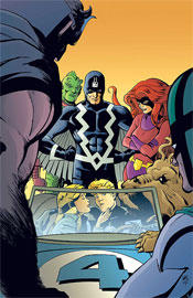
Marvel Adventures: Fantastic Four #27

The Marvel Adventures line, intended for a younger audience, focuses on standalone stories, simple themes and its own loose brand of continuity. MA: Fantastic Four, for instance, this month spotlights the team’s first encounter with the royal family of Inhumans. It’s a nice concept: introduce kids to the characters before you overwhelm them with forty years of back stories and chase them away.

Fred Van Lente aims to bring a light, humorous air to the book, but ultimately doesn’t seem all that comfortable with the format. Each of his characters are spoiling for a fight above all else, whether they’re hero or villain. The primary focus of the story is on the quirks and absurdities of life as a superhuman, but he never delves too deeply into the concept. It’s basically fifteen pages of the heroes calling each other weirdos and shifting their eyes around, with a few random acts of violence thrown in. Everybody gets a chance to show off their powers and grimace, and the problem is solved tidily at the end of the day.

Cory Hamscher’s art is extremely inconsistent – he’ll knock your socks off with a great illustration on the left side of a spread and mail in his contribution to the right. His work is excessively cartoonish with a heavy manga influence, often to a fault. While he retains much of the flair and excitement of the style’s action sequences, he also carries over an excess of its clichés and stereotypes. Every single female character has gargantuan bug eyes, accompanied by teeny tiny miniscule necks. It’s cute once or twice, but when it’s overdone to this degree, it becomes really distracting and obnoxious. I realize that the goal is to bring something to the table that’s bright and flashy for the kids, but that doesn’t mean it can’t have substance, too.

Hamscher also doesn’t seem to have much of a feel for these characters. Reed looks twice as old as he’d have been at the time of this story, (continuity or no, he wasn’t 50-something his entire life) while Black Bolt’s appearance hasn’t changed a bit. Sue is more of a brainless ditz in a dark dress than an intelligent, motherly type. The artist usually fills his backgrounds with needless speed lines or aimless crosshatch. Add to all that a paneling style that’s over the top, far too busy and tough to follow, and you’ve got a book that’s just a mess, visually. When he’s on, he really delivers, (as evidenced by the two or three really nice splash pages in this issue) but he isn’t ready for a gig as a regular artist yet.

As the printed version of a Saturday morning cartoon, this is what you’d imagine it would be. Loud, overly stylized artwork, paired with a rudimentary, thin story. Reading this book is like eating popcorn: light and airy, but not quite enough for a full meal. It might reach its target audience on name value alone, but a younger crowd shouldn’t necessarily make for a weaker story. A great tale can entertain children and adults alike, which is a claim Marvel Adventures: Fanastic Four can’t quite make. I’d skip this one, even if you’re shopping for your kid brother. There’s much better kid-oriented material out there.

On a scale of 1 to 10, where 1 is poor and 10 is amazing...
Overall Score: 1.5

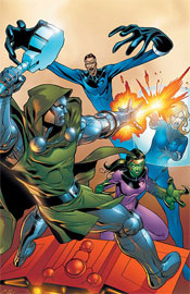
Fantastic Five #4

Residing in MC2, a future-based counterpart to the regular Marvel Universe, the Fantastic Five consists of the same four faces you’ve come to know and love, plus Franklin Richards, Reed and Sue’s all-grown-up-now baby boy. In issue three, Dr. Doom escaped from an imprisonment by the Sub-Mariner, who’d held him for over a decade, regained the Power Cosmic, spread the might amongst his army of robotic duplicates, and set out to claim the world as his own. This issue: repercussions!

Since the story is set in an alternate future, the gloves are really off as far as major storyline direction goes. If writer Tom DeFalco wants to kill off Dr. Doom or the entire population of New York City, there’s nothing that says he can’t, at least from a continuity standpoint. That opens up a tremendous amount of storytelling possibilities, which come in handy during Doom’s heavy-duty display of power that opens the issue. His aim is global domination, and he makes more of an impact on that front in just a few panels than he’s ever managed to in the main F4 title.

But, while it’s a lot of fun to see Doom kicking so much ass and making a joke out of our world leaders, the plot itself is fairly stagnant. The great majority of DeFalco’s work came before and during his run as Editor-in-Chief in the mid ‘80s and early ‘90s, and his style doesn’t seem to have changed since those days. His presentation of the team, of Doom, of the world powers, of the public in general… it’s all very dated, with cheesy dialog, two-dimensional storyline development and no shades of grey. You’ve got the good guys, squeaky clean and glisteningly honest, the bad guys, with a single nefarious goal and a god complex, and the public, blissfully unaware and easily confused. If a character doesn’t fit into one of those molds, (s)he’s not going to have a place in one of these stories.

For a Fantastic family title, there’s a notable lack of adventuring, science fiction and teamwork. The dual narratives of this issue take place in Doom’s palace and a sealed ship floating aimlessly through space, respectively – neither very interesting settings. The presence of the all-powerful Power Cosmic makes any potential scientific contributions worthless, and Franklin Richards devises a questionable plan of his own midway through the issue, putting it into action without consulting nor asking for the aid of his companions. It’s a fake F4 story, one that uses many of the same characters but none of the familiar themes.

Ron Lim’s art is similarly dated, which actually makes the two a good match for one another. His work is simple, neatly underdetailed, but without much of a personality. In a way, he reminds me of Dan Jurgens during his run as both artist and writer for Superman. Both artists’ work is disturbingly clean-cut, technically correct but never overly interesting. Even when a Doom Bot is single-handedly going to war with the entire roster of Avengers, I was never really excited by the moment. It’s there, it tells the story adequately, but it doesn’t stand out.

If you’re a big fan of the more run-of-the-mill superhero books of decades past, this might be right up your alley. It’s quite shallow, which makes it light reading at best, and does nothing particularly inventive with the all-star cast. The artwork treads water for twenty-two pages, the dialog is uncomfortable and the plot strays from the traditional Fantastic Four direction. Skip this if you aren’t a balls-to-the-wall Marvel completist extraordinaire.

On a scale of 1 to 10, where 1 is poor and 10 is amazing...
Overall Score: 2

Sunday, August 12, 2007

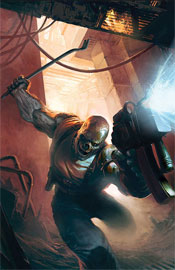
Terror, Inc. #1

David Lapham, known for his work on Stray Bullets, collaborates this month with Patrick Zircher (Nightwing, Cable and Deadpool) for this mini-series relaunch of Marvel’s Terror, Inc. A holdover from Epic Comics in the late ‘80s, Terror is the story of Shreck, a creature cursed with eternal life. Why would that be a curse, you might ask? Only his soul is undying, while his flesh and bones rot at a rapid pace. To retain mobility and appearances despite these trying circumstances, he need only tear a limb from another (formerly) living creature and affix it to his own body, which adopts it as its own. In the act of doing so, he also absorbs the talents and memories of the limb’s former owner. So, in terms of abilities, there really isn’t anyone else like him.

While much of Terror’s backstory remains intact from the book’s original run, Lapham has done wonders with both simplifying and expanding upon it here. He’s brought the book forward to the present without losing sight of the character’s rich history or dating the material. He tells just enough backstory to allow the reader to appreciate Shreck’s unique perspective and to plant a few seeds for future tales, but not so much that the entire story reads like a period piece.

In the present day, the lead character takes work as a contract killer, specializing in particularly tricky situations. We’re along for the ride on one such predicament as the first issue comes to a close, which gives Lapham all the room he needs to flex his muscle and show just how original and exciting this book can be. Though he kills with little remorse, (a remnant from his life before this affliction, where he was a marauding warrior) Shreck remains likeable. He’s well defined, knows who he is and what that means, and works with a smile on his face. And, although he has one of those metal arms that were all the rage for no particular reason in the mid ‘90s, his actually has a reason to exist.

Patrick Zircher’s artwork is a bit of a departure from his previous stuff, especially on Cable and Deadpool, and proves to be a very welcome change. This shift is perfectly suitable for the much darker, horror-meets-action tale Lapham has spun, and makes for a great fit. His take on Shreck is grotesque, but not faceless (well... physically faceless, yes). In addition, his art doesn’t feel out of place in the middle ages nor modern day Los Angeles, and actually seems to shift ever so slightly to better suit the era he happens to be illustrating. When we’re raiding villages in 455 AD, the art feels more in keeping with Conan the Barbarian. When we’re detonating grenades in an LA high rise, it’s more like Tim Bradstreet’s covers for The Punisher.

This is some straight-up outstanding material. A great premise, amazing execution, a story that’s off and running from the first page, a perfectly complimentary art style and just enough of a cliffhanger to leave me hungry for more. I’m adding this to my pull list posthaste, you’d better do the same. Buy it, buy it, and buy it again.

On a scale of 1 to 10, where 1 is poor and 10 is amazing...
Overall Score: 9.5

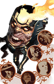
Super-Villain Team-Up / M.O.D.O.K.’s 11 #2

Quite possibly the most heavily punctuated book of all time, Super-Villain Team-Up / M.O.D.O.K.’s 11 greets its readers with a summary so simple it brought a smile to my face. Rather than establishing what had been accomplished in the first issue with a wordy write-up, the inside cover lays out a photo montage of the entire cast and their specialized roles. It’s quick, it gets the job done, and it’s very entertaining. “This guy: (the brains of the operation, M.O.D.O.K.) is giving these guys: (the eight villains that play a part in the story) this: (five million dollars apiece) to rob this: (The Infinicide).” Establishes itself and stands out from the pack right out of the gates. I like that.

Along those same lines, much of the dialog between villains is kept light and conversational, though M.O.D.O.K.’s speeches (god, I’m already sick of typing that name) can get pretty long-winded. I caught myself vegging out more than once as he laid out his master plan, but writer Fred Van Lente seems aware of the problem. He actually turns it around on the reader, as a few of the villains themselves lose their attention span during the monologue.

As a book focused exclusively on the activities of super-villains, you’d have to expect a certain degree of ulterior motives, backstabbing and conspiracy, which Super-Villain Team-Up provides in excess. Nearly every single character has an ace up their sleeve or a failsafe backup plan that involves incriminating their peers. It’s nice to read something that’s so polar an opposite to what’s usually provided in a team-up book, but eventually it stops being unique and loses its edge.

We’re still getting to know a lot of these characters, so the majority of this issue is spent fleshing them out and exploring their personalities. Problem is, only about half of the cast is deep enough to merit this kind of closer inspection and the lower-tier villains wind up doubly exposed for the effort. Now that I know Rocket Racer is a bit of an idiot who stutters when he speaks, does that make me care about his fate? Not really.

Francis Portela’s artwork is enticing, and his light detail work gives the colors plenty of room to work their magic. The two facets work together in a way that bears more than a passing resemblance to Steve McNiven and Morry Hollowell’s efforts on the main Civil War book last year. Portela doesn’t hesitate at the prospect of rendering some of the more offbeat subject matter of a book like this, and he shows a good understanding of when to go crazy with a dynamic action frame and when to show some restraint. He’s got a firm handle on each of these characters, too, which isn’t always a guarantee on a team book.

When its focus isn’t on a deep-seeded conspiracy from within or M.O.D.O.K.’s penchant for long-winded instructions, this is a fun book that doesn’t really have a peer. I enjoyed the way these overlooked villains worked together during their down time, but when the story turns a bit more serious near the halfway point, much of that is lost. Flip through this and enjoy the good stuff. If it were more consistent and could’ve resisted the urge to veer from its more humorous path, I’d have enjoyed it a lot more.

On a scale of 1 to 10, where 1 is poor and 10 is amazing...
Overall Score: 5.5

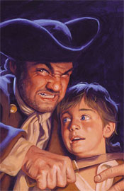
Marvel Illustrated: Treasure Island #3

The latest in Marvel’s series of classic literature translations, Treasure Island is a coming-of-age tale set within the confines of a swashbuckling pirate story. If I’ve ever read the original, it’s been long enough that I’ve forgotten about it, so this is a fresh experience for me. I doubt I’m the target demographic here, though, as I’d imagine the ultimate goal is to expose a younger audience to these time-honored classics.

It’s a shame, then, that Mario Gully’s artwork and Roy Thomas’s storytelling miss that mark so entirely. If the interest is truly on interesting the youth with these stories, the issue should be bursting at the seams with life, personality and enthusiasm. I should be able to pick this up, open to the first page and immediately lose myself. Instead, those introductory panels are painfully stiff, extremely word-heavy and ultimately very dull. This looks like something my grandparents would be interested in reading, which is exactly the kind of atmosphere that’s keeping kids away from these stories in the first place.

Gully’s work is strict to a fault, like the stuff you’d expect to find in Prince Valiant with your Sunday paper. From my own experience as a child, Valiant was the one strip I would go out of my way to avoid every weekend in the funny pages, and I’m sure I can’t be the only one. Truthfully, I still avoid it today for the very same reasons. As the issue carries on the artwork loosens up a bit, but even at it’s best is nothing I’d consider to be up to the task of capturing the imagination of a younger audience.

The excess of captions and word balloons throughout only serve to further muddy an already-murky style of rendering. Every single panel has no less than two full sentences of narrative crammed in, which gives the entire issue a very weighty, overdone feel. Granted, the very idea of the story is that it’s adapted from the personal recollections of several participants. However, where that approach might be effective in the context of a novel, within the confines of a highly visual medium like a comic book, it’s ineffective. Although the story itself is filled with adventure and excitement, the excessively descriptive text turns the act of reading about it into a chore.

There’s a real lack of characterization in this tale, too, which is downright shocking considering the source material. The entire cast of villainous pirates functions as one single-minded unit, not a cluster of individuals. The level-headed crew of honest men are rigid, faceless and totally lacking in personality. Even Jack, the youthful face of the story, seems to exist only to react and never to participate. A handful of men lose their lives as the story progresses, but their deaths never mean anything because they were never proven to be valuable to the story. It’s like writer Roy Thomas cut out the meat of the original tale and retained the fat.

Regardless of the desired target market, this issue fails to connect. On a few rare occasions, the brilliance of the original story is given an opportunity to shine through, but those moments are few and far between. In the meantime, you’re left to wade through an excess of text describing the artwork it conceals, a lightweight cast and a dull, C-Level artist. Skip this and mourn the missed opportunities.

On a scale of 1 to 10, where 1 is poor and 10 is amazing...
Overall Score: 1.5

Friendly Neighborhood Spider-Man #23

Peter David and Todd Nauck conclude their run on FNSM with this issue, which also serves as a sort of bookend to Spidey’s actions during Civil War. Last issue, J. Jonah Jameson fired longtime Bugle editor Robbie Robertson in a characteristic hissy fit. This month, Peter confronts Triple J in person about those actions and a few lingering issues left over from his public unmasking more than a year ago.

The story is a sound, character-driven read that plays with a lot of the longstanding conflicts between Jameson’s editorial direction and Parker’s involvement with the paper. I’ve long considered Peter David’s work on X-Factor in the mid ‘90s to be among my all-time favorites, and he carries the same style to his approach here with Spider-Man and company. He’s great at humanizing the life of a superhero, (or team of superheroes, whichever the case may be) grounding them to the same reality occupied by the rest of us. His characters may fire beams of pure plasma from their hands from time to time, but they’ve got the same insecurities and hang-ups as you and I. That’s especially the case in this issue, as Peter and Jonah’s emotions collide, both verbally and physically.

David’s approach typically treads a thin line between charming and cutesy, however, and he does cross from one side to the other a few times as this issue plays out. When Jameson visits Robbie’s home during the first few pages of this issue, for instance, his back-and-forth with the entire Robertson family provides some great dialog, but eventually goes to the well once too often and spoils the effort. Jonah’s argument with Peter later on, though, is much more balanced and carefully scripted, which results in a more enjoyable, entertaining read.

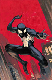
Nauck’s artwork is a good fit for the more lighthearted Spider-Man material, with a stylized, cartoonish feel. His work is a sort of Madureira / Wieringo mix, with thick linework and exaggerated expressions. For the most part, it works (he really does the dark Spider-Man costume justice, giving it a smooth, leathery texture) but he has some odd problems with maintaining consistent proportions. JJJ’s hands kept changing size throughout the issue, to the point that it became increasingly distracting, and nobody had a normally-sized nose on their face. To an extent, I can chalk that kind of stuff up to artistic license, but at some point it turns into a flaw.

This issue has high hopes. David and Nauck aim to finish their run with a memorable issue that allows Jonah and Spidey to finally work some of their frustrations out on one another, but the end result is a bit underwhelming. The big blow-over between Peter and Jonah didn’t carry the weight I was expecting, and was over and done with before I knew it. While it was actually happening it was good stuff, fun to finally see… but because it was so concise, it didn’t feel like that big of a deal. This wasn’t a bad read, but it didn’t knock my socks off, either. Flip through it on the shelves, but don’t invest too much time.

On a scale of 1 to 10, where 1 is poor and 10 is amazing...
Overall Score: 4

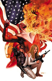
Captain America #29

Ed Brubaker, Steve Epting and Mike Perkins check in this month with Captain America #29, the fifth installment in “The Death of the Dream.” There’s a lot going on in this book at the moment, especially considering the marquee character bit the bullet several issues back.

The artwork of Epting and Perkins is best suited to a story with simple gunfights, deep characterization and a minimum of hands-and-fists action, and that’s almost exclusively what they’re given to work with here. In the few occasions that they are asked to delve into more traditional comic book action sequences, their collaborative style just doesn’t hold up. They reach for supreme realism above all else, and that doesn’t mesh well with the idea of a man in a skin tight, red and white avian-themed costume throwing kicks and punches at a gentleman with a flame thrower.

When they’re in their element, however, these two can deliver some really nice work. Their rendition of the city of New York is breathtaking – a sea of lights, bricks, mortar and concrete – and their knack for creative camerawork really emphasizes that strength. When the Winter Soldier is infiltrating an enemy’s operation at the pinnacle of a downtown skyscraper, clinging for dear life to a dangling American flag, the effect is both dizzying and captivating.

While their style may not have the kind of flash and personality to catapult them to the top of the artistic heap, the subtleties of their work are worthy of some praise. For the most part, they’re right at home in this kind of an espionage book, although writer Ed Brubaker does ask them to fill an awful lot of pages with talking heads and computer monitors. Epting and Perkins’ work is a great match for the mood this series evokes, although I wonder if it will hold up once Cap makes his inevitable return from the grave and the focus shifts back to more traditional costumed fare.

Brubaker’s script for issue twenty nine is very, very complex. He aims to tell an epic, involved, detailed story filled with twists and turns, but that’s tough to do in brief monthly installments like this. Maybe it all makes sense in the long run, but as a fresh reader coming in midway through this story arc, I was completely and utterly lost within the first six pages. This is obviously an extremely layered, delicate storyline and the actual writing within the issue is compelling, but when I had trouble following the “previously in Captain America” blurb, I knew it meant trouble.

It’s difficult to tell who’s on which side as the tale progresses, as well. Between Tony Stark, the Black Widow, Sharon Carter, the Falcon, the Winter Soldier, the Red Skull and Crossbones, there seem to be no less than four competing alliances and coalitions, and that’s just within the confines of this issue. It’s one thing to spin a yarn with depth and unpredictable twists, it’s another to tie a knot and confuse your audience. I fear Brubaker may have grown a bit overambitious here.

If you’re a longtime Cap follower, or the kind of reader who prefers to wait for the collected edition to hit store shelves, this story may be right up your alley. It’s interesting enough that I’m curious about the full story, and may grab up the trade myself if and when it arrives in my local shop. As a standalone, though, it has quite a few shortcomings. If you’re brave enough, borrow it from a friend and try to comprehend what’s going on. It’s got potential.

On a scale of 1 to 10, where 1 is poor and 10 is amazing...
Overall Score: 6.5

Monday, August 6, 2007

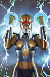
Nova #5

Marvel has almost always placed an unusual emphasis on the activities of its alien species, with the business of the Kree, Shi’ar and Skrull species of particular interest to humanity at large (not to mention the activities of Galactus, his Heralds or the Watchers). With that in mind, the powers that be have recently taken the initiative of relaunching Nova, telling the otherworldly adventures of the golden-helmed adventurer.

The last time we saw the title character, AKA Richard Rider, he was in rough shape. Flying full-force into an impenetrable Phalanx force field generally has that kind of effect on a guy. So, to give the man some time to gather his thoughts and reassemble his body, the Worldmind computer (the source of Nova’s power) has gone to the trouble of choosing a temporary assistant: a Kree medic named Ko-Rel. She’s the public face of this issue, and wields the same powers and apparel as Nova himself.

Dan Abnett and Andy Lanning have brought a surprisingly shrewd, entertaining story to the table in this issue. They do a nice job of developing the temporary supporting cast to accommodate the new lead, take the reader on a roller coaster ride that keeps them guessing, and finish things off with a final page that had me legitimately interested in the follow-up. Never underestimate the value of a good cliffhanger.

Although the entire cast of this issue is alien, they each have a unique look and feel to them. Where the common cliché would be to give every alien creature a similar physique, outlook and uniform, here they’re treated intelligently. They’re given outfits that suit their occupation, natural personalities… in short, they’re given the same dignity that human characters are afforded. I probably shouldn’t have been as surprised about that as I am, especially considering Nova focuses so exclusively on extraterrestrial affairs. Still it’s something that was nice to see anyway, even if some other stumbling blocks aren’t as carefully avoided. It’s especially distracting that these guys speak fluent English save the curse words, for which they have their own odd pronunciations. If the story takes two steps forward with its handling of the alien culture and the similarities to our own, it takes one back for including a line like “Oh fark, what the das’t is that?”

Sean Chen and Scott Hanna deliver safe, solid visuals in the vein of Greg Land. Chen’s visual style is picturesque, almost to a fault. The characters look too realistic, in that they never seem overly dramatic or stylized. I prefer an artist who takes little more creative liberty with their work, but he’s good at what he does and I can respect that, even if it’s not to my taste. At worst, he knows what he’s doing and that’s enough to stand out from the horde.

Chen does get a bit crazy with the speed-lines from time to time, but it’s never so bad as to spoil the composition. It’s the use of silhouettes that seems to be his real interest, and also his greatest strength. He introduces them to imply depth, to further emphasize the power of a bright light, and to simply deliver a cool visual, but they’re never overdone or forced into a situation.

Brian Denham fills in for five or six pages throughout the book, and provides close enough a replica of the other artists’ style that I didn’t even notice the change. That’s good, too, because I really can’t stand the disruption of a drastic artistic shift in the middle of a book. It completely pulls me out of the immersion.

Having finished this issue, I’ll actually be keeping my eyes peeled for the next, where before I never would’ve given it the time of day. Do yourself a favor, borrow this one from a friend. If you can hang with the artist’s style and the prospect of an almost exclusively blue-skinned lead cast, you might lose yourself in the quality sci-fi storytelling.

On a scale of 1 to 10, where 1 is poor and 10 is amazing...
Overall Score: 7.5

New Avengers #33

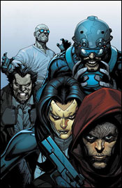
Brian Michael Bendis and Leinil Yu are in town this month to continue their second story arc together on New Avengers, “The Trust.” I’ve been onboard with this series since the very beginning, and I don’t think I’ve been nearly as excited about it as I am right now. After stumbling through a few early story arcs, the conclusion of Civil War has delivered a great shared identity to the members of this team, which has opened up a lot of storyline possibilities that just weren’t there before.

The beauty of Leinil Yu’s work is in the details. He’ll throw in little unscripted touches like a good actor will ad-lib a few lines. When Echo signs the tab for a room service order, she does so on the delivery boy’s back. Before the food has even arrived, Wolverine has somehow produced a bottle of alcohol. Most people won’t even notice these things, but they work subliminally to paint a better picture, to explore little bits and pieces of the heroes’ personalities, and to create a more realistic environment. Not that he’d need the help, since his background work is breathtaking. When he’s asked to set the mood in a seedy bar, your fingers feel dirty leafing through the pages.

Yu’s also mastered facial expression and body language virtually across the board, (although Jessica Jones does look entirely too skinny throughout the issue) which really helps to clear the page of unnecessary word balloons. Why clutter things with too much dialog when you can tell the story through expression? His work is equally at home with civilians and superheroes, and they don’t look awkward interacting with one another.

One of the biggest advantages of the two ongoing Avengers books sharing a writer is how effortlessly the two can reference one another. Bendis delivers a brief mention of the happenings in the latest issue of Mighty Avengers midway through this book that’s amazingly insightful, interesting and downright cool – and it takes a grand total of five panels, start to finish. Barely half a page, but it’s enough to remind you that there’s always something going on in the Marvel Universe, that the two teams are aware of one another, and that these guys really do exist in the same plane of existence when they aren’t face to face.

That’s something that used to be so unique about the mighty Marvel line in its heyday: even if you bought an issue of Spider-Man, there was a good chance you’d see another character making a guest shot or at least getting some sort of mention. The heroes were always conscious of each other’s activities, which made the whole world feel much smaller and more interesting. The practice was lost for quite a while as the stories’ themes grew more complex and mature, but Bendis has reminded us of it perfectly here. Not only that, but he’s proven that it can work even within the guidelines of a smart, intricate story.

This issue is almost entirely character-driven. Having blown through the last few chapters with ninjas, superhuman duels and the threat of open interplanetary warfare, it was nice to settle down and just get to know these characters a bit better. The team bickers like a room full of school children, as many adults are prone to do in high-pressure situations, and it keeps the book on its toes. It’s boring to watch a team that gets along like a happy family, and New Avengers has never been better.

Of course, it’s not all chatter with no fireworks. An old, forgotten B-level hero from the ‘90s makes a return to the funny pages in this issue, and Leinil Yu illustrates him better than I’ve ever seen before. A new pair of villains are introduced, as well, and make an immediate impact on the proceedings. If the last panel is any indication, this issue was merely the eye of the storm and the action should escalate once again in NA #34.

This series is really starting to kick some ass right now, and remains one of my favorite monthly reads. Brian Michael Bendis somehow manages to get every member of the team involved in the dialog without forcing anything, introduces tiny new plot threads for the public to paw at, acknowledges the activities of the pro-reg Avengers team, and wraps it all up in just twenty two pages. There’s enough meat here to satisfy my appetite, but enough clean air to keep the book from feeling too weighty and dialog-ridden. You should be tripping over your own two feet to buy this. It’s outstanding work.

On a scale of 1 to 10, where 1 is poor and 10 is amazing...
Overall Score: 9.5

New Avengers / Transformers #2

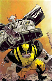
Stuart Moore and Tyler Kirkham are in with the second of four planned issues in Marvel’s New Avengers / Transformers gathering. The membership of both teams is a little goofy here, with the Avengers appearing in a modified pre-Civil War incarnation (The Sentry is MIA, replaced by Ms. Marvel and The Falcon) and the Transformers themselves arriving in very limited numbers. The entire face-off occurs over the backdrop of a Latverian / Symkarian war, which means Dr. Doom is in on the fun, too.

I’m not entirely sure why this crossover was necessary. Granted, the Transformers motion picture is in theaters as we speak, so I suppose any opportunity to take advantage of that momentum is reason enough, but I can’t really grasp the logic here. It’s a very by-the-books meeting: random circumstances bring the two teams together, a misunderstanding forces them into battle, cooler heads prevail and they reunite to battle a common foe. I don’t think that plotline was very interesting the first time I read it, about fifteen years ago.

As a whole, the story and artwork are both quire unremarkable. Much of the issue reads like filler, there to needlessly complicate and elongate the storyline, and when I’d finished the book I wasn’t really sure what had been accomplished. I don’t think Stuart Moore has more than a passing knowledge of either team’s longstanding mythos, as evidenced by the heroes’ words and actions. The Avengers don’t work together as a unit or put their individual strengths to good use, they sail into battle with a bloodlust. Optimus Prime reminds his crew to avoid fatally wounding the humans at all costs, then immediately fires at Cap’s head. There’s no personality, no characterization, no familiarity, just two teams of empty shells wearing familiar wardrobe. The Decepticons’ master plan is flimsy at best, and leads the reader to wonder why they’d travel such a great distance to see it through to completion. Surely there must be easier, less risky methods of acquiring energy?

Tyler Kirkham’s art would feel more at home in the mid 90s, but feels dated and unwelcome alongside the more stylized work that’s on the shelves today. His paneling is confusing and weighty, often distracting from what’s actually going on. His work on the Transformers themselves lands somewhere between strict realism and cartoony exaggeration, when it would be better suited sticking with one extreme or the other. Instead of compassionate living beings, the Autobots have never felt colder, more metallic than they do here. Granted, he didn’t get much to work with as the vast majority of the issue is centered on talking heads, but a good artist knows how to get around such difficulties. Kirkham merely passes the buck.

The Autobots spend most of the issue in their vehicular form, which is strange because they don’t really do anything outside of the first three or four pages. They’re just kind of parked there, speaking through their holographic human “drivers” as the story slowly drags itself toward the finish line. It’s a missed opportunity to deliver a few impressive visuals – Captain America standing tall next to Optimus Prime or Iron Man chatting it up with Wheeljack– and if the goal of this series isn’t to take advantage of those kind of opportunities, I’m at a loss as to its true intentions.

Bottom line, unless you’re an absolutely masochistic Cybertronian completist, you’re going to want to skip this one. It’s cool to see a lot of these guys sharing a panel here and there, but not nearly as cool as it was when the Transformers met up with G.I. Joe a couple of years ago. It’s lacking in just about everything but star power, which makes its ultimate failure even more disappointing.

On a scale of 1 to 10, where 1 is poor and 10 is amazing...
Overall Score: 2

Criminal #8

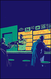
Ed Brubaker and Sean Phillips, known for collaborating on DC / Wildstorm’s Sleeper, are working together again in Criminal, which delivers issue eight to the shelves this week. For Brubaker, who’s been making a name for himself on superhero books of late, the series marks a triumphant return to crime-focused subject matter. But really, both creators have a great handle on telling these kinds of stories, lending a sort of authenticity and gritty realism to them without overdoing it.

In the vein of Sin City, each arc of Criminal features a different cast of characters. They inhabit the same world, share the same haunts and interact with the same people, though, so there’s that overlying sense of unity to tie the whole thing together. This particular issue focuses on Tracy and Mallory, a sort of reverse odd couple. Tracy, the introspective, emotional type, is the muscle of the operation, while Mallory is more collected, intelligent and spontaneous. They’re related strictly through their work, which happens to involve the relocation of a large amount of cash from a nearby ATM, although the relationship quickly moves forward from there.

Brubaker knows how to flesh out these characters: by the end of the issue, I felt like I’d known Tracy and Mallory for years. His finest gift is an excellent capacity for basing things in the real world. There’s no master plan for the theft that provides the initial spark for this story, just a fair amount of common sense, a little brawn and a plenty of personality. The characters don’t talk to each other like a pair of cardboard cutouts with a pre-recorded monologue, they chat like regular folks. Their moods shift, they misunderstand each other, they make fun… anything to take their minds off of the risky business at hand.

If you’re worried about jumping in midway through a story arc and losing all sense of direction, erase that thought from your mind. Although this issue is the third in a five part storyline, it functions wonderfully as a standalone tale of its own right. There’s enough going on in the background to pique your curiosity about what’s come before, though it’s never a big enough part of the tapestry to overshadow the main storyline.

The artwork of Sean Phillips provides an excellent counterpart to Brubaker’s script. In true crime noir fashion, much of the rendering is done by the shadows. Even surrounded by a glistening coat of fresh snow this city looks grimy, foreboding and intimidating. He lends each character a look and feel all their own, provides a nice variety of angles and visuals, works wonders with the concrete jungles in the backdrop, and doesn’t jump up and down screaming for your attention when he doesn’t need to. His work with Tracy is particularly great, as he’ll carry an entirely innocent expression in one panel, then shoot a glare like a pitbull backed up against the wall just a few pages later. Outstanding range, good grasp of the characters’ personalities… good stuff.

This is a great little crime book. It provides excellent pacing, strong characters, solid artwork that fits the mood and a good balance between gunfire and conversation. It’s got some adult content, so you’re going to want to keep it out of the kids’ hands, but it’s never gratuitous. Either buy this right now and savor the wait between issues or hold off for the collected edition and enjoy it all at once on a lazy Sunday afternoon. Just don’t forget about it, because books like this one deserve the attention.

On a scale of 1 to 10, where 1 is poor and 10 is amazing...
Overall Score: 9