Monday, September 26, 2011

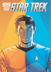
Star Trek (2011) #1

Confidence is a trait James Kirk never seemed to lack in Star Trek's recent film reboot, but for that quality to truly manifest itself into something meaningful, it requires the respect and loyalty of one's peers. That's something we never had a chance to see in play during the squad's first adventure, as Kirk spent the entire tale proving his worth and, ultimately, staking a claim to the captain's chair. When we rejoin the cast in this month's Star Trek #1, and presumably in the forthcoming sequel, Kirk has already completed his transition from ragged potential leader to proven, venerable commander.

In some respects that's a good thing; leaving the origin chapter behind can only open new doors to adventure. Eventually the core group members have to embrace their responsibilities and push forward as a bright, versatile young unit. However, it also runs plenty of risks, some of which aren't so deftly avoided in this very issue. When Kirk, Spock and Bones step away from the bridge to discuss a sudden threat to the Enterprise, for example, the conversation could just as easily have come from the mouths of Shatner, Nimoy and Kelley as their fresh-faced counterparts. They've already slid too easily into the static, classical roles associated with each character, and the last thing the fledgling crew should be doing at this point is getting too comfortable on the bridge. After all, what's the point of taking a new direction if it's just going to wind up in exactly the same place as before?

I suppose it's inevitable that some amount of revisitation is in order for such a long running, well-regarded series. The plot of this month's issue, notably, is lifted almost directly from an episode of The Next Generation. What's to stop the movie franchise from going a similar route and resurrecting Khan in the near future? And who's to say they'd be wrong to do so? My concern is that too much reverence is paid to the original tales at the cost of ingenuity and fresh thinking. It's a very thin line between the two, but I left this issue with the impression that it wound up standing on the wrong side. Excessive familiarity does breed contempt, after all.

Fortunately, the artwork doesn't subscribe to quite the same mantra as the storytelling. Stephen Molnar's linework is loose and playful, more concerned with gesture and character than rigid technical proficiency. Though he does occasionally tread a bit too near the uncanny valley in some of his interpretations of the actors behind each role, those transgressions are usually tempered by a crisp, clean environment and a quick return to form in the next panel. Molnar doesn't get much liberty to light up the page in this bookful of board rooms and staff meetings, but he does manage to keep things fresh and interesting all the same.

Sadly, as slightly more than a passing fan of the Trek mythos myself, I found the new troupe's debut issue redundant and actionless, a safe reinterpretation of a classic story that never manages to shift out of first gear. Though forthcoming issues may promise more in the way of exploration and extraterrestrial encounters, the tone that's been set in this initial adventure is a long ways from reaching the potential set by its celluloid predecessor. Die-hard Trekkies might enjoy it as an appetizer for things yet to come, but even they will find plenty of minor ticks and glitches to pick away at. Flip through it.

On a scale of 1 to 10, where 1 is poor and 10 is amazing...
Overall Score: 4

Monday, September 5, 2011

Planet of the Apes #5

When this issue rolled into my review box, I momentarily paused to consider how such a lucrative franchise had managed to avoid this medium for so long. After all, the intelligent blend of sci-fi and fantasy seen in the Apes seres has typically fared very well in comic books, and without any concern for prosthetics and special effects to get in the way, the concepts and ideas behind the story itself could be reasonably expected to succeed. Well, a quick Wikipedia search later and the facts stand revealed: the 2011 edition is far from the first adaptation attempted with this license. Since the original film landed in theaters, no less than a dozen different publishers have tried their hand at the simian landscape, including several mangas, a three-year run at Marvel and a Dark Horse tie-in to the 2001 Tim Burton-helmed failed relaunch. Learn something new every day.

Despite that long tradition of ill repute, however, Daryl Gregory's new interpretation might just wind up being the one that finally sticks. Like this year's big screen relaunch, it seems like Gregory can see beyond the masks, make-up and long-lasting catchphrases of the first film to the enduring message buried beneath. On the surface it's a sci-fi adventure with apemen riding saddled horses and humans thrashing wildly in their cages, but beneath that lies a complex, relevant message about segregation, society and racism of all shapes and sizes. Not only does the new series meet these issues head-on, but it does so with a hefty, diverse cast, a large-scale primary storyline and dozens of intelligent minor plot threads. And though this issue can at times be intimidating for new readers, its pace is deliberate enough for fresh faces to catch up quickly without feeling completely overwhelmed.

Gregory's found himself a great match in Carlos Magno, too, whose sharp, vivid artwork is all the proof at-a-glance viewers need to tell Boom! Studios is serious about this series. Like former Wildstorm golden boy Travis Charest, Magno's work is richly meticulous, but sparingly so. Both artists speak volumes in the details of each panel, balancing the heavier portions of a layout with effective, strategic use of negative space. Naturally, Magno's contribution doesn't entirely benefit from such comparisons, as Charest's work is more evenly stylized and poetic, but the potential for similar growth is there. With a bit more finesse and a few more years at the table, Carlos could easily grow into a formidable talent. As it is, his artwork is a bargain for the $1 asking price.

That last statement holds true for the full issue, as well. At a standard price, this effort would have received a firm "borrow"”" recommendation and a few words about its potential to move into my pull list somewhere down the line. At less than a third the price of most mainstream comics, though, it easily makes the leap up a level, making it a solid buy. The moody, cinema-influenced artwork might get the first hooks in, but it's the smart, multifaceted storytelling that'll bring readers back for more.

On a scale of 1 to 10, where 1 is poor and 10 is amazing...
Overall Score: 8

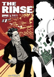
The Rinse #1

With no shortage of crime drama on the shelves today, it can be difficult for new books in the genre to make their mark, particularly ones without the benefit of a big-name creative team. In the case of The Rinse, new from Boom! Studios, the goal is to overcome both issues by shedding light on a heretofore under-explored aspect of the shady man's business: the laundering, or "rinsing," of dirty money into nice clean, suspicion-free taxable income. This issue's man of the hour, one Jeff Sinclair, became the best there is at what he does through careful dealings, a razor-sharp mind for the business and more than a few well-placed punches and kicks. He's the under the table high roller's best friend, with a playboy's gift of gab and an attitude like a pulp private eye.

Although we're joining Sinclair at the top of his game, with a wealth of experience and a bed of hundred dollar bills beneath him, that doesn't mean the first issue doesn't deliver its share of elaboration. In fact, the book's half over by the time Jeff removes the training wheels, leaves the paint-by-the-numbers explanations behind and gets on with the story developments. Thing is, for all the effort author Gary Phillips dedicates to explaining the various hoops Jeff jumps through on any given day, I didn't completely buy into the validity of his work. It all seems too straightforward, too effortless and too transparent to escape the eye of his enemies. It's a trend that carries over into the forward-gazing plot threads that stretch their legs in the latter half of this issue, where again our rinser's interactions seem far too on-the-surface to be credible. While the charm of a good noir tale is often in the hints and clues that are left unspoken, The Rinse may as well have spelled everything out on a series of flash cards.

Marc Laming's artwork is a curious choice for such a book. His bright, bubbly style and grinning, happy-go-lucky characterizations seem at odds with the street smart tone of the narrator and the seedy underworld he occupies, like a hot dog stand set up inside the front door of a ritzy club. Laming's best work is in establishing shots, where he showcases a slick, minimal knack for rendering vivid landscapes and bustling city street corners - throw an important character or some action into the mix and he gets tripped up. The mismatch of styles isn't helped by Darrin Moore's shiny, polished color efforts. With a subtle, sleazy palette at play, much of the artwork's shortcomings could have been neutralized. Moore's overuse of warm, friendly shades just drives it further in the wrong direction.

For all the small things this issue gets right - a calm, cool lead, an original take on a crowded genre - there are another dozen larger issues it gets helplessly wrong. Hammy, vanilla dialog is a cardinal sin in a book like this one, but under the right circumstances that can be forgiven. A blunt, predictable plot would take a bit more work to compensate for. Roll all of that up with a badly paired artist, though, and you've got a full platter of problems. Not even a discounted cover price can get this one where it needs to be. Skip it.

On a scale of 1 to 10, where 1 is poor and 10 is amazing...
Overall Score: 3