David Morrell’s story, though, is at best loosely associated with that star-chested American icon, and lacks any real depth or gravity. The soldiers he’s thrown into the spotlight in Cap’s place are right in the line of fire throughout the issue, but the threats they face are dispensed so nonchalantly that I never felt like the group was in any kind of danger. Really, that’s a theme that runs throughout the book – it’s very bland, with every potential point of interest handled so dryly that it’s robbed of most of its weight and value. Nobody seems to be all that affected by the events surrounding them, and that influences the reader to react in the same way.
Brian Reber’s colors and Mitch Breitweiser’s artwork are the most noteworthy elements of this book. Breitweiser’s rendering style is extremely tight and realistic, but also dynamic and exciting enough to work within the pages of a comic. His artwork bears more than a passing similarity to that of Travis Charest, in that it’s very detailed while still retaining some looser sketchbook-style qualities. When the panel is a tight close-up of a soldier’s face, he finds every individual blemish and shares them with the reader. When it’s a broader shot of a group investigating the charred remains of an enemy stronghold, his work becomes more expressive and less painstakingly accurate.
Breitweiser never shirks on rendering an environment or vehicle, either, which is nice to see. He brings a nice noir-ish quality to this book, in the style of Alex Maleev’s work with Daredevil, a fresh take for a war story. What’s probably most impressive is the amount of personality he brings to these inanimate objects. It’s easy to tell that the car in that junkyard has a story behind it, and that’s something of a rarity. Most artists would dismiss it as just a prop, where Breitweiser sees it as a character.
Reiber’s colors are largely a wash of greys and browns, but they perfectly match the mood and the tone of the story and add another level to Breitweiser’s artwork. The borders that surround each page are a very faint khaki, which isn’t noticeable at first glance but really helps to cast a dirty, sandy shadow over the proceedings, further emphasizing the setting of the tale in the Middle East. This overlying tone also helps the infrequent uses of a bright, brilliant white to stand out and make an impact when necessary. He works with a very subtle, depressing palette, which is a good match for the flavor Morrell delivers with the story.
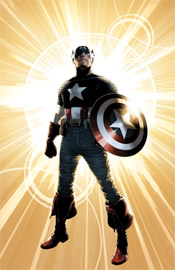
My sole complaint about the artwork is with Mitch Breitweiser’s take on Captain America, (his chain mail is gigantic, making him look like a bird with ruffled feathers) but the hero only appears in a few brief panels throughout this issue, so that’s somewhat forgivable.
I didn’t care all that much for the story, but it was at least passable, and the visuals alone make this issue worthy of a borrow. I’m anxious to see what this team can do with a more interesting plot.
Overall Score: 6.5

No comments:
Post a Comment