It says a lot that the non-powered characters don’t even deem this to be worthy of closer examination, (or even surprise) and that opens up a few interesting possibilities for future storylines (a world where superpowers are the norm, so run of the mill that two guys throwing each other into buildings is as everyday as a traffic accident). Unfortunately, because that possibility isn’t really explored in this issue, it only serves to cast a deadening tone over the book. If the everyman characters don’t see anything worth getting excited over during a quick battle between superhumans, why should the readers?
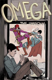
Farel Delrymple’s artwork is very loose, to the point that it seems quite hurried. It reminds me a lot of the style common to DC’s early Vertigo books in the first half of the 1990s: very straightforward, very old school and more than a little outdated. His paneling style is straight out of a textbook, adhering to a strict grid, and while he grants his characters a fair amount of individuality and personality, there’s no emotion in what he brings to the page. I don’t think this issue could’ve taken him more than a day or two to lay out, and it shows. I think he was aiming for a quaint, simplistic style that would help him stand out from the pack, but instead it feels more like a loose series of proposed layouts than a finished book.
Delrymple doubles as the issue’s letterer, which works as both a positive and a negative. On one hand, this association ties the style of the lettering directly to the light, airy style of the artwork, giving the book a single, unified look and feel. On the other, that look and feel really isn’t anything to get excited about. The artist’s lettering is far from professional grade, especially compared to his computer-aided modern contemporaries. It’s too thick, tougher to read than most of the books on the shelves today, but I can’t say it doesn’t have personality.
That’s something I could say for this book as a whole. It’s trying so hard to have a unique take on an overanalyzed concept that it loses sight of simply telling an interesting story. The artwork wants so badly to be noticed among its more dynamic peers that it goes too far in the opposite direction and comes off as unfinished and unrefined. There’s still room for growth here, and the slow-paced story is laying the groundwork for a few long-standing plot threads. Still, it’s a long way from fruition and I’m not entirely sure the series is doing itself any favors by taking such a slow moving approach one issue into its existence. Flip through this on the store shelves and see if it’s your cup of tea. I remain ambivalent.
Overall Score: 3.5

No comments:
Post a Comment