Paul Ens’s writing is tame and totally lacking in depth or substance. What was evidently a cliffhanger at the end of last month’s issue is taken care of in a single page here and then dismissed. David and Trilyn casually abandon their day jobs in favor of spandex-clad adventures at the first sign of trouble, although it had just been stressed how busy they both were. Ens sets up a small handful of conflicts for the pair to navigate, and I have no idea how they got through any of them. They’ll stumble into what seems like a corner, and then suddenly they’re out of trouble and on to the next situation. It’s awful writing, and seems like it was pieced together in about three hours. How did Tarilyn excuse herself from her meeting with the mayor’s daughter? How did David explain his midday absence to his superiors? Better yet, why did he just so happen to have a gas mask with him at the hospital? Don’t look to the story for any answers.
This reads more like a parody of a comic than a serious effort to add to the genre. It never takes itself seriously, so how can the reader? Ens sends the heroes randomly through the city, forgetting about what happened on the previous panel and introducing new faces at every turn. While most of the cast may be wearing different faces and alternating wardrobes, they speak with a common voice and have next to no personality. Nothing I saw made me want to back up MidKnight and Knightingale or pull for them to emerge victorious… I was just counting the pages until it was over.
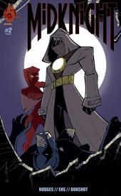
Artist Tom Hodges has a crisp, clean style that’s reminiscent of Bruce Timm, but it’s very loose and lacking in polish. Some panels are so under-detailed and poorly illustrated that they felt like bad amateur work. Hodges pays no special attention to his backgrounds, which are generally left very bland and vacant, and the book’s colors do him no favors there, usually painting the scene with a weak gradient if anything. The artist does have a knack for gracing the characters with a flavor and personality that makes them easy to identify, which is much easier said than done, but largely I found his artwork to be very lacking and unrefined. He didn’t convince me that he knew what he was doing for the majority of the story… at his best, I’d say he’s almost average, no more. Most of the time, he isn’t even that.
This is bad stuff. The writing is passive and lacking of consequence, with disposable characterization and nothing to say. The artwork is passable in a few sporadic instances, but largely intolerable. Is this fan fiction? It certainly doesn’t seem to be professional… skip it without a second thought.
Overall Score: 1

No comments:
Post a Comment